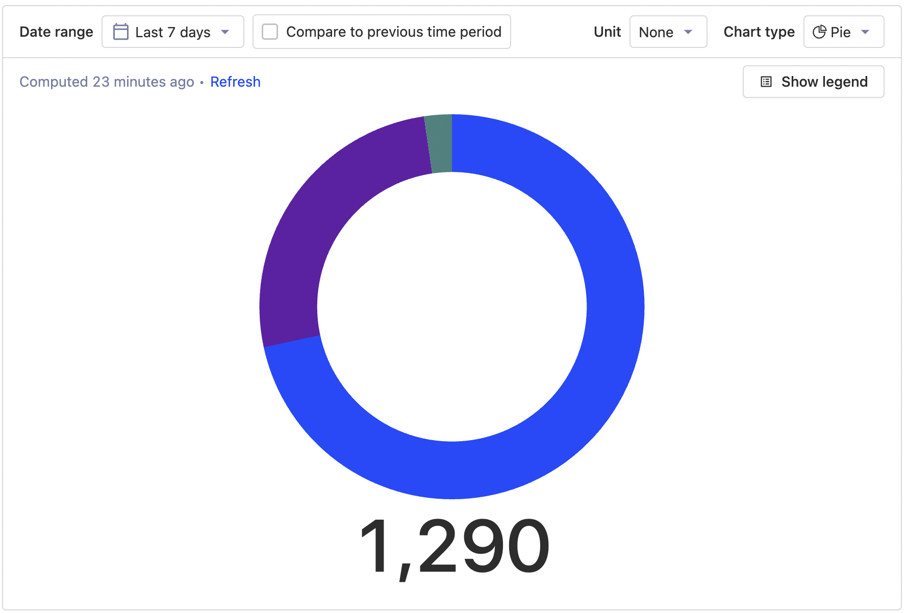
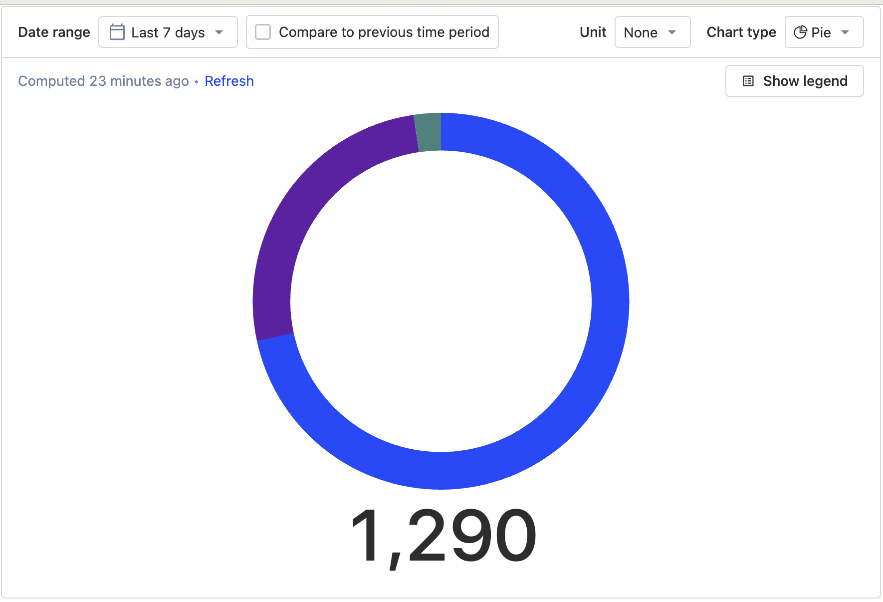
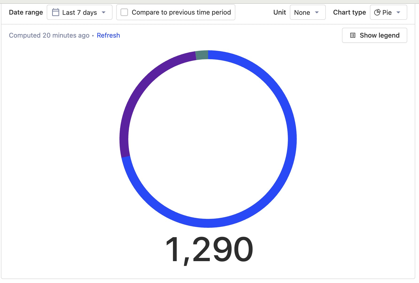
feat: slimmer doughnut
Problem
relates to #11433
As a first step
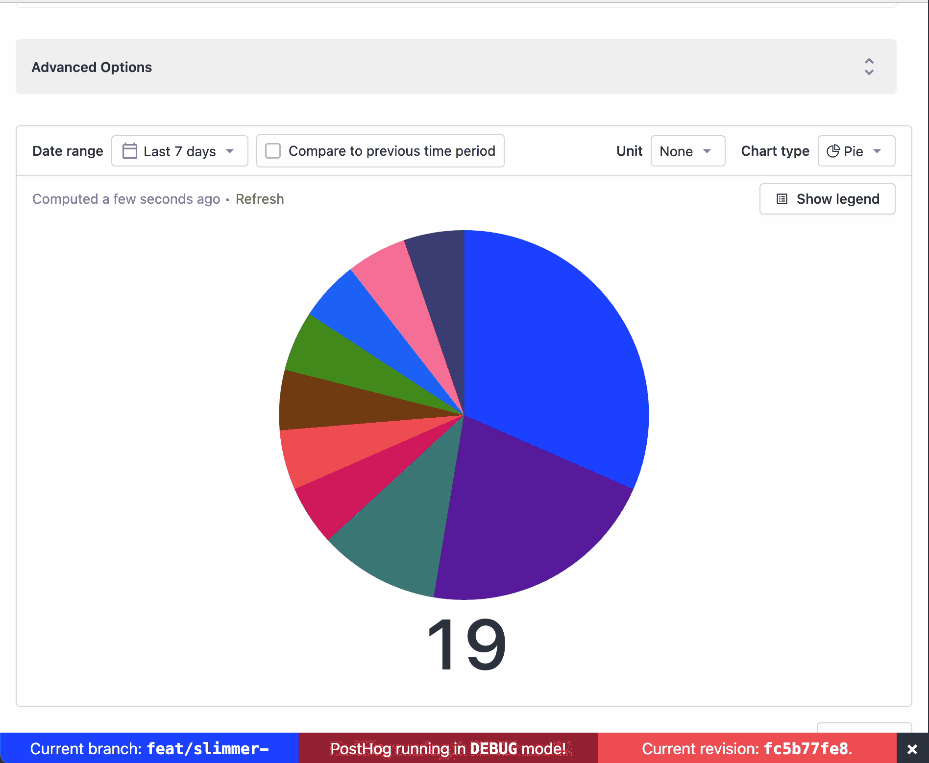
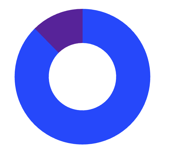
- slims the donut
- makes the total underneath it larger
- starts splitting out the doughnut chart from the linegraph
- magnifies an arc on hover
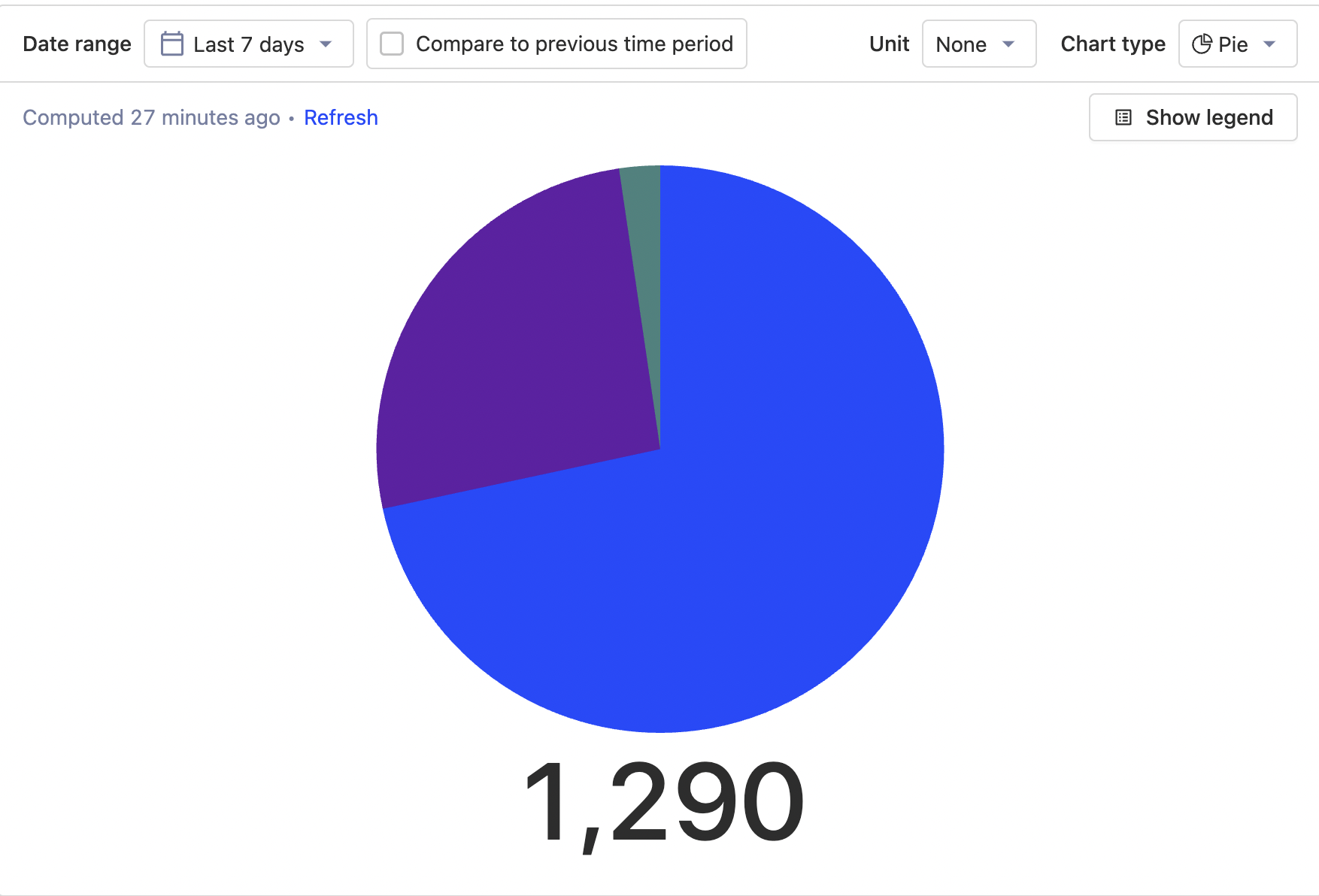
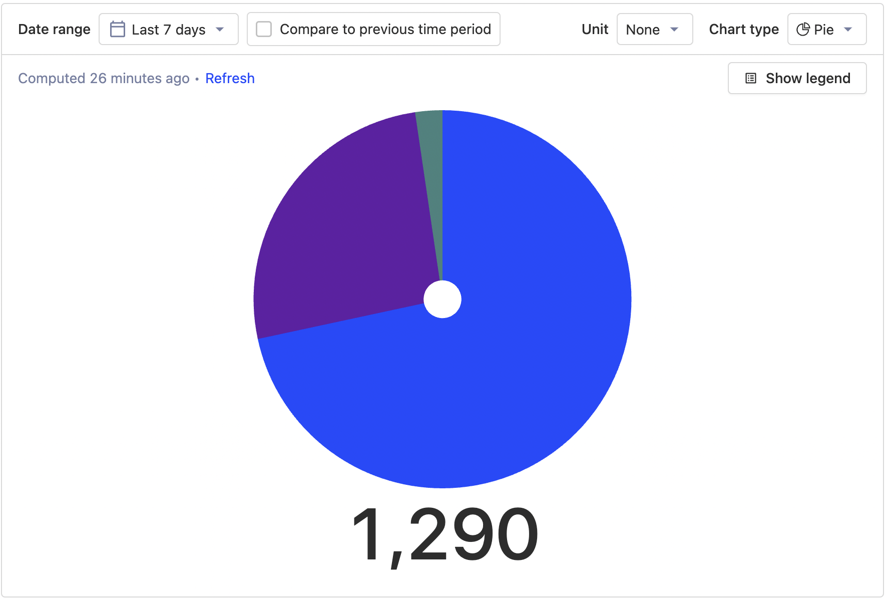
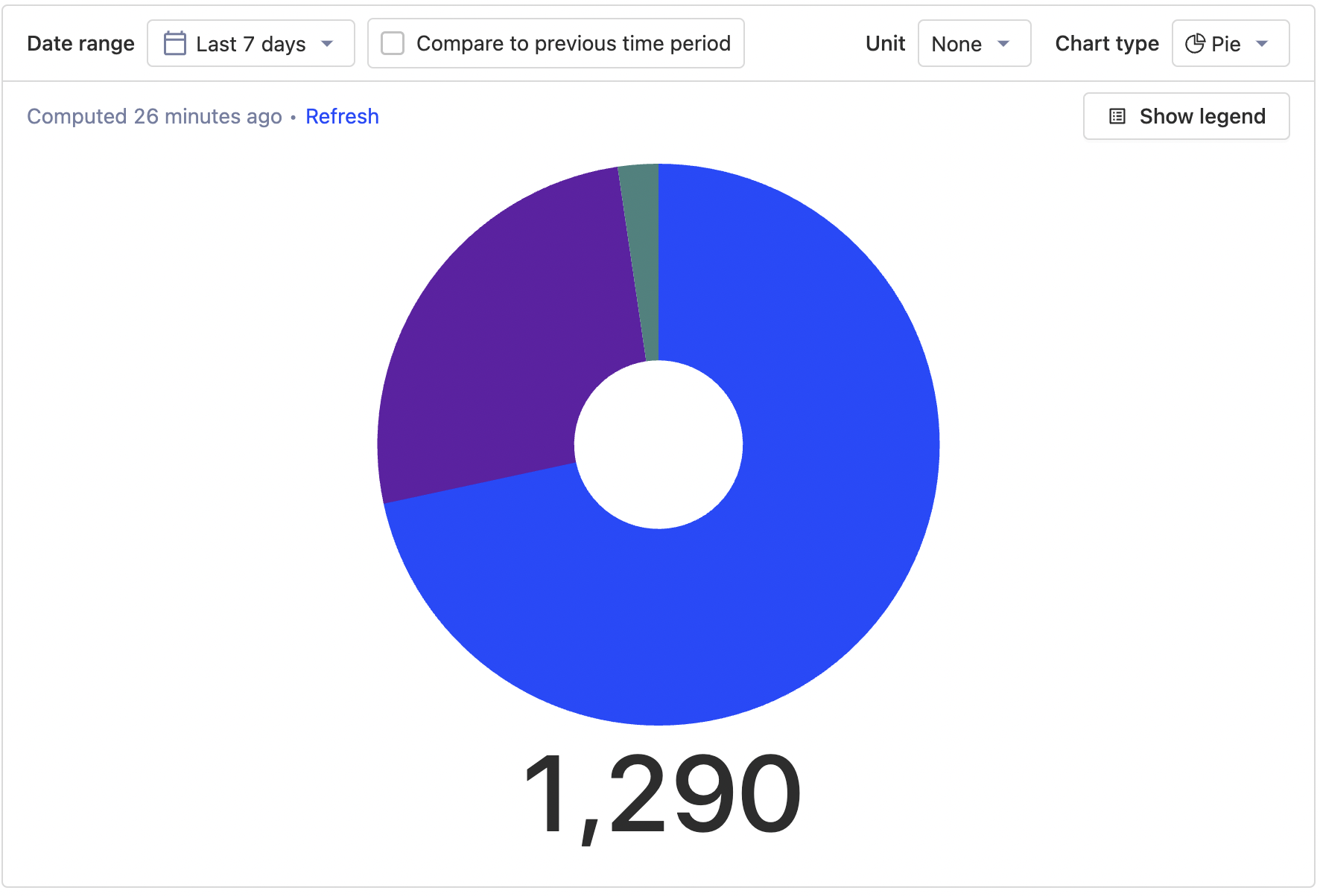
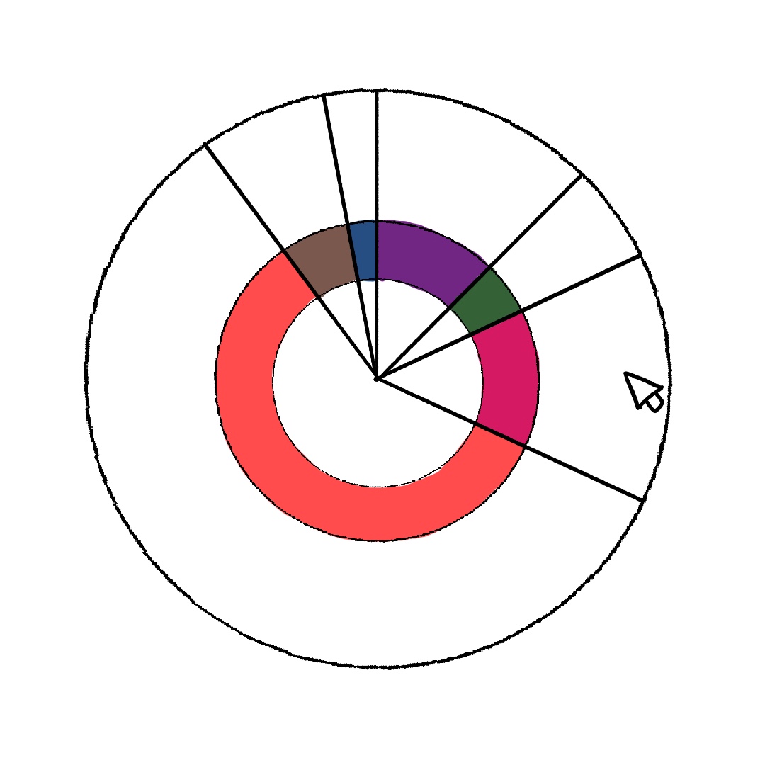
### without legend
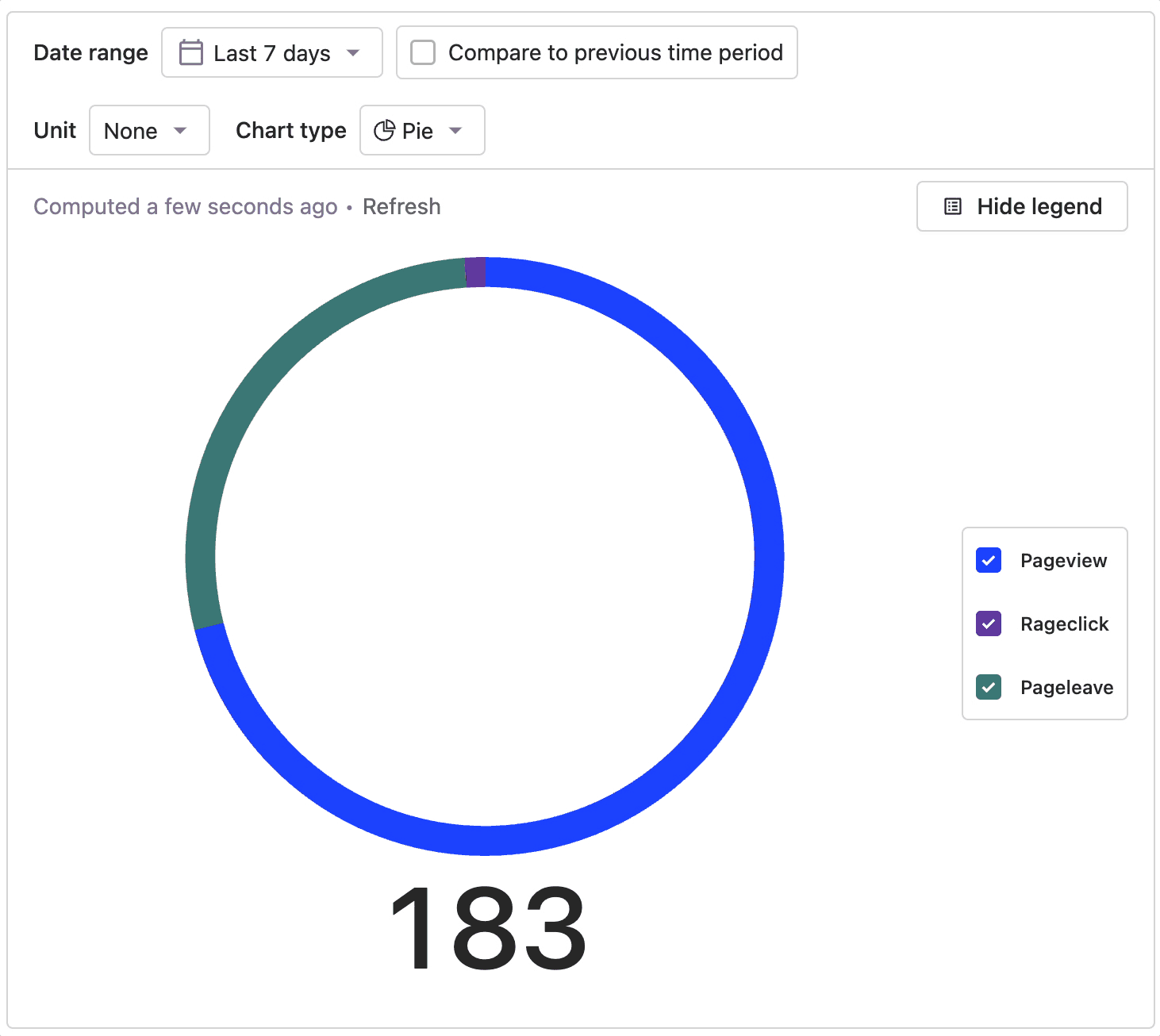
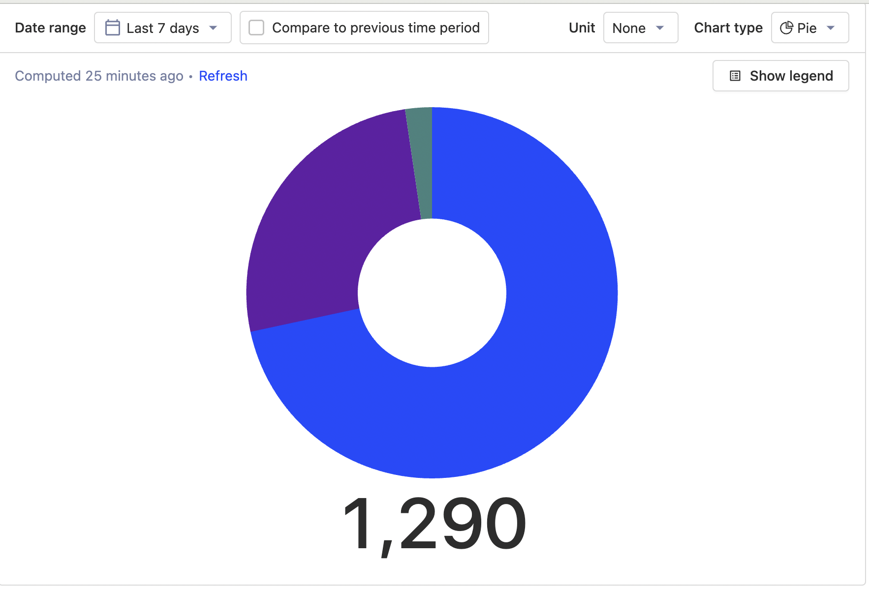
with legend

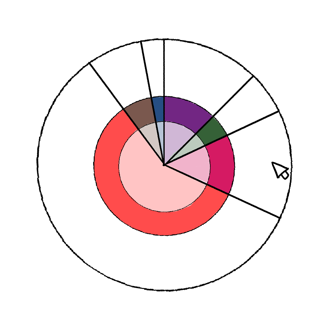
hover
I think this looks better but I find the small hover area somewhat frustrating... I almost wonder if this isn't better as an option rather than the default? I dunno maybe thats just me
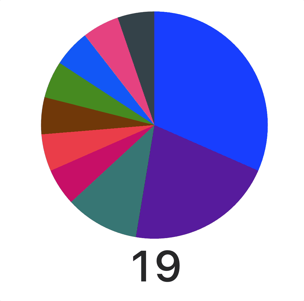
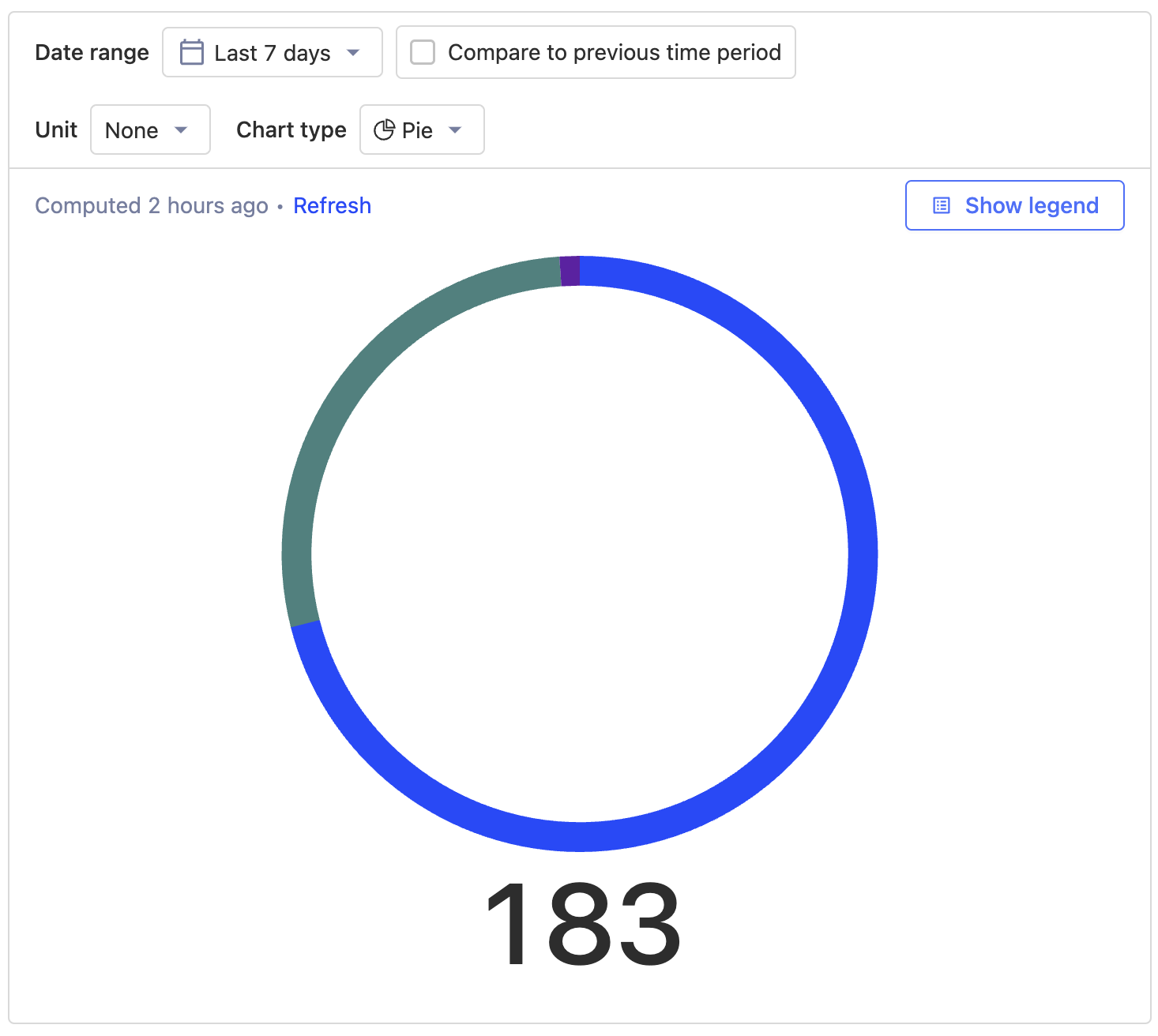
| chunky | slim |
|---|---|
 |
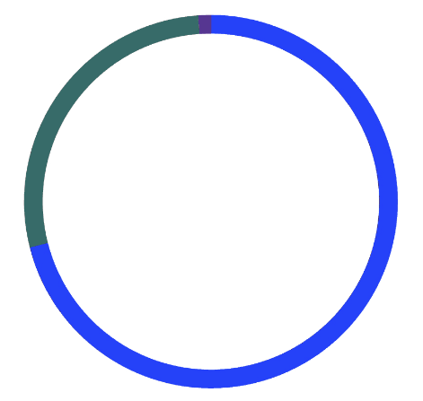 |
Yep, I went almost all the other way from chunky to slim :)
chartjs expresses it as a percentage of the circle cut out so we can pick a different cutout amount
Pie charts are a bad way of displaying data (IMHO) so the next steps of making the breakdown easier to read are the important ones
I agree with you guys on this - the usability has massively done down hill in the aim of looking good- need to go back to the drawing board and see what we can do to fix this. Would people be open to having a filled pie chart? this would help with the visibility as well as usability ?

0%, 60% and 70% I am happy with
I was thinking about how to fix our hover issue with the super skinny charts and I was wondering would a layering method help or just be confusing and difficult to implement. (Feel free to pushback- these are just experimental ideas for now)
Having an invisible selection area
Idea: when you would hover over the invisible boundary for one of these sections it would react on the visible colour section.
Having a slightly faded area filled and a thinner section full
This would basically create more space for hovering/reacting but with less of the intense colour?
cc @mariusandra @lottiecoxon as a pie as agreed in https://posthog.slack.com/archives/C0368RPHLQH/p1663942196109679