 PostHog
[EPIC] Implement new page layout, content template for all content-heavy sections
Our new content template will be used across all content-heavy pages. This includes:
- Blog index (maybe)
- Blog category
- Blog article (show view)
- Customer story (show view)
- Docs index
- Docs article
- API index
- API article
- User guides
- Tutorials index
- Tutorials show
- Integrations index
- Integrations show
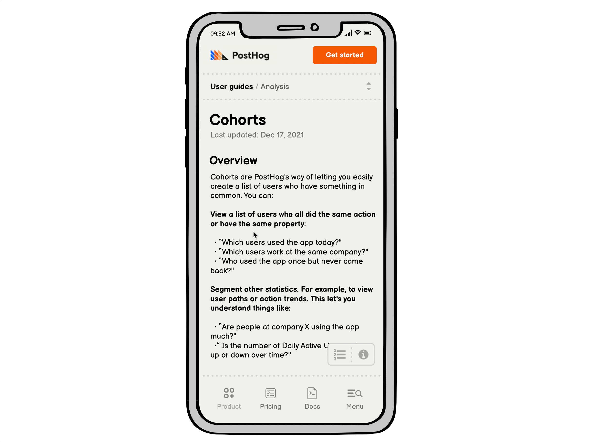
Preview - Note: footer will look a little wonky due to Figma prototype limitations
High-level tasks
- [x] Update page structure (sticky left nav)
- [ ] New global subnav layout
- [ ] Built new expandable subnav component (looks similar to current Docs/Handbook but slightly improved interactivity) - Figma demo
- [x] Split API section out of Docs
- [x] Remove Tutorials from Docs
- [x] Contextual right rail (shows different blocks depending on the view)
- [x] Updated design for Feature availability block
- [x] Updated anchor link nav menu (lower right) that limits top-level items to h2s, h3s and auto-expands smaller items inside the current highlighted item
- [ ] Responsive considerations (mobile view WIP)
- [ ] Global search (and real Algolia API integration)
- [x] Tease Our story on
/about
See the (WIP) content outline to show which page components will exist on which views.
Outstanding items
@corywatilo to think through these remaining items:
Incorporate left nav into:
- [ ] Homepage
- [x] Product index
- [ ] Pricing
- [x] About
- [x] Careers
Mobile
- [x] Finish article design
- [x] Make sure we have a plan for global elements on above pages
Related issues
Resolves:
- #2663
- Polished design for #2620
- #2672
- #2124
One quick thought RE: categories:
On blog URLs, just wanted to let you know that I'm looking at changing the primary categories on the blog. I'll raise an issue for this so people can input, but it would make sense to implement category changes ahead of this work. What's your timeline for completing this epic?
Edit: Issue discussing blog categories - #2771
Here's a concept for a site-wide mobile navigation. It includes a fixed nav bar at the bottom of the screen, thanks to some recent iOS dEvELoPmEnTs!
The menu at the bottom makes it easier for our thumbs to reach. No one else is really doing this, so unless there are still technical reasons this doesn't work yet, let's get the ball rolling.
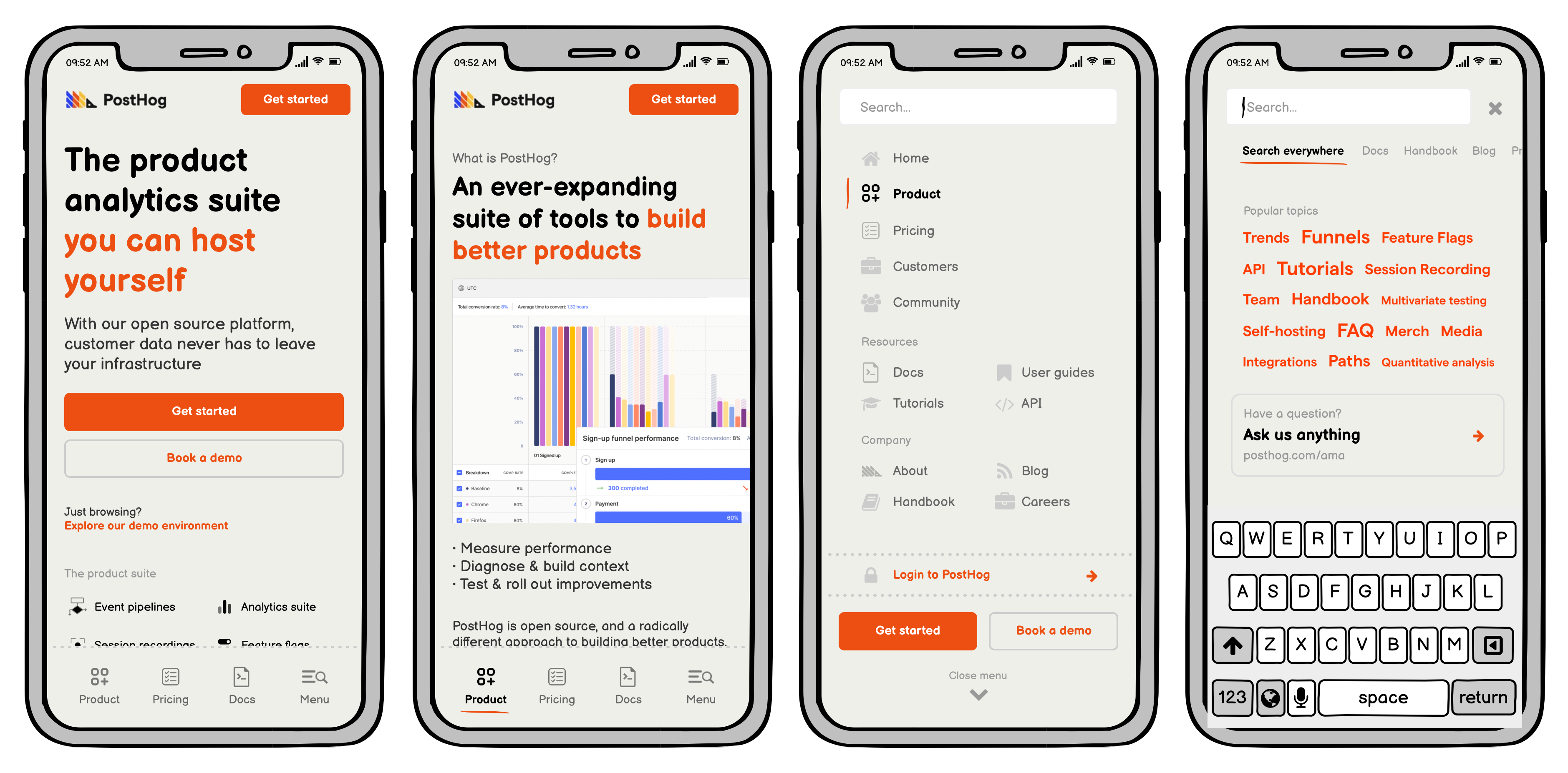
Why these four buttons?
Three most important sections for a casual first-time mobile visitor would be to learn about our product, understand pricing, and get a sense for how much effort we put into our docs. (We might swap this for "Community" down the road... or just add a fifth button if we want to get weird.)
We can add site-wide search later when we get to it. Until then, the menu/search icon just becomes a regular 'ol hamburger button. The searchbar:focused wireframe shows the idea of "topic tags" where you'd tap to see results for everywhere that topic is discussed, broken down by website section (Algolia + a bunch of custom, pinned articles we want to call out).