what-if-tool
 what-if-tool copied to clipboard
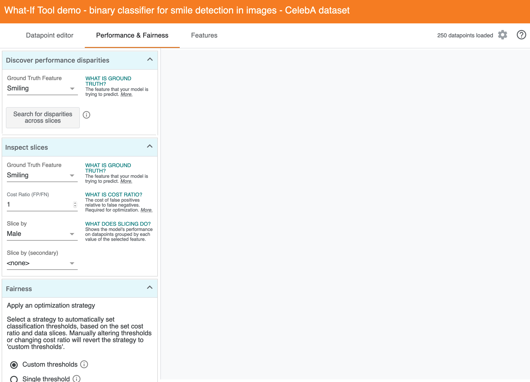
Automatic slice detection
In performance tab, would be nice to have a button to (in the background) calculate slices with the largest performance disparities and surface those to the user for them to explore.
Currently users have to check slices one by one to look at their performance disparities.
Need to do this in an efficient manner as with intersectional slices this becomes quadratic in scale.
@jameswex To confirm the intention here, here's an example in the Smiling demo.
The problem
While the Performance tab allows folks to look at difference in accuracy, recall, etc. with respect to one slice like "Young"...
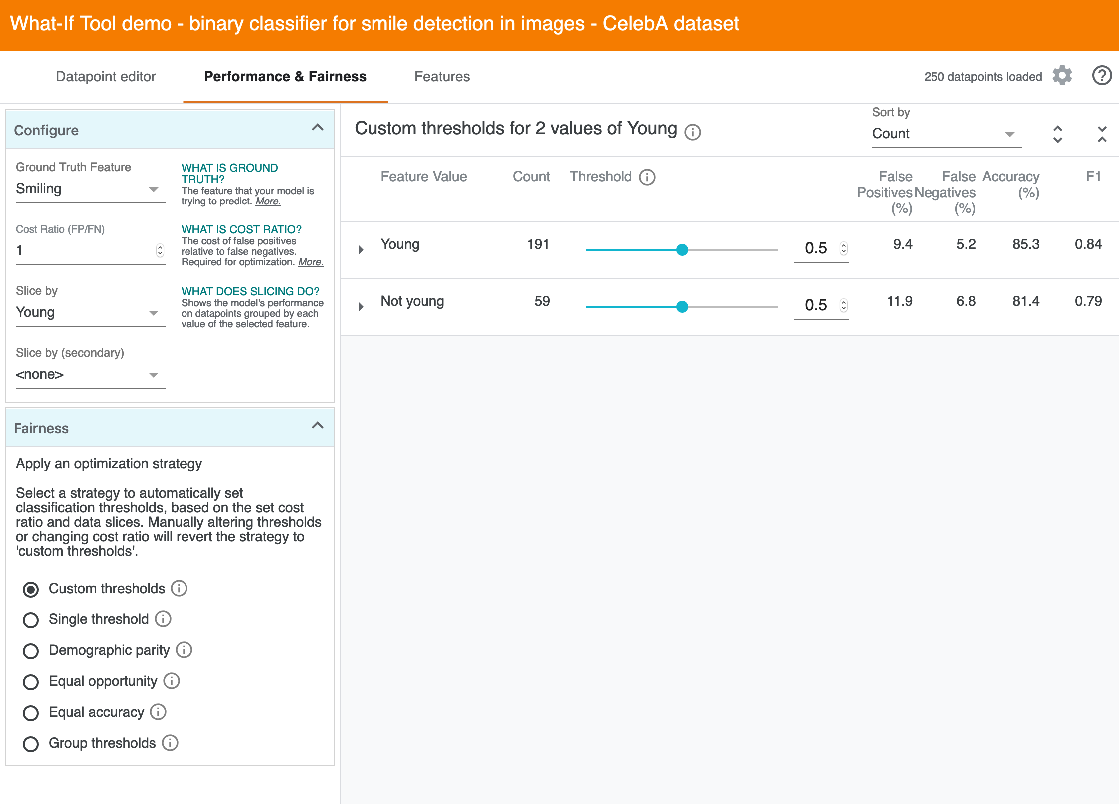
And another slice like "Male"...

The UI doesn't directly support discovering gaps across all slices, let alone intersectional combinations of two slices.
One approach
So the idea in this issue is to make a way that the computers can do this search for disparities in the background, since they are better at that than humans :)
If there are existing design ideas, I'd be curious to see, but here's one path I'm imagining:
1. New drawer on the left
The interactions with the current "configure" seem like different kinds of user interactions with different intents. One is "I want to look at a slice or intersection of slices" while the other is "I want to discover disparities and triage where to look more closely." My assumption is that sequencing that so that it moves from "explore and discover towards "investigate something I care about." These columns reflect that idea:
The explanation near the search is something like:
Searches for disparities across all slices, including intersectional slices across all combinations of two features. This can help you find subsets of the dataset where performance with predicting "Smiling changes with respect to all slices of two features (eg, "Oval Face and Not Male" or "Pale Skin and Young").
2. Triaging disparities
After the computation finishes, the right panel helps triage disparities. This would change the overall layout for this page a bit, as the right panel now changes based on what left drawer the user is working from. This seems not great, but my intuition at this point is that "optimize for fairness strategies" is secondary to "discover disparities and investigate particular slices." And this feature seems like it implies a gradual migration of these parts of the UI, but I may be making too many assumptions :)
A. The main idea here is to show different slices, support sorting by disparities across different metrics, and allow visual scanning of "disparities." In this view, each slice is an intersection across two features (eg, one slice might be "Oval Face and Not Male" and another might be "Pale Skin and Young"). Here's a visual of everything all at once, but I'll walk through the ideas for each section more gradually below:
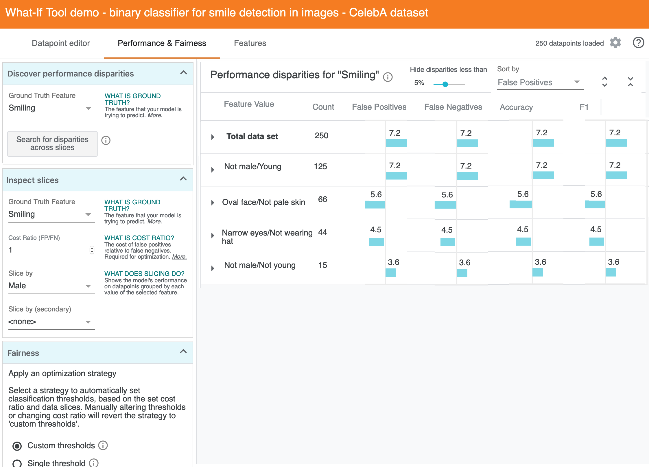
B. The overall layout is similar to the existing table, and shown below with some design elements masked. The main difference is that the metrics are presented as "percentage different from performance on the total dataset" (eg, these are like basis points, not like accuracyForAllDataSet - accuracyForSlice). The sort order is false positives by default, since it's more meaningful for discovering disparities than count.
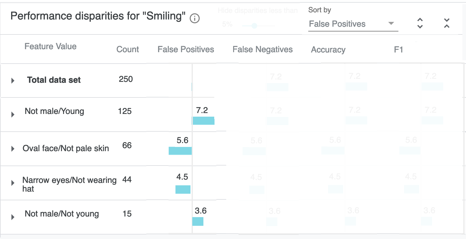
C. The magnitude of the disparity is encoded in the width of the colored bar, and secondarily in the label text. To de-noise this from being a grid, there's a filter in the top bar for hiding disparities less than a given percentage. In the default case shown here, it would hide several values (or perhaps just fade their opacity):
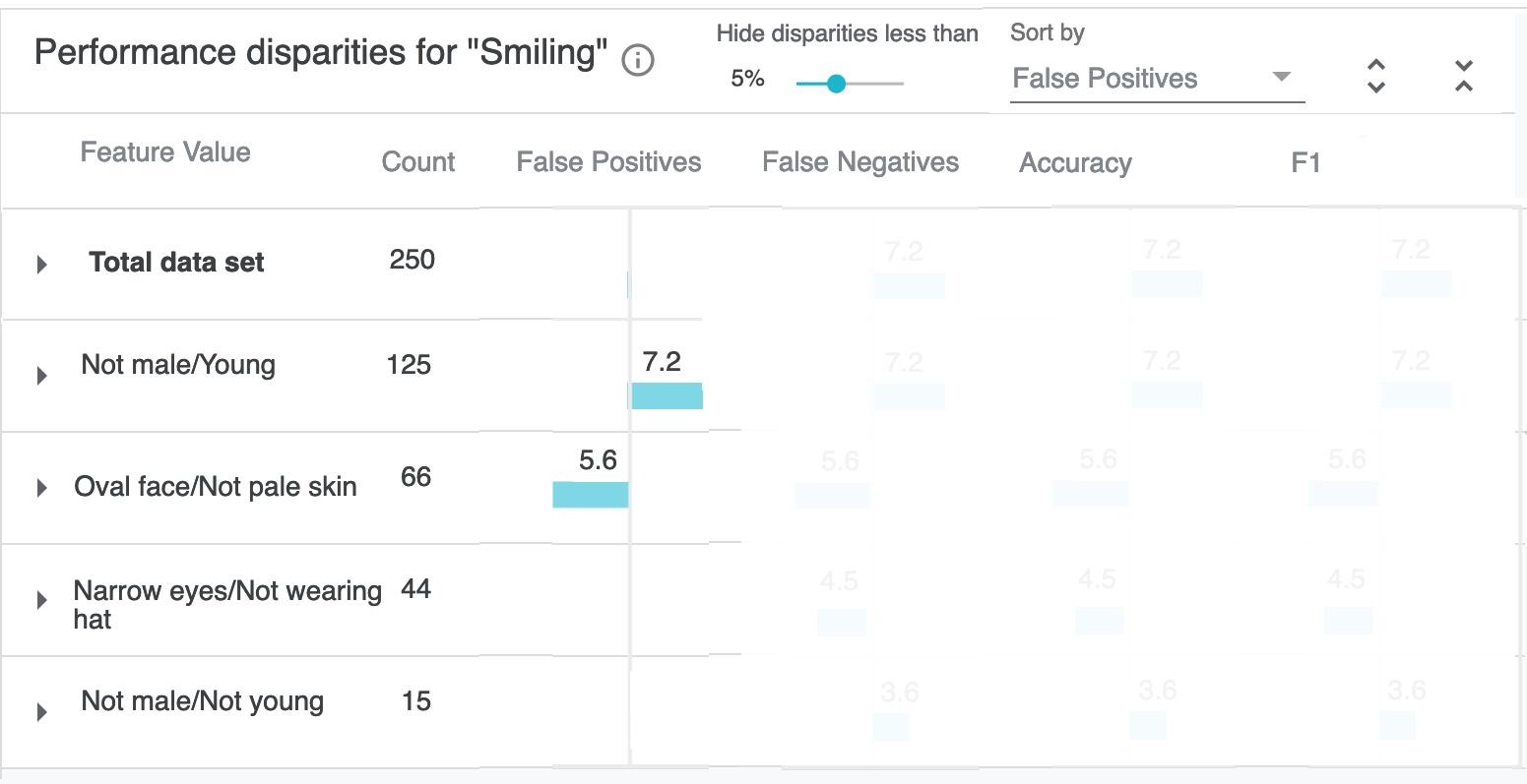
D. This de-noising important if we unmask the rest of the table. These are of course just dummy values, since my aim here is communicating about the design intent, and we'd have to prototype this to more effectively critique or get feedback on how the density and level of visual noise impacts discovering disparities. But the overall idea is that users can sort and then visually scan and triage, without having to read the numbers initially.
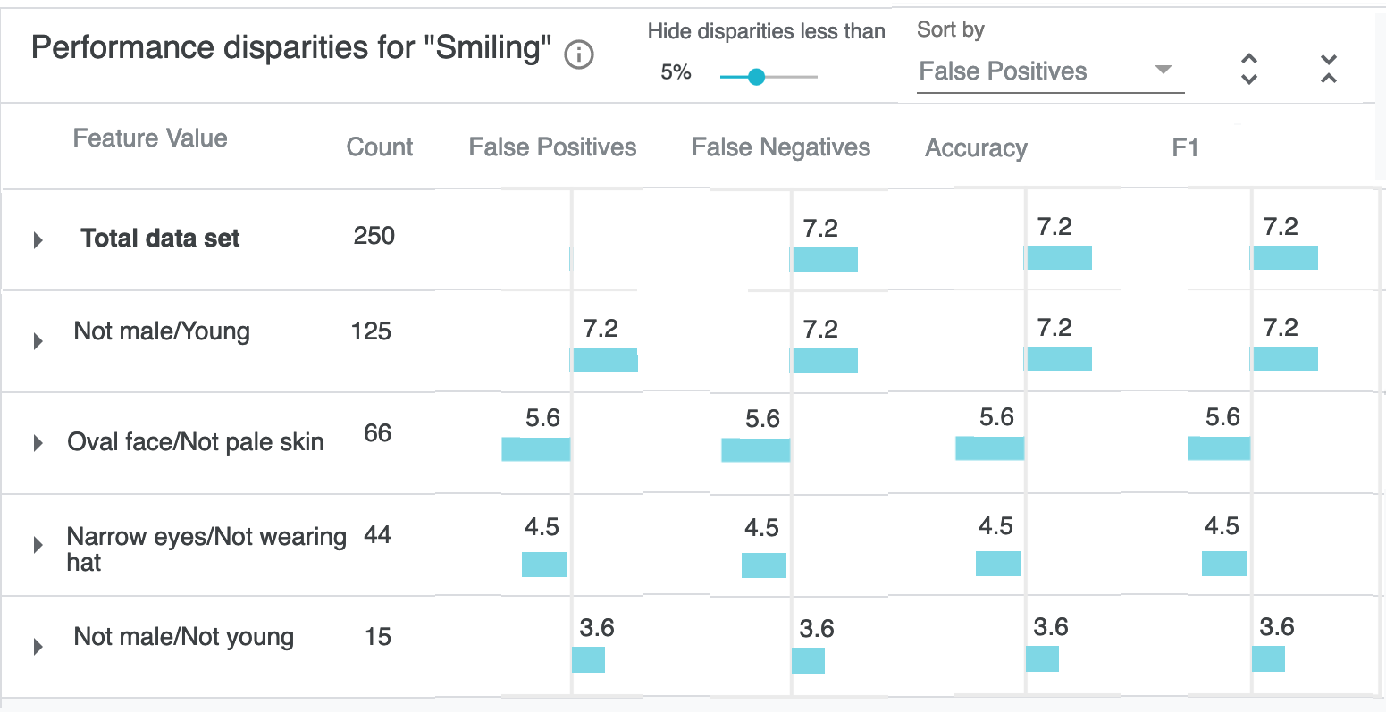
E. Clicking in to any row does the same as the existing table, and shows PR curves, confusion matrix, etc.
3. Efficiency
In my mind, it's more productive to sync on UX ideas first. But roughly, what's a reasonable target for latency and the level of interactivity during that kind of compute? I'm assuming it's good enough to start smoke testing with say the CelebA smile demo and console.log that it takes ~1000-2000ms on say a MacBook Pro from 2012 :) I'm figuring adding web workers is better done is a separate pass, after any initial UX feedback and testing. If that's not the right ballpark to start with, feel free to share what you think would be a reasonable test set and goals for latency.
EDIT: ha oops I thought this was one of the issues that was tagged as 'help wanted' but see now that it is now... sorry if this is just noise then :)
Thanks for putting in all this effort @kevinrobinson !
The proposed UI does a good job of showing all slices/intersectional-slices with big performance disparities. It definitely complicates things, as you stated, because the visualization is different if that "discover slices" button is selected versus if a user selects a slice by hand. But it does nicely mirror what the TFMA Fairness Indicators work is separately doing.
Another simpler approach is to have that "discover slices" button just return an ordered list of problematic slices to explore (such as young, narrow eyes / wearing hat, male, ...), and clicking any of these returned slices in the list causes the slices settings to be set to that selected entry. The ordered list that is displayed could even be a version of the table you designed, placed above the current performance table shown in the main panel.
@mpushkarna want to loop you in on this discussion about how to visualize the results of automatically finding slices worth exploring in WIT.
Sure!
Yeah I realize there's potential overall upstream in Fairness Indicators (which does seem like a more natural place for this kind of discovery support to live, for folks using both tools end-to-end). And supporting that over there it sort of removes the need for WIT to support discovery more directly, or to change the structure in this panel.
Relatedly, I'm sure you all have seen FairVis but if not it references this work and has some other visualization treatments with slightly different goals and tradeoffs (and also some heuristics on top). An important element that comes up there (and is visible in WIT demos as well) is how as you explore slices that are increasingly small, you see a lot of variance in metrics across those slices.