Add a "display unprintable chars" toggle mode
As mentioned in #1268 ... because I'm a purist and because I work with UTF-8 quite a bit and unprintable control characters are significant to my work...
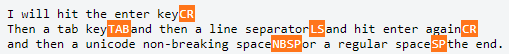
I want to see in OpenRefine a toggle mode for DISPLAY UNPRINTABLE CHARS for our users (like the ACK and CR/LF below)...so that they show up and are highlighted with special coloring/font. This toggle mode should work perhaps on both datagrids & facets, and perhaps other dialogs or extension mechanisms, yet to be determined.
This is work to be done in the future in part of our UI Enhancement project(s).
We will want to utilize CSS styling for this and not actual Javascript replacement characters. An example of how CSS Styling in a cell could be utilized for the various unprintable control characters: http://mleibman.github.io/SlickGrid/examples/example8-alternative-display.html
Another alternative might be https://developer.mozilla.org/en-US/docs/Web/SVG/Element/symbol and calling <use> whenever we need to show unprintable characters
@ostephens @ettorerizza @wetneb Do you guys also like that orange colored example ? Does it have a good fit and finish for cell styling in OpenRefine ? Of course we will work with a Google Designer for some of this later on, but for now I wanted to just show a better example of how the look could be. Both Jacky and I prefer the coloring and style using graphic symbols, like example 2 shows, rather than the text based control character symbols as shown in example 1 and typically used in other programs such as "SP", "ACK", "CR", "DEL", "TAB", etc.
VOTE: Agree that example 2 is more towards our liking and preference for the future UI toggle of "display all chars" ?
To be contrary, I have to admit I prefer the text based control character symbols. But happy to go with the majority view!
@ostephens Why do you like them more ? because they stand out more ? they are a bit larger ?
I prefer them both because they are easier to read (larger text) and I feel they are more explicit and easier to learn - I don't have to learn what each of the icons/graphics stand for.
On the latter point - easier to know the difference between SP and NBSP in comparison to learning which one is represented by a filled in square, and which is an empty square.
@ostephens interesting you mention you have to learn what the icons/graphics stand for. The icons and graphics are actually international and well defined. You will see them on Chinese and Ukrainian keyboards for instance. Look at your Tab key. But I think I understand...we're a bit of an internet society now and the historical ways of labeling don't want to budge. :)
Its a bit 'in your face'... but that's a pretty useful thing for things that were hidden before and make you want to beat your head into a wall when things don't work as intended :)
OK. We will go with just simple text highlighted labels instead of the graphic symbols.
@thadguidry I agree some of the icons are clear/well understood (the tab is a good example). I also accept that the icons/graphics are defined internationally - so it maybe that I just need to get used to them.
At the moment I think the weight of opinion (such as it is) is in favour of the graphic symbols - you and @ettorerizza vs me. Unless anyone else wants to support my view, then I think graphics win it tbh
@ostephens No, I agree with you now. The \n\l for instance will be better represented, its actually 2 separate control chars, and not just 1. Despite their being Unicode graphic forms that represent some of these control characters, not all of the char(0) - char(31) are well represented in those graphic forms.
We'll use the Unicode abbreviations (NUL, DEL, etc) https://en.wikipedia.org/wiki/Control_character but not for HT, that should be replaced with TAB.
Maybe of interest - in this post the approach taken is to replace char(0)-char(32) with the equivalent Unicode control picture https://charlee.li/display-non-printable-characters.html
@ostephens Personally not a fan of the newer diagonal flows on post-2003 Unicode Control Pictures. I prefer the original horizontal flows just as they were from Bigelow 1993 and just scaling smaller with good fonts as I gave in the examples before. Which is in LucidaSansUnicode font.
https://pdfs.semanticscholar.org/4a8e/2fa49b13a2bcabf7d0ebdf2b55b0816abaf8.pdf
But perhaps on second thought...to support those that are younger aged :) the diagonal flows might be better overall since they won't confuse with regular text, but regardless my idea was to enforce some different CSS coloring for the control chars/pics.
This question on StackOverflow shows the importance of this new feature. The file on the Open Refine screenshot looks very clean compared to the original Excel file, actually full of tabs and spaces.
Found a good article that contains the mappings of the 2 and 3 letter abbreviations that we can use to replace the control chars. The article also mentions the history of the control chars and what they control :-) https://www.aivosto.com/articles/control-characters.html
It also contains translations of the abbreviations further down its page, but I think we can just rely on English only?
@aghaSaad04 instead of HT (horizontal tab), I'd use the more familiar 3 letter abbreviation TAB, but keep the abbreviation for "vertical tab" to use VT
Came across another complimentary use case with a dataset I was helping someone with today. Unicode values that are True Null also do not display and we should show them rendered as NUL when the user toggles the Unprintable Chars mode.
(This is different from the 'null' char rendering that is not Unicode based (if I remember correctly from Owen's code on null display handling) that we already have in All->View->Show/Hide 'null' values in cells)
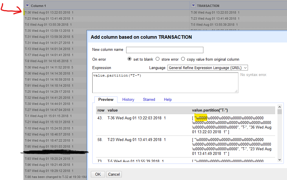
Notice none of the \u0000 values are displayed in the grid, but show up with .partition()
@ostephens I'd like to know your thoughts on this as well.
Why is this labelled Priority: High? It seems like it would be a pretty rarely used feature.
Can you please assign this issue as well to me as the other one is inter-related. @thadguidry
@shriyasankhyan Sure, it's going to be really cool stuff for your portfolio if you are up for it. I hope your HTML and CSS and most importantly JavaScript skills can handle it :-) The old branch is https://github.com/OpenRefine/OpenRefine/tree/non-printable-characters and not sure what differences are there from the previous PR #2350 from @AghaSaad04 which you are welcome to checkout locally (click <> Code button in top right of any GitHub PR) and work upon and submit as a new PR by you.
Ya surely :) would look up to the provided resources. Again thanks for assigning me this issue.
Can anyone from the community please check this pull request? @antoine2711 @thadguidry @wetneb