mapper
 mapper copied to clipboard
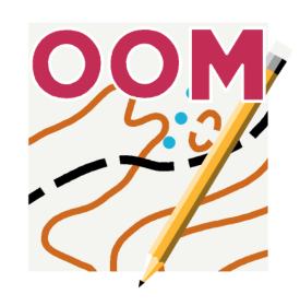
Mapper 1.0 icon & OpenOrienteering logo redesign
Actual behaviour
Current Mapper app icon is too complex:
- https://github.com/OpenOrienteering/mapper/tree/dev/images/mapper-icon
- there are NO vector version of icon;
- no clear RGB/CMYK/Spot colors values;
- not ready for scalling, and on low scale it very blurred.
Current OpenOrienteering logo design also not so good:
- https://github.com/OpenOrienteering/mapper/blob/dev/images/open-orienteering.png
- original version was raster with gradient fills and blurs, that not correctly converted in vector-style for symbol sets;
- path of vector-style logo bundled in symbol sets is not optimized and needs cleanup.
- it's colors not clear, as we has only
OpenOrienteering OrangeSpot color that based on old ISOM 2000 Spot colors, and there are NO clear CMYK/RGB values; we still has noOpenOrienteering BlueSpot color.
Expected behaviour
As upcoming Mapper v1.0 would be first "production-ready" release, we need cleanup and upgrade Mapper branding.
New icon
- should be vector-based and little simpler;
- should be ready for different Android versions;
- should be not more than 3-4 flat colors;
- remove ~~
OOM~~ text label, becauseOOMabbreviation mostly recognized as "Out of memory" and "OOM killer":- https://en.wikipedia.org/wiki/Out_of_memory
- https://linux-mm.org/OOM_Killer
- remove gradient fills.
New logo
- should be little tuned for direct combination with app icon (and some cartographic background; optionally);
- need review text font and (possibly) choose another type licensed under SIL OFL license (or other FLOSS license);
- need choose clear values of all logo colors in CMYK, RGB and Spot (combination of actual ISOM Spot colors; optional, as we already coming to CMYK printing for orienteering maps).
Other
Social Media tags:
#OpenOrienteering#Mapper#omap#orienteering#map(+ optionally#maps#mapping#cartography)- ~~
#OOM~~ - bad idea; reason described above.
- ~~
Symbols/Emojis:
Ɔ- for "Open-O(rienteering)" meaning, also look little similar to "Copyleft" symbol:- https://en.wikipedia.org/wiki/Open_O
- https://www.fileformat.info/info/unicode/char/0186/index.htm
- 🗺👷 (world map + construction worker) - for "Mapper" meaning.
- https://www.fileformat.info/info/unicode/char/1f5fa/index.htm
- https://www.fileformat.info/info/unicode/char/1f477/index.htm
Message sample:
WOW!
#OpenOrienteering🗺👷#Mapper1.0 released 🎉 https://www.openorienteering.org/news/2019/mapper-v1.0.0-released Grab source & binary builds for your mobile or desktop ➡ https://github.com/OpenOrienteering/mapper/releases/tag/v1.0.0 And lets draw your 1st#orienteering#map! https://www.openorienteering.org/mapper-manual/pages/new_map.html
Configuration
Mapper Version: 1.0
Operating System: all
Reference
- http://blog.qgis.org/2017/01/08/qgis-3-0-logo-voting-results/
- https://github.com/olive-editor/olive/issues/429
Despite the wording, this states your personal opinion.
However I do agree with some points, and I want to add some useful links concerning the Android Laucher icon: https://developer.android.com/guide/practices/ui_guidelines/icon_design_adaptive.html https://material.io/design/iconography/product-icons.html https://developer.android.com/google-play/resources/icon-design-specifications
However I do agree with some points
May I launch contests for new Mapper icon and OpenOrienteering logo designs on Reddit/Twitter/Facebook?
May I launch contests for new Mapper icon and OpenOrienteering logo designs on Reddit/Twitter/Facebook?
I think this would give the wrong impression that you are representing the OpenOrientering project, and that the result of such a contest would have direct impact on the OpenOrienteering project.
I think this would give the wrong impression that you are representing the OpenOrientering project
But, to be honest, OpenOrienteering project contributors (me too) may be not so good art designers and additional contribution to branding design task would be very useful.
BTW, I know (and in-touch with) few external open-source contributors that are good in design/branding for other FLOSS tools, so could cast them too.
So, what to do?
There are many talented designers and inexpensive art studios in my country who support open source projects. I am ready to organize work with them and cover expenses of OpenOrienteering branding. But I need something like community approved technical task.
FWIW, I'm all for graphical design refresh. Still, I don't like the idea of logo contest very much. I'd keep the activity within the round od regular contributors (be it code, translations or bug reports).
But I need something like community approved technical task.
Yes, we need to agree on what are our hard requirements, what are the soft requirements and what is out of scope, for the umbrella OpenOrienteering brand logo and for the Mapper product icon.
IMO, while other OpenOrienteering "products" do not play a major role so far, this aspect should be prepared for. Possible applications include course planning, individual race analysis, event management.
With contest or without, there might be a period to generate alternative proposals, and another one to elaborate and finalize a chosen proposal.
IMO, while other OpenOrienteering "products" do not play a major role so far, this aspect should be prepared for.
Yeah, logo and icon should be designed in same style.
There are many talented designers and inexpensive art studios in my country who support open source projects. I am ready to organize work with them
@yevhenmazur, think, you imply Max Kovalenko's graphic design studio (Kovalen.com)? His contribution to Ukrainian orienteering sport branding is really cool! 😉
I would like to somehow unify the wording / branding. At this moment there are six versions in use. After dash there is its usage within Github.
Mapper - 663 OOMapper - 101 OO-Mapper - 35 OMapper - 6 O-Mapper - 27 OOM - 152 (OMAP - 151)
Which one do you prefer?
I would like to omit the OOM letters from the Android icon and replace it with a more telling OOMapper.
And now I see that the original open orienteering Mapper have small beginning letters. So there are even options like ooMapper, etc.

I would like to omit the OOM letters from the Android icon and replace it with a more telling OOMapper.
It would be much better to not add any text on icon (this is different from logo).
Also, ~~OOMapper~~ ooMapper is hard to read or pronounce.
I prefer use full OpenOrienteering Mapper, or Mapper for short.
It would be much better to not add any text on icon (this is different from logo).
You are probably right.
It would be nice though if logo and icon share some design.
After dash there is its usage within Github.
Mapper - 663 OOMapper - 101 OO-Mapper - 35 OMapper - 6 O-Mapper - 27 OOM - 152 (OMAP - 151)
I guess that it's absolutely OK, to use just "Mapper" internally, while talking between everybody involved in the project, like here on GitHub. Hence the high usage value should not play a role here.
To the general public branding, I currently prefer the "OO Mapper" variant (with space), as the simplest abbreviation of the full name (being "OpenOrienteering Mapper").
But maybe it's time to re-think the branding in more depth. "O-mapper" might be both short and easily understandable name for the target audience... 🤔
Since many years, I consistently use only Mapper or OpenOrienteering Mapper. I consider this to be the only valid terms.
"OO" is more frequently used for OpenOffice, so I explicitly avoid this, too.
Folder in Android is called OOMapper
Yeah, it should be
../Mapper/instead.
But that would be a breaking change. If some renaming like this occurs, then Mapper should read from /OOMapper/ still to keep backward-compatibility or warn the user during installation time at least...
or warn the user during installation time at least...
Adding warning in release notes would be enough.
But that would be a breaking change. If some renaming like this occurs, then Mapper should read from
/OOMapper/
Why it 'would be breaking'? /OOMapper/ folder would be still available after reinstall/upgrade Mapper, so the only thing user should do just copy old files from /OOMapper/ to /Mapper/ (and delete empty /OOMapper/) manually.
Folder in Android is called OOMapper
Thanks for bringing this up here.
Yeah, it should be ../Mapper/ instead.
Android is a moving target with regard to PC-style direct file system access. I guess we need to let the user select his map folder(s) via Android content mechanisms. This would also add providers like Google drive.
But let's stop the discussion on the folder name/implementation in this issue.
As a reference (name clashes), there is a program called PC-Mapper used by some orienteers. http://www.cmtinc.com/software/MAPPER05.HTM
With contest or without, there might be a period to generate alternative proposals, and another one to elaborate and finalize a chosen proposal.
I already contacted with @gonz4gi (aka 'gonz4'), whose SVG/vector art related to orienteering & icons design on "OpenClipArt" is really cool & professional:
- https://openclipart.org/artist/gonz4
- https://openclipart.org/detail/324673/orienteering-icons
- https://openclipart.org/detail/317498/orienteering-compass-use
- https://openclipart.org/detail/317497/orienteering-compass-parts
During conversation with 'gonz4' on Twitter & I got positive response on joining him to this competition:
- https://twitter.com/gonz4tw/status/1323937948212056064
I could come up with some proposals for OpenOrienteering, I hope the contest opens because I would like to collaborate! Thanks for sharing!
So, @dg0yt, may you assign @gonz4gi for this "competition" to solve this task? 😉
Thanks for refreshing this @Symbian9 , I have nearly forgotten... It is more then a year now, probably, when I got sick and had some "free time" during which (for whatever reason) I mused about the Mapper logo and icon. I concluded with a design I was somewhat satisfied with, but wanted to draw it in vectors first, before posting it here... Nevertheless, time has obviously passed and I didn't get to it so.. I am going to find the draft papers somewhere and post them here in the state they are. Perhaps they can inspire someone, at least.
Thanks @Symbian9 and good afternoon everyone!
I have never participated but I have known OpenOrienteering for a long time and have used Mapper some times (I have even contributed anonymously to the translation on weblate). I really like the app and I find the philosophy of the project very interesting.
For my part, I’m professionally interested in vector drawing, graphic design, visual identity and web development (Front-end), and I would like to collaborate with this task (and with any other related)... well, for me it’s an honor to be active in the project, but if you do not consider my participation appropriate, or it is not the time, no problem, I will continue to contribute in the translations :)
Greetings and I’m at your disposal!
This year the OpenOrienteering project celebrates its 10th Anniversary since initiated by @puzzlepaint on September 25, 2011:
- https://www.openorienteering.org/news/2011/hello-world
- https://sourceforge.net/projects/oorienteering/
On January 1, 2022 we would also celebrate 10th Anniversary since OpenOrienteering Mapper development announced:
- https://www.openorienteering.org/news/2012/the-next-project
JFTR @dg0yt, are there any plans to release next version of Mapper to celebrate? ;)
Merry Christmas 🌟 & Happy New Year 🎄, Y'all the OpenOrienteering mappers, developers & contributors!
- https://github.com/OpenOrienteering/mapper/graphs/contributors