magento-lts
 magento-lts copied to clipboard
Small improvements to openmage backend theme for better readability
The new openmage backend theme is good, openmage needed something more moderns compared to the legacy backend theme. I still couldn't use it for my customers because I think the contrast between foreground text and background is not enough and this makes it not really readable.
With this PR I tried to fix this problem (in my opinion) and packed a couple minor improvement into it.
I modified the sass files and recompiled the css with sass --style=expanded sourcefile.scss destination.css as found in https://github.com/OpenMage/magento-lts/pull/1230
Highlights of this PR
-
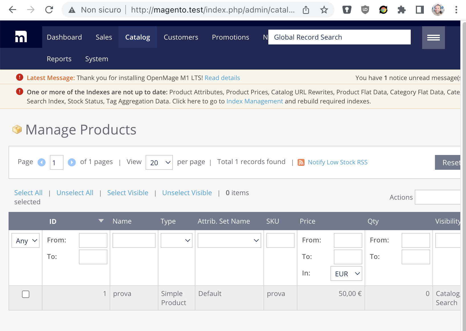
Header now has a single, more "popping" color, which makes it easier to understand (at first glance) that that element is in fact very important

-
Better vertical alignment of the "hint" symbol with the question mark
-
Removed font definitions for IE <= 9
-
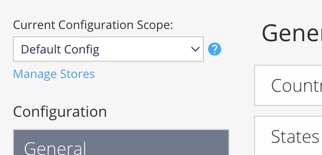
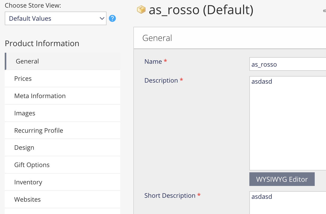
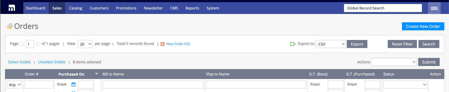
Better contrast between foreground text and background grey (this is reflected in the whole backend theme):
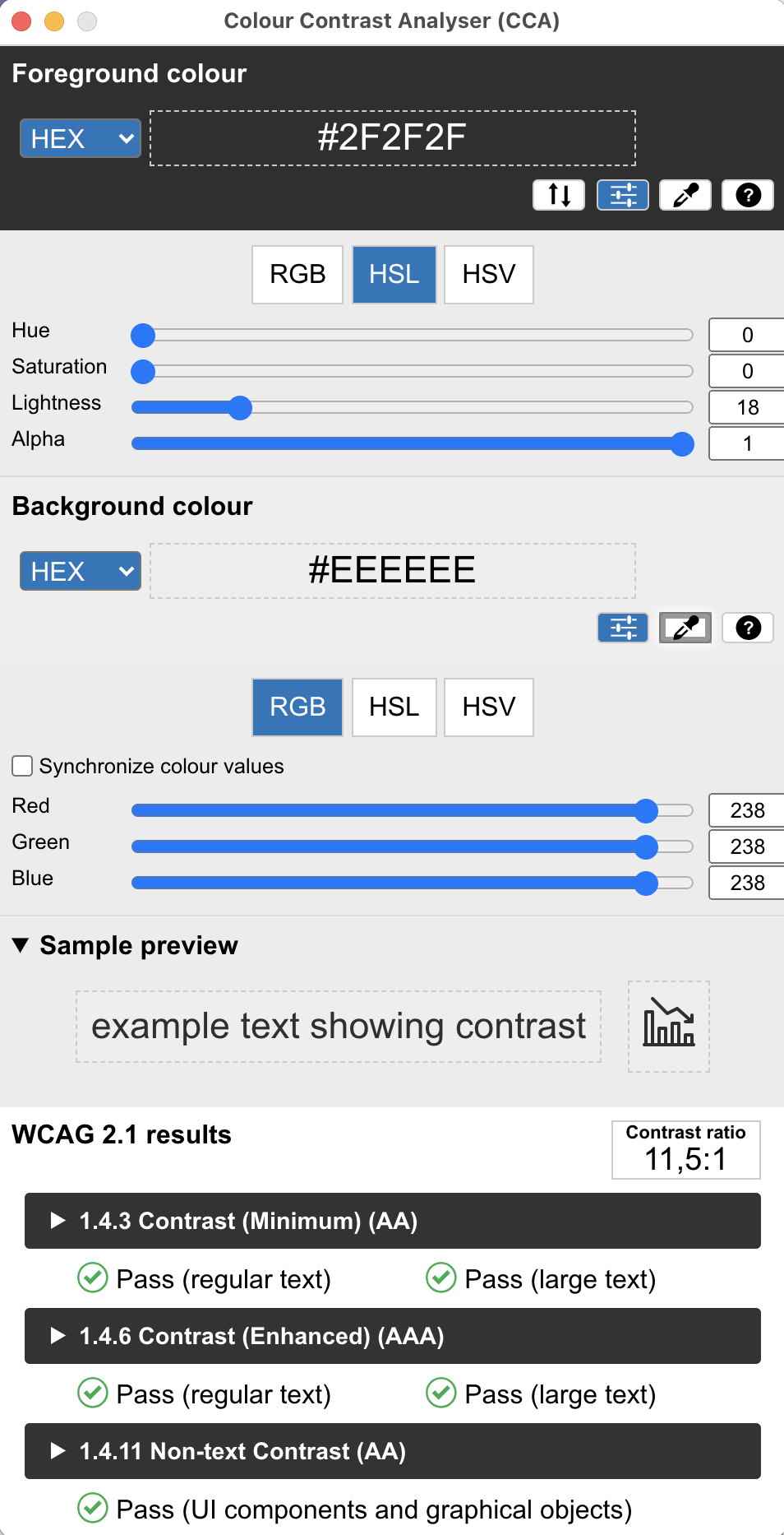
 and this is the contrast analyser:
-
Better alignment for the selection and mass action widget above the grid
-
Restored grid header borders between cell

I can't see most of the listed changes, perhaps you forgot to compile a file or something?
mmm i tried it now and it works for me, I was on another branch and i saw this:
then i switched branch, reset cache and I got:
Weird...To get the same one color menu as in your screenshot, I need to modify the background for two other selectors .header and .header-top .logo. Any chance you still have some unpushed changes locally?
I'm say it's impossible, I switched, created and deleted like 10 branches and the workspace is clean
I'm now able to see all the changes you did, was there a commit missing?
I actually only rebased with github's GUI, but good that it works now :-)
I will test this PR and you will have a feedback from me. Unfortunately I didn't have enough. I analyzed others.
How ugly looks that input field named "Global Record Search" sitting in front of the menu links. If we move it in the hamburger on the first position we would make the picture more attractive. It can be a new PR in which those template divs do not overlap over the hamburger (Issue #2226).
I didn't notice it since I never use it :-D (actually I always disable the global search for my customers but that's another topic) but also I didn't touch it (unless I did some mistake) since it would be more complex and I only wanted to make the backend more readable.
There is a post (I guess in the Discussions section) where the remove of its functionality was discussed. Basically it offers a quick way to products searched by name, but the same thing can be achieved with more search and filter options in Catalog > Products. One who used to its presence there at the top of the page will immediately notice its absence. I think I used it a few more times out of curiosity. I wouldn't remove it, I would just move it in other place when the window width drops below a value. As shown in the image it is an issue, however, we are in 2022 when CSS such of issues should have been resolved long time ago.
It's perfectly fine to keep the global search, I just disable it with the config setting ;-)
I'd fix the ugly global search in another PR just not to mix too many things in one. Also keep in mind that I shrinked the browser window to take the screenshot, in a "normal" size the problem is usually not visible.
It's a lot of work to make an attractive Backend theme, but it's better than the current one. As someone who has never used it I can say that I would try to get used to it but the Open-Sans font literally kills me. When I deactivate it it's a different story. If what you mentioned in the PR description are all the changes made I agree with it.
TODO
-
When we sort a column in the grid it would be good for that grid to be a lighter shade to make it more visible to you that it is active like in legacy theme.
-
When I go through the product grid page by page the loading dial that appears for a fraction of a second and page blinks are very annoying to see. Only if the page loads in seconds it could be useful based on a modern dial animation, but this is not the case. When sorting by columns the dial animated appears and page content blinks.
-
Please solve the [Global Record Search] input box issue which is overlapping the menu when the window is narrowed.
-
Remove all the help icons (?) from 1.9.4.x. changing their links to webarchive is not a solution. It's just a patch that doesn't help anyone anyway, instead we free the landscape from junk.
I will continue to use the Magento theme, the one from OpenMage needs a lot of polishing. I worked as an advisor for UI/UX interfaces and I can say that it is a bread and butter in this direction.
I also don't love the new theme, I never activated it for any of my customers and I think that it would be better to have only one theme to maintain. But... it still has some more modern looks that maybe in the future could make a difference and we would be able to drop the legacy one (in some years maybe...). I know why the new theme it was created and the limited timeframe they had so this is not criticizing their work.
All your four points are good but I'd address them in separate PRs or this one would be too big.
I just wanted to address the readability problem with this one ;-)
I would have proposed that OpenMage Theme be a separate project and be added with Composer. The advantage of the separation was that developers who have solid knowledge of CSS, JavaScript Frameworks (Alpine JS), Bootstrap, Tailwind, and less of PHP could contribute there. In my case that I don't use it, it is a dead code in the installation. I know that at some point I found a free theme that almost made me forget about the Magento theme, but it was a long time ago and I did not analyze it in detail.
Unit Test Results
1 files ±0 1 suites ±0 0s :stopwatch: ±0s 0 tests ±0 0 :heavy_check_mark: ±0 0 :zzz: ±0 0 :x: ±0 7 runs ±0 5 :heavy_check_mark: ±0 2 :zzz: ±0 0 :x: ±0
Results for commit fba3208c. ± Comparison against base commit 69023597.