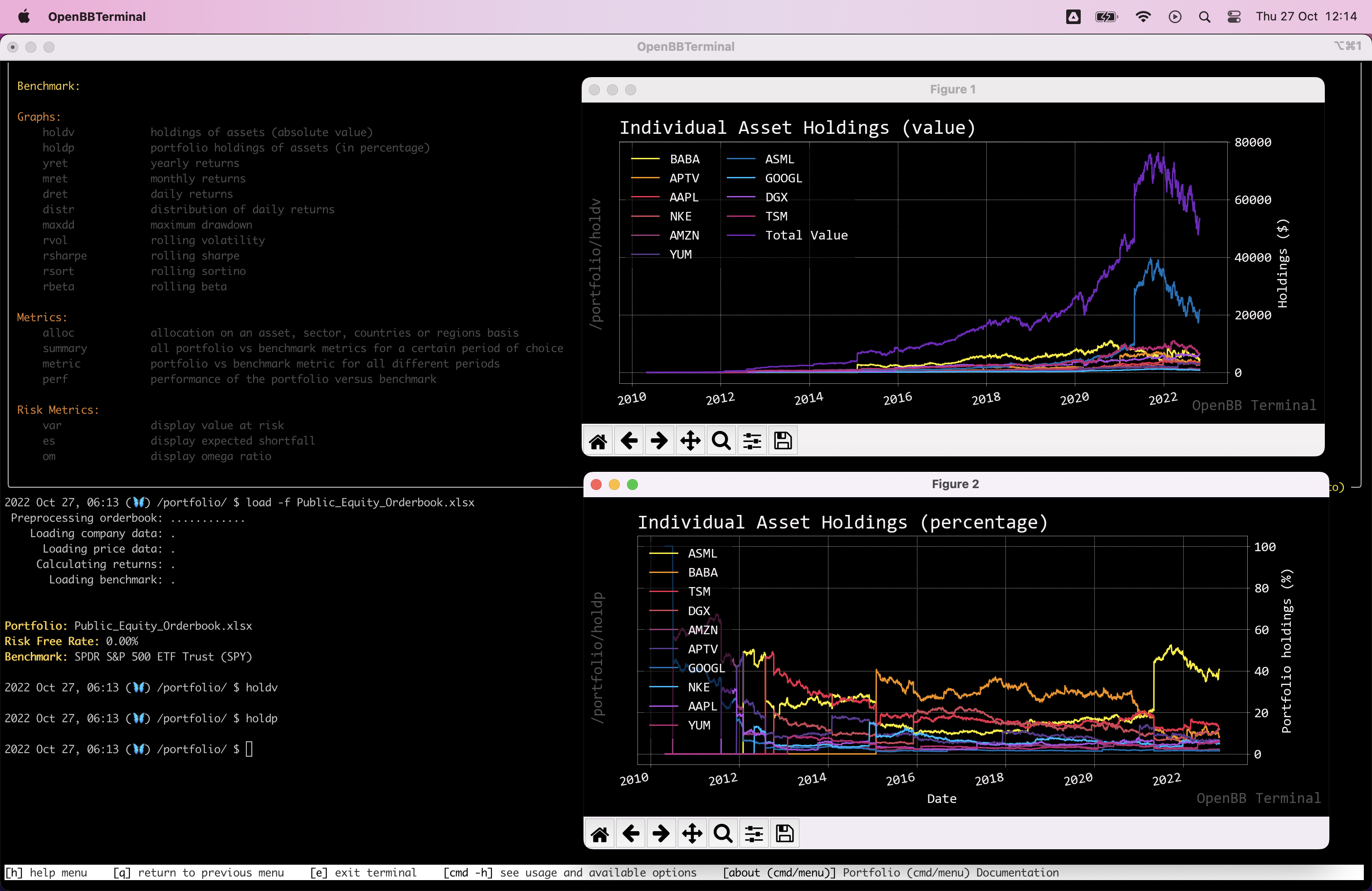
[IMPROVE] Redesign `portfolio/holdv` and `portfolio/holdp`
What's the feature that should be improved? These two charts are absolute not insightful. Especially once you have a portfolio of more than a 100 tickers.
Describe how you would like the feature improved
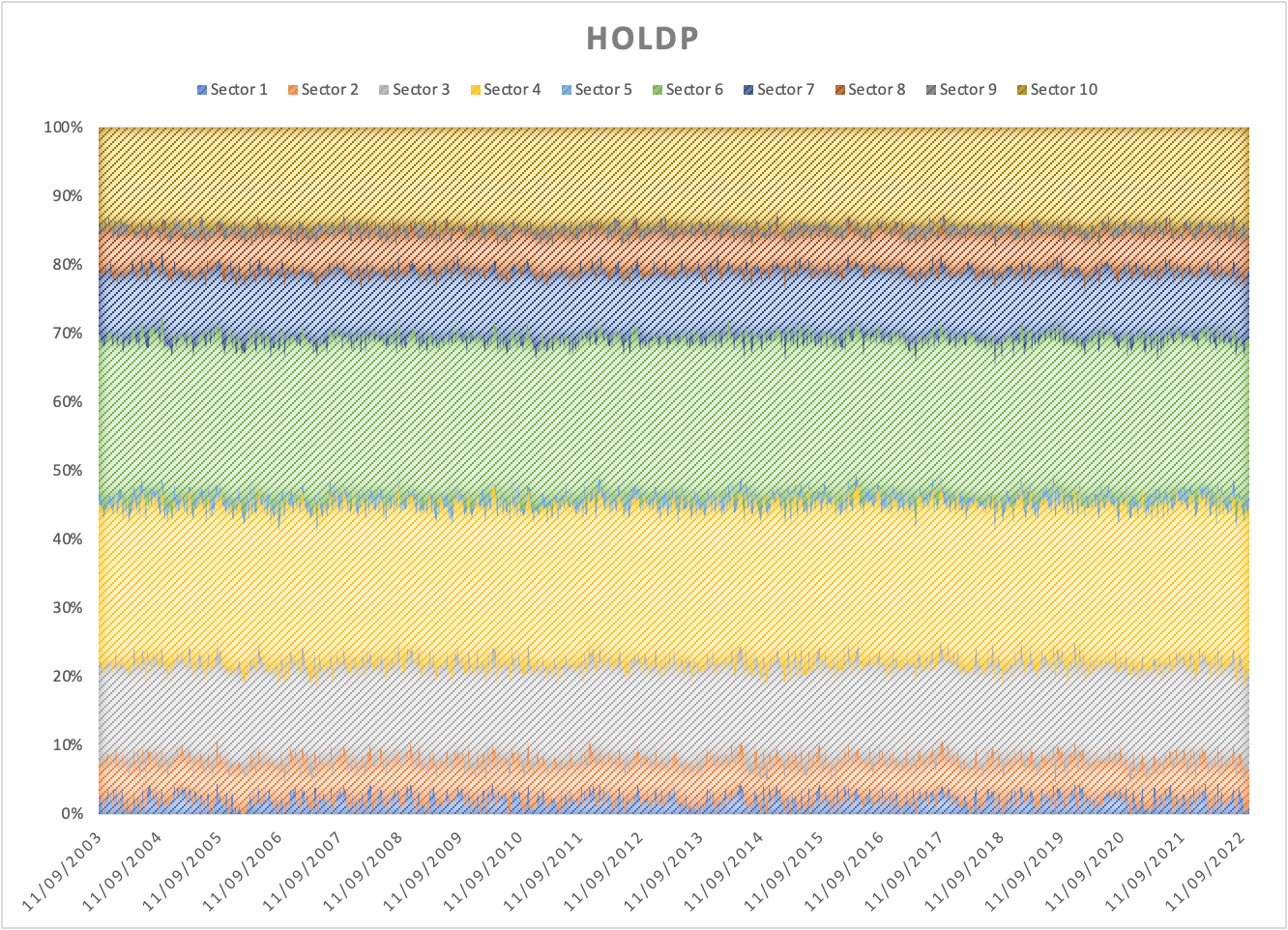
This needs to be redesigned to be based off Sectors, Industries and assets by using stacked charts. Assets would be the current method but done in a better way. See the attached Excel for a randomized example and the following charts (note that due to how the random numbers are defined in the spreadsheet, the capital doesn't really grow).

Possibly describe the ideal way to improve this
I am looking for stacked charts for both functionalities. Here, I want it to select by default the sectors. Whenever the amount of sectors, industries or assets are greater than 10. Pick the top 9 based on allocation value or percentage and put the remainder in "Others". Also include a flag that can disable this functionality. We do this to prevent overflooding the chart leading to meaningless results.
@JerBouma did you try wit --sum ? Looks like this, prob should be the default
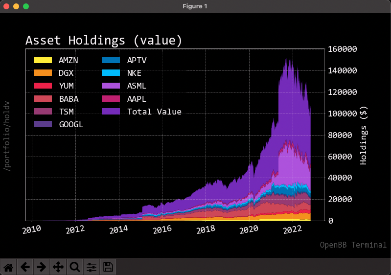
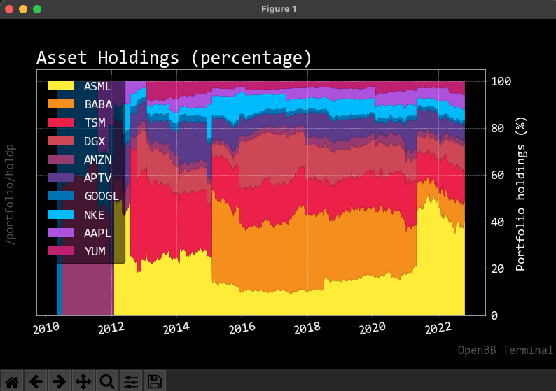
Should be default yes but needs support for sector, industry and assets. Legend most likely outside the graph.