Matching titlebar on Linux DEs
This issue is unique.
- [X] I have used the search tool and did not find an issue describing my idea.
Your idea.
Currently OnlyOffice looks quite off on Linux - no matter whether you use Gnome, KDE, Cinnamon, Xfce etc. The reason is simple - Windows type of styling the titlebar is used. Would be awesome to see matching styles for Linux. Also I wonder - is there anything end user could do to tweak the titlebar and change close,minimize, maximize titlebar buttons?
Hi, those 2 options may help you
https://helpcenter.onlyoffice.com/installation/desktop-flags.aspx
--system-title-bar and --custom-title-bar
@ShockwaveNN As they stand currently, I wouldn't consider those a solution. I've came here to report the same issue and when I saw those being proposed, I was really disappointed by the result.
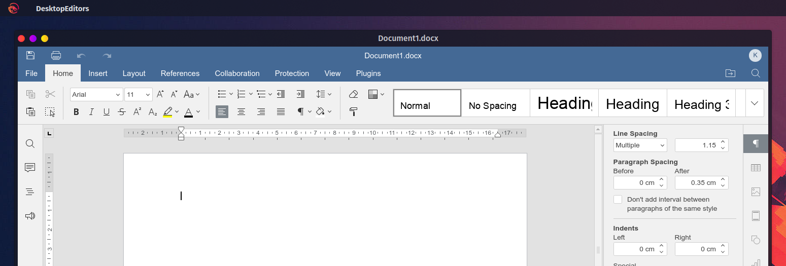
It's not surprising. The entire application is designed for this custom title bar. It's not just the window decorations. This is what it looks like on my DE with --system-title-bar and single window mode, which is the best experience I could get:
UI wise, the document title is duplicated, there's an incredibly large amount of wasted vertical space in the ribbon, it doesn't behave well with the global menu, and strangely the app didn't respect my color scheme when set to "Same as system"; not that I would want to use a dark theme that still doesn't respect my color scheme anyway. There is also no way of returning to the launcher once it's closed. You can't even start a second instance to get it back.
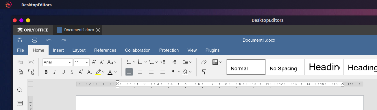
Without single window mode, the app looks even worse as we now have even wasted space and duplicated information:
If you want your UX to look good on Linux, I can see two solutions:
- You integrate with the DE for decorations (like Chrome is doing with their GTK+ theme)
- You drastically improve the UX of the app when running with the system title bar / without the document tabs.
Just switching to the system title bar never looks good for apps that tries to reinvent window decorations (it looks awful on Chrome too).
Something you could do design wise is:
- Shift the save/print/undo/redo widget to the left of the file tab
- Shift the user widget to the right of the search button.
- Completely remove the now superfluous row in the ribbon to gain some vertical space.
- Add a menu that replicates the launcher's "Create new...", "Recent files", and "Open local file" features.
- Include "Connect to cloud", "Settings", and "About" as link that simply reopen the launcher on those pages.
With those small changes, you gain a lot of vertical space. You give users the ability to access the launcher once closed when the tab bar is disabled. People like me with DEs that makes use of a global menu will be able to extract your menu options and hide the in app menu automatically. Most of those changes should be gated behind --system-title-bar and Open file in its own window, but they would provide a much better experience than what we currently get with those options. The system title bar option should probably also be a setting instead of a command argument. It's weird to have an arg like this that is remembered across multiple launches. Also, just the fact that you had to mention this multiple times to users shows that the option might need more visibility in the UI.
Anyway, I hope this will lead to a better UX for linux users.