[Feature Request] Improve horizontal scrolling
Sengi has a horizontal scrollbar on bottom, that is hard to see because it has low contrast and is very thin. It is hard for me to quickly navigate between columns like I do, for example, in the default Mastodon interface. The column markers in the middle of the bottom row are a nice idea, but also a very small click target.
My suggestions:
- Increase the height of the horizontal scrollbar to a usual scrollbar size and give it enough contrast to be easy to spot.
- Instead of only displaying little bars in the row for switching between columns, use the space to add larger indicators, e.g., icons for the column type or an option to set an custom icon, emoji or letter as indicator. I would think one could use the Tweetdeck sidebar as inspiration, but make the icons more configurable by, for example, being able to set different colors for different accounts, or use two different icons for columns of the same type.
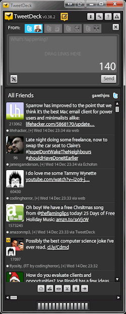
Tweetdeck (the old one!) is already an inspiration of Sengi's implementation. 🙂

And there is also a hotkey you might find useful: Ctrl+Left/Right Arrow. But thanks for the improvement ideas!
I never used the old Tweetdeck. The web version now has the icons on the left sidebar. I must say I don't really use them there, but the horizontal scrollbar often to switch between my columns. I have Firefox configured such that the scrollbar is 20px tall (about what the scrollbars were before the latest updates) and has good contrast so I can easily grab the handle when I often navigate between different parts of the column layout.
But I think the bars there can be a very good design, if they weren't such a small click target. By putting an icon in each button, it could automatically have a convenient size (at least in a large window on a desktop pc) and be an indicator which column is shown.
I guess there are many other possible designs and the issue is not about having this particular idea, but about the feedback that I find it hard with the current design to click the small button and to remember what it corresponds to. If other people have other ideas than using icons (or emoji / letters for personalization) they may be better than my suggestion.