 NicolasConstant
Electron Sengi doesn't properly resize in i3wm on Linux
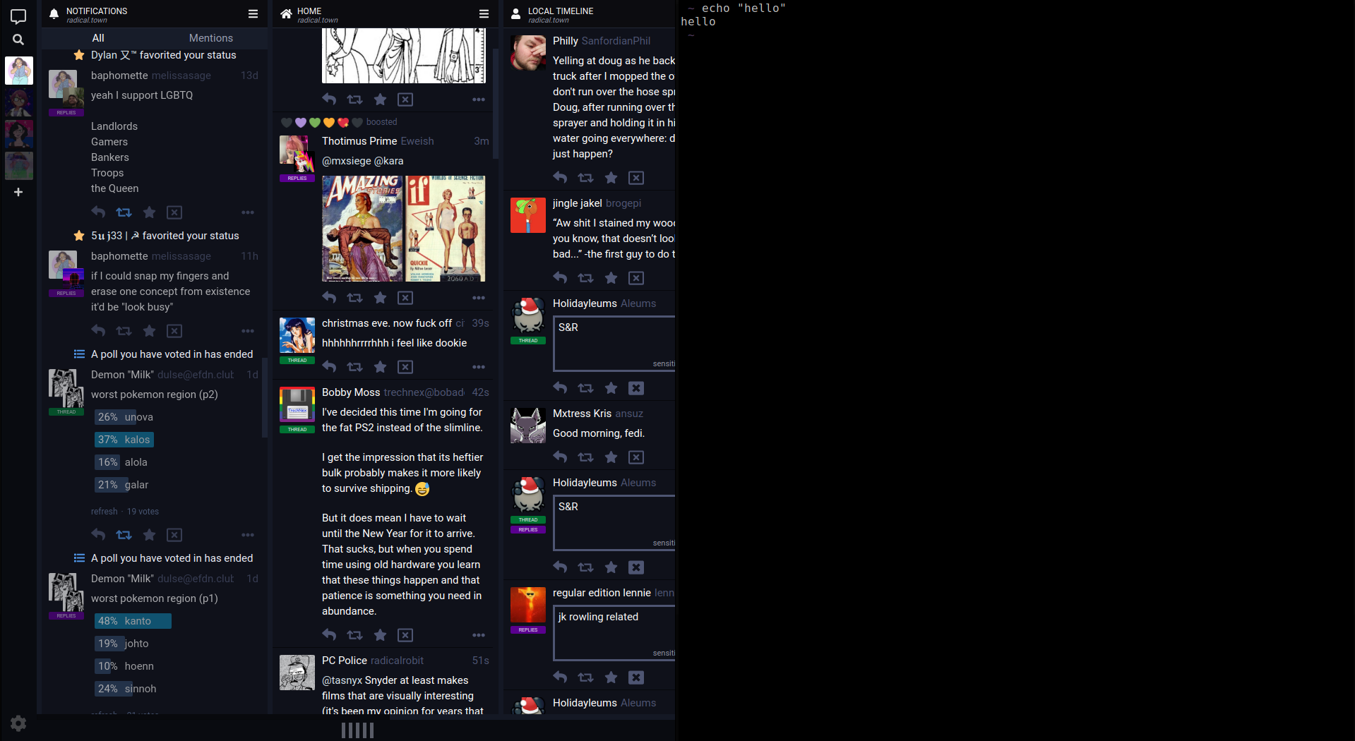
I'm using the snap version, and I honestly didn't even know that Sengi was build with responsive sizing until looking at the readme on github, since i3wm defaults new windows to fullscreen. If you reduce the size of the window, you just get a smaller window with nothing resized, causing you to have to scroll.
given that this is kind of specific, I might try to figure this out on my own and report back here, but I wanted to open the issue to let you know.
Can you provide me some screenshots of the issue? I think I see what you're experiencing but I just want to be sure.
and with an arbitrary number of terminals, at a size that should definitely trigger resizing.
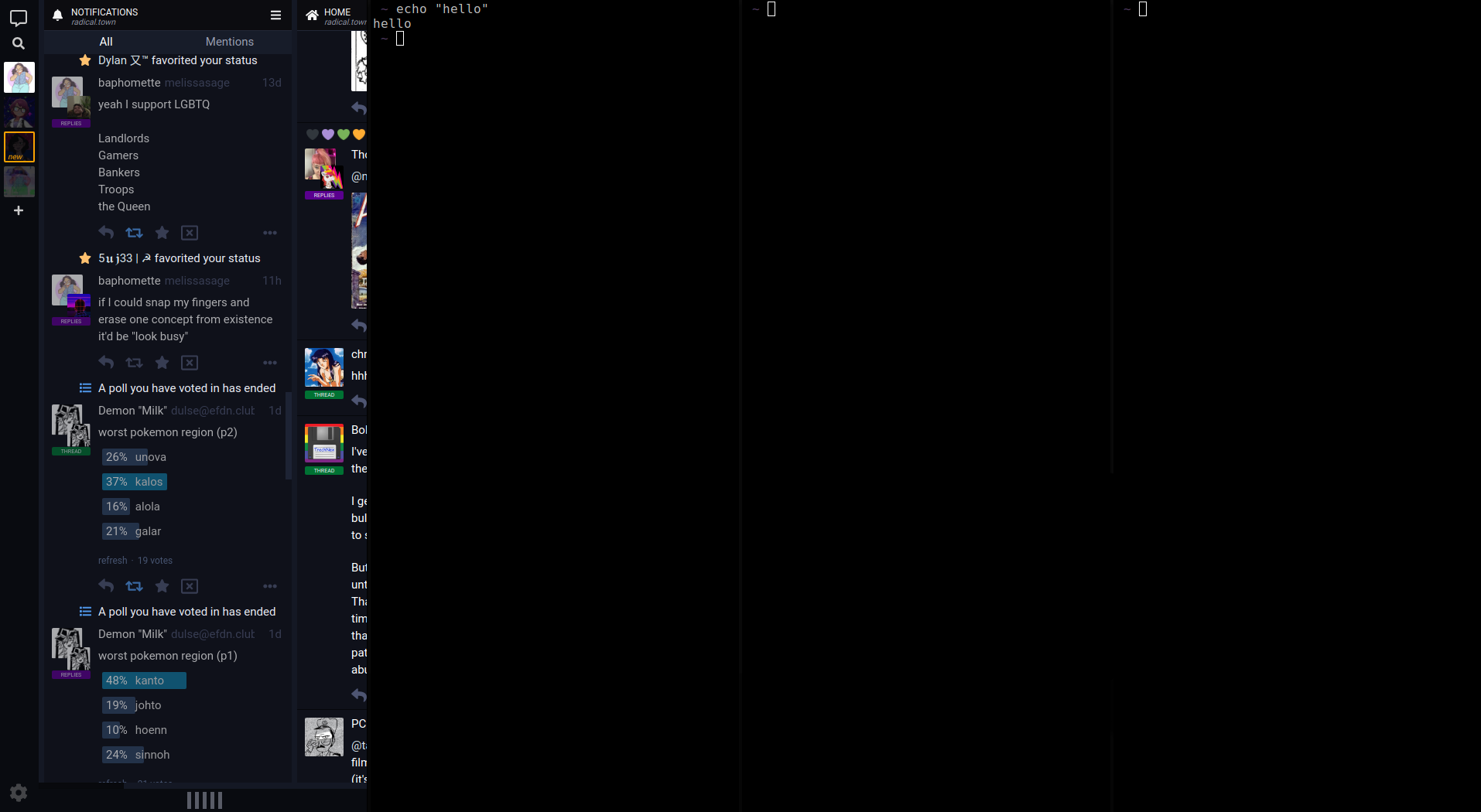
Thanks for those screens! I see the issue but I can't promise a fix in a close future: due to the stacking aspect of the columns, a CSS only solution won't be possible and would require a heavy part of JS logic. Unless I find a trick that won't require such work of course. :)
I'm not sure it fixes this issue, but would flexible columns help (as a parameter, not a default value)?
The CSS used in the example (for testing purposes):
.main-display {
    display: flex;
}

html body .main-display .main-display__stream-column {
    flex: 1;
    width: auto;
    min-width: 320px;
    max-width: 640px;
}

html body .main-display .stream-column {
    width: auto;
}

html body .main-display .sliding-column {
    width: auto;
}

html body .main-display .stream-statuses {
    width: auto;
}

html body .main-display .stream-column__stream-header {
    width: auto;
}

html body .main-display .stream-column__stream-selector {
    width: auto;
}

html body .main-display .stream-toots {
    overflow: hidden;
}
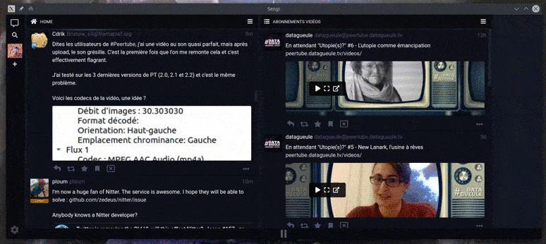
This is an interesting idea. :)
But it's difficult to determine only in css when it's a single column mode and therefore the TL should stretch to fit the space, and when you're on multi-columns mode and therefore be with multiple TLs (and then be displayed on the normal column size, since in this mode you want to see as much information as possible). On your example the columns are far too wide in multi-column display for instance.
Maybe combining media-queries with your idea could do the trick.
the way it's done in the CSS above would be perfect for my use ... i specifically need to have 4 columns visible at the same time (and for them to fill the width of the window, which in my case is around 1200px wide) :) so even as a "testing" option - that would already be perfect for me (and quite a few other people as well, i would imagine)