Proposal for an icon and a logo type for the application
Hello my name is Richard Caseres I am a graphic designer and I like to make contributions for open source projects from the graphic and advertising point of view. in this opportunity I contact you to propose a new icon and a logo more personalized and more current for your application in development this in order to give a better image to your project.
I develop within the platform Utopian.io with blockchain of steemit, the rewards I receive from them however they require me to contact the developer of the project so that they can verify that my logo proposal will be used in the project and so do not compensate contributions that will not be used in the projects.
Here I show you a model of the proposal of the logo if it is of tua degree I can provide you all the necessary files within a contribution in GitHub to be added to your project.
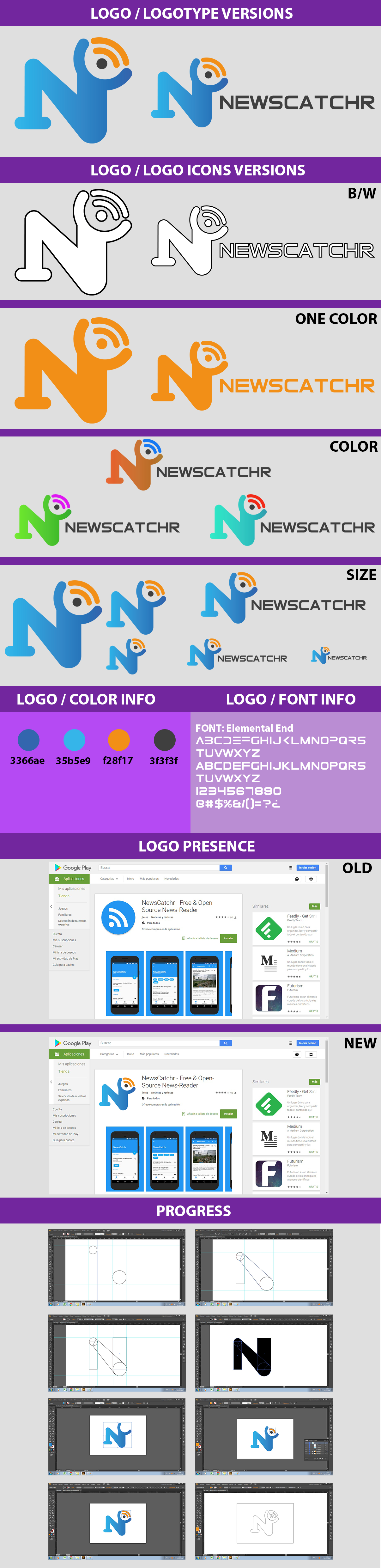
The design is mainly based on incorporating the letter N with the letter C without losing the base of the functions of the application that is the search for news by rss that is why I incorporate the universal logo of rss, the blue color is maintained as a basis however, it can vary to the color you want.
So that within Utopian-io my contribution to your project is valid you must place on the main page of the project on GitHub an application for a new logo or icon as a contribution to your project to simply demonstrate that you will use the new icon and the new logo.
Well I hope you like my proposal, thank you very much for your time to read this and I hope we are in contact. Greetings.
Hi, thanks for your contribution!
I really appreciate your efforts for contributing to open source projects with your skills. Your probably right and NewsCatchr needs a new and better icon (with the next major release).
However I have a two questions:
- Would it be possible for you to optimize the icon for the use with an adaptive icon?
- Your icon looks good, but would it be possible to make it a bit more "simple"? I think it has too many shapes, but I also don't really have knowledge about design :sweat_smile:.
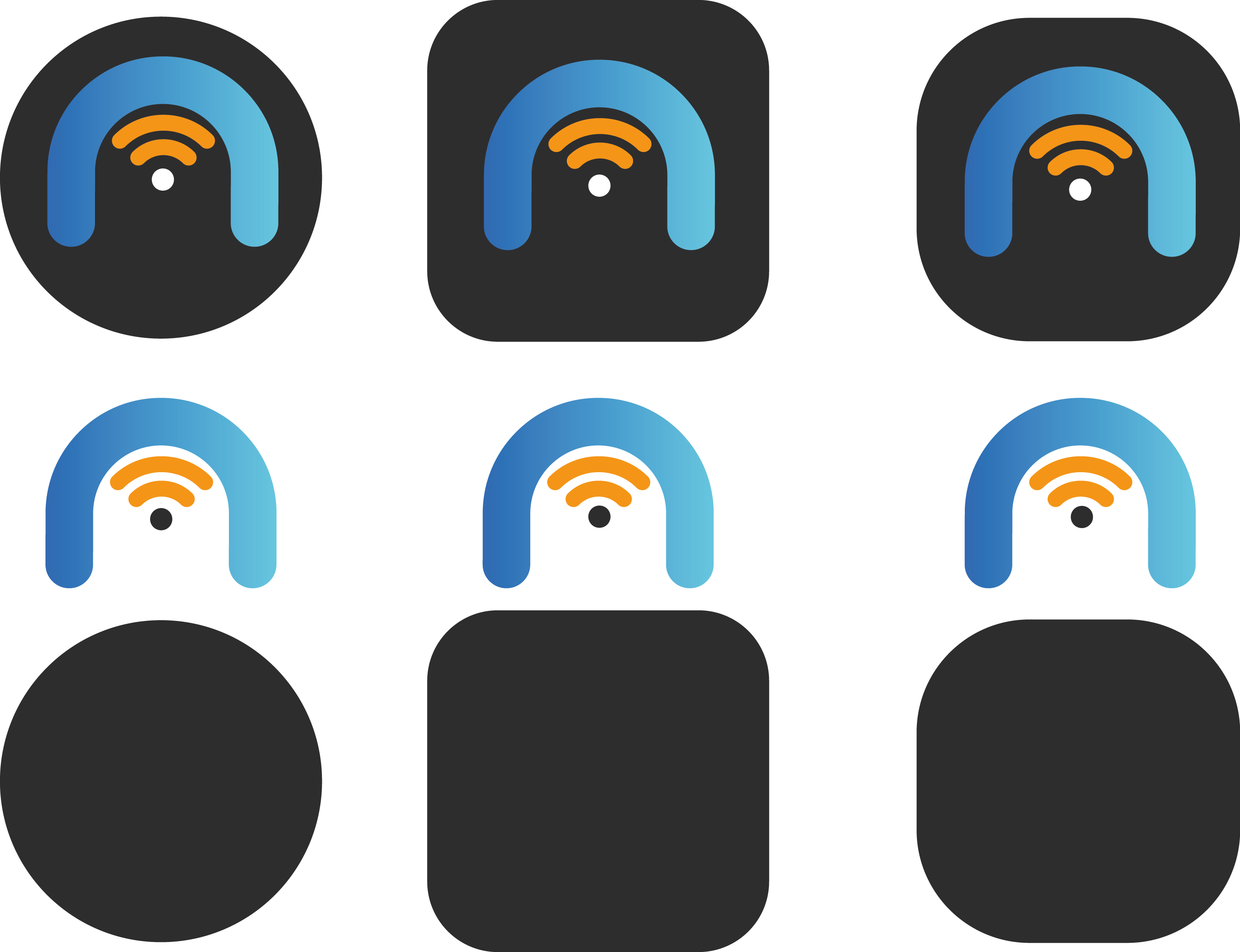
Perfect that good that you like what I do, with respect to what you request if it is possible an adaptive icon from the point of view of design is simply an icon that can be used inside a square a circle a triangle without losing its form original, when we talk about android you need the different layers to give it the effect with programming (which is no longer my job :-) ) I can give you the icons in different ways and you can do the effect as explained in the link you sent me.
I'm going to work on redesigning the icon to make it simpler if you have some basic idea of how you would like it to look and show me I can work based on that too.
This is a second more simple and adaptive model :-) the letter N is retained as the main figure and the universal RSS icon present.
These new icons are amazing :smiley:
Just one last small request: Could you make the two orange curves to the blue curve / make them just a little bit more curved?
That would be awesome!
Hello happy day, here I show you the change you suggested with the orange lines more curves

Hello I hope you are very well acontinuación that supply the link where you can find all the necessary files to use the new logo I hope you like it .. greetings
All File: GoogleDrive
Hello happy day I see that you have not used the logo you make, if you want some change I would gladly do ... greetings ...