service-call-tile-feature
 service-call-tile-feature copied to clipboard
 Nerwyn
Home Assistant custom features for tile cards and more. Call any action using buttons, sliders, selectors, and spinboxes
Service Call Tile Feature


Call any service and most actions via tile features. This custom tile feature will let you create super customizable tile buttons, sliders, selectors, and spinboxes. The Home Assistant developers gave us the ability to create custom tile features, why is no one else taking advantage of it? And why isn't something like a generic service call tile button already in Home Assistant? I don't know but here it is.
Feature Types
Buttons
Buttons are the most basic type of custom tile feature, being based on the example provided in the Home Assistant developer documentation.
To create a button, add a Service Call tile feature to your tile and edit it. By default type will be set to button. In order for this button to actually do anything you need to give it an action to perform, like so:
type: custom:service-call
entries:
  - type: button
    tap_action:
      action: call-service
      service: light.toggle
As explained above, the entity ID of the feature and service call data is autofilled with the tile entity ID.
All basic style options work with service call buttons as show in example 2
In addition to tap_action, buttons also support hold_action, double_tap_action, momentary_start_action, and momentary_end_action. All of these are described in further detail below.
Like all features in this project, buttons can be given an icon and a label. The icon, label, and rest of the feature can be stylized using style options described below.
Sliders
Sliders allow you to create Home Assistant styled input range sliders, similar to those available for light brightness and temperature. But these sliders can be used for any action.
To create a slider, add a Service Call tile feature to your tile and edit it. Change the type field under entries (NOT the root tile feature type) to slider. By default this will look like a normal tile light brightness or cover position slider, but you can change this to a couple of other thumb styles as shown in example 3 using the thumb option.
If the domain of the feature entity is a number/input_number, then the service and data will be set to use the number/input_number.set_value service, and range and step will use the corresponding attributes of the entity if they are not set in the config. Otherwise, you will need to set service to a service call to actually do anything.
Sliders can track either the state or attribute of an entity, meaning that when that entity's state or attribute changes so will the slider to match. By default it will track the state of an entity. To change this, set value_attribute to the name of the attribute you want the slider to track. In order to pass the the slider's value to a service call, set the value in the service call data to {{ value }}. If you want to use templating to set the slider label, you can use value and unit inside of a template to display the current slider value and unit of measurement.
type: custom:service-call
entries:
  - type: slider
    value_attribute: brightness
    tap_action:
      action: call-service
      service: light.turn_on
      data:
        brightness_pct: '{{ value }}'
To better understand the attributes of Home Assistant entities, use the states tab in Home Assistant Developer tools. Remember, that you can also change the entity of the slider by setting entity_id either at the entry level or within the data or target objects (NOT at the root of the feature config).
By default the slider's range will be from 0 to 100, with a step size of 1. You will need to adjust this depending on the service you are calling. If you find that the service you are calling does not like non-whole numbers (like light.turn with color_temp), make sure to set step size to a whole number.
type: custom:service-call
entries:
  - type: slider
    thumb: line
    value_attribute: color_temp
    range:
      - 153
      - 371
    step: 1
    tap_action:
      action: call-service
      service: light.turn_on
      data:
        color_temp: '{{ value }}'
    style:
      --background-color: linear-gradient(-90deg, rgb(255, 167, 87), rgb(255, 255, 251))
      --background-opacity: 1
Selectors
Selectors allow you to create a row of custom button features with no gaps of which the currently active one will be highlighted, similar to those available for alarm control panel and thermostat modes. But like all features in this project it can be used for any actions.
To create a selector, add a Service Call tile feature to your tile and edit it. Change the type field under entries (NOT the root tile feature type) to selector. At first you will see nothing! This is because you need to define the options to be listed out in the selector manually. Each of these options is actually a custom button feature as described above. For now let's use the options field to give each selector option an icon:
type: custom:service-call
entries:
  - type: selector
    entity_id: input_select.listening_mode
    options:
      - icon: mdi:dolby
      - icon: mdi:music
      - icon: mdi:microsoft-xbox-controller
This feature is set up to work with Home Assistant select/input_select entities out of the box. Just using the config above, you can use it to change the values of input selects entities. By default each button will call the select/input_select.select_option service. The list of options is automatically retrieved, but you still have to include the options array and give each option button style information so that they will render (you can create blank buttons by setting the option to {}).
Since each selector option is a service call button, you can override it's default behavior by including action information as shown in example 2. Doing so will also break the current option highlighting, but you can use the option field within an option alongside value_attribute to restore this, also shown in example 2. option will be the value to compare against the feature's value, whether that is it's entity's state or one of it's attributes. If they match and are not undefined, then the the option will be highlighted. The option highlight color defaults to tile color, but can be changed by setting color to a different value. You can also set color within an option to give that option a different highlight color.
Spinboxes
Spinboxes allow you to create Home Assistant style number boxes with increment and decrement buttons, similar to the climate target temperature feature. By default the user can increment or decrement this feature's internal value using the corresponding buttons. Once the user stops pressing the buttons for a time period defined by debounce_time (default 1000ms), the user defined tap_action will fire. Similar This action should use a service which sets a value similar to number/input_number.set_value or climate.set_temperature and the user should use value by itself or in a template to pass it to the action call. This way the user can keep incrementing or decrementing the value until they reach the desired value, and the action to update it in Home Assistant is only called once. You can make this features buttons repeat when held by setting hold_action.action to repeat.
You can also override the default behavior of the increment and decrement buttons by including action information as show in example 6. Doing so will disable the normal increment/decrement and debounce button behavior and create a stylized button feature instead.
type: custom:service-call
entries:
  - type: spinbox
    icon: mdi:thermometer
    label: '{{ value }}{{ unit }}'
    step: 1
    debounceTime: 1000
    range:
      - '{{ state_attr("climate.downstairs_thermostat", "min_temp") }}'
      - '{{ state_attr("climate.downstairs_thermostat", "max_temp") }}'
    value_attribute: temperature
    unit_of_measurement: ' °F'
    tap_action:
      service: climate.set_temperature
      data:
        entity_id: climate.downstairs_thermostat
        temperature: '{{ value }}'
How To Use
The trade off for the level of customizability that this card offers is that it can be a bit confusing to use. All of the available features and options are documented below. This card can be installed using HACS by adding it as a custom frontend repository.
- To start create a tile card. The entity ID can be anything you like.
- Click
ADD FEATUREand thenService Call - Click the edit icon on the
Service Callentry. By default you should see something like this:
type: custom:service-call
entries:
  - type: button
Base Config
| Name | Type | Description/Value |
|---|---|---|
| type | string | custom:service-call |
| hide | boolean | Whether to hide this row of entries. Should be set using a template. Defaults to false. |
| show | boolean | Whether to show this row of entries. Should be set using a template. Defaults to true. Supercedes hide if true. |
| entries | array | List of entries to include in a tile features row. |
type: custom:service-call
hide: '{{ is_state("light.lounge", "off") }}'
show: '{{ is_state("light.lounge", "on") }}'
entries: []
The custom service call feature is actually a row of entries, each of which have their own configuration. When you first add the Service Call feature to your tile card it creates a button to start. You can add more tile features to this row by adding more entries to the entries array.
Entry Configs
General Options
| Name | Type | Description |
|---|---|---|
| type | string | Type of tile feature. Currently supported options are button, slider, selector, and spinbox. |
| value_attribute | string | The attribute to use to determine the value of the feature. Defaults to state. |
| entity_id | string | The entity ID of the tile feature. Defaults to the entity ID provided in the service call data/target or the entity ID of the tile card. |
| autofill_entity_id | boolean | Whether to autofill the entity_id of the tile feature and the service call data/target if no entity, device, or area ID is provided. Defaults to true. |
| icon | string | The name of the icon to use. |
| label | string | A string to place either underneath the icon or by itself. |
| unit_of_measurement | string | A string to append to the end of the label, if it exists. |
| style | StyleInfo | CSS style properties to set to the feature, further explained below. |
| haptics | boolean | Enable haptics on the feature, defaults to false. |
type: custom:service-call
entries:
  - type: button
    value_attribute: brightness
    entity_id: light.lounge
    autofill_entity_id: false
    haptics: true
    icon: >-
      {{ iif(is_state("light.chandelier", "on"), "mdi:ceiling-light",
      "mdi:ceiling-light-outline") }}
    label: >-
      {{ value }}{{ unit }}
    unit_of_measurement: '%'
    style:
      --icon-color: yellow
      --color: |
        {% if is_state("light.chandelier", "on") %}
          rgb({{ state_attr("light.chandelier", "rgb_color") }})
        {% else %}
          initial
        {% endif %}
By default type will be button. If you're using an older version of this feature it may not be present but will still default to button. Currently slider, selector, and spinbox are also supported.
The value_attribute field is to set which entity attribute the feature should use for it's value, if not the default entity state. For sliders this field is used to determine the it's default value on render. For selectors this field is used for determining which option is currently selected. For spinboxes, this field is used to determine which attribute to decrement or increment.
value_attribute can also be used to include the feature value in service call data by setting a field in the data object to '{{ value }}', such as for sliders. If the attribute which you wish to use is an array, you can also further include the index at the end of the attribute name in brackets (like hs_color[0]).
Some additional logic is applied for certain value_attribute values:
-
brightness- Converted from the default range of 0-255 to 0-100. -
media_position- Updated twice a second using the current timestamp and the attributemedia_position_updated_atwhen the entity state isplaying, and locked to a max value using the attributemedia_duration. -
elapsed- Only for timer entities. Updated twice a second using the the current timestamp and the attributesduration,remaining, andfinishes_at, and locked to a max value using the attributeduration.-
NOTE:
elapsedis not an actual attribute of timer entities, but is a possiblevalue_attributefor timer entities for the purpose of displaying accurate timer elapsed values. Timer entities do have an attributeremaining, which only updates when the timer state changes. The actualremainingattribute can be calculated using theelapsedvalue and the timerdurationattribute.
-
NOTE:
If you find that the autofilling of the entity ID in the service call or tile feature value is causing issues, setting autofill_entity_id to false may help. Just remember to set the entity ID of the tile feature and the entity, device, or area ID of the service call target.
If the icon or label is empty, then the entire HTML element will not render. Both can be defined using templates, and the variables value and unit can be included in label templates.
Haptics are disabled for tile features by default, but can be enabled by setting haptics to true.
Templating
Almost all fields support nunjucks templating. Nunjucks is a templating engine for JavaScript, which is heavily based on the jinja2 templating engine for Python which Home Assistant uses. While the syntax of nunjucks and jinja2 is almost identical, you may find the nunjucks documentation useful. Please see the ha-nunjucks repository for a list of available functions. If you want additional functions to be added, please make a feature request on that repository, not this one.
You can include the current value of a tile feature and it's units by using the variables value and unit in a label template. You can also include hold_secs in a template if performing a momentary_end_action. Each tile feature can also reference it's entry using config within templates. config.entity will return config.entity_id with it's template rendered (if it has one), and other templated config fields can be rendered within templates by wrapping them in the function render within a template. Note - that the style field is applied onto the tile feature HTML element and does not have access to these variables and functions. Internal style fields like those described in Style Options do.
Actions
There are three traditional ways to trigger an action - tap, double tap, and hold. Buttons, selector options, and spinbox buttons support all three, and sliders only support tap actions. Defining a double tap action that is not none introduces a 200ms delay to single tap actions.
| Name | Type | Description |
|---|---|---|
| tap_action | object | Action to perform on single tap. |
| hold_action | object | Action to perform when held. |
| double_tap_action | object | Action to perform when double tapped. Adding this introduces a 200ms delay to single tap actions. |
| momentary_start_action | object | Action to perform when the button is initially held down. If configured normal tap and hold actions will not trigger. |
| momentary_end_action | object | Action to perform when the button is released. |
type: custom:service-call
entries:
  - type: button
    icon: mdi:ceiling-light
    tap_action:
      action: call-service
      service: light.toggle
      target:
        entity_id: light.lounge
    double_tap_action:
      action: url
      url_path: youtube.com
    hold_action:
      action: assist
Each action also supports the confirmation field. More information on Home Assistant action confirmations can be found here. Confirmation text supports string interpolation as described above.
type: custom:service-call
entries:
  - type: button
    icon: mdi:ceiling-light
    tap_action:
      action: call-service
      service: light.toggle
      target:
        entity_id: light.lounge
      confirmation:
        text: >-
          Are you sure you want to turn the light {{ 'on' if
          is_state('light.lounge', 'off') else 'off' }}?
Adjustable Timings
Hold Time
Hold actions are triggered by holding down on a button for a defined amount of time and then releasing. The default amount of time is 500ms. You can change this by setting hold_time in the hold action to a different number.
type: custom:service-call
entries:
  - type: button
    icon: mdi:view-dashboard
    hold_action:
      action: navigate
      navigation_path: /lovelace/2
      hold_time: 600
Repeat and Repeat Delay
By setting a hold action to repeat, the tap action will repeat while the button is held down. The default delay between repeats is 100ms. You can change this by setting repeat_delay in the hold action to a different number. See the below section on repeat for more.
type: custom:service-call
entries:
  - type: button
    icon: mdi:lightbulb
    tap_action:
      action: call-service
      service: light.toggle
      target:
        entity_id: light.bedroom
    hold_action:
      action: repeat
      repeat_delay: 1000
Double Tap Window
Double tap actions have a default window of 200ms to trigger before a single tap action is triggered instead. You can change this by setting double_tap_window in the double tap action to a different number.
type: custom:service-call
entries:
  - type: button
    icon: mdi:view-dashboard
    double_tap_action:
      action: navigate
      navigation_path: /lovelace/1
    double_tap_window: 400
NOTE: Setting double_tap_window above or too close to hold_time can result in undesirable behavior, as the hold timer expires before the double tap window does.
Action Types
Actions follow the Home Assistant actions syntax. Most Home Assistant actions are supported.
| Action | Description |
|---|---|
| call-service | Call any Home Assistant service. |
| navigate | Navigate to another Home Assistant page. |
| url | Navigate to an external URL. |
| assist | Open the assist dialog. Uses the mobile dialog if available, like in the Home Assistant app. |
| more-info | Open the more info dialog. |
| fire-dom-event | Fire a browser dom event using whatever information is in the Action object. Useful for opening browser-mod popup cards. |
| repeat | Repeat the tap_action ten times a second while held. Only applicable to hold_action, acts as none if used in tap_action or double_tap_action. |
| none | Explicilty set a command to do nothing. |
Each action has a set of possible options associated with them. If action is not provided the card will guess which type of action it is by the options used.
call-service
| Name | Description |
|---|---|
| service | The service to call. Use the format domain.service, e.g. "light.turn_on". |
| data | Additional data to pass to the service call. See the Home Assistant documentation or go to Developer Tools > Services to see available options for each service. |
| target | The entity IDs, device IDs, or area IDs to call the service on. |
data and target get internally merged into one object and can be used interchangeably or together. You can safely put all information into one object with any of these names. This was done so that you can easily design service calls using Home Assistant's service developer tool and copy the YAML to custom button configurations in this card.
If you include '{{ value }}' in any of the data fields, then it will get replaced with the feature's value. This is especially useful for using the slider and spinbox.
type: custom:service-call
entries:
  - type: slider
    icon: mdi:brightness-4
    value_attribute: brightness
    tap_action:
      action: call-service
      service: light.turn_on
      data:
        brightness_pct: '{{ value }}'
      target:
        entity_id: light.lounge
navigate
| Name | Description |
|---|---|
| navigation_path | Home Assistant page to navigate to. |
| navigation_replace | Whether to replace the current page in the history with the new URL. |
type: custom:service-call
entries:
  - type: button
    icon: mdi:view-dashboard
    tap_action:
      action: navigate
      navigation_path: /lovelace/0
      navigation_replace: true
    double_tap_action:
      action: navigate
      navigation_path: /lovelace/1
    hold_action:
      action: navigate
      navigation_path: /lovelace/2
url
| Name | Description |
|---|---|
| url_path | External website to navigate to. |
type: custom:service-call
entries:
  - type: button
    icon: mdi:google
    tap_action:
      action: url
      url_path: https://www.google.com
assist
The following options are only available in the mobile assist dialog.
| Name | Description |
|---|---|
| pipeline_id | Assist pipeline id to use. |
| start_listening | If supported, listen for voice commands when opening the assist dialog. |
type: custom:service-call
entries:
  - type: button
    icon: mdi:assistant
    tap_action:
      action: assist
      pipeline_id: preferred
      start_listening: true
more-info
| Name | Description |
|---|---|
| data.entity_id | The entity ID to open the more info dialog for. |
type: custom:service-call
entries:
  - type: button
    icon: mdi:cctv
    tap_action:
      action: more-info
      data:
        entity_id: camera.front_door
fire-dom-event
| Name | Description |
|---|---|
| browser_mod | A field expected by browser mod for popups. |
type: custom:service-call
entries:
  - type: button
    icon: mdi:map
    tap_action:
      action: fire-dom-event
      browser_mod:
        service: browser_mod.more_info
        data:
          large: true
          entity: zone.home
          ignore_popup_card: false
        target:
          entity: THIS
repeat
| Name | Description |
|---|---|
| repeat_delay | Milliseconds between repeats. Defaults to 100ms. |
The tap_action must also be defined.
type: custom:service-call
entries:
  - type: button
    icon: mdi:lightbulb
    tap_action:
      action: call-service
      service: light.toggle
      target:
        entity_id: light.theater
    hold_action:
      action: repeat # light will be toggled repeatedly while held
    repeat_delay: 1000
none
None. This action does nothing. Can also be used to make a slider ready only.
```yaml
type: custom:service-call
entries:
  - type: button
    tap_action:
      action: none
    hold_action:
      action: more-info
Momentary Button mode
As an alternative to normal tap, hold, and double tap actions, buttons and selectors can also be used in a momentary mode. Configuring this option disables the normal tap, hold, and double tap actions.
momentary_start_action is fired when you first press down on a button (or center of touchpad). momentary_end_action is fired when you release the button or touchpad. While these are meant to be used together you can use one or the other.
type: custom:service-call
entries:
  - type: button
    icon: mdi:ceiling-light
    momentary_start_action:
      action: call-service
      service: light.turn_on
      data:
        entity_id: light.sunroom_ceiling
    momentary_end_action:
      action: call-service
      service: light.turn_off
      data:
        entity_id: light.sunroom_ceiling
Style Options
While any CSS property can be used, these values are internal CSS variables designed to be set by the user.
| Name | Type | Description |
|---|---|---|
| --color | string | Custom color for the tile feature. Can also be a CSS function (see examples). |
| --opacity | float | Opacity of the tile feature. Defaults to 0.2. |
| --icon-color | string | Custom color for the icon. |
| --label-color | string | Custom color for the string label. |
| --icon-filter | string | Filter to apply to the icon. |
| --label-filter | string | Filter to apply to the string label. |
| --background | string | Custom color for the tile feature background. Can also be a CSS function (see examples). |
| --background-opacity | number | Opacity of the tile feature background. Defaults to 0.2. |
| flex-basis | string | Percentage of the row the the feature should populate relative to it's siblings. Defaults to 100%. |
If you want to apply additional styles to subelements, you can also use the options icon_style, label_style, background_style, slider_style, and tooltip_style. While style applies to the outer HTML element, these subelement style fields are applied internally. Because of this, they can also use internal variabes in templates such as value.
type: custom:service-call
entries:
  - type: button
    icon: mdi:brightness-4
    label: '{{ value }}{{ unit }}'
    unit_of_measurement: '%'
    value_attribute: brightness
    tap_action:
      action: call-service
      service: light.toggle
      target:
        entity_id: light.lounge
    style:
      --color: |
        {% if is_state("light.lounge", "on") %}
          rgb({{ state_attr("light.lounge", "rgb_color") }})
        {% else %}
          initial
        {% endif %}
      --opacity: 1
      --icon-color: white
      --label-color: var(--disabled-color)
      --icon-filter: blur(1px)
      --label-filter: hue-rotate(90deg)
      --background: gray
      flex-basis: 200%
Slider Specific Options
| Name | Type | Description |
|---|---|---|
| range | array | The minimum and maximum numbers for the slider, defaults to [0, 100]. |
| step | number | The step size of the slider. Defaults to 1/100 of the range. You may have to manually set this to a whole number for service data like light color_temp. |
| thumb | string | The slider thumb style. - default: Like a tile light brightness slider.- line: Like a tile color temperature slider.- flat: Like a mushroom slider.- round: Like an Android Material volume slider. |
| value_from_hass_delay | number | The time the feature will wait after firing an action before it starts retrieving values from Home Assistant again. Useful for preventing bouncing between new and old values if an entity takes a while to update. Defaults to 1000ms. |
| style.--thumb-width | string | Width of the actual slider thumb, not including box shadow. Default varies by thumb style and browser. |
| style.--thumb-border-radius | string | Border radius of the slider thumb. Default varies by thumb style. |
| style.--thumb-box-shadow | string | Box shadow of the slider thumb. Default varies by thumb style. |
| style.--tooltip-label | string | Tooltip label template, defaults to {{ value }}{{ unit }}. |
| style.--tooltip-transform | CSS function | Tooltip location transform function, defaults to translate(var(--thumb-offset), -35px). |
| style.--tooltip-display | string | Tooltip display value, set to none to hide tooltip, defaults to initial. |
type: custom:service-call
entries:
  - type: slider
    icon: mdi:brightness-4
    label: '{{ value }}{{ unit }}'
    unit_of_measurment: ' Mireds'
    thumb: flat
    range:
      - '{{ state_attr("light.lounge", "min_mireds") }}'
      - '{{ state_attr("light.lounge", "max_mireds") }}'
    step: 1
    value_attribute: brightness
    tap_action:
      action: call-service
      service: light.turn_on
      target:
        entity_id: light.lounge
    style:
      --color: |
        {% if is_state("light.lounge", "on") %}
          rgb({{ state_attr("light.lounge", "rgb_color") }})
        {% else %}
          var(--state-inactive-color)
        {% endif %}
Selector Specific Options
| Name | Type | Description |
|---|---|---|
| options | Option[] | An array of entries to use as options for the selector, each one being like it's own button feature. |
| options.i.option | string | A value to used to compare against the features value (see value_attribute above) to determine if it is the currently selected option. |
| style.--hover-opacity | number | Opacity to use when hovering over a selector option. |
type: custom:service-call
entries:
  - type: selector
    options:
      - option: A
        icon: mdi:alpha-a
        style:
          '--icon-color': >-
            {{ "var(--disabled-color)" if is_state("input_select.test_select",
            "A") }}
          '--color': var(--red-color)
      - option: B
        icon: mdi:alpha-b
        style:
          '--icon-color': >-
            {{ "var(--disabled-color)" if is_state("input_select.test_select",
            "B") }}
          '--color': var(--green-color)
      - option: C
        icon: mdi:alpha-c
        style:
          '--icon-color': >-
            {{ "var(--disabled-color)" if is_state("input_select.test_select",
            "C") }}
          '--color': var(--blue-color)
    style:
      --hover-opacity: 0.4
Spinbox Specific Options
| Name | Type | Description |
|---|---|---|
| range | array | The minimum and maximum numbers for the spinbox, defaults to [-32767, 32767]. |
| step | number | The increment/decrement step amount, defaults to 1. |
| value_from_hass_delay | number | The time the feature will wait after firing an action before it starts retrieving values from Home Assistant again. Useful for preventing bouncing between new and old values if an entity takes a while to update. Defaults to 1000ms. |
| debounce_time | number | The time to wait before firing the spinbox action, defaults to 1000ms. |
| increment | IEntry | Override the default increment button behavior and style options. |
| decrement | IEntry | Override the default decrement button behavior and style options. |
type: custom:service-call
entries:
  - type: spinbox
    icon: mdi:brightness-4
    label: '{{ value }}{{ unit }}'
    unit_of_measurement: '%'
    step: 5
    debounceTime: 1000
    range:
      - 0
      - 100
    value_attribute: brightness
    tap_action:
      action: call-service
      service: light.turn_on
      data:
        entity_id: light.sunroom_ceiling
        brightness_pct: '{{ value }}'
    decrement:
      icon: mdi:brightness-3
      label: down
      tap_action:
        action: none
        service: light.turn_on
        data:
          entity_id: light.sunroom_ceiling
          brightness_step_pct: -10
      hold_action:
        action: repeat
      style:
        flex-flow: row
      icon_style:
        padding-right: 4px
    increment:
      icon: mdi:brightness-2
      label: up
      tap_action:
        action: none
        service: light.turn_on
        data:
          entity_id: light.sunroom_ceiling
          brightness_step_pct: 5
      hold_action:
        action: repeat
      style:
        flex-flow: row-reverse
      icon_style:
        padding-left: 4px
    style:
      '--light-color': rgb({{ state_attr("light.sunroom_ceiling", "rgb_color") }})
      '--on-color': >-
        {{ "var(--light-color)" if is_state("light.sunroom_ceiling", "on") else
        "initial" }}
      '--background': var(--on-color)
      '--icon-color': var(--on-color)
      '--label-color': var(--on-color)
Examples
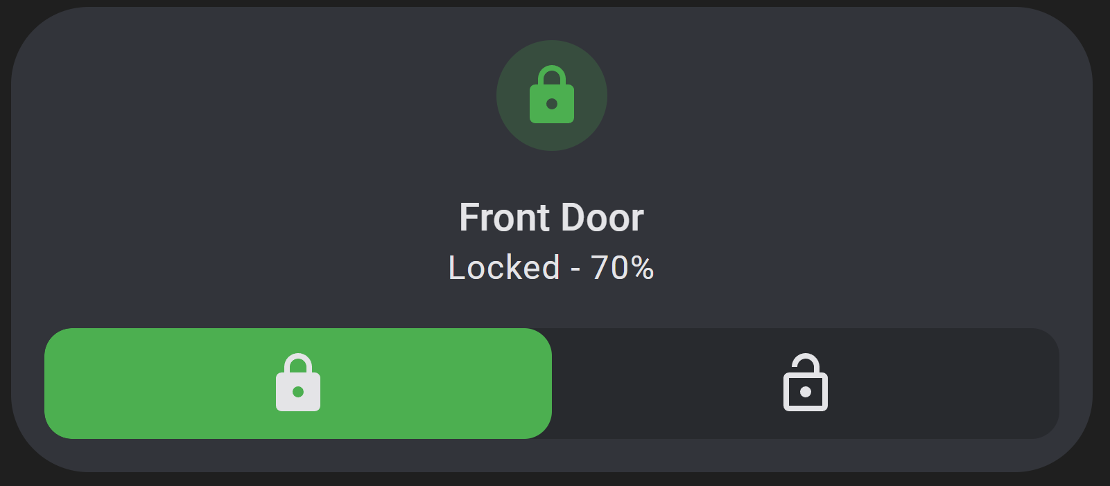
Example 1
A lock tile with lock and unlock selector options
features:
  - type: custom:service-call
    entries:
      - type: selector
        entity_id: lock.front_door_ble
        options:
          - icon: mdi:lock
            option: locked
            tap_action:
              action: call-service
              service: lock.lock
            style:
              '--color': var(--green-color)
          - icon: mdi:lock-open-outline
            option: unlocked
            tap_action:
              action: call-service
              service: lock.unlock
            style:
              '--color': var(--red-color)
type: tile
entity: lock.front_door_ble
show_entity_picture: false
vertical: true
card_mod:
  style:
    ha-tile-info$: |
      .secondary:after {
        visibility: visible;
        content: " - {{ states('sensor.front_door_battery_level') }}%";
      }
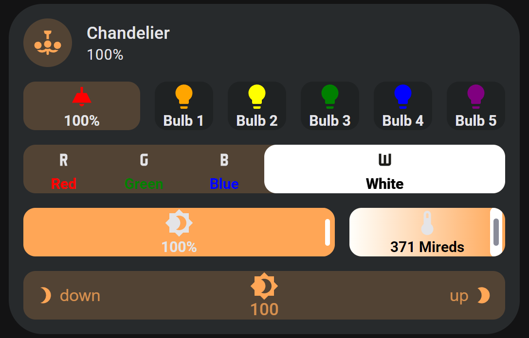
Example 2
A light tile with a button for each bulb, a color selector, brightness and temperature sliders, and a brightness spinbox with emphasis on certain options.
features:
  - type: custom:service-call
    entries:
      - tap_action:
          action: call-service
          service: light.toggle
          confirmation:
            text: >-
              Are you sure you want to turn the light {{ 'on' if
              is_state('light.chandelier', 'off') else 'off' }}?
        icon: >-
          {{ iif(is_state("light.chandelier", "on"), "mdi:ceiling-light",
          "mdi:ceiling-light-outline") }}
        label: >-
          {{ (100*state_attr("light.chandelier", "brightness")/255) | round or
          undefined }}
        unit_of_measurement: '%'
        style:
          flex-basis: 200%
          '--icon-color': red
          '--color': |
            {% if is_state("light.chandelier", "on") %}
              rgb({{ state_attr("light.chandelier", "rgb_color") }})
            {% else %}
              initial
            {% endif %}
      - tap_action:
          action: call-service
          service: light.toggle
          target:
            entity_id: light.chandelier_bulb_1
        icon: mdi:lightbulb
        icon_color: orange
        label: Bulb 1
      - tap_action:
          action: call-service
          service: light.toggle
          target:
            entity_id: light.chandelier_bulb_2
        icon: mdi:lightbulb
        icon_color: yellow
        label: Bulb 2
      - tap_action:
          action: call-service
          service: light.toggle
          target:
            entity_id: light.chandelier_bulb_3
        icon: mdi:lightbulb
        icon_color: green
        label: Bulb 3
      - tap_action:
          action: call-service
          service: light.toggle
          target:
            entity_id: light.chandelier_bulb_4
        icon: mdi:lightbulb
        icon_color: blue
        label: Bulb 4
      - tap_action:
          action: call-service
          service: light.toggle
          target:
            entity_id: light.chandelier_bulb_5
        icon: mdi:lightbulb
        icon_color: purple
        label: Bulb 5
  - type: custom:service-call
    entries:
      - type: selector
        entity_id: light.chandelier
        value_attribute: rgb_color
        style:
          '--background': |
            {% if is_state("light.chandelier", "on") %}
              rgb({{ state_attr("light.chandelier", "rgb_color") }})
            {% else %}
              initial
            {% endif %}
        options:
          - tap_action:
              action: call-service
              service: light.turn_on
              data:
                color_name: red
            option: 255,0,0
            label: Red
            icon: mdi:alpha-r
            style:
              '--label-color': red
              '--color': red
              '--label-filter': >-
                {{ "invert(1)" if (state_attr("light.chandelier", "rgb_color")
                or []).join(',') == '255,0,0' }}
          - tap_action:
              action: call-service
              service: light.turn_on
              data:
                color_name: green
            option: 0,128,0
            label: Green
            icon: mdi:alpha-g
            style:
              '--label-color': green
              '--color': green
              '--label-filter': >-
                {{ "invert(1)" if (state_attr("light.chandelier", "rgb_color")
                or []).join(',') == '0,128,0' }}
          - tap_action:
              action: call-service
              service: light.turn_on
              data:
                color_name: blue
            option: 0,0,255
            label: Blue
            icon: mdi:alpha-b
            style:
              '--label-color': blue
              '--color': blue
              '--label-filter': >-
                {{ "invert(1)" if (state_attr("light.chandelier", "rgb_color")
                or []).join(',') == '0,0,255' }}
          - tap_action:
              action: call-service
              service: light.turn_on
              data:
                color_temp: 500
            option: 255,166,86
            label: White
            icon: mdi:alpha-w
            style:
              '--label-color': white
              '--color': white
              flex-basis: 300%
              '--icon-filter': >-
                {{ "invert(1)" if (state_attr("light.chandelier", "rgb_color")
                or []).join(',') == '255,166,86' }}
              '--label-filter': >-
                {{ "invert(1)" if (state_attr("light.chandelier", "rgb_color")
                or []).join(',') == '255,166,86' }}
  - type: custom:service-call
    entries:
      - type: slider
        label: '{{ value }}{{ unit }}'
        unit_of_measurement: '%'
        value_attribute: brightness
        icon: mdi:brightness-4
        tap_action:
          action: call-service
          service: light.turn_on
          data:
            brightness_pct: '{{ value }}'
        style:
          flex-basis: 200%
      - type: slider
        thumb: line
        value_attribute: color_temp
        tap_action:
          action: call-service
          service: light.turn_on
          data:
            color_temp: '{{ value }}'
        label: '{{ value }}{{ unit }}'
        unit_of_measurement: ' Mireds'
        icon: mdi:thermometer
        range:
          - '{{ state_attr("light.chandelier", "min_mireds") }}'
          - '{{ state_attr("light.chandelier", "max_mireds") }}'
        step: 1
        style:
          '--label-color': var(--disabled-color)
          '--background': linear-gradient(-90deg, rgb(255, 167, 87), rgb(255, 255, 251))
          '--background-opacity': 1
  - type: custom:service-call
    entries:
      - type: spinbox
        haptics: true
        icon: mdi:brightness-4
        label: '{{ value }}{{ unit }}'
        unit_of_measurement: '%'
        step: 5
        debounceTime: 1000
        range:
          - 0
          - 100
        value_attribute: brightness
        tap_action:
          action: call-service
          service: light.turn_on
          data:
            brightness_pct: '{{ value }}'
        decrement:
          icon: mdi:brightness-3
          label: down
          hold_action:
            action: repeat
          style:
            flex-flow: row
          icon_style:
            padding-right: 4px
        increment:
          icon: mdi:brightness-2
          label: up
          hold_action:
            action: repeat
          style:
            flex-flow: row-reverse
          icon_style:
            padding-left: 4px
        style:
          '--light-color': rgb({{ state_attr("light.chandelier", "rgb_color") }})
          '--on-color': >-
            {{ "var(--light-color)" if is_state("light.chandelier", "on") else
            "initial" }}
          '--background': var(--on-color)
          '--icon-color': var(--on-color)
          '--label-color': var(--on-color)
type: tile
entity: light.chandelier
Example 3
Multiple sliders for a room's light and curtains.
features:
  - type: custom:service-call
    entries:
      - type: button
        tap_action:
          action: call-service
          service: light.turn_on
          data:
            entity_id: light.sunroom_ceiling
            color_name: red
        double_tap_action:
          action: call-service
          service: light.turn_on
          data:
            entity_id: light.sunroom_ceiling
            color_name: green
        hold_action:
          action: call-service
          service: light.turn_on
          data:
            entity_id: light.sunroom_ceiling
            color_name: blue
        icon: mdi:power
        label: '{{ states("light.sunroom_ceiling") }}'
        style:
          '--color': |-
            {% if is_state("light.sunroom_ceiling", ["on"]) %}
              rgb({{ state_attr("light.sunroom_ceiling", "rgb_color") }})
            {% else %}
              initial
            {% endif %}
      - type: slider
        label: '{{ value }}{{ unit }}'
        unit_of_measurement: '%'
        value_attribute: brightness
        icon: mdi:brightness-4
        tap_action:
          action: call-service
          service: light.turn_on
          data:
            brightness_pct: '{{ value }}'
            entity_id: light.sunroom_ceiling
        style:
          flex-basis: 200%
          '--color': |
            {% if is_state("light.sunroom_ceiling", "on") %}
              rgb({{ state_attr("light.sunroom_ceiling", "rgb_color") }})
            {% else %}
              var(--state-inactive-color)
            {% endif %}
        tooltip_style:
          display: |
            {% if is_state("light.sunroom_ceiling", "on") %}
            initial
            {% else %}
            none
            {% endif %}
  - type: custom:service-call
    entries:
      - type: slider
        thumb: line
        range:
          - 0
          - 360
        step: 0.1
        service: light.turn_on
        value_attribute: hs_color[0]
        icon: mdi:palette
        data:
          hs_color:
            - '{{ value }}'
            - 100
          entity_id: light.sunroom_ceiling
        style:
          flex-basis: 200%
          '--background': >-
            linear-gradient(to right, #f00 0%, #ff0 17%, #0f0 33%, #0ff 50%, #00f 66%, #f0f 83%, #f00 100%)
          '--background-opacity': 1
      - type: slider
        thumb: line
        value_attribute: color_temp
        tap_action:
          action: call-service
          service: light.turn_on
          data:
            color_temp: '{{ value }}'
            entity_id: light.sunroom_ceiling
        label: '{{ value }}{{ unit }}'
        unit_of_measurement: ' Mireds'
        icon: mdi:thermometer
        range:
          - '{{ state_attr("light.sunroom_ceiling", "min_mireds") }}'
          - '{{ state_attr("light.sunroom_ceiling", "max_mireds") }}'
        step: 1
        style:
          '--background': linear-gradient(-90deg, rgb(255, 167, 87), rgb(255, 255, 251))
          '--background-opacity': 1
          '--label-color': var(--disabled-color)
  - type: custom:service-call
    entries:
      - type: slider
        tap_action:
          action: call-service
          service: cover.set_cover_position
          data:
            position: '{{ value }}'
            entity_id: cover.sunroom_curtains
        value_attribute: current_position
        icon: mdi:curtains
        style:
          '--color': var(--tile-color)
          '--icon-color': var(--disabled-color)
  - type: custom:service-call
    entries:
      - type: slider
        entity_id: media_player.spotify
        tap_action:
          action: call-service
          service: media_player.volume_set
          data:
            volume_level: '{{ value }}'
        value_attribute: volume_level
        icon: mdi:spotify
        label: |
          {{ state_attr(config.entity, "media_title") }}
          {{ state_attr(config.entity, "media_artist") }}
        range:
          - 0
          - 1
        thumb: round
        style:
          '--color': rgb(31, 223, 100)
          flex-direction: row
          border-radius: 40px
          '--tooltip-label': '{{ (value * 100) | int }}%'
          flex-basis: 500%
        icon_style:
          color: rgb(37, 79, 55)
          padding: 8px
          flex: auto
          position: absolute
          transform: translateX(var(--thumb-offset))
        label_style:
          left: '-16px'
      - type: button
        entity_id: media_player.spotify
        icon: mdi:play-pause
        tap_action:
          action: call-service
          service: media_player.media_play_pause
  - type: custom:service-call
    entries:
      - type: button
        entity_id: media_player.spotify
        value_attribute: media_position
        tap_action:
          action: call-service
          service: media_player.media_previous_track
        label: >-
          {% set minutes = (value / 60) | int %} {% set seconds = (value - 60 *
          minutes) | int %} {{ minutes }}:{{ 0 if seconds < 10 else "" }}{{
          seconds | int }}
        style:
          overflow: visible
          height: 12px
          border-radius: 0px
          '--color': none
      - type: slider
        tap_action:
          action: call-service
          service: media_player.media_seek
          data:
            seek_position: '{{ value }}'
            entity_id: media_player.spotify
        entity_id: media_player.spotify
        value_attribute: media_position
        value_from_hass_delay: 5000
        range:
          - 0
          - '{{ state_attr(config.entity, "media_duration") }}'
        thumb: flat
        style:
          '--color': rgb(31, 223, 100)
          '--tooltip-label': >-
            {{ (value / 60) | int }}:{{ 0 if (value - 60*((value / 60) | int)) <
            10 else "" }}{{ (value - 60*((value / 60) | int)) | int }}
          flex-basis: 1200%
          height: 10px
      - type: button
        entity_id: media_player.spotify
        value_attribute: media_position
        tap_action:
          action: call-service
          service: media_player.media_next_track
        label: >-
          {{ (state_attr(config.entity, "media_duration") / 60) | int }}:{{ 0 if
          (state_attr(config.entity, "media_duration") -
          60*((state_attr(config.entity, "media_duration") / 60) | int)) < 10
          else "" }}{{ (state_attr(config.entity, "media_duration") -
          60*((state_attr(config.entity, "media_duration") / 60) | int)) | int
          }}
        style:
          overflow: visible
          height: 12px
          border-radius: 0px
          '--color': none
type: tile
entity: binary_sensor.sun_room
color: accent
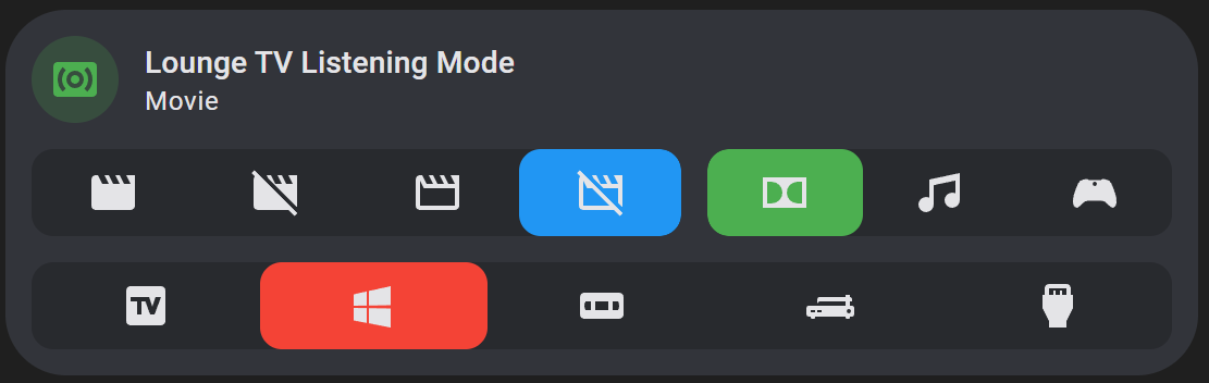
Example 4
Selectors for input selects. Note that the opacity of selector buttons is set to 0 by default, so they are completely transparent against the selector background.
features:
  - type: custom:service-call
    entries:
      - type: selector
        entity_id: input_select.lounge_tv_theater_mode
        options:
          - icon: mdi:movie
          - icon: mdi:movie-off
          - icon: mdi:movie-outline
          - icon: mdi:movie-off-outline
        style:
          '--color': var(--blue-color)
          flex-basis: 140%
      - type: selector
        entity_id: input_select.lounge_tv_listening_mode
        options:
          - icon: mdi:dolby
          - icon: mdi:music
          - icon: mdi:microsoft-xbox-controller
  - type: custom:service-call
    entries:
      - type: selector
        entity_id: input_select.lounge_tv_source
        options:
          - icon: mdi:television-box
          - icon: mdi:microsoft-windows
          - icon: mdi:vhs
          - icon: mdi:record-player
          - icon: mdi:video-input-hdmi
        style:
          '--color': var(--red-color)
type: tile
entity: input_select.lounge_tv_listening_mode
color: green
Example 5
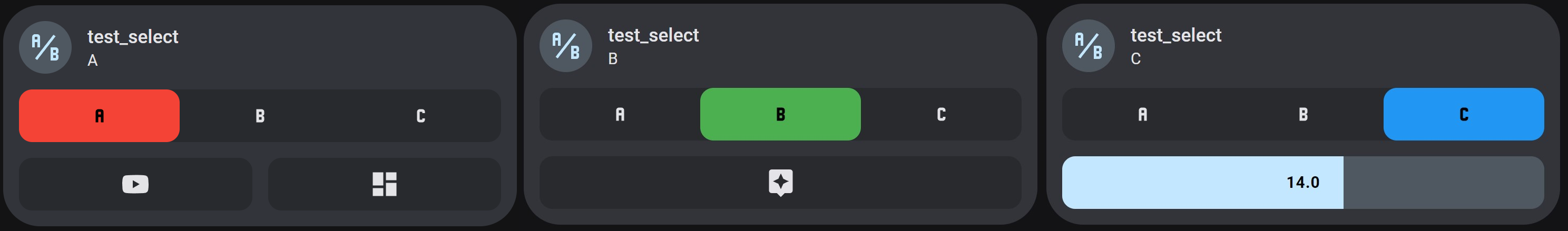
Using a selector to display different features.
features:
  - type: custom:service-call
    entries:
      - type: selector
        options:
          - option: A
            icon: mdi:alpha-a
            style:
              '--icon-color': >-
                {{ "var(--disabled-color)" if
                is_state(config.entity, config.option) }}
              '--color': var(--red-color)
          - option: B
            icon: mdi:alpha-b
            style:
              '--icon-color': >-
                {{ "var(--disabled-color)" if
                is_state(config.entity, config.option) }}
              '--color': var(--green-color)
          - option: C
            icon: mdi:alpha-c
            style:
              '--icon-color': >-
                {{ "var(--disabled-color)" if
                is_state(config.entity, config.option) }}
              '--color': var(--blue-color)
  - type: custom:service-call
    show: '{{ is_state(config.entity, "A") }}'
    entries:
      - type: button
        icon: mdi:youtube
        tap_action:
          action: url
          url_path: youtube.com
        double_tap_action:
          action: url
          url_path: play.spotify.com
      - type: button
        icon: mdi:view-dashboard
        tap_action:
          action: navigate
          navigation_path: /lovelace/0
        double_tap_action:
          action: navigate
          navigation_path: /lovelace-extra/0
  - type: custom:service-call
    show: '{{ is_state(config.entity, "B") }}'
    entries:
      - type: button
        icon: mdi:assistant
        tap_action:
          action: assist
  - type: custom:service-call
    show: '{{ is_state(config.entity, "C") }}'
    entries:
      - type: slider
        thumb: flat
        entity_id: input_number.slider_test
        label: '{{ value }}'
        style:
          '--label-color': var(--disabled-color)
type: tile
entity: input_select.test_select
show_entity_picture: false
vertical: false
color: accent
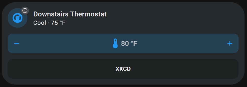
Example 6
A better looking temperature spinbox with hold on repeat, tile color, and an icon and label. Also an XKCD button that opens a different comic based on how long you hold it using momentary button mode.
features:
  - type: custom:service-call
    entries:
      - type: spinbox
        icon: mdi:thermometer
        label: '{{ value }}{{ unit }}'
        step: 1
        debounceTime: 1000
        value_from_hass_delay: 5000
        range:
          - '{{ state_attr("climate.downstairs_thermostat", "min_temp") }}'
          - '{{ state_attr("climate.downstairs_thermostat", "max_temp") }}'
        value_attribute: temperature
        unit_of_measurement: ' °F'
        tap_action:
          service: climate.set_temperature
          data:
            entity_id: climate.downstairs_thermostat
            temperature: '{{ value }}'
        hold_action:
          action: repeat
        style:
          '--background': var(--tile-color)
          '--icon-color': var(--tile-color)
          flex-flow: row
  - type: custom:service-call
    entries:
      - type: button
        label: XKCD
        momentary_end_action:
          action: url
          url_path: https://xkcd.com/{{ 1000* hold_secs }}
type: tile
entity: climate.downstairs_thermostat
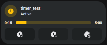
Example 7
A read only timer display with buttons and multiple labels.
features:
  - type: custom:service-call
    entries:
      - type: button
        value_attribute: elapsed
        label: >-
          {% set minutes = (value / 60) | int %} {% set seconds = (value - 60 *
          minutes) | int %} {{ minutes }}:{{ 0 if seconds < 10 else "" }}{{
          seconds | int }}
        style:
          overflow: visible
          height: 12px
          border-radius: 0px
          '--color': none
      - type: slider
        tap_action:
          action: none
        value_attribute: elapsed
        thumb: flat
        style:
          flex-basis: 1200%
          height: 10px
        step: 1
        range:
          - 0
          - >-
            {% set hms = state_attr(config.entity, "duration").split(":") %} {{
            (hms[0] |int ) * 3600 + (hms[1] | int) * 60 + (hms[2] | int)
            }}
      - type: button
        value_attribute: duration
        label: '{% set hms = value.split(":") %} {{ hms[1] | int }}:{{ hms[2] }}'
        style:
          overflow: visible
          height: 12px
          border-radius: 0px
          '--color': none
  - type: custom:service-call
    entries:
      - type: button
        icon: mdi:timer-check
        tap_action:
          action: call-service
          service: timer.start
          target:
            entity_id: timer.timer_test
      - type: button
        icon: mdi:timer-pause
        tap_action:
          action: call-service
          service: timer.pause
          target:
            entity_id: timer.timer_test
      - type: button
        icon: mdi:timer-cancel
        tap_action:
          action: call-service
          service: timer.cancel
          target:
            entity_id: timer.timer_test
type: tile
entity: timer.timer_test
 Nerwyn