android-tv-card
 android-tv-card copied to clipboard
 Nerwyn
Universal Customizable TV Remote Card, with HA actions, super configurable touchpad, slider, haptics, and keyboard
Android TV Remote Card


📦 This repo is a fork of tv-card, which is a fork of another tv-card merged with two other projects, and includes the same features and improvements usernein made along with a many other new features and improvements:
Ported to TypeScript
- Refactored to use proper types (no anys!) and separated large objects like the default keys and sources into their own files.
- Proper use of packages such as
lit-elementandcustom-card-helpers. - Separates out buttons, touchpad, and slider into separate lit elements for better stability and maintainability.
- Provides a clean base on which to add future features.
Redesigned for the Android TV Remote integration (but can be used for anything)
- Uses
remote.send_commandto send commands to an Android TV for all default keys and sources using Android TV Remote entity IDremote_id. - Navigation speed increased to be closer to (but not as crazy fast) as the Google TV remote.
Super customizable touchpad
-
Touchpad actions are now remappable by creating custom actions for
up,down,left,right, andcenter. - Alter touchpad CSS using
touchpad_style. - Touchpad style now follows theme.
- Touchpad haptics can now be toggled.
- Supports multi touch gestures for all swipe directions and the center tap, meaning you can program the touchpad with up to twenty-two different actions.
Tap, double tap, hold tap, momentary, and multi-touch actions support for buttons and touchpad on all platforms
- All buttons and the touchpad
centercommand support tap, double tap, and long tap custom actions.- Using the Home Assistant actions syntax.
- Supports the actions
call-service,navigate,url,assist,more-info, andnone, card specific actionskeyandsource, and browser-mod popup cardfire-dom-event. - Double tap actions are not configured by default but can be set on any button or the touchpad.
- If configured then there will be a default 200ms window before the single tap action is triggered.
- The double tap action window can be changed by setting
double_tap_windowglobally in the root of the config or for a specific custom action.
- Hold actions can be set to either their own action or to repeat the tap action ten times a second by setting action to
repeat.- Time to trigger a hold action can be changed by setting
hold_timeglobally in the root of the config or for a specific custom action. - Hold actions for default keys
up,down,left,right,volume_up,volume_down,delete, andforward_deleteare set torepeatby default but can be changed using custom actions. - Time between repeats can be changed by setting
repeat_delayglobally in the root of the config or for a specific custom action.
- Time to trigger a hold action can be changed by setting
- Configure the touchpad to perform alternate actions by using multiple fingers.
- Use buttons and the touchpad in an alternate momentary mode where different actions are fired on the initial press and release.
Better row handling and columns
- Rows exist in a
rowsarray with no limit on the number of rows you can add. - Sliders and touchpads can now be placed in rows alongside other buttons.
- For special volume and navigation features use
vol_buttons,slider,dpad, andtouchpadas button names within a row.
- For special volume and navigation features use
- Empty buttons are no longer clickable.
- Create columns by creating an array within a row array (see examples). Create an array within that array to create another row. Experiment with nesting rows and columns to make weird remote layouts.
Better button and icon handling
- Many more default keys and sources with SVG icons for sources with no material design icon present in Home Assistant's default material design icon list.
- Not all default keys and sources are working or tested at this time, please let me know if you find the correct source/activity names for the ones that are incorrect.
- Also let me know if you find a key or source that is not listed here and you want to add to the default lists!
- Custom actions that replace default ones will now inherit the default icons and tap actions if no new ones are given.
- Default svg icons provided in this card can be used for custom actions by referencing them by name.
- Alter CSS of all buttons using
button_style. - Alter CSS of an individual button by including a
styleobject in a custom action. - Button haptics can now be toggled globally or on the individual custom action level.
Fully native slider
-
Slider has been replaced with a native solution rather than an embedding an external card.
- Greatly improves the stability of the slider as it now renders consistently with the rest of the card.
- Slider is now animated like Home Assistant tile and Mushroom sliders.
- Slider purpose can be changed by creating a custom action for
slider. - Alter CSS of slider by using the
stylefield in theslidercustom action. - Change slider range, step size, and value attribute to work with different entities and services.
- Range defaults to [0,1] but can be changed for media players that use different volume ranges.
- Step defaults to one hundredth of slider range.
- Value attribute defaults to state but can instead be used to track any numeric attribute of an entity.
- Slider style now follows theme.
- Slider has a tooltip which shows up when the slider is held down on which displays it's current value.
Keyboard support
- Send text to text input fields on your Android TV using
androidtv.adb_commandby setting the media player entity ID created by the Android Debug Bridge integration tokeyboard_id. - Includes three different methods:
-
Seamless text entry - Create and press the button
keyboardto pull up the on screen keyboard (on mobile, otherwise use your physical keyboard) and send keystrokes seamlessly to your Android TV.- Also works with backspace, delete, enter, and left and right keys.
-
Bulk text entry - Create and press the button
textboxto pull up a browser prompt in which you can type in text to send to your Android TV all at once.- Highly recommended that you also create buttons for
deleteandenterso you can remove and send your input text.
- Highly recommended that you also create buttons for
-
Google Assistant search - Create and press the button
searchto pull up a browser prompt in which you can type in text to send to your Android TV to process as a Google Assistant search.- Works well if you are experiencing this issue.
-
Seamless text entry - Create and press the button
- Can also be used for Fire TV, Kodi, and Roku (see below)
Template support
- Supports Home Assistant jinja2 style templating using nunjucks.
- Uses the same syntax as normal Home Assistant templating with a subset of functions.
Many thanks to the original authors. Getting this to work with Android TV was straightforward and all of the frontend heavy lifting they did has provided an excellent base on which to build my personal ultimate Android TV remote.
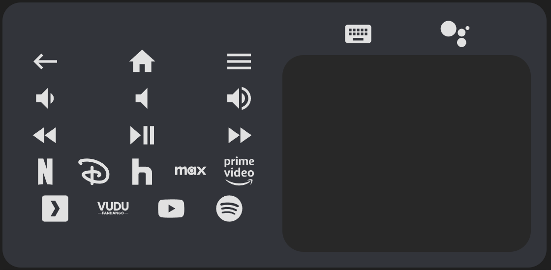
Demo
type: custom:android-tv-card
remote_id: remote.google_chromecast
slider_id: media_player.google_chromecast
keyboard_id: media_player.google_chromecast_adb
title: Example
rows:
  - - back
    - power
    - home
  - - keyboard
    - search
    - slider
  - - - netflix
      - null
      - youtube
      - null
      - spotify
    - touchpad
  - - previous
    - play_pause
    - next
Installation
Step 1
This project is now available on HACS! Search for it under frontend repositories.
Step 2
When in edit mode on a lovelace view, click add card and search for Android TV Card. Create a remote config like the below examples.
type: custom:android-tv-card
remote_id: remote.google_chromecast
slider_id: media_player.google_chromecast
rows:
  - - power
    - channel_up
    - info
    - channel_down
  - - netflix
    - youtube
    - spotify
  - - slider
  - - touchpad
  - - back
    - home
    - tv
  - - rewind
    - play_pause
    - fast_forward
Options
Basic
| Name | Type | Description |
|---|---|---|
| type | string | Must be custom:android-tv-card |
| title | string | Title to display in the card header. |
| remote_id | string | The remote entity id to control, required for default key and source actions. Also autofills into service call data when autofill_entity_id is set to true. |
| media_player_id | string | A media_player entity ID to autofill into service call data when autofill_entity_id is set to true. Also populates slider_id if it is not present and autofills for the kodi and denonavr domains. |
| autofill_entity_id | boolean | Enable autofilling of the entity ID of remote and media_player service calls if no target IDs are provided, defaults to false. |
All fields are technically optional except for type, but the card will not function unless you customize it using the above options.
Using only these options you will get an empty card (or almost empty, if you set a title).
Buttons
| Name | Type | Description |
|---|---|---|
| rows | string[] | Defines the buttons used in the card. Each row within rows defines a row of buttons (or slider and touchpad). Sub-arrays within these rows will display as columns, and sub-arrays within those will alternate between rows and columns. |
| button_haptics | boolean | Enable haptics on the buttons, defaults to true. |
| button_style | object | CSS style to apply to all buttons. |
| hold_time | number | The time needed to trigger a hold action when holding down a button or the touchpad. Defaults to 500ms. |
| repeat_delay | number | The delay between repeats for actions configured to repeat when held (buttons and touchpad swipes). Defaults to 100ms. |
| double_tap_window | number | The window of time in which a double tap can be triggered before a single tap is triggered isntead. Defaults to 200ms. |
In order to include the buttons, you need to specify in the config the rows you want and which buttons you want in it. You do it by declaring the rows as arrays and its buttons as values. See this file for a list of default keys, and this file for a list of default sources.
rows:
  - - power
  - - rewind
    - play_pause
    - fast_forward
There is no hard limit to the number of rows, columns, or buttons you can add.
Button Style
You can declare a global button style using the button_style option, like so.
button_style:
  '--size': 32px
  color: var(--secondary-text-color)
Example options:
| Name | Description |
|---|---|
| --size | Sets the width and height of the button icon and all of it's sub elements. |
| color | Color of the button. |
| background-image | Image to set the button to. Use with background-size: contain, background-repeat: no-repeat, and background-position: center. |
Special Elements
This card also supports the following special button shortcuts and elements which can be added to any row or column. slider and touchpad will be further explained below.
| Name | Type | Description |
|---|---|---|
| vol_buttons, volume_buttons | buttons | Shorthand to generate a set of volume down, volume mute, and volume up buttons in a row or column. |
| dpad, d_pad, direction_pad, nav_buttons, navigation_buttons | buttons | Shorthand to generate a set of up, down, left, right, and center buttons arranged in a d-pad across three rows within a column. |
| slider, volume_slider | slider | A slider that controls the entity defined by slider_id. |
| touchpad, nav_touchpad, navigation_touchpad | touchpad | A touchpad that functions the same as navigation buttons but uses swipe actions instead. |
Custom Actions
| Name | Type | Description |
|---|---|---|
| custom_actions | object | Custom actions for the remote control. Each item is an object that can optionally have an icon (will use original key icon if overwriting an existing one and icon is not provided) and at least one of the following properties: tap_action, hold_action, double_tap_action, momentary_start_action, momentary_end_action. |
If you want to add custom buttons to the remote control (or if you want to reconfigure the existing buttons or touchpad actions), you can do it by adding an object to the custom_actions object. Each object should contain one or more of either tap_action, hold_action, and or double_tap_action.
| Name | Type | Description |
|---|---|---|
| icon | string | Name of an icon to use. If overriding a default action uses the default icon if not defined |
| haptics | boolean | Enable haptics on a specific action (does not apply to touchpad), defaults to true. |
| confirmation | boolean or object | Whether to display a browser confirmation popup or not before executing an action. See here for more information. |
| tap_action | object | Action to perform on single tap. |
| hold_action | object | Action to perform when held. Can also be set to repeat to repeat the tap action when held. |
| double_tap_action | object | Action to perform when double tapped. Adding this introduces a delay to single tap actions and is therefore not configured by default. |
| momentary_start_action | object | Action to perform when the button is initially held down. If configured normal tap and hold actions will not trigger. |
| momentary_end_action | object | Action to perform when the button is released. |
custom_actions:
  input_tv:
    icon: mdi:television-classic
    tap_action:
      action: key
      key: tv
  browser:
    icon: mdi:web
    tap_action:
      action: source
      source: browser
  toggle_light:
    icon: mdi:lightbulb
    tap_action:
      action: call-service
      service: light.toggle
      target:
        entity_id: light.bedroom
  to_hass_home:
    icon: mdi:view-dashboard
    tap_action:
      action: navigate
      navigation_path: /lovelace/0
    double_tap_action:
      action: navigate
      navigation_path: /lovelace/1
    hold_action:
      action: navigate
      navigation_path: /lovelace/2
  volume_up:
    hold_action:
      action: call-service
      service: media_player.volume_set
      data:
        entity_id: media_player.google_tv
        volume_level: 1
Then you can easily use these buttons in your card:
rows:
  - - browser
    - power
    - input_tv
  - - rewind
    - play_pause
    - fast_forward
    - toggle_light
With custom actions you can override existing buttons for changing its icon or even its functionality. Here I do both:
custom_actions:
  power:
    icon: mdi:power-cycle
    tap_action:
      action: call-service
      service: media_player.toggle
      target:
        entity_id: media_player.tv
You can also reference the default icons provided with this card for default sources for other keys and sources by using the names in the linked file.
custom_actions:
  discovery:
    icon: discovery
    tap_action:
      action: call-service
      service: media_player.select_source
      data:
        source: discovery+
      target:
        entity_id: media_player.appletv
Adjustable Timings
Hold Time
Hold actions are triggered by holding down on a button or the touchpad. The default amount of time is 500ms. You can change this by setting hold_time in the hold action to a different number, or globally by setting it in the remote config root.
hold_time: 1000
custom_actions:
to_hass_home:
  icon: mdi:view-dashboard
  hold_action:
    action: navigate
    navigation_path: /lovelace/2
    hold_time: 600
Repeat and Repeat Delay
The following default keys have hold actions set to repeat by default. You can disable this by setting their hold actions to none or a different action.
- up
- down
- left
- right
- volume_up
- volume_down
- delete
- forward_delete
custom_actions:
  toggle_light:
    icon: mdi:lightbulb
    tap_action:
      action: call-service
      service: light.toggle
      target:
        entity_id: light.bedroom
    hold_action:
      action: repeat
  volume_up:
    hold_action:
      action: call-service
      service: media_player.volume_set
      data:
        entity_id: media_player.google_tv
        volume_level: 1
  volume_down:
    hold_action:
      action: none
By setting a hold action to repeat, the tap action will repeat while the button is held down. The default delay between repeats is 100ms. You can change this by setting repeat_delay in the hold action to a different number, or globally by setting it in the remote config root. See the below section on repeat for more.
Double Tap Window
Double tap actions have a default window of 200ms to trigger before a single tap action is triggered instead. You can change this by setting double_tap_window in the double tap action to a different number, or globally by setting it in the remote config root.
double_tap_window: 300
custom_actions:
  to_hass_home:
    icon: mdi:view-dashboard
    double_tap_action:
      action: navigate
      navigation_path: /lovelace/1
    double_tap_window: 400
NOTE: Setting double_tap_window above or too close to hold_time can result in undesirable behavior, as the hold timer expires before the double tap window does.
Action Types
Actions follow the Home Assistant actions syntax. It supports a subset of Home Assistant actions along with key and source, which are shorthands for remote service calls.
| Action | Description |
|---|---|
| key | Send a key to send to the TV via the service call remote.send_command. |
| source | Switch to a source via the service call remote.turn_on. |
| call-service | Call any Home Assistant service. |
| navigate | Navigate to another Home Assistant page. |
| url | Navigate to an external URL. |
| assist | Open the assist dialog. Uses the mobile dialog if available, like in the Home Assistant app. |
| more-info | Open the more info dialog. |
| fire-dom-event | Fire a browser dom event using whatever information is in the Action object. Useful for opening browser-mod popup cards. |
| repeat | Repeat the tap_action ten times a second while held. Only applicable to hold_action, acts as none if used in tap_action or double_tap_action. |
| none | Explicilty set a command to do nothing. |
Most actions have a set of possible options associated with them. If action is not provided the card will guess which type of action it is by the options used.
key
| Name | Description |
|---|---|
| key | Android TV key. While most Android TV remote keys are already defined as default keys, you can find a list of supported commands here. |
custom_actions:
  menu:
    icon: mdi:menu
    tap_action:
      action: key
      key: MENU
    hold_action:
      action: key
      key: HOME
By default, hold actions on default keys adds hold_secs: 0.5 to the data sent with the remote.send_command service call. Creating a hold_action on a key action overwrites this.
source
| Name | Description |
|---|---|
| source | Android TV app. See here for a guide on Android TV app deep links. |
custom_actions:
  netflix:
    icon: mdi:netflix
    tap_action:
      action: source
      source: netflix://
call-service
| Name | Description |
|---|---|
| service | The service to call. Use the format domain.service, e.g. "light.turn_on". |
| data | Additional data to pass to the service call. See the Home Assistant documentation or go to Developer Tools > Services to see available options for each service. |
| target | The entity IDs, device IDs, or area IDs to call the service on. |
data and target get internally merged into one object and can be used together or interchangeably. You can safely put all information into one object with any of these names. This was done so that you can easily design service calls using Home Assistant's service developer tool and copy the YAML to custom button configurations in this card.
custom_actions:
  toggle_light:
    icon: mdi:lightbulb
    tap_action:
      action: call-service
      service: light.toggle
      target:
        entity_id: light.theater
    double_tap_action:
      action: call-service
      service: light.turn_on
      target:
        entity_id: light.theater
      data:
        brightness_pct: 10
    hold_action:
      action: call-service
      service: light.turn_off
      target:
        entity_id: light.theater
navigate
| Name | Description |
|---|---|
| navigation_path | Home Assistant page to navigate to. |
| navigation_replace | Whether to replace the current page in the history with the new URL. |
custom_actions:
  to_hass_home:
    icon: mdi:view-dashboard
    tap_action:
      action: navigate
      navigation_path: /lovelace/0
    double_tap_action:
      action: navigate
      navigation_path: /lovelace/1
    hold_action:
      action: navigate
      navigation_path: /lovelace/2
url
| Name | Description |
|---|---|
| url_path | External website to navigate to. |
custom_actions:
  google:
    icon: mdi:google
    tap_action:
      action: url
      url_path: https://www.google.com
assist
The following options are only available in the mobile assist dialog.
| Name | Description |
|---|---|
| pipeline_id | Assist pipeline id to use. |
| start_listening | If supported, listen for voice commands when opening the assist dialog. |
more-info
| Name | Description |
|---|---|
| data.entity_id | The entity ID to open the more info dialog for. |
fire-dom-event
| Name | Description |
|---|---|
| browser_mod | A field expected by browser mod for popups. |
custom_actions:
  map:
    icon: mdi:map
    tap_action:
      action: fire-dom-event
      browser_mod:
        service: browser_mod.more_info
        data:
          large: true
          entity: zone.home
          ignore_popup_card: false
        target:
          entity: THIS
repeat
| Name | Description |
|---|---|
| repeat_delay | Milliseconds between repeats. Defaults to 100ms. Can also be set globally in the config root. |
The tap_action must be defined, whether by the default key or as a custom action.
repeat_delay: 200 # defaults to 100, applies to all actions (custom or not) unless redefined within custom action
custom_actions:
  channel_up:
    hold_action:
      action: repeat # channel up default tap action will now repeat while held
  toggle_light:
    icon: mdi:lightbulb
    tap_action:
      action: call-service
      service: light.toggle
      target:
        entity_id: light.theater
    hold_action:
      action: repeat # light will be toggled repeatedly while held
    repeat_delay: 1000
none
None. This action does nothing.
custom_actions:
  volume_up:
    hold_action:
      action: none # volume up will no longer repeat while held
  back:
    tap_action:
      action: none # you can no longer go back
Momentary Button Mode
As an alternative to the normal tap, hold, and double tap actions, buttons can also be used in a momentary mode. Configuring this option disables the normal tap, hold, and double tap actions.
momentary_start_action is fired when you first press down on a button (or center of touchpad). momentary_end_action is fired when you release the button or touchpad. While these are meant to be used together you can use one or the other.
custom_actions:
  momentary_light:
    icon: mdi:ceiling-light
    momentary_start_action:
      action: call-service
      service: light.turn_on
      data:
        entity_id: light.sunroom_ceiling
    momentary_end_action:
      action: call-service
      service: light.turn_off
      data:
        entity_id: light.sunroom_ceiling
Using buttons (and touchpad center) in momentary mode also allows you to send the number of seconds elapsed in momentary_end_action by setting a data key value to HOLD_SECS.
custom_actions:
  fast_forward:
    momentary_end_action:
      action: call-service
      service: remote.send_command
      data:
        entity_id: remote.google_tv
        command: MEDIA_FAST_FORWARD
        hold_secs: HOLD_SECS
Custom Button Style
You can define an icon and CSS style for each button.
| Option | Description |
|---|---|
| icon | The icon to show in the button. Can be a Home Assistant built in mdi icon, an icon defined by another custom integration, or a custom icon as shown below. |
| style | CSS style to apply to this specific button. Is applied on top of button_style. |
If an icon is not provided for a custom key or source that overwrites a predefined key or source, the original icon will be used instead.
Custom Icons
| Name | Type | Description |
|---|---|---|
| custom_icons | object | Custom icons for the remote control. Defined using svg paths. |
You can customize any icon with a custom svg path using the custom_icons option.
Usage:
custom_icons:
  <button>: <svg_path>
Example:
custom_icons:
  hbo: >-
    M7.042 16.896H4.414v-3.754H2.708v3.754H.01L0
    7.22h2.708v3.6h1.706v-3.6h2.628zm12.043.046C21.795 16.94 24 14.689 24
    11.978a4.89 4.89 0 0 0-4.915-4.92c-2.707-.002-4.09 1.991-4.432
    2.795.003-1.207-1.187-2.632-2.58-2.634H7.59v9.674l4.181.001c1.686 0
    2.886-1.46 2.888-2.713.385.788 1.72 2.762 4.427 2.76zm-7.665-3.936c.387 0
    .692.382.692.817 0 .435-.305.817-.692.817h-1.33v-1.634zm.005-3.633c.387 0
    .692.382.692.817 0 .436-.305.818-.692.818h-1.33V9.373zm1.77
    2.607c.305-.039.813-.387.992-.61-.063.276-.068 1.074.006
    1.35-.204-.314-.688-.701-.998-.74zm3.43 0a2.462 2.462 0 1 1 4.924 0 2.462
    2.462 0 0 1-4.925 0zm2.462 1.936a1.936 1.936 0 1 0 0-3.872 1.936 1.936 0 0 0
    0 3.872Z
You can also paste the entire SVG path onto one line.
The svg path was copied from SimpleIcon. Although you can use this integration for using icons from SimpleIcons (there's also one for fontawesome).
I highly recommend using a service like iLoveIMG Resize SVG to resize any icons you find to 24x24 pixels so that they render correctly, and this SVG path editor to modify the icons to properly fit within the 24x24 pixel window.
Having defined the custom icon, you can use it on any custom button:
custom_actions:
  max:
    icon: hbo
    tap_action:
      source: hbomax://deeplink
You can also put the icon svg directly in the custom action.
custom_actions:
  max:
    icon: >-
      M7.042 16.896H4.414v-3.754H2.708v3.754H.01L0
      7.22h2.708v3.6h1.706v-3.6h2.628zm12.043.046C21.795 16.94 24 14.689 24
      11.978a4.89 4.89 0 0 0-4.915-4.92c-2.707-.002-4.09 1.991-4.432
      2.795.003-1.207-1.187-2.632-2.58-2.634H7.59v9.674l4.181.001c1.686 0
      2.886-1.46 2.888-2.713.385.788 1.72 2.762 4.427 2.76zm-7.665-3.936c.387 0
      .692.382.692.817 0 .435-.305.817-.692.817h-1.33v-1.634zm.005-3.633c.387 0
      .692.382.692.817 0 .436-.305.818-.692.818h-1.33V9.373zm1.77
      2.607c.305-.039.813-.387.992-.61-.063.276-.068 1.074.006
      1.35-.204-.314-.688-.701-.998-.74zm3.43 0a2.462 2.462 0 1 1 4.924 0 2.462
      2.462 0 0 1-4.925 0zm2.462 1.936a1.936 1.936 0 1 0 0-3.872 1.936 1.936 0 0 0
      0 3.872Z
    tap_action:
      source: hbomax://deeplink
Slider
| Name | Type | Description |
|---|---|---|
| slider_id | string | The entity id to use for the slider. |
| value_from_hass_delay | number | The time the feature will wait after firing an action before it starts retrieving values from Home Assistant again. Useful for preventing bouncing between new and old values if an entity takes a while to update. Defaults to 1000ms. |
By default the slider calls the media_player.volume_set service, with entity_id set to slider_id and volume_level set to the slider value.
You can change this by creating a custom action for slider. Set the value which you wish to set using the slider to '{{ VALUE }}'.
custom_actions:
  slider:
    tap_action:
      service: light.turn_on
      data:
        entity_id: light.sunroom_ceiling
        brightness: '{{ VALUE }}'
    range:
      - 0
      - 255
    step: 1
    value_attribute: brightness
    value_from_hass_delay: 2000
You can change several other attributes of the slider by setting them in a custom action for the slider.
| Name | Type | Description |
|---|---|---|
| value_attribute | string | An entity attribute (or state) for the slider to track, defaults to volume_level |
| range | [number, number] | The range of the slider, defaults to [0,1]. |
| step | number | The step size of the slider, defaults to one hundredth of the range. |
You can change the entity attribute that the slider tracks by setting value_attribute to either state or an entity specific attribute. If the attribute which you wish to use is an array, you can also further include the index at the end of the attribute name in brackets (like hs_color[0]).
Some additional logic is applied for certain value_attribute values:
-
brightness- Converted from the default range of 0-255 to 0-100. -
media_position- Updated twice a second using the current timestamp and the attributemedia_position_updated_atwhen the entity state isplaying, and locked to a max value using the attributemedia_duration.
custom_actions:
slider:
  value_attribute: brightness
While most Home Assistant media players use a volume range of [0,1], you can change this as needed by setting range.
custom_actions:
  slider:
    range:
      - 0
      - 0.6
By default the slider will have 100 steps with step size calculated using the range. You can change the step size by setting step.
custom_actions:
  slider:
    step: 1
Slider Style
Similar to how styles can be set for each custom action, it can be used to change the CSS of the slider. Slider also utilizes the following custom properties.
| Name | Description |
|---|---|
| --color | Color of the slider thumb / percentage on. |
| --background | Slider background color. |
| --height | Slider thumb / percentage on height. |
| --background-height | Slider background height. Maximum is constrained by the foreground height. |
| --border-radius | Border radius of the entire slider. |
| --tooltip-label | Tooltip label template, defaults to {{ VALUE }}. |
| --tooltip-offset | Tooltip offset from center, defaults to {{ OFFSET }}px. |
| --tooltip-transform | Tooltip location transform function, defaults to translateX(var(--tooltip-offset)). |
| --tooltip-display | Tooltip display value, set to none to hide tooltip, defaults to initial. |
Touchpad
Touchpad style and haptics can be set at the root level.
| Name | Type | Description |
|---|---|---|
| touchpad_style | object | CSS style to appy to the touchpad. |
| touchpad_haptics | boolean | Enable haptics on the touchpad, defaults to true. |
Touchpad Style
| Name | Description |
|---|---|
| height | Height of the touchpad, including units. Defaults to 250px. |
| background | Color of the touchpad. Follows theme by default. |
| background-image | Image to overlay on the touchpad. Use with background-size: contain, background-repeat: no-repeat, and background-position: center. |
| opacity | Opacity of the touchpad. |
Custom Touchpad Commands
The touchpad can be customized using custom_actions so that it can be used with other devices. The touchpad acts as a center button but also supports touch swipes to send the keys up, down, left, and right. You can remap touchpad commands by creating custom actions for these actions. This includes remapping the center key hold and double tap actions, along with turning the touchpad into a momentary button.
Like buttons, double tap actions introduces a 200ms delay to single taps, and the hold action default adds hold_secs: 0.5 to the remote.send_command data. Double tap and hold actions cannot be added to touchpad directional swipes, just the center action.
In addition to regular tap, hold, and double tap actions, the touchpad can also be programmed with multi touch actions by creating custom actions for multi_tap_action, multi_hold_action, and multi_double_tap_action. These actions are triggered by perform a tap, double tap, or hold tap action with more than one finger for center, or a single swipe or hold swipe with more than one finger for up, down, left, and right.
media_player_id: media_player.kodi
autofill_entity_id: true
custom_actions:
  up:
    tap_action:
      service: kodi.call_method
      data:
        method: Input.Up
    multi_tap_action:
      service: kodi.call_method
      data:
        method: Application.SetVolume
        volume: increment
  down:
    tap_action:
      service: kodi.call_method
      data:
        method: Input.Down
    multi_tap_action:
      service: kodi.call_method
      data:
        method: Application.SetVolume
        volume: decrement
  left:
    tap_action:
      service: kodi.call_method
      data:
        method: Input.Left
  right:
    tap_action:
      service: kodi.call_method
      data:
        method: Input.Right
  center:
    tap_action:
      service: kodi.call_method
      data:
        method: Input.Select
    double_tap_action:
      service: kodi.call_method
      data:
        method: Input.Back
    hold_action:
      service: kodi.call_method
      data:
        method: Input.ContextMenu
    multi_tap_action:
      action: call-service
      service: kodi.call_method
      data:
        method: Player.PlayPause
        playerid: 1
    multi_hold_action:
      action: call-service
      service: kodi.call_method
      data:
        method: Input.Home
    multi_double_tap_action:
      action: call-service
      service: kodi.call_method
      data:
        method: Input.Info
Keyboard
| Name | Type | Description |
|---|---|---|
| keyboard_id | string | The entity id to use to send keyboard events. Requires the Android Debug Bridge integration for Android TV, and other media platform integration for other supported ones. |
| keyboard_mode | string | The media platform type for sending keyboard commands. Defaults to ANDROID TV. Also supports FIRE TV, KODI, and ROKU. |
You can use the Android Debug Bridge integration with this card to send text to your Android TV (by default, see below for alternate media platforms). This card includes three different methods for sending text to Android TV.
Methods
To use the keyboard, create one of three buttons based on the keyboard method you want to use.
Seamless Text Entry
Send text to Android TV in seamlessly by creating a button named keyboard. Clicking on it will activate several listeners which will send any text you type to the Android TV, along with backspace, delete, enter, left, and right commands (note that the latter two may not behave as expected depending on where the cursor is on the Android TV). You can also paste by holding clicking CTRL + V while the keyboard is active or holding down and selecting paste on the keyboard button itself. You may experience some delay as keys are being sent to Android TV as they are being sent one at a time by ADB. Tip: Put the keyboard button at the top of your card so that your screen does not shift to keep it in focus when the on screen keyboard opens.
type: custom:android-tv-card
remote_id: remote.google_chromecast
keyboard_id: media_player.google_chromecast_adb
rows:
  - - back
    - home
    - play_pause
  - - keyboard
    - search
  - - touchpad
Bulk Text Entry
Send text to Android TV in bulk by creating a button named textbox. Clicking on it will create a text prompt in which you can enter the text which you wish to send. It is highly recommended that you also create keys for delete and enter so you can easily delete the text you send and quickly search using it.
type: custom:android-tv-card
remote_id: remote.google_chromecast
keyboard_id: media_player.google_chromecast_adb
rows:
  - - back
    - home
    - play_pause
  - - vol_buttons
  - - touchpad
  - - delete
    - textbox
    - enter
Google Assistant Search
Send text to Android TV to be processed as a Google Assistant global search by creating a button named search. Clicking on it will create a text prompt in which you can enter text you wish to search for using Google Assistant on Android TV. This method cannot be used to enter text into text fields on Android TV, but does work if you are experiencing this issue which prevents the on screen keyboard from appearing, and therefore search from being triggered.
Alternate Media Platform Support
You can also use the keyboard to send text on the following alternate platforms by setting keyboard_id to the entity ID of the platform and keyboard_mode to one of the following:
| Media Platform | Info |
|---|---|
ANDROID TV |
Default, not required if using Android TV |
FIRE TV |
Mostly the same as Android TV, but uses ADB to send backspace, delete, enter, and left/right arrow commands. |
KODI |
Does not support backspace, delete, enter, left, and right but these can be used with the on screen keyboard. Seamless mode does not work as the Kodi Input.SendText method clears the textbox before sending text. |
ROKU |
Uses the Roku remote entity ID for seamless and bulk modes, and the Roku media player ID for global search. Either one can be provided as the keyboard ID, but the other must be provided as the remote or media player ID in order to support all three keyboard modes. Does not support the delete key. |
More may be added as requested if there is a way to do so through their Home Assistant (or possibly community made) integrations.
Templating
All fields support nunjucks templating. Nunjucks is a templating engine for JavaScript, which is heavily based on the jinja2 templating engine which Home Assistant uses. While the syntax of nunjucks and jinja2 is almost identical, you may find the nunjucks documentation useful. Please see the ha-nunjucks repository for a list of available functions. If you want additional functions to be added, please make a feature request on that repository, not this one.
Examples and Alternate Media Platforms
Example 1
Playing with order, moving and repeating buttons.
type: custom:android-tv-card
remote_id: remote.google_chromecast
slider_id: media_player.google_chromecast
title: Example 1
rows:
  - - power
  - - back
    - home
    - tv
    - netflix
  - - youtube
    - spotify
    - netflix
  - - touchpad
  - - slider
  - - channel_up
    - channel_down
    - info
  - - rewind
    - play
    - spotify
    - pause
    - fast_forward
Result:
Example 2
Buttons, buttons everywhere!
type: custom:android-tv-card
remote_id: remote.google_chromecast
slider_id: media_player.google_chromecast
title: Example 2
rows:
  - - power
    - channel_up
    - info
    - channel_down
  - - netflix
    - youtube
    - spotify
  - - vol_buttons
  - - dpad
  - - back
    - home
    - tv
  - - rewind
    - play
    - pause
    - fast_forward
Result:
Example 3
Using less.
type: custom:android-tv-card
remote_id: remote.google_chromecast
slider_id: media_player.google_chromecast
title: Example 3
rows:
  - - power
    - netflix
    - youtube
    - spotify
  - - slider
  - - touchpad
  - - back
    - home
Result:
Example 4
In any row, if you add an empty or null item, there will be an empty button sized space.
type: custom:android-tv-card
rows:
  - - back
    - home
    - tv
  - - rewind
    - null
    - null
    - fast_forward
Example 5
A tablet UI using columns.
type: custom:android-tv-card
remote_id: remote.google_chromecast
rows:
  - - - - back
        - null
        - home
        - null
        - menu
      - - volume_down
        - null
        - volume_mute
        - null
        - volume_up
      - - rewind
        - null
        - play_pause
        - null
        - fast_forward
      - - netflix
        - disney
        - hulu
        - max
        - primevideo
      - - plex
        - vudu
        - youtube
        - spotify
    - - - keyboard
        - search
      - - touchpad
touchpad_style:
  height: 300px
Result:
Example 6
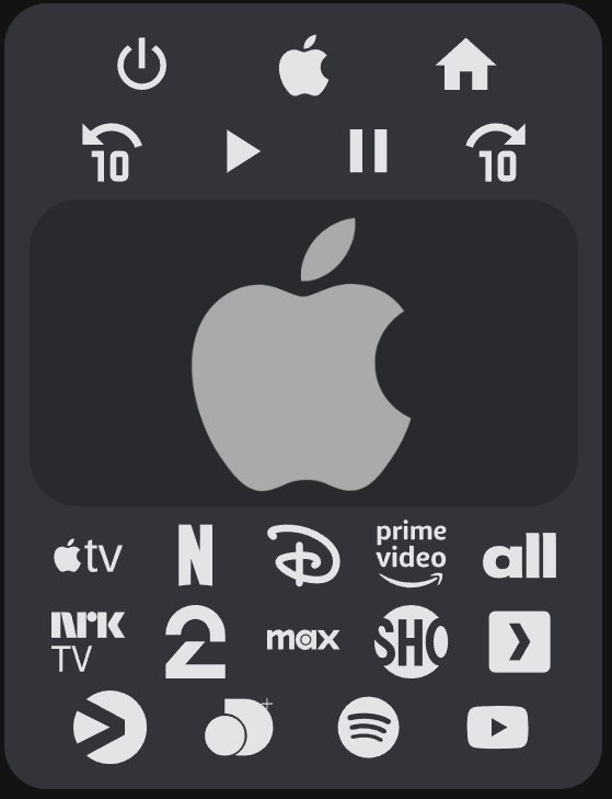
Apple TV.
type: custom:android-tv-card
remote_id: remote.appletv
media_player_id: media_player.appletv
autofill_entity_id: true
rows:
  - - power
    - menu
    - home
  - - skip-backward
    - play
    - pause
    - skip-forward
  - - touchpad
  - - appletv
    - netflix
    - disney
    - primevideo
    - allente
  - - nrktv
    - tv2play
    - max
    - skyshowtime
    - plex
  - - viaplay
    - discovery
    - spotify
    - youtube
touchpad_style:
  height: 200px
  background-image: url("https://upload.wikimedia.org/wikipedia/commons/thumb/1/1b/Apple_logo_grey.svg/505px-Apple_logo_grey.svg.png")
  background-size: 150px
  background-repeat: no-repeat
  background-position: center
  opacity: 1.0
custom_actions:
  power:
    icon: mdi:power
    tap_action:
      action: key
      key: wakeup
    hold_action:
      action: key
      key: suspend
  menu:
    icon: mdi:apple
    tap_action:
      action: key
      key: menu
  home:
    tap_action:
      action: key
      key: home
    hold_action:
      action: more-info
  skip-backward:
    icon: mdi:rewind-10
    tap_action:
      action: key
      key: skip_backward
  skip-forward:
    icon: mdi:fast-forward-10
    action: key
    key: skip_forward
  play:
    tap_action:
      action: key
      key: play
  pause:
    tap_action:
      action: key
      key: pause
  up:
    tap_action:
      action: key
      key: up
  down:
    tap_action:
      action: key
      key: down
  left:
    tap_action:
      action: key
      key: up
  right:
    tap_action:
      action: key
      key: right
  center:
    tap_action:
      action: key
      key: select
    double_tap_action:
      action: key
      key: menu
  primevideo:
    tap_action:
      action: call-service
      service: media_player.select_source
      data:
        source: Prime Video
  netflix:
    tap_action:
      action: call-service
      service: media_player.select_source
      data:
        source: Netflix
  spotify:
    tap_action:
      action: call-service
      service: media_player.select_source
      data:
        source: Spotify
  disney:
    tap_action:
      action: call-service
      service: media_player.select_source
      data:
        source: Disney+
  youtube:
    tap_action:
      action: call-service
      service: media_player.select_source
      data:
        source: YouTube
  appletv:
    tap_action:
      action: call-service
      service: media_player.select_source
      data:
        source: TV
  max:
    tap_action:
      action: call-service
      service: media_player.select_source
      data:
        source: HBO Max
  skyshowtime:
    tap_action:
      action: call-service
      service: media_player.select_source
      data:
        source: SkyShowtime
  plex:
    icon: mdi:plex
    tap_action:
      action: call-service
      service: media_player.select_source
      data:
        source: Plex
  discovery:
    icon: discovery
    tap_action:
      action: call-service
      service: media_player.select_source
      data:
        source: discovery+
  viaplay:
    icon: viaplay
    tap_action:
      action: call-service
      service: media_player.select_source
      data:
        source: Viaplay
  tv2play:
    icon: tv2play
    tap_action:
      action: call-service
      service: media_player.select_source
      data:
        source: TV 2 Play
  nrktv:
    icon: nrktv
    tap_action:
      action: call-service
      service: media_player.select_source
      data:
        source: NRK TV
  allente:
    icon: allente
    tap_action:
      action: call-service
      service: media_player.select_source
      data:
        source: Allente
Result:
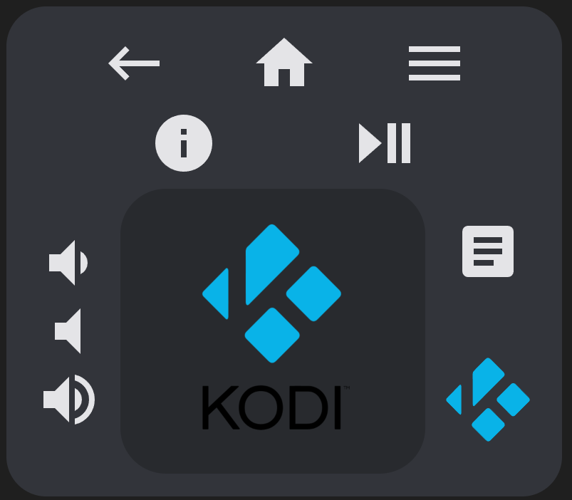
Example 7
Kodi with keyboard and touchpad. Use the Kodi JSON-RPC API to add more buttons like below.
type: custom:android-tv-card
keyboard_id: media_player.kodi
keyboard_mode: KODI
media_player_id: media_player.kodi
autofill_entity_id: true
rows:
  - - back
    - home
    - menu
  - - info
    - play_pause
  - - - vol_buttons
    - touchpad
    - - textbox
      - null
      - search
touchpad_style:
  height: 200px
  background-image: url("https://upload.wikimedia.org/wikipedia/commons/thumb/2/25/Kodi-logo-Thumbnail-light-transparent.png/600px-Kodi-logo-Thumbnail-light-transparent.png?20141126003611")
  background-size: contain
  background-repeat: no-repeat
  background-position: center
  opacity: 1.0;
custom_actions:
  up:
    tap_action:
      action: call-service
      service: kodi.call_method
      data:
        method: Input.Up
  down:
    tap_action:
      action: call-service
      service: kodi.call_method
      data:
        method: Input.Down
  left:
    tap_action:
      action: call-service
      service: kodi.call_method
      data:
        method: Input.Left
  right:
    tap_action:
      action: call-service
      service: kodi.call_method
      data:
        method: Input.Right
  center:
    tap_action:
      action: call-service
      service: kodi.call_method
      data:
        method: Input.Select
    double_tap_action:
      action: call-service
      service: kodi.call_method
      data:
        method: Input.Back
    hold_action:
      action: call-service
      service: kodi.call_method
      data:
        method: Input.ContextMenu
  back:
    tap_action:
      action: call-service
      service: kodi.call_method
      data:
        method: Input.Back
  search:
    icon: mdi:kodi
    tap_action:
      action: key
      key: SEARCH
    style:
      color: rgb(9, 179, 232)
      '--size': 64px
  volume_mute:
    tap_action:
      action: call-service
      service: kodi.call_method
      data:
        method: Application.SetMute
        mute: toggle
  volume_up:
    tap_action:
      action: call-service
      service: kodi.call_method
      data:
        method: Application.SetVolume
        volume: increment
  volume_down:
    tap_action:
      action: call-service
      service: kodi.call_method
      data:
        method: Application.SetVolume
        volume: decrement
  menu:
    tap_action:
      action: call-service
      service: kodi.call_method
      data:
        method: Input.ContextMenu
  home:
    tap_action:
      action: call-service
      service: kodi.call_method
      data:
        method: Input.Home
  info:
    tap_action:
      action: call-service
      service: kodi.call_method
      data:
        method: Input.Info
  play_pause:
    tap_action:
      action: call-service
      service: kodi.call_method
      data:
        method: Player.PlayPause
        playerid: 1
Result:
Example 8
Sony Bravia KD.xx TV.
type: custom:android-tv-card
remote_id: remote.sony_kd_75xf8596
rows:
  - - touchpad
custom_actions:
  up:
    tap_action:
      action: key
      key: Up
  down:
    tap_action:
      action: key
      key: Down
  left:
    tap_action:
      action: key
      key: Left
  right:
    tap_action:
      action: key
      key: Right
  center:
    tap_action:
      action: key
      key: DpadCenter
    double_tap_action:
      action: key
      key: Back
Example 9
Marantz Receiver.
type: custom:android-tv-card
media_player_id: media_player.marantz_sr7013
autofill_entity_id: true
rows:
  - - touchpad
touchpad_style:
  height: 200px
custom_actions:
  down:
    tap_action:
      action: call-service
      service: denonavr.get_command
      data:
        command: /goform/formiPhoneAppDirect.xml?MNCDN
  up:
    tap_action:
      action: call-service
      service: denonavr.get_command
      data:
        command: /goform/formiPhoneAppDirect.xml?MNCUP
  left:
    tap_action:
      action: call-service
      service: denonavr.get_command
      data:
        command: /goform/formiPhoneAppDirect.xml?MNCLT
  right:
    tap_action:
      action: call-service
      service: denonavr.get_command
      data:
        command: /goform/formiPhoneAppDirect.xml?MNCRT
  center:
    tap_action:
      action: call-service
      service: denonavr.get_command
      data:
        command: /goform/formiPhoneAppDirect.xml?MNENT
    double_tap_action:
      action: call-service
      service: denonavr.get_command
      data:
        command: /goform/formiPhoneAppDirect.xml?MNRTN
Example 10
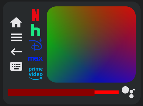
Even more disorder with columns and special elements in the same row as buttons, and stylized everything.
type: custom:android-tv-card
remote_id: remote.google_chromecast
slider_id: media_player.google_chromecast
rows:
  - - - home
      - menu
      - back
      - keyboard
    - - netflix
      - hulu
      - disney
      - max
      - primevideo
    - touchpad
  - - slider
    - search
custom_actions:
  netflix:
    style:
      color: rgb(229, 9, 20)
  hulu:
    style:
      color: rgb(28, 231, 131)
  disney:
    style:
      color: rgb(17, 60, 207)
  max:
    style:
      color: rgb(0, 35, 246)
  primevideo:
    style:
      color: rgb(0, 165, 222)
  slider:
    range:
      - 0
      - 0.6
    style:
      '--border-radius': 4px
      '--height': 24px
      '--background-height': 12px
      '--color': darkred
      '--background': red
touchpad_style:
  background: >-
    linear-gradient(217deg, rgba(255,0,0,.8), rgba(255,0,0,0) 70.71%),
    linear-gradient(127deg, rgba(0,255,0,.8), rgba(0,255,0,0) 70.71%),
    linear-gradient(336deg, rgba(0,0,255,.8), rgba(0,0,255,0) 70.71%)
Result:
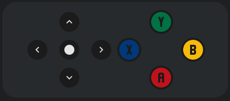
Example 11
A simple gamepad.
type: custom:android-tv-card
remote_id: remote.google_chromecast
rows:
  - - dpad
    - - - x
      - - 'y'
        - null
        - a
      - - b
custom_actions:
  a:
    style:
      '--size': 48px
      padding: 0
      color: '#C1121C'
  b:
    style:
      '--size': 48px
      padding: 0
      color: '#F7BA0B'
  x:
    style:
      '--size': 48px
      padding: 0
      color: '#00387b'
  y:
    style:
      '--size': 48px
      padding: 0
      color: '#007243'
button_style:
  '--size': 24px
  background: rgb(27,27,27)
  padding: 8px
  border-radius: 24px
Result:
Example 12
Samsung TV, using ha-samsungtv-smart.
type: custom:android-tv-card
media_player_id: media_player.samsung_tv
autofill_entity_id: true
custom_icons:
  dazn: >-
    m14.774 8.291.772-2.596.79 2.596zm3.848
    2.268-2.025-6.128c-.045-.135-.097-.224-.154-.266a.497.497 0 0
    0-.28-.063h-1.12a.485.485 0 0 0-.284.068c-.06.045-.11.132-.149.261l-2.045
    6.128c-.025.032-.038.096-.038.192 0 .149.09.223.27.223h.84c.076 0
    .139-.003.187-.01a.207.207 0 0 0 .116-.048.326.326 0 0 0
    .077-.116c.022-.051.046-.119.072-.202l.318-1.071h2.306l.327
    1.051c.026.09.051.16.077.213a.395.395 0 0 0
    .087.12c.031.028.07.047.114.053h.002c.045.006.103.01.173.01h.897c.18 0
    .27-.074.27-.223a.59.59 0 0 0-.005-.09.878.878 0 0
    0-.036-.108l.003.006zm-.994 2.467h-.646c-.168
    0-.279.024-.333.072-.055.049-.082.147-.082.295v3.638l-1.91-3.647c-.076-.155-.152-.253-.226-.295-.074-.041-.204-.063-.39-.063h-.599c-.167
    0-.278.025-.332.073-.055.048-.082.147-.082.294v6.138c0
    .148.025.246.077.294.052.048.16.072.328.072h.656c.167 0
    .278-.024.332-.072.055-.048.082-.146.082-.294v-3.648l1.91
    3.657c.077.155.152.253.227.295.073.042.204.062.39.062h.598c.167 0
    .278-.024.333-.072.054-.048.082-.146.082-.294v-6.138c0-.148-.028-.246-.082-.294-.055-.048-.166-.073-.333-.073zm3.203-.581
    1.665 1.665v8.385H1.505V14.11l1.663-1.664a.63.63 0 0 0 0-.89L1.504
    9.891V1.505h20.991v8.384l-1.665 1.666a.63.63 0 0 0 0 .89zM24
    0H0v10.613L1.387 12 0 13.387V24h24V13.387L22.613 12 24 10.613zM10.67
    18.469H7.96l2.855-4.014a.67.67 0 0 0 .087-.155.425.425 0 0 0
    .019-.135v-.772c0-.148-.028-.246-.082-.294-.055-.048-.166-.073-.334-.073H6.382c-.149
    0-.245.028-.29.082-.045.055-.068.169-.068.343v.58c0
    .172.023.287.068.341.045.055.141.083.29.083h2.545L6.11 18.469a.438.438 0 0
    0-.107.27v.792c0 .148.027.245.082.294.055.048.167.072.334.072h4.25c.148 0
    .245-.027.29-.081.045-.055.068-.17.068-.344v-.579c0-.173-.023-.287-.068-.342-.045-.055-.142-.082-.29-.082zM9.408
    8.233c0 .264-.017.484-.052.661a1.08 1.08 0 0 1-.174.43.648.648 0 0
    1-.318.231 1.523 1.523 0 0 1-.487.068h-.79v-4.17h.79c.366 0
    .63.11.79.324.16.215.241.571.241
    1.067v1.389zm1.38-2.789c-.225-.457-.533-.795-.921-1.013-.39-.219-.88-.328-1.47-.328H6.418c-.167
    0-.278.024-.333.072-.054.049-.082.147-.082.294v6.138c0
    .148.028.246.082.295.055.048.166.072.333.072h2.218c1.048 0 1.765-.447
    2.15-1.342.09-.205.153-.413.188-.622a4.91 4.91 0 0 0
    .054-.796V6.911c0-.367-.018-.656-.054-.868a2.2 2.2 0 0 0-.193-.612l.006.013z
custom_actions:
  '0':
    icon: mdi:numeric-0
    tap_action:
      action: call-service
      service: media_player.play_media
      data:
        media_content_type: send_key
        media_content_id: KEY_0
  '1':
    icon: mdi:numeric-1
    tap_action:
      action: call-service
      service: media_player.play_media
      data:
        media_content_type: send_key
        media_content_id: KEY_1
  '2':
    icon: mdi:numeric-2
    tap_action:
      action: call-service
      service: media_player.play_media
      data:
        media_content_type: send_key
        media_content_id: KEY_2
  '3':
    icon: mdi:numeric-3
    tap_action:
      action: call-service
      service: media_player.play_media
      data:
        media_content_type: send_key
        media_content_id: KEY_3
  '4':
    icon: mdi:numeric-4
    tap_action:
      action: call-service
      service: media_player.play_media
      data:
        media_content_type: send_key
        media_content_id: KEY_4
  '5':
    icon: mdi:numeric-5
    tap_action:
      action: call-service
      service: media_player.play_media
      data:
        media_content_type: send_key
        media_content_id: KEY_5
  '6':
    icon: mdi:numeric-6
    tap_action:
      action: call-service
      service: media_player.play_media
      data:
        media_content_type: send_key
        media_content_id: KEY_6
  '7':
    icon: mdi:numeric-7
    tap_action:
      action: call-service
      service: media_player.play_media
      data:
        media_content_type: send_key
        media_content_id: KEY_7
  '8':
    icon: mdi:numeric-8
    tap_action:
      action: call-service
      service: media_player.play_media
      data:
        media_content_type: send_key
        media_content_id: KEY_8
  '9':
    icon: mdi:numeric-9
    tap_action:
      action: call-service
      service: media_player.play_media
      data:
        media_content_type: send_key
        media_content_id: KEY_9
  up:
    tap_action:
      action: call-service
      service: media_player.play_media
      data:
        media_content_type: send_key
        media_content_id: KEY_UP
  down:
    tap_action:
      action: call-service
      service: media_player.play_media
      data:
        media_content_type: send_key
        media_content_id: KEY_DOWN
  left:
    tap_action:
      action: call-service
      service: media_player.play_media
      data:
        media_content_type: send_key
        media_content_id: KEY_LEFT
  right:
    tap_action:
      action: call-service
      service: media_player.play_media
      data:
        media_content_type: send_key
        media_content_id: KEY_RIGHT
  center:
    tap_action:
      action: call-service
      service: media_player.play_media
      data:
        media_content_type: send_key
        media_content_id: KEY_ENTER
  power:
    icon: mdi:power
    tap_action:
      action: call-service
      service: media_player.toggle
  home:
    tap_action:
      action: call-service
      service: media_player.play_media
      data:
        media_content_type: send_key
        media_content_id: KEY_HOME
  back:
    tap_action:
      action: call-service
      service: media_player.play_media
      data:
        media_content_type: send_key
        media_content_id: KEY_RETURN
  volume_mute:
    tap_action:
      action: call-service
      service: media_player.play_media
      data:
        media_content_type: send_key
        media_content_id: KEY_MUTE
  ch_up:
    icon: mdi:arrow-up-bold
    tap_action:
      action: call-service
      service: media_player.play_media
      data:
        media_content_type: send_key
        media_content_id: KEY_CHUP
  ch_down:
    icon: mdi:arrow-down-bold
    tap_action:
      action: call-service
      service: media_player.play_media
      data:
        media_content_type: send_key
        media_content_id: KEY_CHDOWN
  DAZN:
    icon: dazn
    tap_action:
      action: call-service
      service: media_player.select_source
      data:
        source: DAZN
  netflix:
    icon: mdi:netflix
    tap_action:
      action: call-service
      service: media_player.select_source
      data:
        source: Netflix
  youtube:
    icon: mdi:youtube
    tap_action:
      action: call-service
      service: media_player.select_source
      data:
        source: YouTube
rows:
  - - power
    - null
    - volume_mute
  - - slider
  - - ch_up
    - ch_down
  - - netflix
    - youtube
    - DAZN
    - primevideo
    - spotify
  - - touchpad
  - - back
    - home
  - - 1
    - 2
    - 3
    - 4
    - 5
  - - 6
    - 7
    - 8
    - 9
    - 0
Example 13
Conditional layouts using templating and an input select.
type: custom:android-tv-card
remote_id: remote.google_tv
slider_id: media_player.google_tv
rows:
  - - next_thing
  - |
    {% if is_state("input_select.test_select", "A") %}
    - touchpad
    - - slider
    {% elif is_state("input_select.test_select", "B") %}
    - navigation_buttons
    - - volume_buttons
    {% elif is_state("input_select.test_select", "C") %}
    - - n7
      - n8
      - n9
    - - n4
      - n5
      - n6
    - - n1
      - n2
      - n3
    {% endif %}
custom_keys:
  next_thing:
    icon: mdi:skip-next-circle
    service: input_select.select_next
    data:
      cycle: true
    target:
      entity_id: input_select.test_select
Example 14
RGB Remote using Broadlink RM4 Pro.
type: custom:android-tv-card
remote_id: remote.rm4_pro
title: TV RGB
rows:
  - - power
    - null
    - poweroff
  - - up
    - null
    - down
  - - 1
    - 2
    - 3
  - - 4
    - 5
    - 6
  - - 7
    - 8
    - 9
  - - 10
    - 11
    - 12
custom_actions:
  '1':
    icon: mdi:circle
    tap_action:
      action: call-service
      service: remote.send_command
      target:
        entity_id: remote.rm4_pro
      data:
        device: Office TV Led
        command: red
    style:
      '--size': 42px
      color: red
  '2':
    icon: mdi:circle
    tap_action:
      action: call-service
      service: remote.send_command
      target:
        entity_id: remote.rm4_pro
      data:
        device: Office TV Led
        command: green
    style:
      '--size': 42px
      color: green;
  '3':
    icon: mdi:circle
    tap_action:
      action: call-service
      service: remote.send_command
      target:
        entity_id: remote.rm4_pro
      data:
        device: Office TV Led
        command: dark_blue
    style:
      '--size': 42px
      color: darkblue;
  '4':
    icon: mdi:circle
    tap_action:
      action: call-service
      service: remote.send_command
      target:
        entity_id: remote.rm4_pro
      data:
        device: Office TV Led
        command: yellow
    style:
      '--size': 42px
      color: yellow;
  '5':
    icon: mdi:circle
    tap_action:
      action: call-service
      service: remote.send_command
      target:
        entity_id: remote.rm4_pro
      data:
        device: Office TV Led
        command: yellow-orange
    style:
      '--size': 42px
      color: goldenrod;
  '6':
    icon: mdi:circle
    tap_action:
      action: call-service
      service: remote.send_command
      target:
        entity_id: remote.rm4_pro
      data:
        device: Office TV Led
        command: orange
    style:
      '--size': 42px
      color: orange;
  '7':
    icon: mdi:circle
    tap_action:
      action: call-service
      service: remote.send_command
      target:
        entity_id: remote.rm4_pro
      data:
        device: Office TV Led
        command: orange-light
    style:
      '--size': 42px
      color: lightsalmon;
  '8':
    icon: mdi:circle
    tap_action:
      action: call-service
      service: remote.send_command
      target:
        entity_id: remote.rm4_pro
      data:
        device: Office TV Led
        command: cyan
    style:
      '--size': 42px
      color: cyan;
  '9':
    icon: mdi:circle
    tap_action:
      action: call-service
      service: remote.send_command
      target:
        entity_id: remote.rm4_pro
      data:
        device: Office TV Led
        command: blue
    style:
      '--size': 42px
      color: blue;
  '10':
    icon: mdi:circle
    tap_action:
      action: call-service
      service: remote.send_command
      target:
        entity_id: remote.rm4_pro
      data:
        device: Office TV Led
        command: pink
    style:
      '--size': 42px
      color: magenta;
  '11':
    icon: mdi:circle
    tap_action:
      action: call-service
      service: remote.send_command
      target:
        entity_id: remote.rm4_pro
      data:
        device: Office TV Led
        command: green_light
    style:
      '--size': 42px
      color: mediumseagreen;
  '12':
    icon: mdi:circle
    tap_action:
      action: call-service
      service: remote.send_command
      target:
        entity_id: remote.rm4_pro
      data:
        device: Office TV Led
        command: white
    style:
      '--size': 42px
      color: white;
  power:
    tap_action:
      action: call-service
      service: remote.send_command
      target:
        entity_id: remote.rm4_pro
      data:
        device: Office TV Led
        command: 'on'
    style:
      color: green
  poweroff:
    icon: mdi:power
    tap_action:
      action: call-service
      service: remote.send_command
      target:
        entity_id: remote.rm4_pro
      data:
        device: Office TV Led
        command: 'off'
    style:
      color: red
  up:
    tap_action:
      action: call-service
      service: remote.send_command
      target:
        entity_id: remote.rm4_pro
      data:
        device: Office TV Led
        command: brightness+
  down:
    tap_action:
      action: call-service
      service: remote.send_command
      target:
        entity_id: remote.rm4_pro
      data:
        device: Office TV Led
        command: brightness-

Example 15
Style the dpad to be like the Google TV app remote.
type: custom:android-tv-card
remote_id: remote.google_tv
rows:
  - - dpad
custom_actions:
  center:
    style:
      color: rgb(94, 94, 94)
      '--size': 200px
      background: rgb(31, 31, 31)
      border-radius: 200px
      margin: '-70px'
      padding: 70px
  up:
    style:
      color: rgb(197, 199, 197)
      z-index: 2
      top: 25px
      height: 90px
      width: 300px
  down:
    style:
      color: rgb(197, 199, 197)
      z-index: 2
      bottom: 25px
      height: 90px
      width: 300px
  left:
    style:
      color: rgb(197, 199, 197)
      z-index: 2
      left: 30px
      height: 170px
      width: 90px
  right:
    style:
      color: rgb(197, 199, 197)
      z-index: 2
      right: 30px
      height: 170px
      width: 90px

 Nerwyn