MaterialDesignInXamlToolkit
 MaterialDesignInXamlToolkit copied to clipboard
 MaterialDesignInXAML
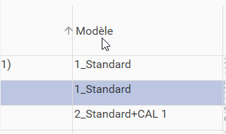
The sorting arrow into a DataGrid is displayed outside the column on the left.
The sorting arrow into a DataGrid is displayed outside the column on the left when vertical grid lines are displayed. The arrow should be contained into the colum on the left side of the header title column. (Using MaterialDesign library 4.3.0).
See below Screenshot.
I can't reproduce the bug.
Can you send the xaml code of the DataGrid please.
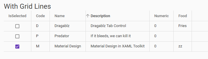
@Xaalek
You can see below a sample of my DataGrid :
<ResourceDictionary

	...

    <Style x:Key="CustomMaterialDesignDataGridRowFullLineSelection" BasedOn="{StaticResource MaterialDesignDataGridRow}" TargetType="{x:Type DataGridRow}">
        <Setter Property="Background" Value="Transparent"/>
        <Setter Property="SnapsToDevicePixels" Value="true"/>
        <Setter Property="Validation.ErrorTemplate" Value="{x:Null}"/>
        <Setter Property="ValidationErrorTemplate">
            <Setter.Value>
                <ControlTemplate>
                    <TextBlock Foreground="{StaticResource CustomRedColor}" Margin="2,0,0,0" Text="!" VerticalAlignment="Center"/>
                </ControlTemplate>
            </Setter.Value>
        </Setter>
        <Setter Property="Template">
            <Setter.Value>
                <ControlTemplate TargetType="{x:Type DataGridRow}">
                    <Border x:Name="DGR_Border" BorderBrush="{TemplateBinding BorderBrush}" BorderThickness="{TemplateBinding BorderThickness}" Background="{TemplateBinding Background}" SnapsToDevicePixels="True">
                        <SelectiveScrollingGrid>
                            <SelectiveScrollingGrid.ColumnDefinitions>
                                <ColumnDefinition Width="Auto"/>
                                <ColumnDefinition Width="*"/>
                            </SelectiveScrollingGrid.ColumnDefinitions>
                            <SelectiveScrollingGrid.RowDefinitions>
                                <RowDefinition Height="*"/>
                                <RowDefinition Height="Auto"/>
                            </SelectiveScrollingGrid.RowDefinitions>
                            <DataGridCellsPresenter Grid.Column="1" ItemsPanel="{TemplateBinding ItemsPanel}" SnapsToDevicePixels="{TemplateBinding SnapsToDevicePixels}"/>
                            <DataGridDetailsPresenter Grid.Column="1" Grid.Row="1" SelectiveScrollingGrid.SelectiveScrollingOrientation="{Binding AreRowDetailsFrozen, ConverterParameter={x:Static SelectiveScrollingOrientation.Vertical}, Converter={x:Static DataGrid.RowDetailsScrollingConverter}, RelativeSource={RelativeSource AncestorType={x:Type DataGrid}}}" Visibility="{TemplateBinding DetailsVisibility}"/>
                            <DataGridRowHeader Grid.RowSpan="2" SelectiveScrollingGrid.SelectiveScrollingOrientation="Vertical" Visibility="{Binding HeadersVisibility, ConverterParameter={x:Static DataGridHeadersVisibility.Row}, Converter={x:Static DataGrid.HeadersVisibilityConverter}, RelativeSource={RelativeSource AncestorType={x:Type DataGrid}}}"/>
                        </SelectiveScrollingGrid>
                    </Border>
                </ControlTemplate>
            </Setter.Value>
        </Setter>
        <Style.Triggers>
            <Trigger Property="IsSelected" Value="True">
                <Setter Property="Background" Value="{StaticResource CustomLightBlueColor}" />
            </Trigger>
        </Style.Triggers>
    </Style>


    <Style x:Key="CustomMaterialDesignDataGridCell" BasedOn="{StaticResource MaterialDesignDataGridCell}" TargetType="{x:Type DataGridCell}">
		<!-- Evolution #2662, lower Cells Padding -->
		<!--<Setter Property="Padding" Value="{Binding RelativeSource={RelativeSource Self}, Path=(wpf:DataGridAssist.CellPadding)}" />-->
		<Setter Property="Padding" Value="1" />
		<Setter Property="Background" Value="Transparent"/>
		<Setter Property="BorderBrush" Value="Transparent"/>
		<Setter Property="Template">
			<Setter.Value>
				<ControlTemplate TargetType="{x:Type DataGridCell}">
					<Border BorderBrush="{TemplateBinding BorderBrush}" BorderThickness="{TemplateBinding BorderThickness}" Background="{TemplateBinding Background}" SnapsToDevicePixels="True">
						<ContentPresenter SnapsToDevicePixels="{TemplateBinding SnapsToDevicePixels}" Margin="{TemplateBinding Padding}"/>
					</Border>
				</ControlTemplate>
			</Setter.Value>
		</Setter>
		<Style.Triggers>
			<Trigger Property="IsKeyboardFocusWithin" Value="True">
				<Setter Property="BorderBrush" Value="{DynamicResource MaterialDesignTextBoxBorder}"/>
			</Trigger>
			<MultiTrigger>
				<MultiTrigger.Conditions>
					<Condition Property="IsSelected" Value="True"/>
					<Condition Property="Selector.IsSelectionActive" Value="False"/>
				</MultiTrigger.Conditions>
				<Setter Property="Foreground" Value="{DynamicResource MaterialDesignBody}"/>
				<Setter Property="Background" Value="Transparent"/>
			</MultiTrigger>
			<MultiTrigger>
				<MultiTrigger.Conditions>
					<Condition Property="IsSelected" Value="True"/>
					<Condition Property="Selector.IsSelectionActive" Value="True"/>
				</MultiTrigger.Conditions>
				<Setter Property="Foreground" Value="{DynamicResource MaterialDesignBody}"/>
				<Setter Property="Background" Value="Transparent" />
			</MultiTrigger>
			<Trigger Property="IsEnabled" Value="False">
				<Setter Property="Opacity" Value=".56"/>
			</Trigger>
		</Style.Triggers>
	</Style>


	<Style x:Key="CustomDataGridColumnHeader" BasedOn="{StaticResource MaterialDesignDataGridColumnHeader}" TargetType="{x:Type DataGridColumnHeader}">
		<Setter Property="FontSize" Value="{StaticResource FontSize}"/>
		<Setter Property="FontWeight" Value="Regular"/>
		<Setter Property="Foreground" Value="{StaticResource CustomNormalTextColor}"/>
	</Style>

	...

</ResourceDictionary>

<DataGrid x:Name="PrinterMessageAssociationLibraryDataGrid" Margin="0 4 0 0" ItemsSource="{Binding PrinterMessagesAssociationsVM, Mode=OneWay}" CanUserSortColumns="True" CanUserAddRows="False" CanUserDeleteRows="False" AutoGenerateColumns="False" materialDesign:DataGridAssist.CellPadding="4" materialDesign:DataGridAssist.ColumnHeaderPadding="4" IsReadOnly="False" VerticalScrollBarVisibility="Auto" HorizontalScrollBarVisibility="Auto" IsSynchronizedWithCurrentItem="True" IsEnabled="{qc:MultiBinding '!$P0', P0={Binding IsApplicationBusy}}" CellStyle="{StaticResource CustomMaterialDesignDataGridCell}" SelectionMode="Single" Style="{StaticResource CustomMaterialDesignDataGrid}" RowStyle="{StaticResource CustomMaterialDesignDataGridRowFullLineSelection}" SelectedItem="{Binding PrinterMessagesAssociationsVM.SelectedItem, Mode=TwoWay}" CanUserResizeColumns="False" MouseDoubleClick="PrinterMessageAssociationLibraryDataGrid_MouseDoubleClick">

	<DataGrid.Columns>

		...

		<!-- Column Number -->
		<materialDesign:DataGridTextColumn x:Name="messageNumberColumn" Binding="{Binding Number}" Header="{loc:LocString String453}" HeaderStyle="{StaticResource CustomDataGridColumnHeader}" SortDirection="Ascending" Foreground="{StaticResource CustomBlueColor}" FontWeight="DemiBold" FontSize="20" IsReadOnly="True" materialDesign:HintAssist.Hint="{loc:LocString String470}"/>

		<!-- Column Name -->
		<materialDesign:DataGridTextColumn x:Name="messageNameColumn" Binding="{Binding LinkedMessageVM[Name].Value, NotifyOnTargetUpdated=True, UpdateSourceTrigger=PropertyChanged, ValidatesOnDataErrors=True, Mode=TwoWay}" Header="{loc:LocString String443}" HeaderStyle="{StaticResource CustomDataGridColumnHeader}" IsReadOnly="True">
			<materialDesign:DataGridTextColumn.ElementStyle>
				<Style TargetType="TextBlock">
					<Setter Property="ToolTip" Value="{Binding LinkedMessageVM[Name].HelpDisplay, NotifyOnTargetUpdated=True, UpdateSourceTrigger=PropertyChanged, Mode=OneWay}" />
					<Setter Property="ToolTipService.ShowDuration" Value="60000"/>
				</Style>
			</materialDesign:DataGridTextColumn.ElementStyle>
		</materialDesign:DataGridTextColumn>

		...
Regards.
What is the version of library use? I think this problem it's solved with current version

I just found the origin of the problem.
It comes from setting the ColumnHeaderPadding to 4 in DataGrid definition.
materialDesign:DataGridAssist.CellPadding="4" materialDesign:DataGridAssist.ColumnHeaderPadding="4"
Removing the padding, solve the problem :
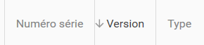
I found a compromise with these values letting enough room for the left arrow :
materialDesign:DataGridAssist.ColumnHeaderPadding="16 0 4 0"
So is it a MaterialDesign bug of a normal feature that should avoid reducing ColumnHeaderPadding from the default value ?
I don't think this is a bug since you put a custom padding value. @Keboo could confirm this.