Improve wording on Auth0 password change screen to improve signup UX
We've now completely moved to using the Auth0 New Universal Login flow. This massively reduces complexity for us and removed several security issues, which was great.
Unfortunately, the flow doesn't really fully handle inviting users. According to official Auth0 documentation is... that "A user invitation is basically a change password link repurposed as an invitation." Yikes. The docs go on to recommend creating a password change ticket. So, this is what we implemented. Sadly, this results in a confusing experiences for newly invited users as they see the following screen right after getting an invitation email:
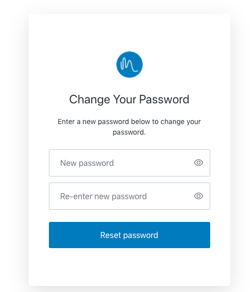
This story is to, at least, change the wording to something that will fit both inviting new users and changing your password.
This is now slightly less important as we've tweaked the wording in the invitation email (in #789), setting expectations that the user will be redirected to a screen for setting passwords... Still not ideal, but perhaps enough to not worry about this until Auth0 comes up with better flows for this that we could use. Or we move to a different solution altogether.
We've just had an intercom conversation where I couldn't work out what the problem was, assuming it was something different, identifying something else that was weird... when my current guess is that it's this issue that caused confusion. Namely that newly invited users see the "change password" screen, which is so obviously wrong. Would be good to address this, perhaps by building our own invitation flow.