 MahApps
Submenu with Hamburger Menu
Is it possible to have submenu with Hamburger menu control? I tried blog http://jkarger.de/2017/02/06/mahapps-hamburgermenu/ but it does not demonstrate the way of using sub menu. I want to integrate submenu like in web application so that I can click on any menu and it will list the submenus of that menu. Also wanted to know the limit of submenu hierarchy.
Having subitems to hamburgermenus would be a great feature, it would save me from doing a custom tabcontrol on most pages..
like a 2 level treeview
Out of curiosity, are you trying to achieve what is described by Giber Fonseca Revilla in those 2 images? 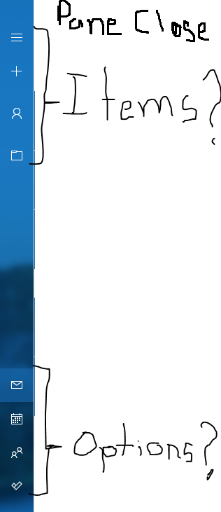
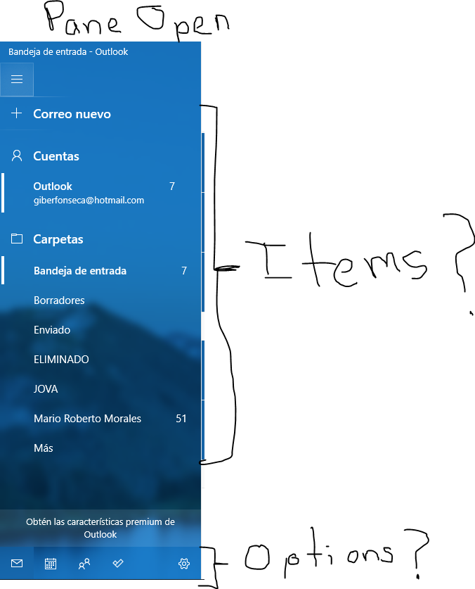
And if so do the buttons on the bottom (except for the settings I guess) behave as a tab control, changing the content of what is displayed just on the bottom of the hamburger button?
I don't know what the tag property is used for, so is used it to tag the submenus as a submenu like so:
<mah:HamburgerMenuIconItem Tag="Submenu" Label="Label" >
    <mah:HamburgerMenuIconItem.Icon>
        <iconPacks:PackIconMaterialDesign Kind="Label"
                                                                  Width="22"
                                                                  Height="22"
                                                                  HorizontalAlignment="Center"
                                                                  VerticalAlignment="Center"/>
    </mah:HamburgerMenuIconItem.Icon>
</mah:HamburgerMenuIconItem>
Then I added several multitrigger which react when there is the Tag="Submenu" and the Pane is open or closed. additionally i added a trigger which sets the textsize to a smaller one and i added a margin so the DockPanel is indented.
<DataTemplate x:Key="HamburgerMenuItemTemplate" DataType="{x:Type mah:HamburgerMenuIconItem}">
        <DockPanel x:Name="DockPanel" Height="48" LastChildFill="True">
            <ContentControl x:Name="IconPart"
                        Width="{Binding RelativeSource={RelativeSource AncestorType={x:Type mah:HamburgerMenu}}, Path=CompactPaneLength}"
                        Content="{Binding Icon}"
                        DockPanel.Dock="Left"
                        Focusable="False"
                        IsTabStop="False" />
            <TextBlock x:Name="TextPart"
                   VerticalAlignment="Center"
                   FontSize="16"
                   Text="{Binding Label}" />
        </DockPanel>
        <DataTemplate.Triggers>
            <DataTrigger Binding="{Binding RelativeSource={RelativeSource AncestorType={x:Type mah:HamburgerMenu}}, Path=PanePlacement}" Value="Right">
                <Setter TargetName="IconPart" Property="DockPanel.Dock" Value="Right" />
                <Setter TargetName="TextPart" Property="Margin" Value="8 0 0 0" />
            </DataTrigger>

            <DataTrigger Binding="{Binding Tag}" Value="Submenu">
                <Setter TargetName="TextPart" Property="FontSize" Value="14"/>
                <Setter TargetName="DockPanel" Property="Height" Value="38"/>
                <Setter TargetName="DockPanel" Property="Margin" Value="30,0,0,0"/>
            </DataTrigger>

            <MultiDataTrigger>
                <MultiDataTrigger.Conditions>
                    <Condition Binding="{Binding Tag}" Value="Submenu" />
                    <Condition Binding="{Binding RelativeSource={RelativeSource AncestorType={x:Type mah:HamburgerMenu}}, Path=IsPaneOpen}" Value="False" />
                </MultiDataTrigger.Conditions>
                <MultiDataTrigger.Setters>
                    <Setter Property="Visibility" Value="Collapsed" />
                    <Setter Property="Visibility" Value="Collapsed" />
                </MultiDataTrigger.Setters>
            </MultiDataTrigger>

            <MultiDataTrigger>
                <MultiDataTrigger.Conditions>
                    <Condition Binding="{Binding Tag}" Value="Submenu" />
                    <Condition Binding="{Binding RelativeSource={RelativeSource AncestorType={x:Type mah:HamburgerMenu}}, Path=IsPaneOpen}" Value="True" />
                </MultiDataTrigger.Conditions>
                <MultiDataTrigger.Setters>
                    <Setter Property="Visibility" Value="Visible" />
                    <Setter Property="Visibility" Value="Visible" />
                </MultiDataTrigger.Setters>
            </MultiDataTrigger>
        </DataTemplate.Triggers>
    </DataTemplate>
@KrisMeissmer Your solution worked like a charm!
Now I'm facing another problem because I can't figure out how to make the sub menu collapsible. What I wanted to achieve is that the sub menu items only show up when the ancestor item is selected

Edit: Actually I found an issue with this solution. In my implementation the tag is used to load the view that is meant to be display as content and using Tag="submenu" invalidates de possibility to load the view because the Tag attribute would be set twice. I'm trying to work my self around this and if I figure it out I'll post the solution here.
Edit 2: I've managed to get around the Tag issue by binding the DataTrigger to the label and using a converter to return true if Label content is one of the sub menu items list.
The HamburgerMenu control uses the HamburgerMenuListBox control to show the menu items. You can use a DataTemplate with an Expander control with an HamburgerMenuListBox control as the Child to show submenu items:
            <DataTemplate DataType="{x:Type mah:HamburgerMenuIconItem}">
                <Expander x:Name="ExpanderPart"
                          HorizontalAlignment="Stretch"
                          HorizontalContentAlignment="Stretch"
                          BorderThickness="0"
                          FlowDirection="RightToLeft"
                          mah:HeaderedControlHelper.HeaderBackground="Transparent"
                          mah:HeaderedControlHelper.HeaderForeground="{Binding RelativeSource={RelativeSource AncestorType={x:Type mah:HamburgerMenu}}, Path=PaneForeground}"
                >
                    <Expander.Header>
                        <DockPanel Height="48" LastChildFill="True" Background="Transparent"
                                   FlowDirection="LeftToRight">
                            <ContentControl x:Name="IconPart"
                                            Width="{Binding RelativeSource={RelativeSource AncestorType={x:Type mah:HamburgerMenu}}, Path=CompactPaneLength}"
                                            Content="{Binding Icon}"
                                            DockPanel.Dock="Left"
                                            Focusable="False"
                                            IsTabStop="False">
                            </ContentControl>
                            <TextBlock VerticalAlignment="Center"
                                       FontSize="16"
                                       Text="{Binding Label}" />
                        </DockPanel>
                    </Expander.Header>
                    <mah:HamburgerMenuListBox ItemsSource="{Binding Tag}"
                                                   Margin="0,0,10,0"
                                                   FlowDirection="LeftToRight"
                                                   HorizontalAlignment="Stretch"
                                                   Foreground="{Binding RelativeSource={RelativeSource AncestorType={x:Type mah:HamburgerMenu}}, Path=PaneForeground}"
                                                   IsTextSearchEnabled="True"
                                                   ItemContainerStyleSelector="{StaticResource HamburgerMenuItemStyleSelector}"
                                                   ItemTemplateSelector="{DynamicResource MenuItemTemplateSelector}"
                                                   SelectionMode="Single"
                    />
                </Expander>
            </DataTemplate>
You can then insert the submenu items in the tag property:
        <mah:HamburgerMenu.ItemsSource>
            <mah:HamburgerMenuItemCollection>
                <mah:HamburgerMenuIconItem Label="Account">
                    <mah:HamburgerMenuIconItem.Icon>
                        <iconPacks:PackIconMaterial Width="22"
                                                    Height="22"
                                                    HorizontalAlignment="Center"
                                                    VerticalAlignment="Center"
                                                    Kind="Account"/>
                    </mah:HamburgerMenuIconItem.Icon>
                    <mah:HamburgerMenuIconItem.Tag>
                        <mah:HamburgerMenuItemCollection>
                            <mah:HamburgerMenuIconItem Label="Add">
                                <mah:HamburgerMenuIconItem.Icon>
                                    <iconPacks:PackIconMaterial Width="22"
                                                                Height="22"
                                                                HorizontalAlignment="Center"
                                                                VerticalAlignment="Center"
                                                                Kind="AccountPlus"/>
                                </mah:HamburgerMenuIconItem.Icon>
                            </mah:HamburgerMenuIconItem>
                            <mah:HamburgerMenuIconItem Label="Edit">
                                <mah:HamburgerMenuIconItem.Icon>
                                    <iconPacks:PackIconMaterial Width="22"
                                                                Height="22"
                                                                HorizontalAlignment="Center"
                                                                VerticalAlignment="Center"
                                                                Kind="AccountEdit"/>
                                </mah:HamburgerMenuIconItem.Icon>
                            </mah:HamburgerMenuIconItem>
                        </mah:HamburgerMenuItemCollection>
                    </mah:HamburgerMenuIconItem.Tag>
                </mah:HamburgerMenuIconItem>
            </mah:HamburgerMenuItemCollection>
        </mah:HamburgerMenu.ItemsSource>
This is what the result looks like:
This work, thanks, but what about click events? how to manage it? I've tried to handle the ItemClick events, but in the event args i recieve always the first child of the menu.
Thanks