Adding metric visualization code snippets in guide/documentation to facilitate use
🚀 Feature
Explaining the methods of visualizing visually interpretable metrics with matplotlib or another library will be much easier in terms of use. It would be nice if, as an example, it could be explained how ROC metric results can be visualized in a very simple way. A draft piece of code can be added even if no visual attachment is added.
Motivation
I sometimes have trouble interpreting the format and/or output of some metrics. Therefore, I think that if I know where to put which output (in the graph), I can understand it more easily.
Pitch
When I read the ROC metric API documentation I would like to see a piece of code where I can visualize the results.
Alternatives
The piece of code that can be executed even if not placed visually will help.
Additional context
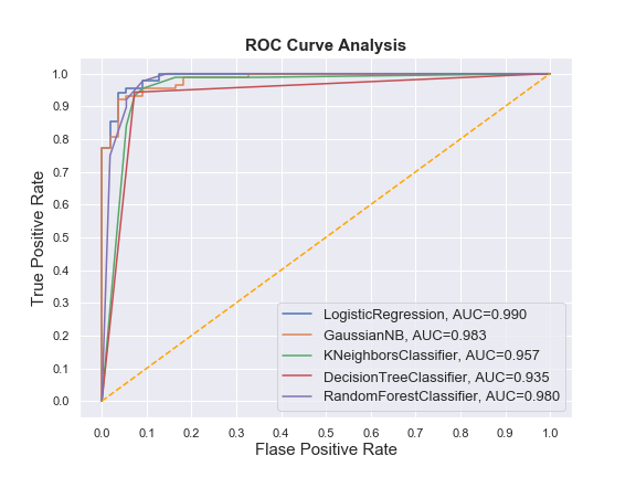
# torchmetrics functional API to compute metric

...

# then visualize

fig = plt.figure(figsize=(8,6))

for i in result_table.index:
    plt.plot(result_table.loc[i]['fpr'],
             result_table.loc[i]['tpr'],
             label="{}, AUC={:.3f}".format(i, result_table.loc[i]['auc']))

plt.plot([0,1], [0,1], color='orange', linestyle='--')

plt.xticks(np.arange(0.0, 1.1, step=0.1))
plt.xlabel("Flase Positive Rate", fontsize=15)

plt.yticks(np.arange(0.0, 1.1, step=0.1))
plt.ylabel("True Positive Rate", fontsize=15)

plt.title('ROC Curve Analysis', fontweight='bold', fontsize=15)
plt.legend(prop={'size':13}, loc='lower right')

plt.show()