LaserWeb4
 LaserWeb4 copied to clipboard
UI - Usability Issues
Theres been a LOT of new features the last couple weeks, but so much of it is missing "intuitive" or "detail" from them:
Examples:
- Right Clicks - sure we can come up with something better? Not intuitive
~~2) Typing, wait for result, type again... hmmm, I wonder, sliders? - feel like in this use case it may work way better~~ - DONE
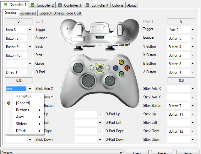
- Use Gamepad
- i think it could do with a modal popup that a) shows you detail of which button does what or b) a mapper to allow you to allocate axes/step sizes/something to buttons
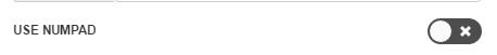
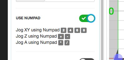
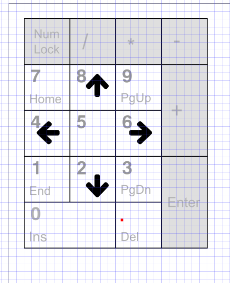
~~4) Use Numpad: Used to be to enable https://github.com/kabachello/jQuery.NumPad on selected text inputs. I think i recall from a past issue it's now to enable use of the Numpad on aan actual keyboard for jog? Same as 3 then, a popup to show what does what could do good?~~ DONE
EDIT:
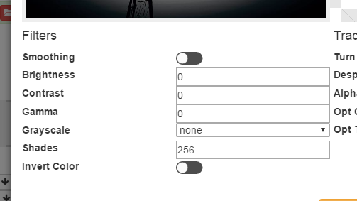
5) Raster Filter Preview - ~~perhaps use the 3D Viewer itself? Didnt even know about the popup before i asked Jorge - its not seemless, its not in the users face like it should be~~ - okay so cant use viewer... open to suggestions
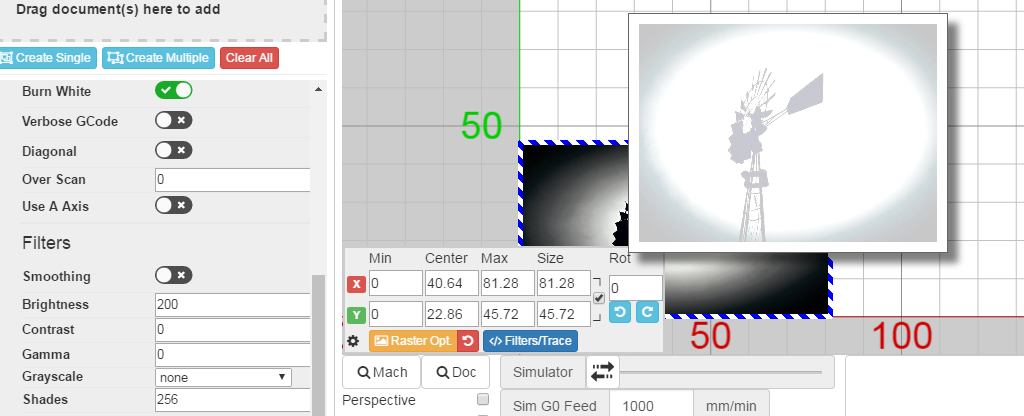
- Integrate Raster Filters and Trace Filters into something more logical, something that doesnt make it look duplicated like #358
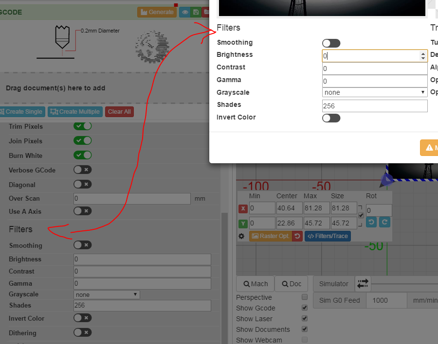
(; more importantly - tabs are cramped - the use of Modals works well, like you did for tracing. More of that can only be a good thing
- Raster Filter Preview - perhaps use the 3D Viewer itself? Didnt even know about the popup before i asked Jorge - its not seemless, its not in the users face like it should be
Was planned that way, but doing so implies to duplicate the dataUrl of every document. Being raster could be a lot of data.
makes sense yes. darn. Still, sleep on how to make it more clear. The current raster preview i dont like. I do like the Trace modal. I think that has potential for being the fix for (5) too
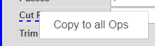
1 Right Clicks - sure we can come up with something better? Not intuitive
Hmm it has the context menu icon on hover :|
Right click (and taking it further, us Pipo users) isnt really a popular thing in webapps. And latest binary build doesnt show context cursor on hover. Even if it did, i feel like people wouldnt try right clicking on a static label. doesnt make sense.
- Typing, wait for result, type again... hmmm, I wonder, sliders? - feel like in this use case it may work way better
On my way
Super Fast (;
- but no need to rush sliders, consider that part of rethink for 6 (;
True.
But I was completely agree for 6, so I made it :D
But I was completely agree for 2, so I made it :D
Lol cool. Glad you liked the sliders idea (;
On Jun 27, 2017 5:40 PM, "jorgerobles" [email protected] wrote:
True. But I was completely agree for 6, so I made it :D
— You are receiving this because you authored the thread. Reply to this email directly, view it on GitHub https://github.com/LaserWeb/LaserWeb4/issues/359#issuecomment-311398145, or mute the thread https://github.com/notifications/unsubscribe-auth/AHVr2_wsHNVdQV_N4hMG_gdzTDesACUhks5sISJOgaJpZM4OGn9U .
@openhardwarecoza Cannot use 5 as you say (preview on canvas). Example: You have 2 operations with the same document added to them. In one, you engrave the image as usual. In the second operation you want to maximize contrast to make darks darker. The image preview should be contextual to the Operation, not the document.
Here's what happens:
- We design a UI around a planned feature set.
- A ton of feature requests come in which don't fit the plan. No requester sees the harm with adding what they want.
- UI becomes confusing and crowded.
Potential solutions:
- Strip out a bunch of functionality to simplify the UI
- Try to come up with a new UI plan which better handles all the new functionality. This is extremely hard. Not the coding part, the coming up with a UI concept part.
Today is the first time I found out what that dotted blue line is. I've been assuming it was a CSS glitch that I planned to fix when I rework the CSS.
UI option: have you seen Rhino or Grasshopper? They use tabs at the top to group all the gazillion options and tools available.
LOL.Well in my discharge some people found it appealing. @openhardwarecoza if you keep pressed over the dashed text about a second it already pops up the menu! (I did not even know :D)
@tbfleming is spot on. It happens, no hard feelings, but its at a point where it is a problem, i think we can all agree. Not right away necceserily, but we need to start thinking of a solution. I do love all the power features, but on the other hand i feel like the "power" makes some if it confusing. The art lies in presenting just enough to a user, while still showing them the option of all the power if they need it. I totally agree thats not easy.
In a way, i regret the sidebar idea we went with - it wasnt scalable enough. My bad, that was me in LW3 (;
UI option: have you seen Rhino or Grasshopper? They use tabs at the top to group all the gazillion options and tools available.
One of the pieces of software where I feel deeply lost, the other one is Blender.
(; kidding aside, my favourite CAM UI is LW. So its not like theres something i want to say "we can draw inspiration from that"... very hard
I dont think we're that far of track... just a little cleanup here and there may just do...
I love all the cool features we have, but it should not scare beginners away. Unfortunately I am not a big frontend guy, but could we implement some operation mode like beginner, advanded, pro (superman) and filter some features by the mode?
Exactly yes. beginner should see "just enough" and advanced should be under a advanced
Surprisingly some begginers asks for some advanced features
El 27 jun. 2017 18:38, "Peter van der Walt" [email protected] escribió:
Exactly yes. beginner should see "just enough" and advanced should be under a advanced where random div is either collapse, modal, replace beginner div with and advanced div, etc
— You are receiving this because you commented. Reply to this email directly, view it on GitHub https://github.com/LaserWeb/LaserWeb4/issues/359#issuecomment-311414728, or mute the thread https://github.com/notifications/unsubscribe-auth/ABoIYHE3MhAJRqvMa9gLaob4SF-AjUfMks5sIS_ygaJpZM4OGn9U .
Yeah, but then they can click advanced (; - the keyword was "some" - the other 90% got dazzled lol
Here's the problem:
- New user starts in simple mode.
- New user asks in forum how to do X. e.g. convert bitmap to vector.
- Answer: switch to advanced mode.
- UI changes. New user is now confused. So are experienced users.
Something else i just though of: Something like what you just added inhttps://github.com/LaserWeb/LaserWeb4/issues/359#issuecomment-311398717
In fact thats the same problem - it just added clutter to the workspace. While at the same time it failed to 100% convey function. you and I know X is left/right so we'll know to use 4/6 for left right. A newb doesnt.
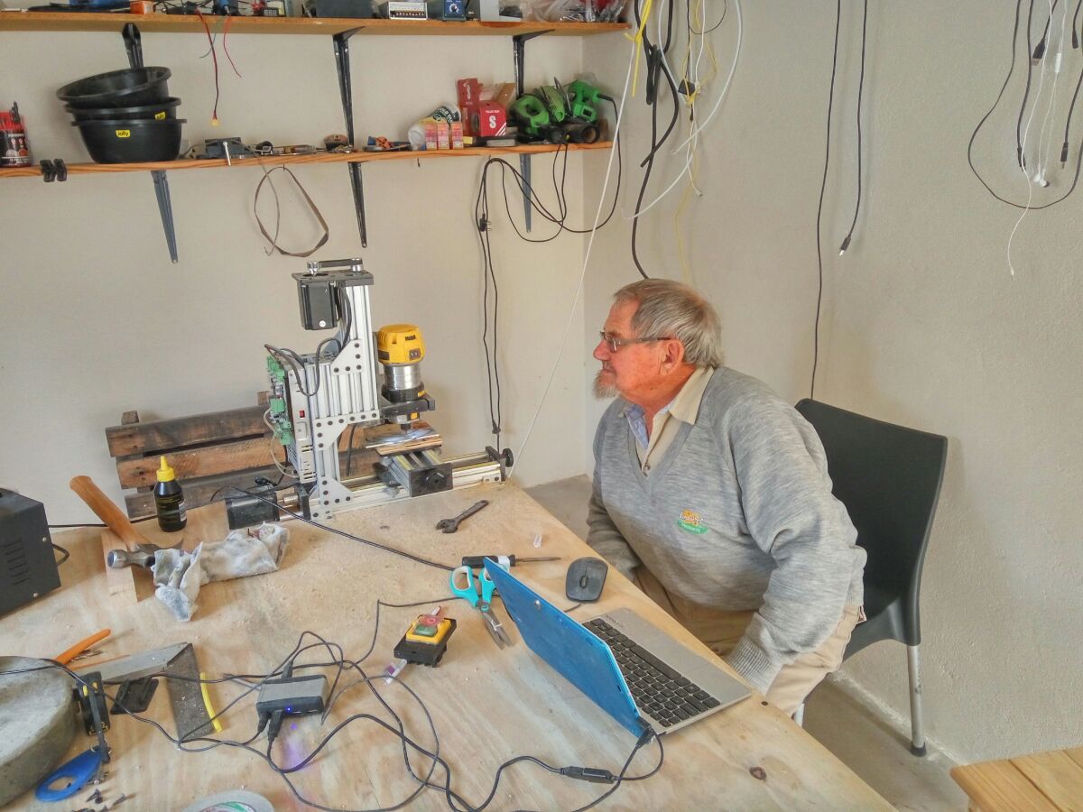
Case in point: (; - my neighbour: in his 80s... learning the ropes
Every function basically needs some "help" - instead of adding little notes that clutter up, but dont tell the whole story, can we perhaps consider create a new standard component called "helpbox" or something. It could be a tooltip, or a modal, that pops up and then has space for pics, text etc. I was working on this just before you posted the fix (; (didnt finish)
Then we can unify the "where to find the info" into a standard style on every element (a ? perhaps, that onclick, or onhover opens the helpbox?