compose-date-text-field
 compose-date-text-field copied to clipboard
Published
20 hours ago •
 LanarsInc
LanarsInc
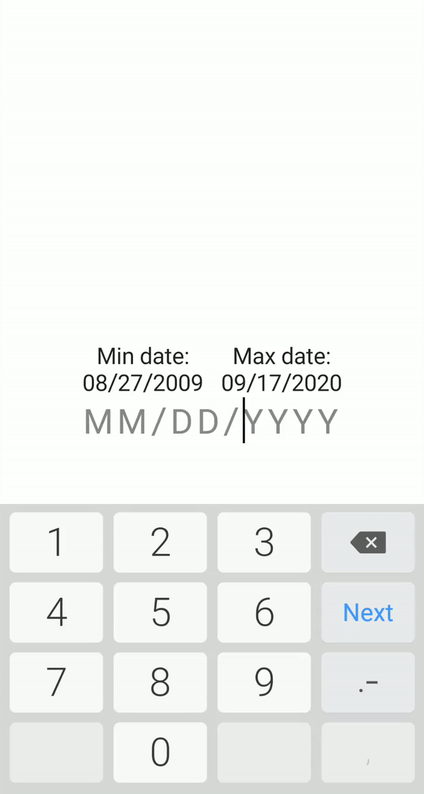
Date text field with on the fly validation
DateTextField for Jetpack Compose
Date text field with on the fly validation built with Jetpack Compose.
The input is validated while the user is typing it, so it is impossible to enter an incorrect value.
Made in LANARS.
Download
repositories {
    ...
    maven { url 'https://jitpack.io' }
}
dependencies {
    implementation 'com.github.LanarsInc:compose-date-text-field:{latest version}'
}
Preview
User can only enter existing dates

User can only enter dates that are in the allowed range
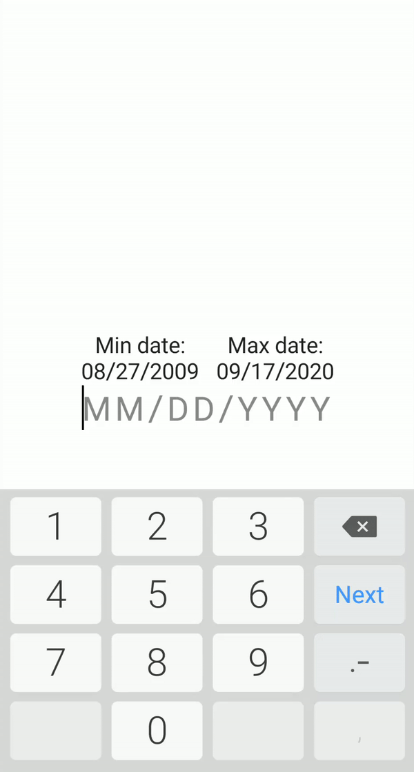
Input is being validated even though some fields are not complete
Usage
Basic implementation
DateTextField(
    onValueChanged = {}
)
You can set the exact date boundaries or leave it by default, from 1/1/1900 to 12/31/2100. Date format by default will be MM/DD/YYYY
DateTextField(
    // Detect focus changes
    modifier = Modifier.onFocusChanged { Log.d("DateInput", it.toString()) },
    // Set the desired date format
    format = Format.MMDDYYYY,
    // Set min and max date
    minDate = LocalDate.now().minusYears(1),
    maxDate = LocalDate.now().plusYears(1),
    // Get notified about value changes
    onValueChanged = { Log.d("DateInput", it.toString()) },
    // Preset date value
    initialValue = LocalDate.now(),
    // Apply text style to input text
    textStyle = TextStyle(fontSize = 25.sp, color = Color.Black),
    // Apply text style to hint
    hintTextStyle = TextStyle(fontSize = 25.sp, color = Color.Gray),
    // Apply style to cursor
    cursorBrush = SolidColor(Color.Red),
    // Set custom delimiter
    delimiter = '.',
    // Set horizontal delimiter margin
    delimiterSpacing = 4.dp,
    // Set field to be readonly
    readOnly = true
)
 LanarsInc