activity-browser
 activity-browser copied to clipboard
Figure improvements 2/x - Updating the LCA Results main tab
[intended for after first major Bokeh update]
When AB finishes an mLCA and opens the LCA results, we currently get the default 'blue bars' graph. and an option to switch to the overview heat map. Some suggested improvements:
-1 Overview figure
A better figure as a first overview could be:
 Each color would show a different Reference flow, and each cluster of bars represents a different impact category.
Note that the values are relative, which often provides more useful information in comparing reference flows than totals.
Credit for this idea to @mixib
-2 A radial chart
In the same tab, we could add a radial chart, showing how different reference flows score on certain impact categories
I just grabbed this figure from google, no clue what it is about

-3 Updating the Overview graph
It would be useful if the overview graph could either be totally switched, or have a button to choose between relative and absolute values. Currently, the absolute values make the color scaling more difficult to interpret with different impact categories (that have very different ranges of results). Also refer to #380
Additional comment for 3: We can modify the heatmap to show the color scale per column, which would make more sense. https://stackoverflow.com/questions/66822222/heatmap-with-multiple-colormaps-by-column
Additional information:
The bar chart should be the "overview", but within this overview one could change from "relative" to "absolute" and then get the heatmap... the coloring on the heatmap should be based on the "relative", the numbers display the "absolute"
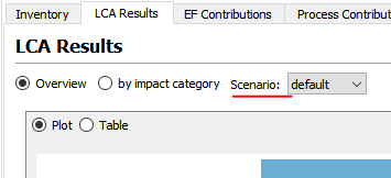
@marc-vdm , Any idea how this would look in case of performing an LCA with scenarios? As discussed the scenarios per reference flow would already be a group, would you instead consider having scenario as a parameter which can be changed at the view level (i.e, scenario dropdown like in the Overview tab)?

I think it'd be most important to compare scenarios when doing a scenario LCA, so perhaps the current layout (viewing all scenarios and 1 impact category and a dropdown to select other impact categories) would be the best as a default. Perhaps a switch (radio button?) to switch between the graph suggested in OP would be nice, that would then have: 1 scenario, all impact categories and a dropdown to select other scenarios.
We could add the switch to the Overview / By impact category option. By default, 2 options could be visible (Overview and Impact categories (with this one being the new graph suggested above)) and Impact categories selected as the default. When scenario LCA is used, we could have 3 options (Overview, Impact categories, Scenarios (with this being the current/old view)) and Scenarios selected as the default.
For implementation, we could just make the menu with 3 options and hide one when not used. We already do this in a lot of places. This would mean however, that the Scenario Graph should not be generated until opened or just be handled with a sort of default scenario?
Not sure this makes complete sense, so let me know if I need to explain further!