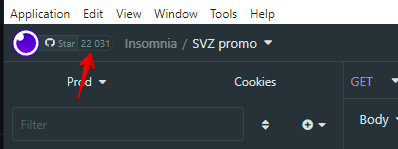
Please remove github stars from UI
Expected Behavior
No github stars in UI
Actual Behavior
Reproduction Steps
No response
Is there an existing issue for this?
- [X] I have searched the issue tracker for this problem.
Additional Information
It interferes with work. It's distracting. There are misclicks.
Insomnia Version
2022.5.0
What operating system are you using?
Windows
Operating System Version
Windows 10
Installation method
download
Last Known Working Insomnia version
No response
I would +1 this. While it is cool to show what Insomnia has achieved - as it is indeed a really good tool - I find that having Github stars in the app's toolbar doesn't meaningfully add to my experience with the app. Neither does it add useful features for daily work, nor for esthetics - and is actually visually cluttering.
What I would suggest here is adding ability to hide the button via settings.
I'm happy to give the repo a star, but I have to agree that putting this where the project selection menu used to be was a poor UX decision. It really gets in the way.
It might be better to occasionally present a "Give us a star on GitHub" dialog in the same way many apps have a "Leave us a review on the app store"-type nag screen.
Heads up @subnetmarco and @wongstein, please see this issue and feedback from community.
Hello everyone, an increasing number of GitHub stars helps the Insomnia application by bringing more visibility to the project, which in turn increases adoption and the amount of investment that we can (and will) allocate to the project. As we all know, open source is free to use, but it is not free to build: GitHub stars are one of the most inexpensive ways to generate an outsized outcome in the community by leveraging the tailwinds of increased adoption.
With that said, we may introduce the capability in the settings to potentially disable the button for users who don't want to see it in the header bar, or perhaps automatically do that for users that are subscribed to a paid plan.
In conclusion, GitHub stars are not just a vanity metric, they actually really help the project, that I am sure we all want to see get better over time.
If I could suggest having it match the overall design?
Perhaps move it to the starting page of Insomnia, and the projects page or a button by the user/settings buttons with just a ★/☆ icon?
I don't mind it appearing by default, but I've long since starred the project. It serves no purpose for me and I'd like an option to hide it.
@prookie yes, this is coming. We will make an update in such a way that paying customers won't see the star button.
I agree that it doesn't enhance the experience at all, and clicking it to star the project doesn't make it go away, so I'm puzzled by this idea that it somehow benefits the project. Just seems like a random marketing idea that was done "because we can". I believe only allowing it to be removed for paid users is against the spirit of open-source and moves Insomnia more in the direction of a "freemium" model seen more commonly in closed-source software. I could understand paywalling cloud & sync features, but paywalling something as arbitrary and unhelpful (to the user) as a Github Stars counter is baffling. And also, by paywalling it, you are essentially admitting that the UI element is superfluous because you don't want users to be able to turn it off.
Just my 2 cents.
It's the mis-clicks. While I sympathize on what @subnetmarco has mentioned above, it's annoying. At a minimum, move it somewhere else. Maybe to the right side by the settings/account icons. It's incredibly distracting.
You can see that the Nightingale REST app has implemented this as a star icon: https://github.com/jenius-apps/nightingale-core
It looks much cleaner.
I still think rating/star begging comes off badly. It reminds me of those mobile apps.
The haphazard way it was just thrown into the UI is concerning. Was there a particular pull request associated with this? How was it reviewed? Was it tested? Etc.
Agree with the comments here, it should be removed or at least moved to a place where it does not break the UI.
Also surprised that this made it given the obvious attention given to details everywhere else in the product.
When logging into the application with any subscription, including the Free subscription, the GitHub start button will disappear after the next version of Insomnia will be released. Later this year there will be a UI redesign on the header bar that will move the "projects dropdown" in a different location, therefore avoiding potential mis-clicks on the GH star button for logged-out users.
Why can't you just move it to the bottom right corner, next to the "Made with..." notice?
It seems that the Github stars are back. Why ?? Please consider what most users have said: they are disruptive and add absolutely no value.
For those that may not know this, GitHub stars disappear after logging into Insomnia with an account.
Furthermore, after the next GA (to be released this or next week), we are introducing a new GUI for the header bar of Insomnia. Among the many improvements, the GitHub stars won't be on the execution path when changing workspace/project anymore, therefore removing the risk of mis-clicks. Either way both with the new GUI, and today even, the GitHub stars already disappear after logging in with an Insomnia account (including a Free tier account).
Below screenshots of the new GUI in both logged and unlogged status:
Unlogged status:
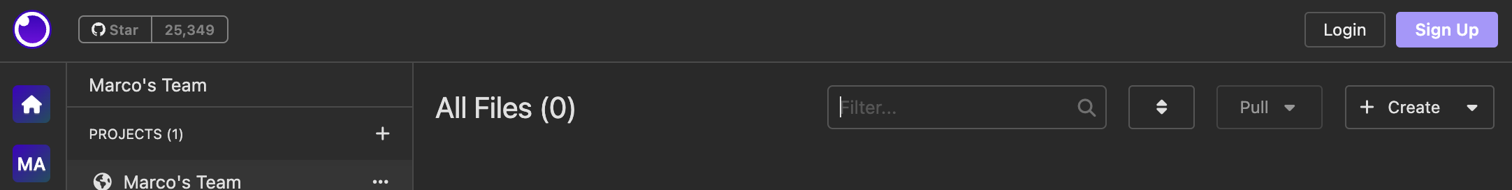
Logged status:
The GitHub stars in general are useful to the project as described in this comment.
But this doesn't resolve the problem. If the stars go away for logged-in users, why do they need to be in such a distracting place for those who are not logged in? Again, why can't the stars be moved to the bottom right corner?
And it introduces another problem. Why should one have to log in? What if I don't want to create an Insomnia account? I am perfectly fine seeing the stars in a place that doesn't accidentally get clicked, like the bottom right corner.