Scaling of legends when composing plots into layout, v1.25
Something has changed with the scaling of subplots within a layout, which causes the legend to become very wide.
Previously, they retained the size they had within individual plots. Now, the legend within one subplot seems to depend on the size of the overall layout. Especially for scatter plots, this causes the point to be marooned out in space, far from the label. Nothing else (that I know of) scales like this -- other features of a plot remain the same when it is placed into a layout.
Example:
julia> using Plots # with GR default
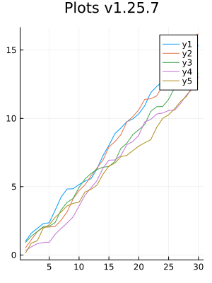
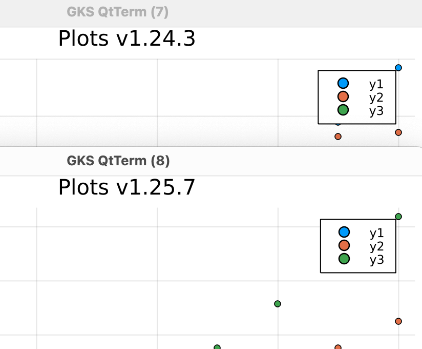
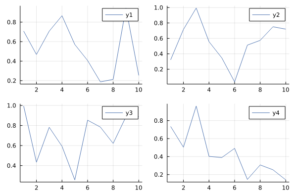
julia> p1 = plot(cumsum(rand(30, 5), dims=1); size=(300,400)) # normal short legend lines
julia> plot(p1, p1, p1, p1; size=(1200, 400), layout=(1,4)) # much longer lines in legend
julia> plot!(title="Plots v1.25.7")


Individual plots do not seem to be as strongly affected:
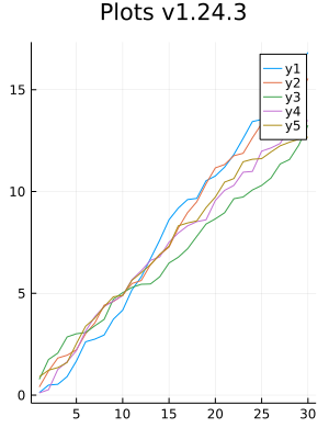
[Edit - subplot sizes corrected so that they are exactly a multiple of the layout size.]
Details
Backends
This bug occurs on ( insert x below )
| Backend | yes | no | untested |
|---|---|---|---|
| gr (default) | X | ||
| pyplot | X | ||
| plotlyjs | X | ||
| pgfplotsx | X | ||
| unicodeplots | X | ||
| inspectdr | X | ||
| gaston | X |
Versions
(jl_A9O98Y) pkg> st
Status `/private/var/folders/yq/4p2zwd614y59gszh7y9ypyhh0000gn/T/jl_A9O98Y/Project.toml`
  [28b8d3ca] GR v0.63.1
  [58dd65bb] Plotly v0.4.1
  [a03496cd] PlotlyBase v0.8.18
  [91a5bcdd] Plots v1.25.7

julia> versioninfo()
Julia Version 1.8.0-DEV.1440
Commit e3b681c687 (2022-02-02 01:39 UTC)
Platform Info:
  OS: macOS (arm64-apple-darwin21.1.0)
  CPU: Apple M1
  WORD_SIZE: 64
  LIBM: libopenlibm
  LLVM: libLLVM-13.0.0 (ORCJIT, cyclone)
Environment:
  JULIA_NUM_THREADS = 4

julia> versioninfo()  # same results with rosetta & Julia 1.7
Julia Version 1.7.0
Commit 3bf9d17731 (2021-11-30 12:12 UTC)
Platform Info:
  OS: macOS (x86_64-apple-darwin19.5.0)
  CPU: Apple M1
  WORD_SIZE: 64
  LIBM: libopenlibm
  LLVM: libLLVM-12.0.1 (ORCJIT, westmere)
This is an effect of https://github.com/JuliaPlots/Plots.jl/pull/3855.
In the mentioned PR, I expressed my opinion (specifically here) against hard-coding a scale factor when a dynamic function of the plot area was implemented before.
Those eventually got merged in https://github.com/JuliaPlots/Plots.jl/pull/4055.
I would vote in favor of reverting these changes.
Example output with the PR reverted:
Ping @BeastyBlacksmith and @isentropic for decision.
Thanks for digging. One further change which this doesn't revert is that the y-axis ticks are calculated differently. Not sure which is better (my real case fixed them by hand).
One further change which this doesn't revert is that the y-axis ticks are calculated differently
Oh I see that only now. That's quite difficult to track down, but I'll try to find out what changed this.
Some significant changes were made in https://github.com/JuliaPlots/PlotUtils.jl/pull/124, which got in after 1.24.3 got out, maybe you can try reverting this PR and see if it fixes the ticks.
To be honest, I don't like both versions for this example. But I agree, that we should have a more dynamic default and maybe also a way to customize this.
Maybe the scatter example is closer to what initially surprised me, as the points seem marooned out in space. (I had turned the legend box off too.)
I also think there might be a better solution than both, but the one now looks better with default figure size (unlike this example), do you agree?
Yes that's intentional, how about 4 subplots in one figure, with default figure sizing (600x400?)
4 plots within the default seems a very crowded case no matter what, I guess I would vote for the legend being pretty tight here rather than taking up too much of the graph?
Super-hard to tune all cases. But inserting so much more space between the symbol and the label, compared to that between different symbols, seems to break up wha the legend is trying to convey.
But https://github.com/JuliaPlots/Plots.jl/issues/4092#issuecomment-1029327238 is close to what I have in reality -- small plots which work fine alone, at the intended size, but change quite dramatically when placed into a larger plot, still at the same size.
That's the coupling which seems odd to me. Why should the legend of one plot care whether it's a small stand-alone plot or a panel (the same size) in a larger one?
I know nothing about the internals of this package but assumed this was tied to the font size or the size of the plot points used in the legend, and perhaps to the plot the legend belongs to, but not to the outermost layout it is placed into.
In the 4 plot example above, the font size doesn't scale, the tick marks (little marks above ticks) don't scale, title font doesn't scale, legend font doesn't scale, size of the markers in the legend doesn't scale. Why should the legend box scale? It just does not make sense. You plotted a scatter, which looks okay in the older version, but line plot doesn't look as well. Next, I was thinking about backend consistency, new GR is also on par with pyplot and pgfpltosx.
At this point it's a debate of tastes I feel. My arguments are:
- Stay consistent with other backends
- Stay consistent with other plot elements
In my opinion, the legendbox should always keep its aspect ratio (defined by the legendbox fontsize), regardless of the figure size. Perhaps this hasn't been achieved yet.
Why should the legend box scale?
To be clear, the original surprise above is that the legend box does now scale, when subplots are combined into a larger plot. While the fonts, the markers, etc, do not.
I don't know why that's happening. Perhaps "keep its aspect ratio" is being defined relative to the whole layout, rather than to the axes on which the legend is located.
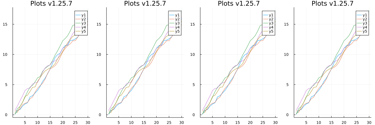
The scaling is an artifact of figure size changing, running your example but without figure size specification:
plot(p1, p1, p1, p1; layout=(1,4), legend=:outertop)
Looks like the legend box keeps its size (more or less) when comparing with the most basic case:
artifact of figure size changing
But by "figure size" I think you mean the total layout, which contains several sets of axes, each of which have their own legend. These axes have not changed size (much), they remain (roughly) 300 x 400.
If we were discussing an overall title which belonged to the total layout, then centring it with respect to the overall layout, and sizing it with respect to the overall layout, would make sense. But it seems weird to do this for objects which belong to a particular set of axes, a particular subplot.
Whether this subplot is placed next to one other (to fit in half the page, say) or next to 4 others (the full page) while it remains the same size, does not change where the data is, and how much space its legend can have before colliding with the data.
Yes, I mean the total figure size. I'm too accustomed to matplotlib semantics: Figure (the whole thing), Ax (subfigure)
Having just come across this change in v1.25, and giving my opinion as a frequent plots user who likes to build complex multipanel figures in plots. I agree with @mcabbott. I am very much in favour of tighter legends and those that scale to the subplot rather than the whole figure. As example, and if you excuse the unfortunate low quality reproduction on the preprint server (due to a collaborator and a weird pdf conversion - which I hope to get fixed), I made this figure near exclusively in Plots with minor svg editing: https://www.medrxiv.org/content/medrxiv/early/2021/12/05/2021.12.03.21267240/F3.large.jpg?width=800&height=600&carousel=1 Making this kind of thing becomes a challenge if legends scale to the full figure.
In #3855 I agree with @t-bltg that in the old vs new examples in https://github.com/JuliaPlots/Plots.jl/pull/3855#issuecomment-929970069 I much prefer the old, better to be able to see the data. If you need to have a small subplot, its great to be able to have a small legend.
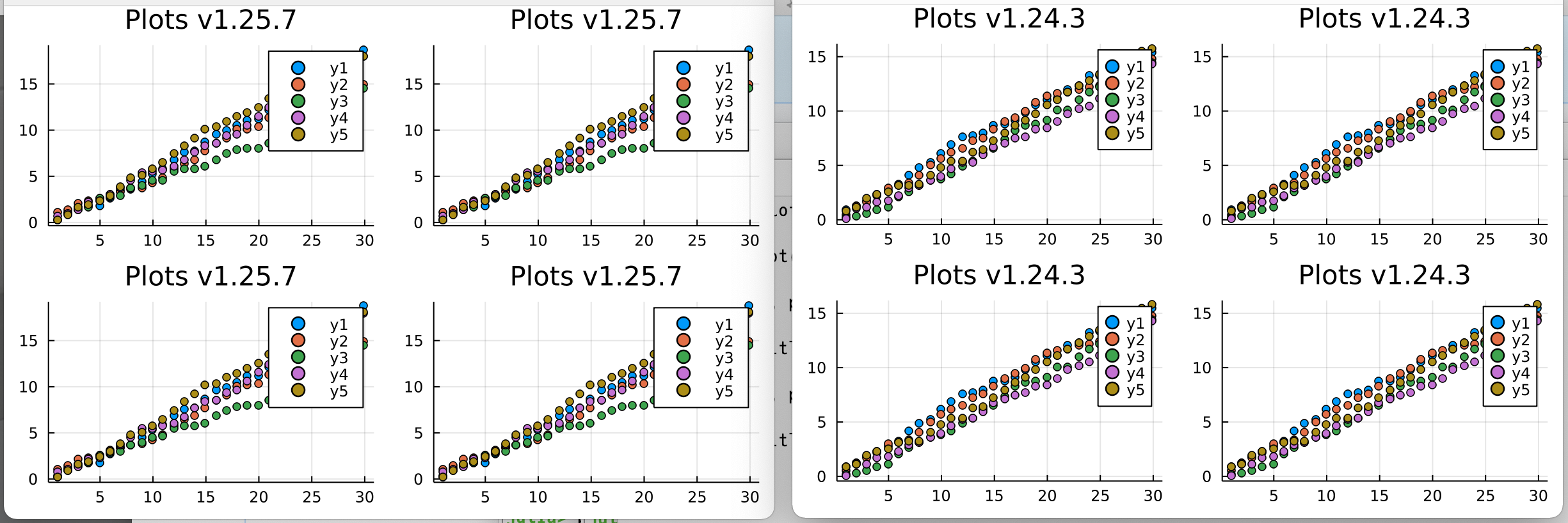
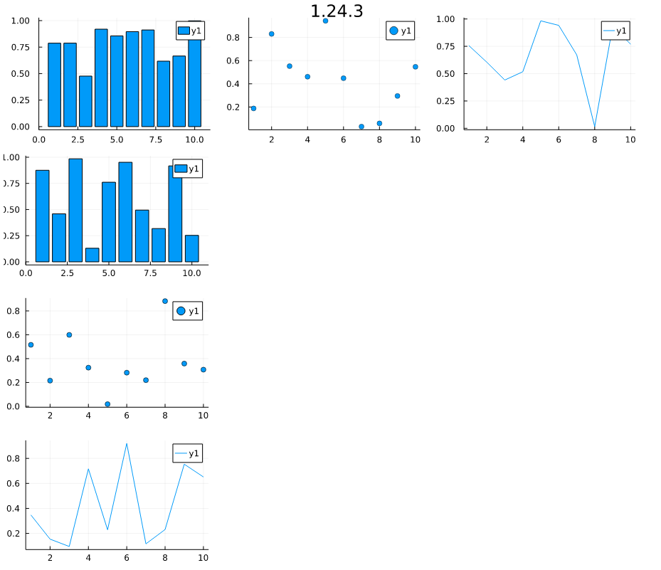
Changing the fontsize is not really a solution as the legend box and line/box now scales to the entire figure size. Taking the advanced layout example and increasing the figure size to something larger than the default:
l = @layout [
    a{0.3w} [grid(3,3)
             b{0.2h}  ]
]
plot(
    rand(10, 11),
    layout = l, legend = true, seriestype = [:bar :scatter :path],
    title = ["($i)" for j in 1:1, i in 1:11], titleloc = :right, titlefont = font(8), legendfont=font(8), size=(1000, 500)
)
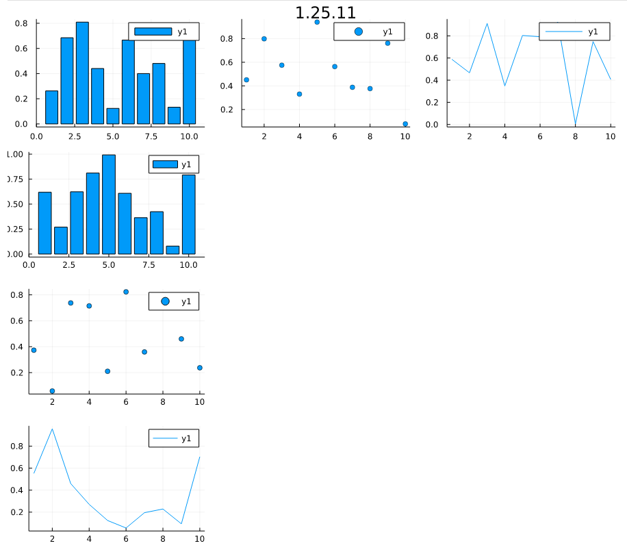
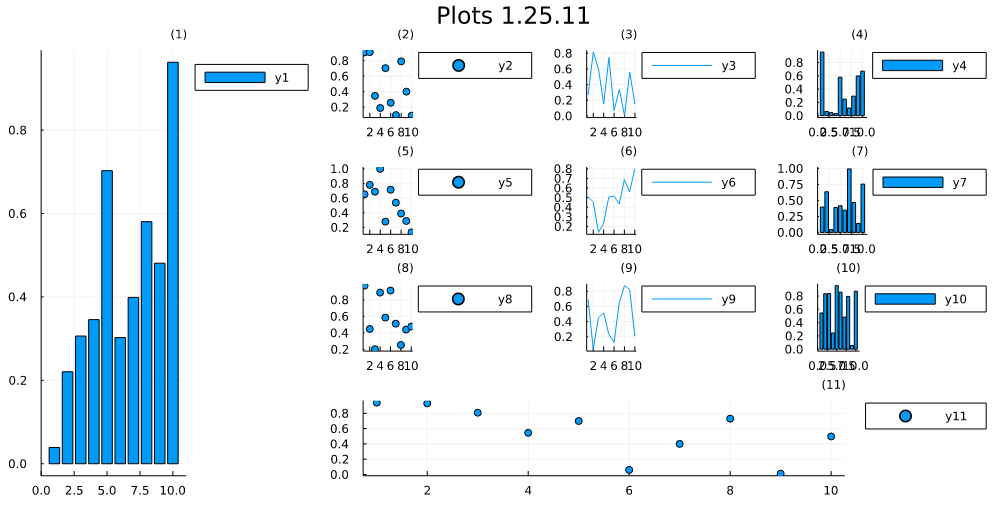
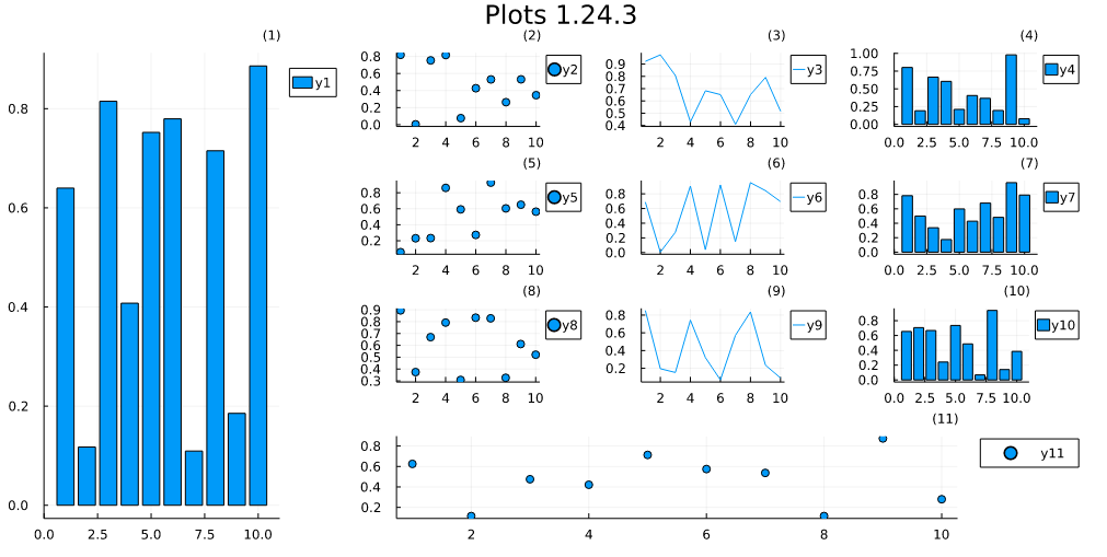
Then comparing v1.24.3 to v1.25.11:
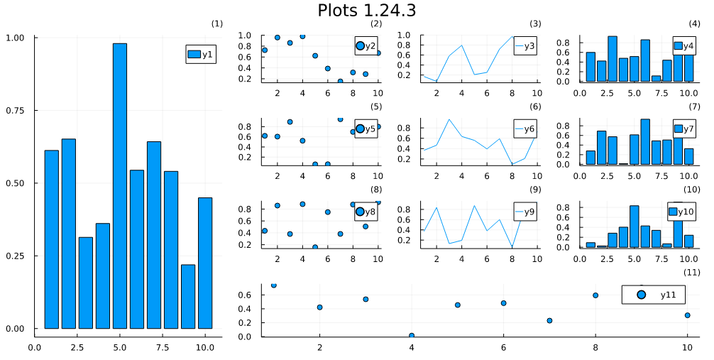
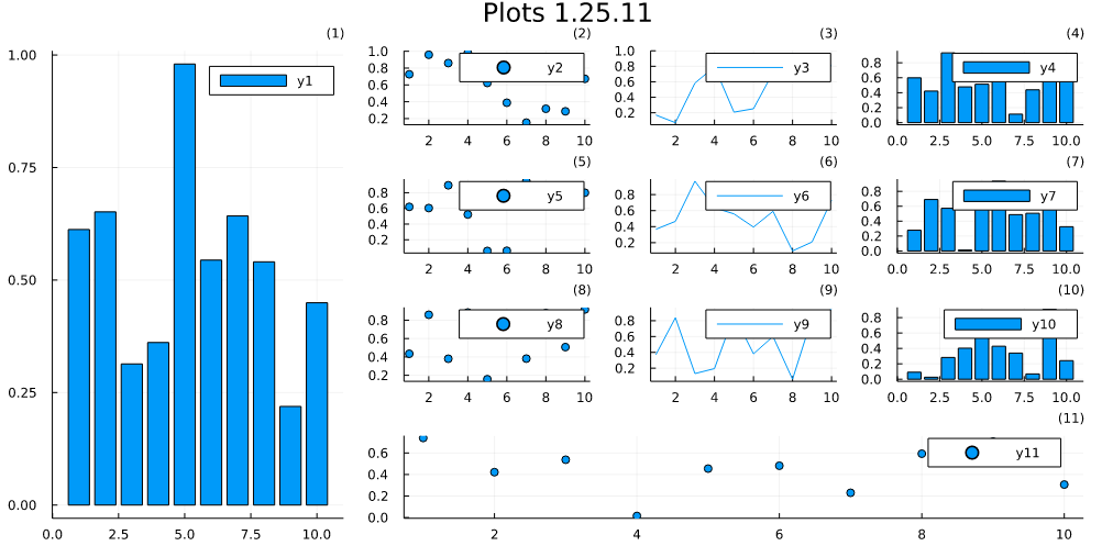
In 1.25.11 the legends unusable and obscure the data, and here individual subplots are a reasonable size as the whole figure is large. I agree that the 1.24.3 behaviour is not perfect and could be improved, but building large multipanel figures is workable. The scaling the legends to subplots was introduced not that long ago, although I do not recall the version of plots exactly. I appreciate there are differing opinions on legends, but this does feel like we have lost a feature.
I agree that the new behavior is not perfect, I think none of these plots look good. The ideal solution would be preserve the size of the legend box so that it always the same regardless of the figure or the subplot size. The legendbox should only scale with the legendfontsize
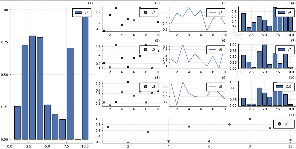
The problem right now is that the newest iteration calculates the size of the legendbox based on the figure size (600x400) by default. Instead, it should always be of the size of the default legendbox, and scale only with the legend font. This is similar to how other plot elements behave - like axis labels. I'm not that proficient in GR to this happen, but the newest solution works well when you're not changing the figure size. Omitting size it looks like:
l = @layout [
    a{0.3w} [grid(3,3)
             b{0.2h}  ]
]
plot(
    rand(10, 11),
    layout = l, legend = true, seriestype = [:bar :scatter :path],
    title = ["($i)" for j in 1:1, i in 1:11], titleloc = :right, titlefont = font(8), legendfont=font(8), size=(1000, 500)
)
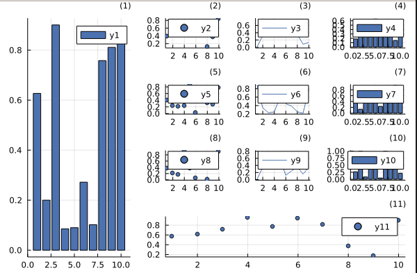
You could say it's bad cause there is overlapping with data, but I say it's very consistent with default plotting. It's just the layout that's bad here. Matplotlib would produce the same. Just to make sure you hear me: I agree that the current behavior is not perfect, but the previous one is not good either. We can endlessly argue which is worse. Instead, let's come up with a solution that gives similar output to pyplot or pgfplots backends. It's good that the change triggered the discussion, now we should wait for someone to come up with a better solution.
I'm not good at the GR backend, but the relevant code is here https://github.com/JuliaPlots/Plots.jl/commit/acb5d5ac4bc6b840aef36330a4087e7b8ac41dfc When testing, please compare with pyplot and pgfplots output to verify the behavior.
Your exact example in pyplot looks like:
pyplot()
l = @layout [
    a{0.3w} [grid(3,3)
             b{0.2h}  ]
]
plot(
    rand(10, 11),
    layout = l, legend = true, seriestype = [:bar :scatter :path],
    title = ["($i)" for j in 1:1, i in 1:11], titleloc = :right, titlefont = font(8), legendfont=font(8), size=(1000, 500)
)
I think it's a good compromise
I think none of these plots look good
It is your sole opinion, and I disagree. I (and others) think that the previous, even if not perfect, was better.
You could say it's bad cause there is overlapping with data, but I say it's very consistent with default plotting
On the left bar-plot, the legend makes the bar look like an horizontal bar, I find it more confusing than the previous legend symbol which was more square-ish. We also loose a lot of usable space with blank in the legend box.
We can endlessly argue which is worse.
We running in circles here, and you are reverting the situation to your advantage. The debate had to be done in https://github.com/JuliaPlots/Plots.jl/pull/3855, and we should have found a satisfactory solution there. Until the approval is collective, you cannot force PRs like this (see https://github.com/SciML/ColPrac). The point is that the PR you merged didn't get full approval, and should not have gone in. Doing otherwise is rude.
Your exact example in pyplot looks like:
This is not an argument. Making plots look like what you get in matplotlib is not and should not be the development guideline. On this particular PyPlot example, the subplots are bigger, and the data can be interpreted. On the GR plot, the data is unreadable, hidden by the legend box (which was the initial argument against these changes). Again, the question is: which is more important in a plot, data or decorations ? My argument is that decorations should not hide data (and others seem to share this opinion).
It's good that the change triggered the discussion, now we should wait for someone to come up with a better solution.
Until anyone finds a better solution - which, given the development timeline of Plots, could take ages - and since it is clearly affecting users, I would propose, again, to revert the PR. We can then work on a draft PR to solve the scaling issue.
Well, I did this with approval, we had a Plots maintainers call with @BeastyBlacksmith and @daschw.
I'm just sad that I'm being accused here.
It is your sole opinion, and I disagree. I (and others) think that the previous, even if not perfect, was better.
And this is your opinion too. It's hard to tell which one people like more without a survey and proper methodology. If you have the will and energy, then go ahead collect some data, and present facts. As you said, this thread is all about opinions.
Until anyone finds a better solution - which, given the development timeline of Plots, could take ages - and since it is clearly affecting users, I would propose, again, to revert the PR.
Sure I do not mind. Though, you can't be certain if people on average don't like the current behavior.
All in all, one example is not enough of a justification for the revert. Although this complex multiplot doesn't look good, simpler 1-4 subplot figures tend to look better I feel. Let's have some more examples for/against this change. We can't base this off a single example.
Examples I think the current behavior is good: Simple 4 subplot:
plot(rand(10,4), layout=4)
Simple 6 subplot plot(rand(10,6), layout=6)
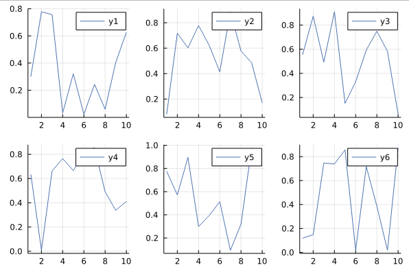
Simple 2 subplot plot(rand(10,2), layout=2)
These all look better in the newest iteration I feel --- my opinion. I also think that this covers >95% of the needs in layouting. After all we want Plots to do well in the simplest cases.
I'm all for making the most basic plotting look good. Although more complex figures do not look as you have shown, the simplest cases are better (my opinion).
It is not entirely right to say that if a complex layout plot looks bad, the change is bad. If the legend is covering the data, then do not use it, or put it outside the figure.
I agree that we should come up with a better solution. My question: was the previous basic plotting bad enough and the improvement good enough to warrant a change that kills off legends in complex plotting. I do not feel that they were that bad previously, and the loss in functionality is significant and therefore am in favour of reverting this as in https://github.com/JuliaPlots/Plots.jl/pull/4117.
@isentropic I do appreciate that you are trying to iron out the inconsistencies in Plots, which is great.
Some useful background: as far as I can make out, we used to have exactly 0.02 constant for legend_rightw, and a bug was raised https://github.com/JuliaPlots/Plots.jl/issues/2808 as legends were proportional to window size, not plot size. It was then fixed here https://github.com/JuliaPlots/Plots.jl/pull/2869. It is the cases that reverting to 0.02 constant legend width in 1.25.11 does not reproduce the window bug, but I have not looked into this enough to know why. This discussion and https://github.com/JuliaPlots/Plots.jl/pull/3855 should acknowledge that bug and PR, otherwise we are really going around in circles.
I think there is a solid argument that legends should not be proportional to the total figure size. Its useful to look at what other plotting packages do. By default matplotlib legends are a constant size and do not scale with plot size at all. The same appears to be true in Makie. The My R is very rusty, but as far as I can tell there the scaling of subplot legends is not proportional to total figure size for any of the plotting packages. Its also the case that in all those cases there is a lot more control over the legend, I appreciate this is challenging in Plots with the multiple backends.
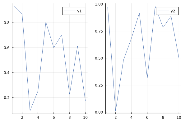
I'm sure everyone gets the point, but to make it explicit. Consider the following horizontal and vertical layouts, where all the plots are approx the same size.
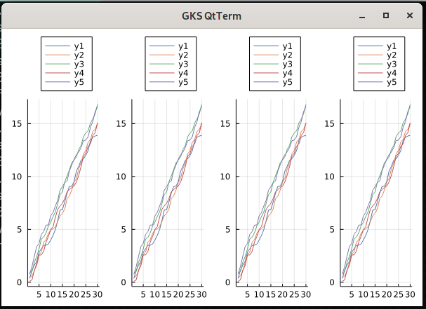
plot(bar(rand(10)), scatter(rand(10)), plot(rand(10)), layout=(1, 3), size=(900, 200)) |> display ### horizontal
plot(bar(rand(10)), scatter(rand(10)), plot(rand(10)), layout=(3, 1), size=(300, 600)) |> display ### vertical
In 1.24.3, it seems right that the legends are approximately the same size in the horizontal and vertical versions.
 In 1.25.11, they are now different sizes:
@isentropic You suggest that if the legend is covering the data do not use it or put the legend outside. We don't really have good options to put the legend outside in 1.25.11, the legends become completely dominant:
My vote would be 1) revert as in https://github.com/JuliaPlots/Plots.jl/pull/4117, or if the following can be done quickly 2) choose a reasonable fixed size legend by default and then have a legend_size atttribute, or legend_width_factor and allow users ideally allowing it to be set in proportion to the figure or the subplot.
Well, I understand your opinion. Yet you are constantly presenting this overly complex plot as the basis of your argument. You prefer functionality over looks. But I'd rather have 2,4,6 subplot figures look very good. I feel most of the users do not care about overly complex plots either. Right now it is one of:
- Make all the subplots ugly, but still readable
- Make default figure size subplots (2,4,6 examples I showed) look very good, but the complex ones are ugly.
I do not see how 1 is better than 2. I just don't think that using legends in overly complex plots is even a good idea to begin with. I'm promoting that the default Plots backend should at least look good with default figure_size and basic subplots. I feel this where the most users are frustrated when they start off. This is prioritizing instant early turnoffs. I'm sorry for those who need so much configurability.
@t-bltg you're making this sound like all the users are complaining and unhappy, I do not think that's the case. Most of the users must like that their moderate complexity workflow just got a little more consistent. The current behavior is more consistent than the old one.
I'd prefer it if you didn't characterise my opinion as "functionality over looks" and setting it up as a false dichotomy is not especially helpful.
Looks are subjective, I'd argue that that old tighter legends looked better and that its bad visualisation practice to have a legend take up more real estate than is absolutely necessary (https://www.edwardtufte.com/tufte/books_vdqi). I'd also argue that in my horizontal/vertical example the new legends look bad, they are not consistent. Single row/column horizontal/vertical layouts are not exactly complex layouts.
Help me understand your position so we can find common ground. Could you be explicit about what is ugly about the previous legends and what is good about the new? Could you also point to the user complaints about the old behaviour, which users have expressed frustration over the previous defaults?
To be honest, I don't have a lot of time to spend on this discussion. I've given you my opinion as a regular plots user, I've also pointed to a previous bug and PR where this issue was discussed in the reverse. I've also pointed out that the the current legend scaling is at odds with most other major plotting packages, and suggested a fixed legend size could be a solution to discuss. You didn't engage in any of those statements, just gave your opinion and told me that you don't think legends in complex layouts plots are not "a good idea to begin with". They are, unfortunately, necessary when publishing in scientific journals, we have limited figure numbers and complex data to communicate, complex layouts become essential. They are also very useful in exploratory data analysis and data dashboards, and I'm sure in many other cases.
This discussion is not productive. I have pinned plots at 1.24.3, and I'll keep my fingers crossed some solution will come along. I am of course thankful for all the work that is done maintaining and adding to plots.
@owensnick, @mcabbott, the PR is now reversed, so you can update to latest 1.25.12 to recover the old behaviour. The issue is kept open for the valuable comments made in this discussion, for future developments.
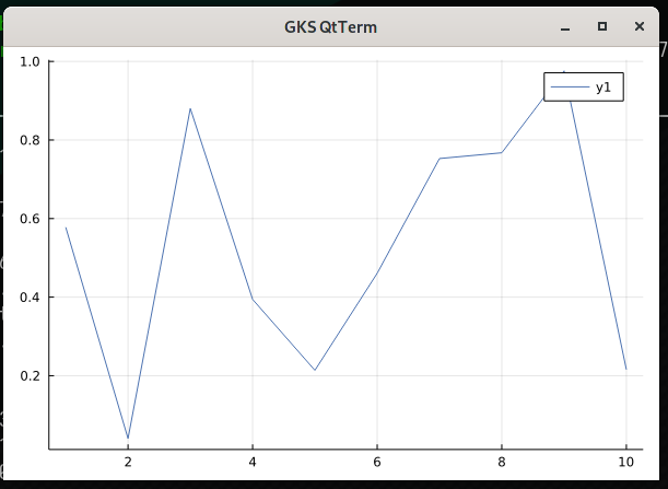
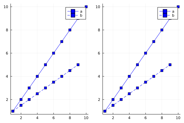
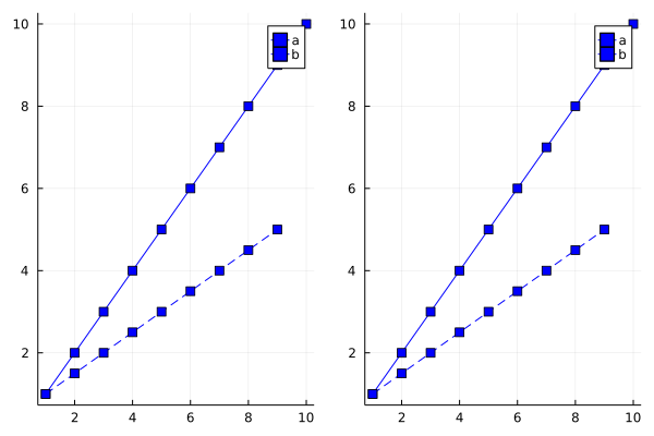
I think I have found one instance where the current behaviour is worse: Differences in linestyle become obscured by markers in legends.
Seems like one fix would be to scale the markersize. Let me know if this should be a separate issue.
# Looks good
pp = plot([1:10, 1:0.5:5]; c=:blue, linestyle=[:solid  :dash], marker=:square, label=["a" "b"])

# Line style not visible behind marker in 1.31.7
plot(pp, pp)
With Plots 1.25.7:
With Plots 1.31.7

Seems like one fix would be to scale the markersize. Let me know if this should be a separate issue.
Yes, probably a downscaling of the markers in the legendbox would be needed. Please do open an issue, or a PR.