AlgebraOfGraphics.jl
 AlgebraOfGraphics.jl copied to clipboard
`LinearTicks` seems to alter the formatting for timeseries data
Hi, thanks for such a cool package! I am copying this discussion from the slack here regarding formatting ticklabels from timeseries data:
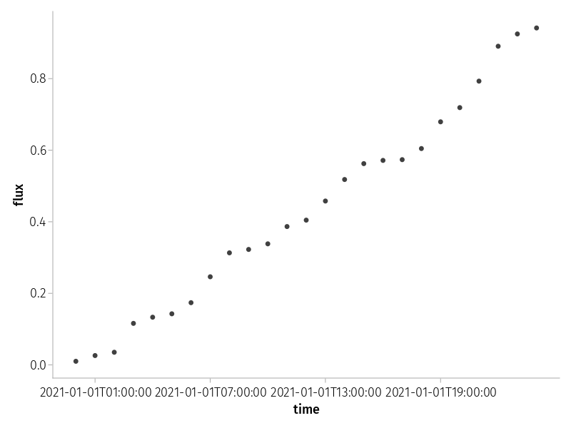
@icweaver said: I have some timeseries data that I was hoping to plot with AoG. The problem I am having is with the label formatting for something like this:
using AlgebraOfGraphics, CairoMakie, Dates, DataFrames
df = DataFrame(
	:t => DateTime("2021-01-01T00:00:00"):Hour(1):DateTime("2021-01-02T00:00:00"),
	:f => sort(rand(25))
)
plt = data(df) * mapping(:t=>"time", :f=>"flux")
draw(plt)
which seems to crowd the tick labels
I see that I can rotate things by passing draw(plt, axis=(xticklabelrotation=π/8,)) so I was wondering if there was also a similar way to modify the date formatting with some combination of xticks and xtickformat with Dates.format?
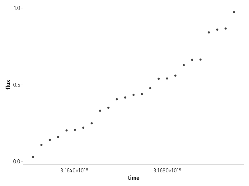
@ericphanson mentioned that it might have been possible to reduce the number of tickmarks in the past with xticks=LinearTicks(N), but that seems to also alter the original formatting of the ticklabels:
Is there another approach that we should be following to apply the desired formatting?
So, the date time ticks situation is not ideal, because to get full support they should be implemented in MakieLayout directly I think.
I'm adding a small helper in #252, so that in your example you could do
ticks = AlgebraOfGraphics.datetimeticks(hour, df.t[5:5:20]) # pass formatting function and list of date times
draw(plt, axis=(xticks=ticks,))
Unfortunately, getting it to work sensibly with LinearTicks is harder, because in the tick selection, the algorithm would ignore that it is dealing with datetimes under the hood and just work with the underlying floating point values.