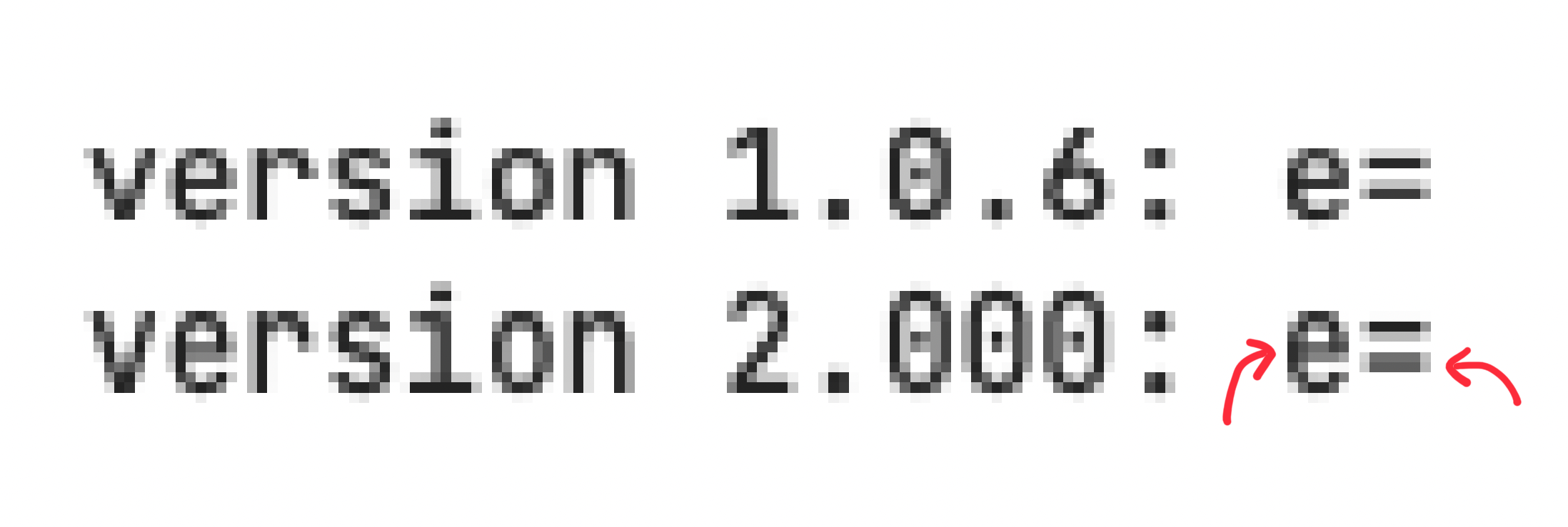
Taller font in version 2.x with blurred 'e' and '=' in size 13
I've just updated PHP Storm to 2021.1 and can't believe my eyes. The perfect JetBrains Mono font is not so perfect anymore! :)
The first "problem" is that all letters are taller. I've found an issue for the same problem between versions 1.0.2 and 1.0.3 (https://github.com/JetBrains/JetBrainsMono/issues/199). However, in my case all versions up to 1.0.6 have the same height of the letters. Started with 2.000, the letters are taller. @philippnurullin argued that this is by purpose. OK, I understand but I'm really not fan of this change. It's like a different font for me...
Despite the height, I found an issue with blurred characters 'e' and '=' when using size 13. Size 12 is OK, but it is not comfortable for me. And as a developer, I use character '=' a lot. And I can see that bottom line is blurred 😀
I assume that non of this will be fixed 😉 So I will stick with 1.0.6 forever. Lucky for me, I don't use ligatures, so I installed NL version and easily set it in my IDE.
Hi @peterpp Please specify the OS. I'll see what can be done in case of =and e.
Sure. I use macOS Big Sur (11.2.3). This blurred rendering is visible in system Font Book application and in IDE (PHP Storm) as well.
The screens seems to be taken from non retina display. Can not reproduce the problem on it. What display you using? Is font smoothing applied?
I don't have retina but 1440p monitor (3440x1440 with Mac mini). Font smoothing should not be active. There is no option in Big Sur preferences to activate it, but I found that it can be enabled by terminal command. So I checked it with:
> defaults -currentHost find AppleFontSmoothing
2021-04-09 20:53:58.064 defaults[33029:15256719] No domain, key, nor value containing 'AppleFontSmoothing'
I'm using 3440x1440 with Mac mini as well, and size 13 looks too tall compared to the other sizes. Size 12 is too small and 14 too large.
I know you said this is intended in #199 but it looks like I'm not the only one who doesn't like this change.