react-native-tree-multi-select
 react-native-tree-multi-select copied to clipboard
 JairajJangle
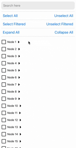
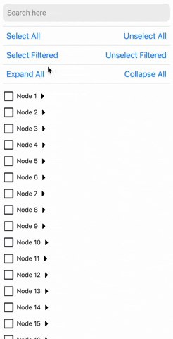
Super-fast tree view with multi-selection capabilities, using checkboxes and search filtering.
react-native-tree-multi-select
⚡️Super-fast Tree view with multi-selection capabilities, using checkboxes and search filtering.


Installation
Using yarn
yarn add react-native-tree-multi-select
using npm:
npm install react-native-tree-multi-select
Dependencies that need to be installed for this library to work:
Make sure to follow the native-related installation instructions for these dependencies.
Usage
import {
  TreeView,
  type TreeNode,
  type TreeViewRef
} from 'react-native-tree-multi-select';

// Refer to the Properties table below or the example app for the TreeNode type
const myData: TreeNode[] = [...];

export function TreeViewUsageExample(){
  const treeViewRef = React.useRef<TreeViewRef | null>(null);

  // It's recommended to use debounce for the search function (refer to the example app)
  function triggerSearch(text: string){
    // Pass search text to the tree along with the keys on which search is to be done(optional)
    treeViewRef.current?.setSearchText(text, ["name"]);
  }

  // Callback functions for check and expand state changes:
  const handleSelectionChange = (checkedIds: string[]) => {
    // NOTE: Do something with updated checkedIds here
  };
  const handleExpanded = (expandedIds: string[]) => {
    // NOTE: Do something with updated expandedIds here
  };

  // Expand collapse calls using ref
  const expandAllPress = () => treeViewRef.current?.expandAll?.();
  const collapseAllPress = () => treeViewRef.current?.collapseAll?.();
  const expandNodes = (idsToExpand: string[]) => treeViewRef.current?.expandNodes?.(
    idsToExpand
  );
  const collapseNodes = (idsToCollapse: string[]) => treeViewRef.current?.collapseNodes?.(
    idsToCollapse
  );

  // Multi-selection function calls using ref
  const onSelectAllPress = () => treeViewRef.current?.selectAll?.();
  const onUnselectAllPress = () => treeViewRef.current?.unselectAll?.();
  const onSelectAllFilteredPress = () => treeViewRef.current?.selectAllFiltered?.();
  const onUnselectAllFilteredPress = () => treeViewRef.current?.unselectAllFiltered?.();
  const selectNodes = (idsToExpand: string[]) => treeViewRef.current?.selectNodes?.(
    idsToSelect
  );
  const unselectNodes = (idsToCollapse: string[]) => treeViewRef.current?.unselectNodes?.(
    idsToUnselect
  );

  return(
    // ... Remember to keep a fixed height for the parent. Read Flash List docs to know why
    <TreeView
      ref={treeViewRef}
      data={myData}
      onCheck={handleSelectionChange}
      onExpand={handleExpanded}
    />
  );
}
Properties
| Property | Type | Required | Description |
|---|---|---|---|
data |
TreeNode | Yes | An array of TreeNode objects |
onCheck |
(checkedIds: string[]) => void |
No | Callback when a checkbox is checked |
onExpand |
(expandedIds: string[]) => void |
No | Callback when a node is expanded |
preselectedIds |
string[] |
No | An array of ids that should be pre-selected |
preExpandedIds |
string[] |
No | An array of ids that should be pre-expanded |
indentationMultiplier |
number |
No | Indentation (marginStart) per level (defaults to 15) |
treeFlashListProps |
TreeFlatListProps | No | Props for the flash list |
checkBoxViewStyleProps |
BuiltInCheckBoxViewStyleProps | No | Props for the checkbox view |
CheckboxComponent |
ComponentType<CheckBoxViewProps> |
No | A custom checkbox component. Defaults to React Native Paper's Checkbox |
ExpandCollapseIconComponent |
ComponentType<ExpandIconProps> |
No | A custom expand/collapse icon component |
ExpandCollapseTouchableComponent |
ComponentType<TouchableOpacityProps> |
No | A custom expand/collapse touchable component |
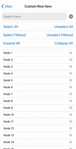
CustomNodeRowComponent |
React.ComponentType<NodeRowProps> |
No | Custom row item component |
ℹ️ If CustomNodeRowComponent is provided then below props are not applied:
indentationMultipliercheckBoxViewStylePropsCheckboxComponentExpandCollapseIconComponentExpandCollapseTouchableComponent.
⚠️ If the tree view doesn't scroll if rendered in a complex nested scroll view/s then try setting the renderScrollComponent value in treeFlashListProps to ScrollView from react-native-gesture-handler.
TreeNode
| Property | Type | Required | Description |
|---|---|---|---|
id |
string |
Yes | Unique identifier for the node |
name |
string |
Yes | The display name of the node |
children |
TreeNode[] |
No | An array of child TreeNode objects |
[key: string] |
any |
No | Any additional properties for the node (May be useful to perform search on) |
TreeViewRef
| Property | Type | Description |
|---|---|---|
selectAll |
() => void |
Selects all nodes |
unselectAll |
() => void |
Unselects all nodes |
selectAllFiltered |
() => void |
Selects all filtered nodes |
unselectAllFiltered |
() => void |
Unselects all filtered nodes |
expandAll |
() => void |
Expands all nodes |
collapseAll |
() => void |
Collapses all nodes |
expandNodes |
(ids: string[]) => void |
Expands specified nodes |
collapseNodes |
(ids: string[]) => void |
Collapses specified nodes |
selectNodes |
(ids: string[]) => void |
Selects specified nodes |
unSelectNodes |
(ids: string[]) => void |
Unselects specified nodes |
setSearchText |
(searchText: string, searchKeys?: string[]) => void |
Set the search text and optionally the search keys. Default search key is "name" Recommended to call this inside a debounced function if you find any performance issue otherwise. |
TreeFlatListProps
All properties of FlashListProps(from @shopify/flash-list) except for data and renderItem
BuiltInCheckBoxViewStyleProps
| Property | Type | Required | Description |
|---|---|---|---|
outermostParentViewStyle |
StyleProp<ViewStyle> |
No | Optional style modifier for the outermost parent view. |
checkboxParentViewStyle |
StyleProp<ViewStyle> |
No | Optional style modifier for the checkbox parent view. |
textTouchableStyle |
StyleProp<ViewStyle> |
No | Optional style modifier for the text touchable style. |
checkboxProps |
CheckboxProps | No | Optional props for the checkbox component. |
textProps |
TextProps (React Native) |
No | Optional props for the text component. |
CheckboxProps
All properties of RNPaperCheckboxAndroidProps(from react-native-paper) except for onPress and status
CheckBoxViewProps
| Property | Type | Required | Description |
|---|---|---|---|
value |
CheckboxValueType | Yes | The current value of the checkbox |
onValueChange |
(value: boolean) => void |
Yes | Function to be called when the checkbox is pressed |
text |
string |
Yes | The display text besides the checkbox |
CheckboxValueType
Type: boolean OR "indeterminate"
ExpandIconProps
| Property | Type | Required | Description |
|---|---|---|---|
| isExpanded | boolean | Yes | Indicates if the icon is expanded |
NodeRowProps
| Property | Type | Required | Description |
|---|---|---|---|
node |
TreeNode | Yes | The node to be rendered |
level |
number |
Yes | The depth of the node in the tree |
checkedValue |
CheckboxValueType | Yes | The current value of the checkbox |
isExpanded |
boolean |
Yes | Whether the node is expanded or not |
onCheck |
() => void |
Yes | Function to be called when the checkbox is pressed |
onExpand |
() => void |
Yes | Function to be called when the expand button is pressed |
🙌 Planned features
- [x] Row Item full-customization
- [ ] Prop to set the maximum checked item limit
- [ ] Prop to disable certain nodes from getting checked
- [x] Ref function to programatically expand/collapse a certain node
- [x] Ref function to programatically un/check a certain node
- [ ] Ref function to auto-scroll to a certain node's position
If you do not see what you want in the planned feature list, raise a feature request.
Contributing
See the contributing guide to learn how to contribute to the repository and the development workflow.
License
MIT
Support the project


❤️ Thanks to
- Module built using create-react-native-library
- To allow super fast list rendering @shopify/flash-list
- Super easy state management done using zustand
- Readme is edited using Typora
- Example app uses @gorhom/showcase-template
Metadata
Owner
 JairajJangle
Metadata
Super-fast tree view with multi-selection capabilities, using checkboxes and search filtering.