 JFormDesigner
Buttons in Darkmode don't indicate focus via background
Hey,
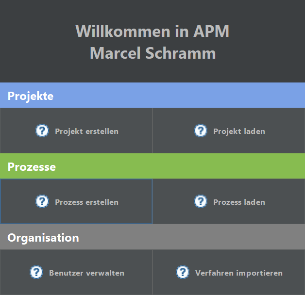
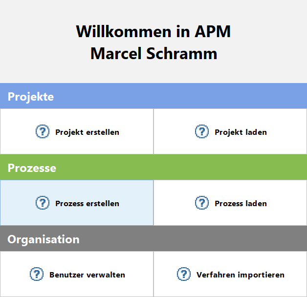
In lightmode the focus is indicated via both a blue border and a blue background. This way, you can clearly see which component is focused. However, in darkmode, we've only got the border. Depending on the layout in which the button is and how big the button is, the border is barely spotable. Meaning that one and the some layout is suited for lightmode, but not darkmode.
But like said, this is only an issue with the specific layout i chose, I think, since I did something rather unconventional. I wanted a "welcome" like dialog where I still have components that do proper focus indication, armed state and whatnot a button does.
Here's what it looks like:
Dark:
Light:
Looks great 👍
In lightmode the focus is indicated via both a blue border and a blue background
That is only the case in the "Flat Light" theme. All other light themes do not use blue background. (but wide focus border)
You can easily enable blue focused button background for dark theme with e.g.:
UIManager.put( "Button.focusedBackground", new Color( 0x3d6185 ) );
Or if you use properties files:
Button.focusedBackground = #3d6185
or
Button.focusedBackground = $Component.focusColor
Looks great +1
Is that a compliment or an agreement with my opinion? ^^
Yeah, I guess we could set a UI manager property.
Btw, I noticed that the hover state sometimes stays even though the mouse has left the window. Kinda weird, since keyboard focus is still available and tabbing onto such a component means that you won't see the focus indication, since the hover rendering takes precedence.