tide

tide copied to clipboard
Light theme?
Is your feature request related to a problem? Please describe
Currently the colors on a light theme are quite saturated and can be difficult to read the text. For example, reading k8s-cluster here isn't easy.
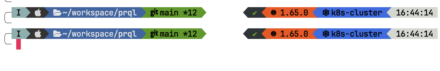
...unless it's just me?
Describe the solution you'd like
Could the colors either be less saturated, or the text be light on the darker, more saturated colors?
Additional context
New user checking this out, looks great so far!
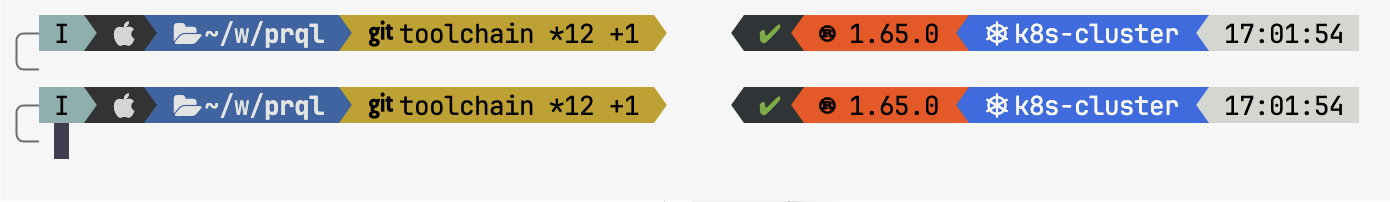
Actually this is likely on me — vscode displays them more reasonably:
If so, feel free to close.
If anyone has ideas of how to get them looking better on Alacritty in light mode (the original image), that would be very helpful (e.g. how does it decide whether to print k8s-cluster in dark or light colors?!)