igniteui-webcomponents
 igniteui-webcomponents copied to clipboard
Published
20 hours ago •
 IgniteUI
Calendar prev/next month buttons focus visual state not distinctive enough
Description
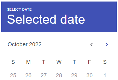
When the previous/next month buttons are focused, the visual state indication doesn't seem to be distinctive enough, specifically in the Bootstrap theme there's barely any difference. Marking this for Bootstrap for that reason, though I believe the Indigo theme might also be too close, depending on requirements for color and contrast value differences to satisfy general accessibility and also color blind users.
Steps to reproduce
- Open the Calendar Docs or Stories
- Focus one of the month buttons (either focus the calendar (date) and shift-tab or click one of the buttons directly)
- Observe the focused visual state
Result
There's a barely perceptible difference in color:
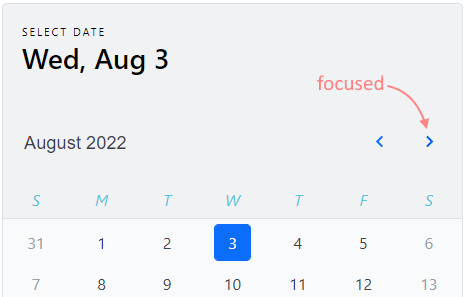
Close contender with the Indigo theme - same button is focused and it is visible (mostly) but I'm not sure this passes accessibility requirements:
Expected result
I'd expect the focused state to be easy to see clearly and follow accessibility standards