 Idered
Node Dependencies UX
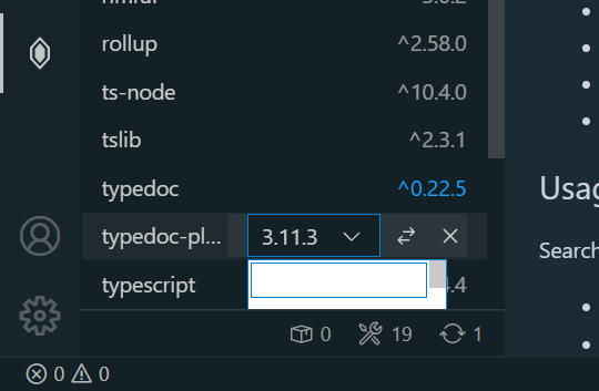
Dropdown colors don't respect the color theme and basically unreadable with a dark theme.
Dropdown for the last item is hidden from the view. It either should open upwards or the list should scroll automatically to bring it into the view (although such jumps may pose an issue on their own, needs testing).
I'd also love to see a flag to enable/disable pre-releases/builds to be shown in the dropdown (everything with - or + in it according to https://semver.org/).
Hmm, dropdown colors are ok for me. Can you please share your theme name? Also can you check with other dark theme?
Yeah, I need to fix last item dropdown position. I have that on my list.
Your idea with prereleases sounds good. I'll add something that will allow to exclude whatever you want.
Theme is Boxy Ocean from Boxy Theme kit. Except I use a lot of customizations.
I checked various dark themes.
- The main background color is always white which is not good;
- Active item background is always dark;
- I got unreadable active item because I have the following in my customizations:
"list.activeSelectionBackground": "#ffffff1c"- it expects the dark background; - Inactive items are always light gray which has pretty poor contrast in combination with white background.
Btw @KillyMXI I found this in one of your repos:
https://marketplace.visualstudio.com/items?itemName=idered.npm Node Dependencies VScode extension
can be extremely handy or annoying depending on how you look at it.
Can you please let me know which parts are annoying? I'm just curious if I can improve those parts
I can't remember what exactly I had in mind when I wrote that. Besides dropdown issues the following comes in mind:
-
Waiting for background processes
- ~~can't add a dev dependency straight~~ - seems solved now, there might've been no message about Alt+Enter back then.
- every individual update creates a background process and a spinner. Subconsciously it prevents me from doing other things even though it is probably fine to start other package updates - not sure, not experimenting, just waiting... There is probably nothing to do about it. Batching and submitting changes for a single
npm icall might be less wasteful but more complicated.
-
Lack of filtering - can't filter the list when it doesn't fit the screen (I'm on Windows and a pretty small display with 1.5 scale factor - only 15 packages fit the screen)
- indicators at the bottom doesn't seem to filter by type on click, "outdated" indicator is also scary to click - it may need a description in the tooltip of what will happen on click.;
- no text filtering either - search field is only for new packages. If there is a way to combine filter and search in the same field - it would be handy.
-
Lack of extra information. When I hover over a package in
package.jsonI get a popup with a package description and a homepage link (albeit with a significant delay for whatever reason). There is nothing like this in the extension. Usually I want to see a changelog/release notes when I update a package so links are really valuable. It might even make sense to recovernpmjs.com/github.comlinks by different means when the homepage link is something else. -
Lack of context menu/keyboard navigation. Not really my issue at this point - I only try to spawn a context menu to check for any extras (of which there seems to be none so far). But I just realized I don't know how to operate it with keyboard alone if I were more of a keyboard navigation fan. Context menu button shows the on-hover menu but it's contents don't seem to be reachable with the keyboard.
@KillyMXI thank you for great feedback 🍻
Re multiple processes: There are two options
- Add actions bar with
Update selectedandDelete selectedbuttons. Allow user to select multiple packages and execute one of those two actions. - When you update/delete multiple packages: first package update is one process and any following updates are queued and grouped into second process which is run after first process ends.
First is most efficient but will make interface more busy. Second one doesn't require any changes in UI but queueing logic might be challenging. Also it's less efficient. No easy decision here that's why I'm postponing this until I get more how people use this.
Re indicators at footer :
Right now deps and dev deps are in two separate lists so there is no need to attach filtering to two icons in footer. I'll probably remove those icons and move dependency counter next to group tiles: Dev Dependencies (12) or something like that.
Re outdated indicator:
I think this can be moved to some kind of dropdown menu where I could give it a proper label like: Plan mass update which would filter visible packages to only show outdated packages. User would be able to select which packages should be updated and to what version. There will be Update and Cancel buttons.
Re filtering:
Gotcha. I can squish this into current input. There will be additional shortcut . which will switch to filtering mode. What do you think?
Re additional info: This is actually one of the hardest things in this project. There is a lot of useful info which I could display but I have no idea how to fit it into UI. Amount of space is very limited so I have to plan this carefully.
Re keyboard support: It's best-effort implementation :) it's a web view extension so vscode doesn't help with that.
Re context menu: Disabled for now because they're were more important features.
Plan mass update
I like the separate view idea - it actually addresses the first point pretty well, nice. I think the feature is definitive for the extension so I'd keep an icon at all times rather than (in addition to) hiding it in the menu. See how other panels use icons for most important features, show them when the panel has mouse hover or keyboard focus.
Dev Dependencies (12)
Making both lists collapsible would be nice.
additional shortcut
.
That might work. I wrote a lot here initially, but after thinking about it a bit, I can only say if you can't use the tree view (it comes with search/filter features built-in) then it's the next best thing that will work in combination with existing features.
If you can think of any different UI for version selection that would work with the tree view (versions in a context menu or a subtree) - it would be really great to unify the experience. (And save some effort from maintaining the webview styles.)
additional info
Extensions panel has a nice popup. No idea whether it is something exposed to extensions though. Context menu or on-hover icons would be a place for links (there is no space for more icons with the current implementation of dropdown though). Making an entry expandable on click to show a card with extra info can work.
With a tree view it can be trees all the way down, like in Git Lens extension.