icingadb-web
 icingadb-web copied to clipboard
 Icinga
Redesign Service Grid
Description taken from #118.
Most important visual changes
Host status
To make host and services axes better distinguishable, host labels now feature the status ball already known from list titles.
Status balls
To match our circular design for status visuals, the status elements's design is now also circular.
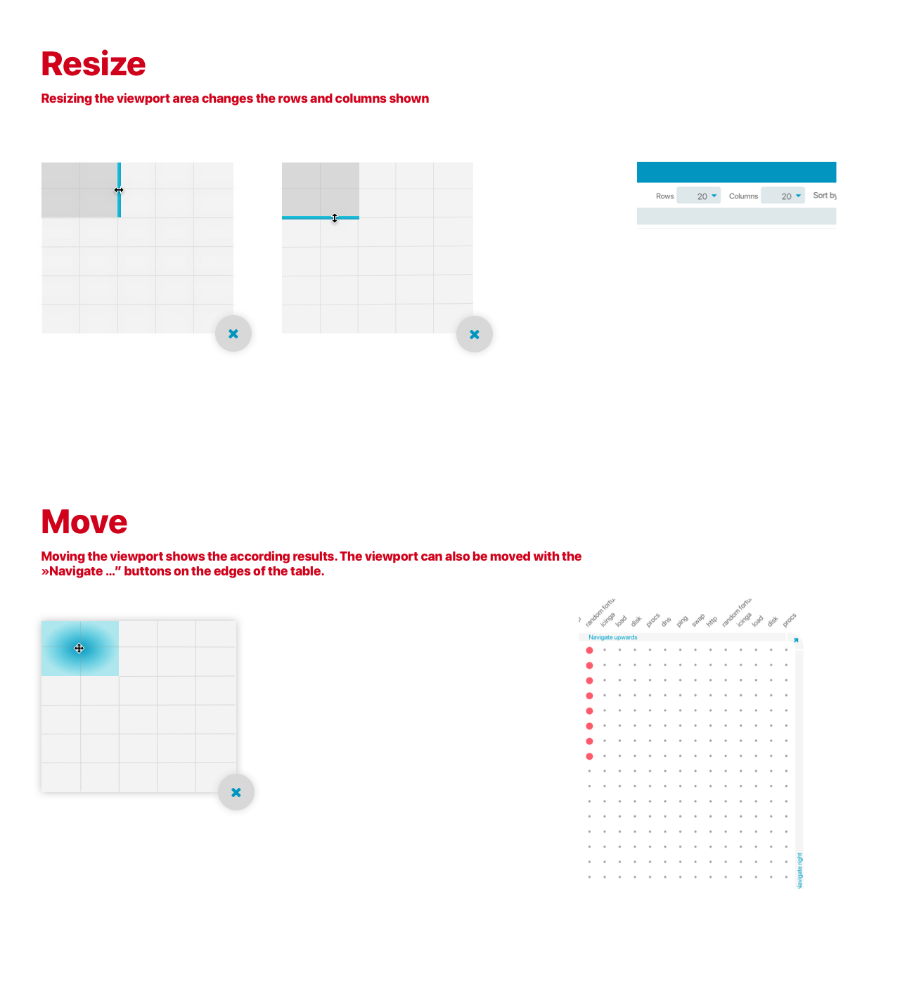
Row/Column Limit controls
The controls are is added with dropdown elements that control the row/column count. Row and column count will also be manageable with the new »Bird's eye« navigation. More here
Navigation buttons
To establish a more consistent navigation concept the "load more…" buttons are replaced by navigation buttons. Their functionality also changed.
While they simply loaded more and more rows/columns cluttering the viewport more and more. They now move the viewport in the according direction.
More on navigation here

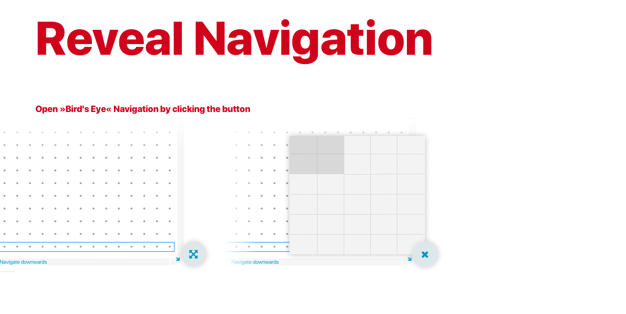
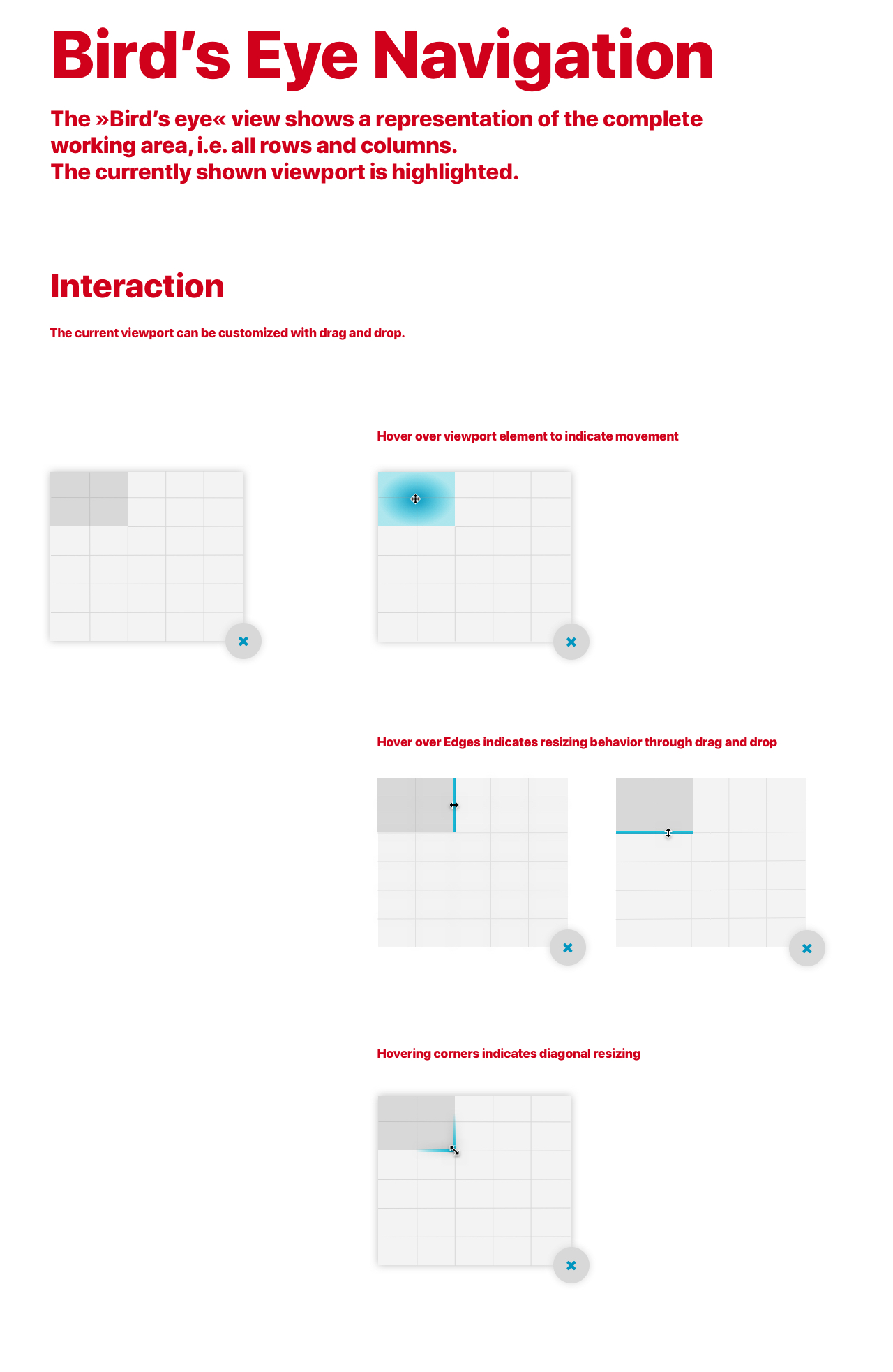
The »Joystick Navigation« was replaced by a bird's eye navigation, which offers map like viewport customization.

Interacting with the bird's eye navigation.
A little code example on how to do the rounded corner buttons in css.
HTML
<table>
  <thead>
    <tr>
      <td style="text-align: right;"><a class="corner-btn nw">↖️</a></td>
      <td><a class="nav-btn">Navigate top</a></td>
      <td><a class="corner-btn ne">↗️</a></td>
    </tr>
  </thead>
</table>
CSS (Less)
@body-bg: lavender;
@btn-thickness: 36px;
@btn-inner-corner-radius: 24px;

* {
  box-sizing: border-box;
}

body {
  background: @body-bg;
}

table {
  width: 100%;
}

table td {
  padding: 0;
  vertical-align: top;
}

a {
  text-decoration: none;
}

.nav-btn {
  display: block;
  background: maroon;
  color: white;
  text-align: center;
  height: @btn-thickness;
}

a.corner-btn {
  display: inline-flex;
  justify-content: center;
  align-items: center;

  width: @btn-thickness + @btn-inner-corner-radius;
  height: @btn-thickness + @btn-inner-corner-radius;
  background: maroon;
  position: relative;

  &:before {
    content: "";
    display: block;
    width: @btn-inner-corner-radius;
    height: @btn-inner-corner-radius;
    background: @body-bg;
    position: absolute;
  }


  &.nw {
    border-top-left-radius: @btn-thickness + @btn-inner-corner-radius;

    &:before {
      border-top-left-radius: @btn-inner-corner-radius;
      bottom: 0;
      right: 0;
    }
  }

  &.ne {
    border-top-right-radius: @btn-thickness + @btn-inner-corner-radius;

    &:before {
      border-top-right-radius: @btn-inner-corner-radius;
      bottom: 0;
      left: 0;
    }
  }
}
Good idea! A colleague asked, if it would be possible to change the colour of the grid-dots - on a high-resolution display in a "sunny" environment/office with the dark theme you can't see where a status ball belongs to
Good idea! A colleague asked, if it would be possible to change the colour of the grid-dots - on a high-resolution display in a "sunny" environment/office with the dark theme you can't see where a status ball belongs to
I prefer this:
#tail -n 4  /usr/share/icingaweb2/public/css/themes/dark-theme.less

.icinga-module.module-icingadb .service-grid-table td {
  color: @base2;
}
@nilmerg Perhaps this will be default?