Suggestion: Combine home view and tree view into a single view
Currently, Curtail has one view to open files and select the compression mode (home view) and another to show the information about the compressed files in the table (tree view). The user switches between them using back and forward buttons located in the header bar.
I don't think it's necessary to have a separate view just for opening a file or switching compression mode. Views can be combined into one by slightly changing the layout:
- Move the open file button to the header bar
- Pin the compression mode switch to the bottom of the window
After this, back and forward buttons can be safely removed without loss of functionality.
Here are quick mockups:
After launching  |
After compressing  |
|---|
Thank you @andrenete for your issues! You have very good ideas! I just need some time to look at all :) If you have time to open some PR don't hesitate. I think that it would be good to release Curtail 1.1 soon with the already merged features/fixes. Then we could integrate all theses issues in an 1.2 release. What do you think?
Thank you for looking at it.
I would say that only https://github.com/Huluti/Curtail/issues/63 should be fixed before 1.1 because it can lead to irreversible user data loss in case of JPEG. https://github.com/Huluti/Curtail/issues/54 is already partially implemented and adding 'Yes/No to all' button could wait, unecessary .bak files is not the problem of Curtail, but optipng.
Other issues are definitely a material for 1.2 or even later versions.
Was experimenting with an adaptive design for Curtail (with libhandy) and came up with an idea:
Instead of a table, the compressed images are presented on a "timeline" that goes from top to bottom, where the images are grouped in lists. Here are the mockups made in Glade:
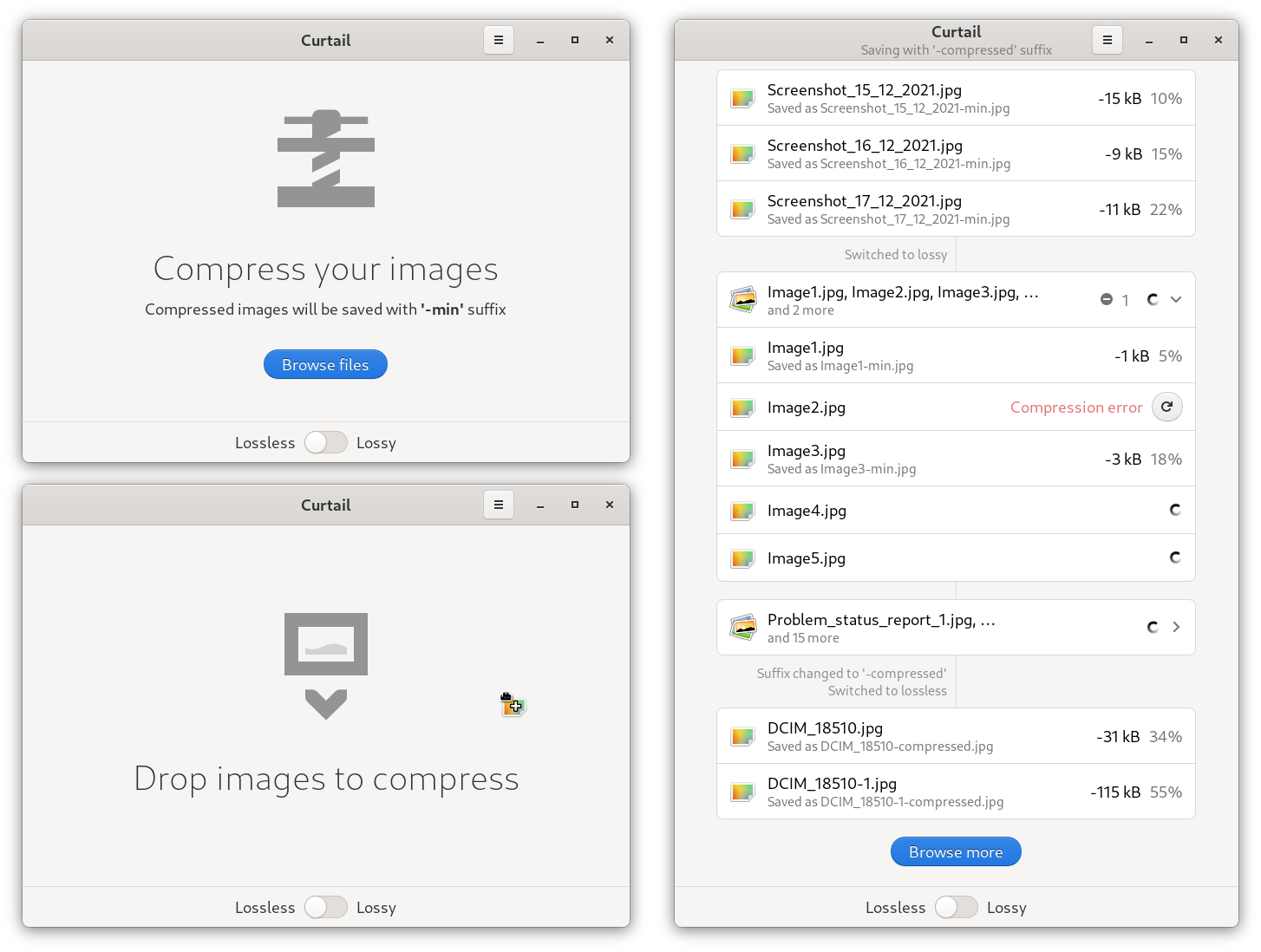
The logic goes something like this:
- Each time the user browses the files and opens them (or drops to the window) or when compression parameters are changed (new timeline status), a new list begins.
- If the user opens a small number of images (say less than 5), they are directly displayed in the list, grouped together
- In case of many images, they are collapsed into a single entry, which can be expanded to show statistics for each image.
Each list entry consists of the image thumbnail (image-x-generic icon on the mockup), the name of the original image, the name of the compressed image and the compression information (clicking on an entry may display a dialog with additional information). If an error occurs during compression, an error message is displayed with "Try Again" button. In collapsible entry, the total compression information for all nested images (total savings) and the total number of errors that occurred are shown. A spinner is displayed for unfinished compressions.
Timeline separators can be used to display status changes when the user has changed important information directly related to compression. This helps to navigate the timeline.
Also, while drag and drop is a very useful feature on a desktop, it is not possible on a mobile device, so "drag and drop images here" label is irrelevant. Either the label should only be displayed on desktop, or it should be removed from the interface completely (only label, the drag and drop function itself should be left intact).
@andrenete Your mockups are really great! I love your concept too. I think on the other hand that someone will have to help me on this one because I unfortunately do no have sufficient knowledge with gtk and libhandy ... however, I am totally in favor of going in this direction.
Gtk4 and Adwaita are part of the latest version and some of ideas from this issue has been used! Thank you!!