FocusTide
 FocusTide copied to clipboard
CSS font-family and font-size
Describe the bug
CSS class="timer-traditional", class="timer-approximate" and class="timer-percentage" do not use the same font-family nor font-size.
timer-traditional uses:
font-family: "Source Sans Pro",monospace; and 72px
timer-percentage uses:
font-family: "Source Sans Pro",monospace; and 96px
timer-approximate uses:
font-family: Poppins,sans-serif; and 30px
Expected behavior In my opinion:
- all three timers should use the same
font-familyandfont-size-font-family: "Source Sans Pro",sans-serif; - allow line breaks where necessary
- there is no need to declare the
font-familyasmonospace
Screenshots

Platform:
- Firefox 78.15.0esr, MacOS 10.11.6
At the moment, this behaviour is by design.
-
font-size: the reason is that timers are of different lengths (eg. "25 minutes" is a lot wider string than "0%"), they needed to be only as large as to fill the screen - here, one font size would not fit all in my opinion. The approximate timer does seem a bit small on the screenshot, though. -
font-family: unfortunately Poppins (the default font of the app) does not have tabular figures (monospace number glyphs), which means that when the classic timer changes (eg. from "20:00" to "19:59"), its width changes, too. This causes a bit of a "jittery" display, so a font with tabular figures (Source Sans Pro) was included.monospacewas added to the end in case Source Sans Pro could not be loaded.
As for the line breaks, I think it's a great idea to add them (and hopefully not too difficult to implement, either). This could also allow me to increase the font size on the approximate timer. Since I'm going to rework the timers, anyway, I'll probably implement some design changes, too. I'm also thinking of designing an Android 12-like clock display, which would also require numbers to be of the same width, but that can probably be solved with a grid.
@Hanziness Yes, I'm aware of the typographic problems. Therefore I've produced the "PoppinsAP" fonts (regular and bold) for you. They are identical with the original "Poppins", but I've added "real" tabular figures (tnum) and a special (raised) colon glyph (ss05). If you like, you could experiment with the fonts and see if they fit your needs.
You could then use the property font-family: "PoppinsAP", sans-serif; already on the html element.
For the .timer classes you could then use something like this:
.timer-traditional, .timer-approximate, .timer-percentage {
    font-weight: 700;
    font-variant-numeric: tabular-nums;
    font-feature-settings: "tnum", "ss05";
}
For the .form-input and .text-sm something like:
.form-input, .text-sm {
    font-weight: 400;
    font-variant-numeric: tabular-nums;
    font-feature-settings: "tnum", "ss05";
}
IMO, for the large text you don't need 14 rem. I think 10rem is big enough.
.lg\:text-\[10rem\] {
    font-size: 10rem;
}
Also, if you decide not to use Day.js (#163), then for the .timer-approximate you could use the abbreviation for minutes "min". That way the font-size could maybe be the same across all .timer classes. And for the last seconds, simply make a translatable string "seconds".
I hope some of my ideas will help. If you don't like any of it, that's ok too.
Thank you very much for the feedback and the font, @milotype! I'm not sure about the licensing nitty-gritty with the modified Poppins (but I will check it out, thank you for providing this!), and since the problem of not having tabular figures is only relevant with the precise timer, I think I'll try to display the timer using a grid first (each number and the colon get a fixed width column, so the text won't "jump" when the timer changes). I'll also check the font sizes while I'm at it. Development has slowed because I've got a bit busier, but all these changes will be implemented soon, hopefully :)
@Hanziness To my knowledge the licensing shouldn't be a problem. The font with tabular figures as font feature I made, have the same OFL license as the original ones. Also there is no "Reserved Font Name" for Poppins, so renaming your versions to "PoppinsAP" should be legitimate.
I've managed to solve the issue of non-tabular figures using CSS*, so the regular Poppins font can still be used (and retrieved from Google Fonts, reducing the required bandwidth). I also updated the designs.
*: For other developers: I created <div>s of width 1ch and aligned characters to center, or in some cases with two characters, the left div has a text-align: right and the right div has text-align: left.


@Hanziness It's your app, so obviously, it's your decision … but as a typographer, I definitely disapprove your changes!
From a typographical point of view, it's simply incorrect and looks strange. Time should be displayed (at least) in the format mm:ss with a colon as a separator. Seconds displayed as "superscript" (as in your first picture above) are more common for displaying prices, not time. The display of time in your second picture is even more strange …
Why did you decide against my generated fonts including my proposed CSS? I'm not a programmer, so I cannot prove it: but, IMO, calling fonts from Google Fonts or from your own domain shouldn't make a difference (or at least shouldn't have such a great impact).
I agree about removing the dependency on day.js … in that case don't forget to include/add translatable strings, as mentioned in my previous comment.
@milotype thank you very much for your detailed feedback, I truly appreciate it! Let's tackle both things:
Timer layout / design
You might very well be right and I'll reopen this issue to further work on the timers. My concept with the redesign was shifting the emphasis onto the minutes. The previous "minutes:seconds" layout (both numbers using the same font weight and size) didn't do that and in my opinion a timer app should not communicate the frequently changing seconds counter that strongly because it might divert the user's attention. If I give less weight to the seconds, the attention shifts (or should shift) to the minute counter, but if needed, the second counter is still visible at a glance.
What are your thoughts? Do you think this is doable somehow if the current design does it badly? My current plan now is to roll back to the previous colon-separated display ([hh:]mm:ss)
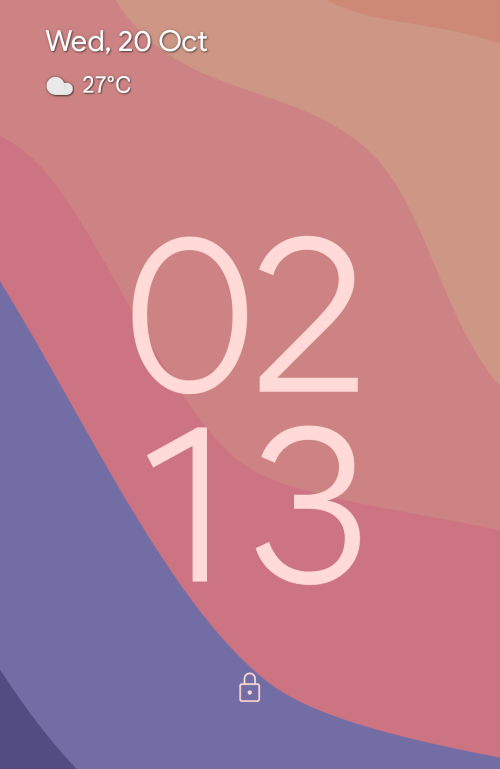
On the second screenshot (mobile view) the timer design is based on the Android 12 lock screen clock (which is displayed when there are no notifications to be shown; see below picture) where the numbers seem to be laid out on a 2-by-2 grid and they vertically align, too, seemingly at the centre. To my eyes, letter spacing with Poppins currently does not look bad (though I imagine it would be better if the font had tabular figures - more on this later).
Why not include the modified Poppins
The reason is bandwidth and it can be split into two more reasons.
- On the free Netlify hosting plan, I get 100 GBs of bandwidth per month. While I'm currently very, very far away from hitting that limit, serving a font from the website would increase the required bandwidth by as much as ~100 KiB (each woff2 file is a bit above 50 KiB, though compression would take care of a larger part of it), potentially also slowing the loading time - for comparison, that could add 5-50% to the current bandwidth usage of the app. If in the future the app gained more visitors, I'd get increasingly closer to this limit and I might have to start shaving off bandwidth usage - one of the easiest ways would be by switching back to the Google Fonts-served Poppins. Here I'm trying to not make more work for future me :)
- If I serve a font using Google Fonts, whenever another website uses Poppins (in this example) from Google Fonts, the browser will not download it again, because my website is requesting the same resource another website did in the past. This helps me potentially speed up the app for some users because their browsers will simply use the cached font file. This advantage would be lost if I served the (modified) font from my app as everyone would have to download the custom files through my app.
This, in my eyes, makes the use of the modified font quite problematic and I wanted to avoid these issues as much as I could - hence the attempt of trying to use a grid to lay out the timer.
Translations
The new files do have the required translations - I settled with not showing "a few seconds" but only "1 minute" in the end. They will be in the Crowdin project :)
@Hanziness IMO, the "minutes:seconds" layout should not have different font styles for minutes and seconds. I aggree to keep the dislay of time with the colon (ideally with a raised colon).
As a matter of fact, all displayed styles (traditional, approximate and percentage) should simply use the bold version of the font. (BTW, you are talking about traditional timer setting with second-precision on the GitHub's README file.).
Deemphasizing "seconds" by using a different font style makes no sense to me and I do not see any danger of diverting the user's attention.
I do understand your concern about bandwidth though … BTW, Android's display of times is not the non-plus-ultra! So following Android's display isn't necessarily the way to go (IMO).
To keep in line with the "traditional" name, you might be right to just keep everything the same, then I could implement a fancier "clock" timer so if someone needs a different looking timer, they can use that, too.
Making everything bold
I don't agree with making everything just bold (if that's what you meant), though, at least in the approximate and percentage timers. In my opinion, the numbers should certainly be bold, but the units like "minute(s)", "hour(s)" and the percentage sign express secondary information, eg. in "25 minutes". It (for the remaining time) will remain "minutes", and that string is already quite long compared to the displayed 2 digits, no need to further emphasise it as it takes more screen space than the actual useful piece of information ("how many minutes I have left"). The same goes for "42 %", it will always express percentage and it likely won't become confusing or strange-looking if I don't emphasise the percentage sign.
Additional changes from #186
An additional change that I implemented in #186 was to make these "secondary" texts smaller, but vertically centred. In my opinion, they look better this way, but now that I'm back at the drawing board, I'd ask for feedback on these, too. Do you think this looks okay? Another option I considered was to align the text at the baseline, but since the whole timer display is already centred, it made more sense to keep everything at the centre (otherwise it would look like the timer is below centre).
Personal opinion on the clock display
While Android's time display might not be the best-in-class (though the question is in what terms is it not that great), I'd argue it looks fresh, is legible from far away and reacts very well to changing time (remaining in the same place regardless of the digits displayed). There's probably no design that satisfies all needs, but it seems to offer a great trade-off between bold and still legible design and "the way" of laying out time on paper, and I don't see any problems with following it (this is an app that is viewed on screen). Another reason would be (but you're probably well aware of it) that browsers are not that great at laying out text anyway, so I wouldn't try fighting them to get print-quality text in an app that features a rounded, bold display.
So here, feedback is much appreciated: do these timers look acceptable or should they use the same font configuration as the numbers?
Approximate timer:

Percentage timer:

IMO, everything should be bold and the same size.
In order to have similar string lenght for the different displays, you could use abbreviations for hours, minutes and seconds, like h, min, s. The only problem would be days, for which there is no abbeviation. Displaying units smaller looks strange to me …