HEBorn

HEBorn copied to clipboard
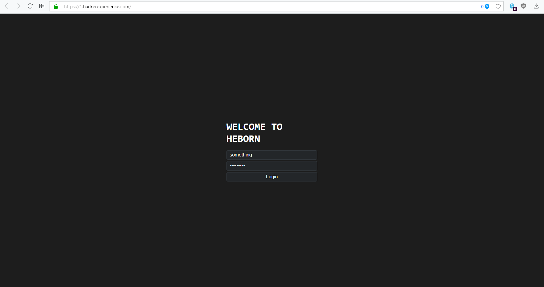
Login landing page UI proposition
I can also try to try to implement following changes:
- Remove all
<br>s in favour of margins where they needed. (applies to#login-form) - Replace
<label>s withplaceholders oninputelements. (applies to#login-form) background: #1d1d1d(or another color) on landing page display manager (#landDM).- Delete
border,background,padding,margin,border-radiusfrom#login-form. - Add
margin: 4px 0to.landInputs. - Add
box-shadow: 0 1px 3px rgba(0, 0, 0, 0.12), 0 1px 2px rgba(0, 0, 0, 0.24)toinputs so they don't look so flat (even if with these colors it's just a detail). text-align: left; text-transform: uppercase; font-weight: bold; font-size: 28px;for.landTitle(if changing the node's contents to something like "welcome to line break or image here? heborn").- only suggestion: you can use Consolas or system fonts (both options should look OK; set like
-apple-system, ".SFNSText-Regular", "San Francisco", "Roboto", "Segoe UI", "Helvetica Neue", "Lucida Grande", sans-serif).
- Font family
Open Sansshould be put in quotes (font-family: 'Open Sans') and there should be some fallback fonts (font-family: 'Open Sans', sans-serif?). - Remove
flex: 0from<input>s and addwidth: 100%. - Consider minimum width for
#login-form(250px should be safe for mobile devices). - Might want to set
margin-bottom: 16px;or higher for.landTitle.
- Add some image (screenshot from the game/render/something) before (a.k.a. to the left of) the login form (you already use flex only forget
flex-direction: column;so it should not be a problem; just add a<div>and the image inside it, also remember about some reasonable container width). Space under the image can be used for links (likeforgot password,discordor something another). - Following screenshot has also these rules:
#landDM > div:first-child {
    color: #4f5260;
}
#landDM > div:first-child > a {
    margin: 0 5px;
    text-decoration: none;
    color: #4f5260;
}
for structure
<div style="margin-right: 36px;width: 350px; "><img src="https://hackerexperience.com/assets/img/clan_war.png" width="350"><a href="/url-here">Forgot password</a>–<a href="/url-here" style="
">Discord</a>–<a href="/url-here">GitHub</a></div>
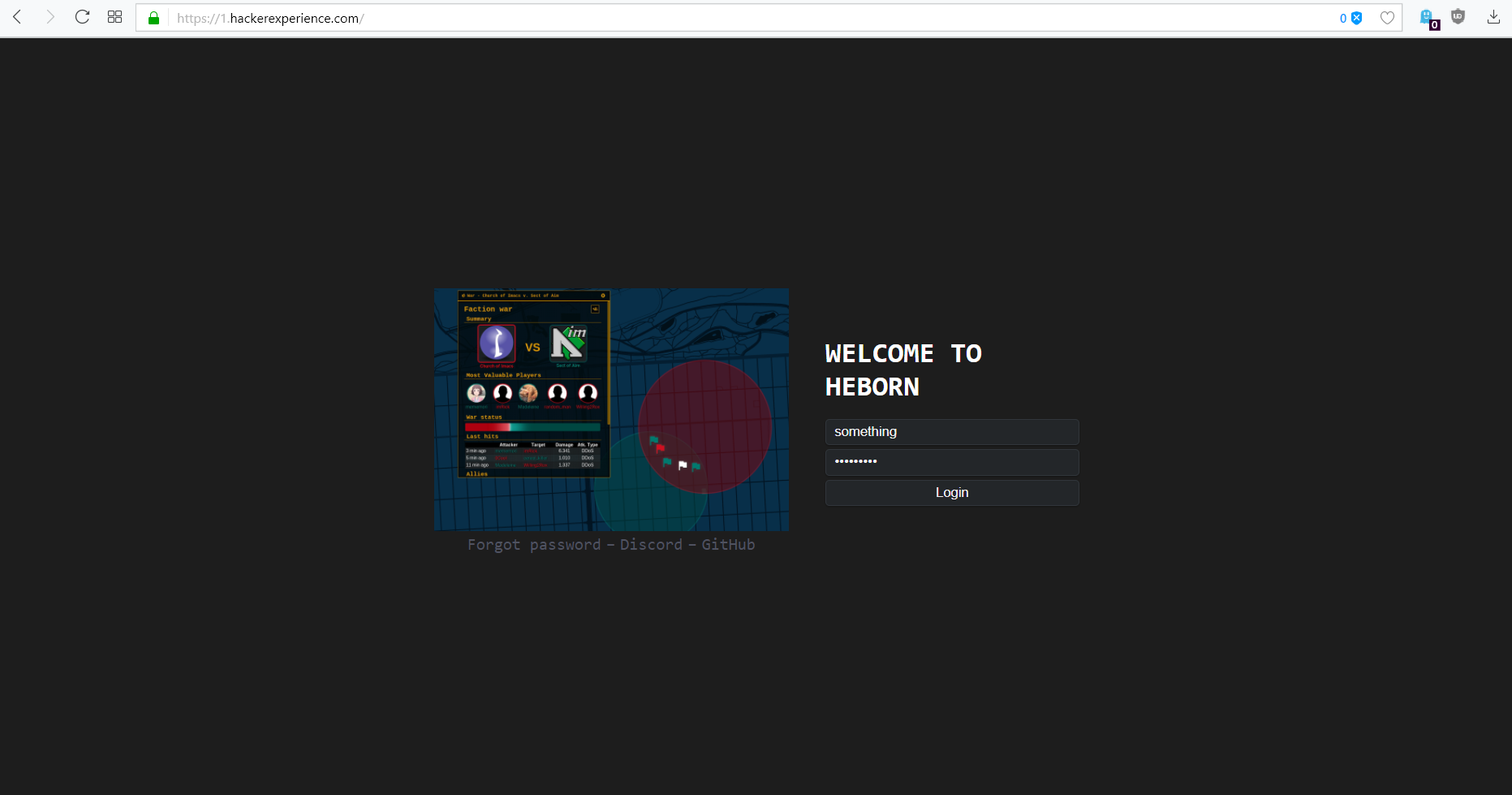
Of course the clan wars image was only as an example. Colors probably have to be tweaked.
I hope I haven't skipped anything.
@renatomassaro 🤣 this is what happens when you don't contract a designer. ~~where is our team designer? it's been two years without one~~ EDIT: Don't worry @rylat, yours suggestions will be considered, after we have a designer.
@renatomassaro is providing a designer, if he accepts the offer, our designer is cmin' next mounth :)