 GwtMaterialDesign
Column-based filter widgets
The idea of column filters is, to give the user a way of filtering the grid for specific data, per column.
It would allow the user to enter a value for that the column's content is filtered for.
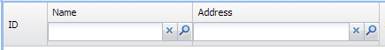
If a filter widget is set for a column, it could be rendered e.g. inside of the column's header (below the title) or e.g. in a row right below a header / sub-header. The size of the widgets would be 100% of the columns width (also resizing when the column width changes); the height would be the organic height of the filters widget.
The filter values could be read on filter widget change (ValueChangeEvent) and set on the data provider instance. The data provider then reloads the current page. Those filter values could also be persistent and remembered on pagination, sorting etc. events (depending on the impl. of the data provider).
To allow a first attempt of an implementation, it would be already sufficient, if we could put widgets in column headers (to be rendered below the header's title, like the image above shows) , because then, all the custom column filter logic could be implemented in user-land code (or as a plugin for the MaterialTable).
For a most simple implementation (leaving a lot to be impl. in user-land) it would be sufficient if the API of MaterialDataTable would support:
public void insertColumn(int beforeIndex, Column<T, ?> col, MaterialWidget header);
public MaterialWidget getColumnHeader(int index);
Thanks and best, Aron
I think that it would be great to extend this widget to support all kind of inputs, f.e.: data picker, time picker, select, etc.
I am quite curious about testing the data table once I have the time opportunity for it...
I would just like to point, please be particularly mindful of any CSS choice taken that is not used for technical purposes, such as color choices, fixed sizes, icons etc...... so that it may be as easy as possible to integrate the data table, plugging in different color styles or icon styles, if that is possible. As well as any built int texts that are hard coded in english.
Otherwise, it will be one more component, that everybody else in order to integrate it into a page with its own strict styling convetions (e.g more on grey side, more on the light colors, bigger buttons / smaller buttons, etc..), will have to take over and customize to be able to integrate without looking a component coming from out of space.
One further suggestion, I would reccomend to consider a universal search field and not a search field by column... When well done, it normally much more user friendly to let a person search by typing into the same field and having the field be searched accross all the columns.
The only case where t might be useful to have filter on column is when you want to have a date type column offer a date picker UI to set in a filter... But there are ways to have a subtble add+ pattern button next to the searchbox that opens up a drop down with Time Filter, to write in for the user a date or time... A suggestion to consider...
The text field per column to do a search to me, just feels like an outdated UI. Ubiquity!