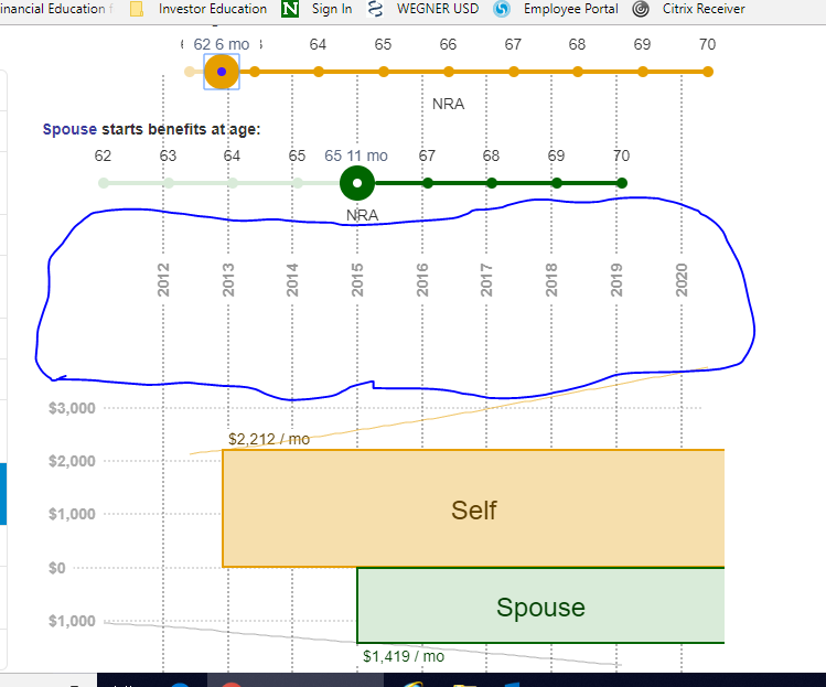
retirement age sliders and bar graphs require a lot of screen real estate
When browsing the site on my tablet or surface laptop, it's difficult to get the sliders and graphical output on the screen on the same time, and I have to scroll a lot (slide, scroll down, slide, scroll down, etc). Is there a way to decrease some of the dead space so that the the input/output part of this section of the reports is more likely be fit on one screen on smaller devises (e.g. bigger than a phone by smaller than a 13" laptop screen)? See the screenshot below, which shows I can just barely fit it on one page on my device. Can the area in circled in blue be reduced easily?
Phones are something that definitely need a lot of work. The biggest problem being that I doubt the typical user can copy/paste from ssa.gov on a phone.
Good observation. I didn't expect a problem on tablets or especially laptops though. I guess I need to be careful always developing on a 4k monitor.
Some of that vertical space would be consumed if you drag the top slider to the right, as the "Self" box would grow in height. There's still some that could be shaved off though even in that case.
The other trick would be to have the sliders "stick" to the top of the page as you scroll down past them, but are still are still above the bottom of the chart, much like the left navigation bar does for the whole page (which hides on narrower screens like this one). I'd probably squeeze together vertically the sliders a bit more, such by hiding some of the text such as "Spouse starts benefits at age:" and "NRA". In this case, the sliders might start overlapping some of the chart depending on scroll position, but it's probably preferable to not being displayed at all.