pygmt
 pygmt copied to clipboard
Add a gallery example showing the usage of vertical and horizontal bars
Description of proposed changes
So far we have no gallery example in which the usage of vertical (b) and horizontal (B) bars is shown. This PR adds such an example to the gallery.
Preview at https://pygmt-git-gallery-vh-bars-gmt.vercel.app/gallery/symbols/bars.html
Reminders
- [ ] Run
make formatandmake checkto make sure the code follows the style guide. - [ ] Add tests for new features or tests that would have caught the bug that you're fixing.
- [ ] Add new public functions/methods/classes to
doc/api/index.rst. - [ ] Write detailed docstrings for all functions/methods.
- [ ] If adding new functionality, add an example to docstrings or tutorials.
Slash Commands
You can write slash commands (/command) in the first line of a comment to perform
specific operations. Supported slash commands are:
-
/format: automatically format and lint the code -
/test-gmt-dev: run full tests on the latest GMT development version
Wanted to add also examples for multi-band bars. However, so far I couldn't figure out how it works. Maybe @meghanrjones can help me out 😉.
Wanted to add also examples for multi-band bars. However, so far I couldn't figure out how it works. Maybe @meghanrjones can help me out 😉.
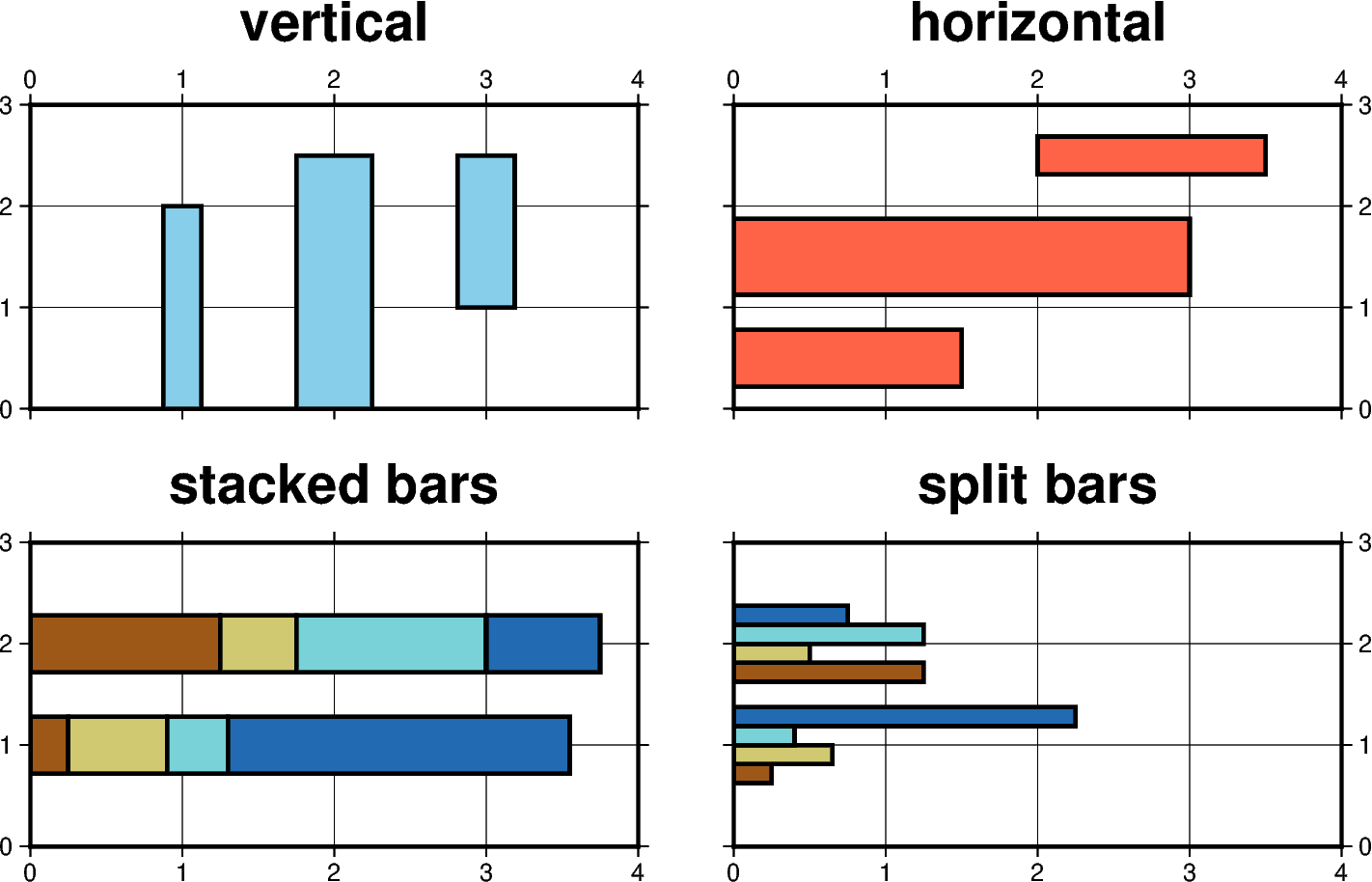
Is this what you're referring to?
import pygmt

data = {'x1': [0.5, 1.5], 'y': [1, 2], 'x2': [1.5, 0.5], 'x3': [0.75, 1.25], 'x4': [1.25, 0.75]}
df = pd.DataFrame(data=data)

fig = pygmt.Figure()
pygmt.makecpt(cmap="hawaii", series=[0,4,1])
with fig.subplot(
    nrows=1, ncols=2, subsize=("8c", "4c"), frame=["ag", "WSne"], sharey=True
):
    pen = "1.5p"
    with fig.set_panel(panel=0):
        fig.basemap(region=[0, 4, 0, 3], frame='+t"stacked bars"')
        fig.plot(data=data, style="B0.2i+i4", cmap=True, pen=pen)

    with fig.set_panel(panel=1):
        color = "tomato"
        fig.basemap(region=[0, 4, 0, 3], frame='+t"split bars"')
        fig.plot(data=data, style="B0.2i+i4+s4", cmap=True, pen=pen)

fig.show()

@michaelgrund The example looks great and useful! What's the status of this PR?
@michaelgrund The example looks great and useful! What's the status of this PR?
Parts of the documentation are missing, however, I try to work on it the next few days @seisman.
This example looks good to me :slightly_smiling_face:!
May I ask a question regarding the general explanation at the top?
Here, +i means we must accumulate the bar values from the increments dy or dx, while +v means we get the complete values relative to base. Normally, the bands are plotted as sections of a final single bar. Use +s to instead split the bar into ny or nx side-by-side, individual and thinner bars.
What is the expected bar plot for only appending +v (no +s), maybe overlaid bars? I ask because the corresponding figure (lower right panel) appears not completely clear to me, especially the lower bar:
(Please note, this is definitely not meant in a way, that the example by @michaelgrund should be changed!)

import pygmt


# outline thickness of bars
pen = "1.5p"

# generate dictonary for plotting multi-band bars
data = {
    "x1": [0.25, 1.25],
    "y": [1, 2],
    "x2": [0.65, 0.5],
    "x3": [0.4, 1.25],
    "x4": [2.25, 0.75],
}

# set up colormap for multi-band bars
pygmt.makecpt(cmap="roma", series=[0, 4, 1])


# create figure object
fig = pygmt.Figure()

# make 2x2 subplot
with fig.subplot(
    nrows=2,
    ncols=2,
    subsize=("8c", "4c"),
    frame="ag",
    sharey=True,
    sharex=True,
    margins=["0.5c", "0.75c"],
    ):

    # top left: horizontal bars
    with fig.set_panel(panel=0):
        color = "tomato"
        fig.basemap(region=[0, 4, 0, 3], frame="+thorizontal bars (B)")
        fig.plot(x=1.5, y=0.5, style="B0.75c", color=color, pen=pen)
        fig.plot(x=3, y=1.5, style="B1c", color=color, pen=pen)
        # +b2 means that the bar is starting from x=2 here
        fig.plot(x=3.5, y=2.5, style="B0.5c+b2", color=color, pen=pen)

    # top right: grouped bars
    with fig.set_panel(panel=1):
        fig.basemap(region=[0, 4, 0, 3], frame="+tgrouped bars (+ v4 + s)")
        fig.plot(data=data, style="B0.75c+v4+s", cmap=True, pen=pen)

    # bottom left: stacked bars
    with fig.set_panel(panel=2):
        fig.basemap(region=[0, 4, 0, 3], frame="+tstacked bars (+ i4)")
        fig.plot(data=data, style="B0.75c+i4", cmap=True, pen=pen)

    # bottom right: overlaid ? bars
    with fig.set_panel(panel=3):
        fig.basemap(region=[0, 4, 0, 3], frame="+toverlaid ? bars (+ v4)")
        fig.plot(data=data, style="B0.75c+v4", cmap=True, pen=pen)

fig.show()
# fig.savefig(fname='question_bars_overlaid.png')
This example looks good to me slightly_smiling_face!
May I ask a question regarding the general explanation at the top?
Here, +i means we must accumulate the bar values from the increments dy or dx, while +v means we get the complete values relative to base. Normally, the bands are plotted as sections of a final single bar. Use +s to instead split the bar into ny or nx side-by-side, individual and thinner bars.
What is the expected bar plot for only appending
+v(no+s), maybe overlaid bars? I ask because the corresponding figure (lower right panel) appears not completely clear to me, especially the lower bar: (Please note, this is definitely not meant in a way, that the example by @michaelgrund should be changed!)
Indeed, that's a good question at this point @yvonnefroehlich. Maybe @PaulWessel can help out again?
This example looks good to me 🙂!
May I ask a question regarding the general explanation at the top?
Here, +i means we must accumulate the bar values from the increments dy or dx, while +v means we get the complete values relative to base. Normally, the bands are plotted as sections of a final single bar. Use +s to instead split the bar into ny or nx side-by-side, individual and thinner bars.
What is the expected bar plot for only appending
+v(no+s), maybe overlaid bars? I ask because the corresponding figure (lower right panel) appears not completely clear to me, especially the lower bar: (Please note, this is definitely not meant in a way, that the example by @michaelgrund should be changed!)
import pygmt


# outline thickness of bars
pen = "1.5p"

# generate dictonary for plotting multi-band bars
data = {
    "x1": [0.25, 1.25],
    "y": [1, 2],
    "x2": [0.65, 0.5],
    "x3": [0.4, 1.25],
    "x4": [2.25, 0.75],
}

# set up colormap for multi-band bars
pygmt.makecpt(cmap="roma", series=[0, 4, 1])


# create figure object
fig = pygmt.Figure()

# make 2x2 subplot
with fig.subplot(
    nrows=2,
    ncols=2,
    subsize=("8c", "4c"),
    frame="ag",
    sharey=True,
    sharex=True,
    margins=["0.5c", "0.75c"],
    ):

    # top left: horizontal bars
    with fig.set_panel(panel=0):
        color = "tomato"
        fig.basemap(region=[0, 4, 0, 3], frame="+thorizontal bars (B)")
        fig.plot(x=1.5, y=0.5, style="B0.75c", color=color, pen=pen)
        fig.plot(x=3, y=1.5, style="B1c", color=color, pen=pen)
        # +b2 means that the bar is starting from x=2 here
        fig.plot(x=3.5, y=2.5, style="B0.5c+b2", color=color, pen=pen)

    # top right: grouped bars
    with fig.set_panel(panel=1):
        fig.basemap(region=[0, 4, 0, 3], frame="+tgrouped bars (+ v4 + s)")
        fig.plot(data=data, style="B0.75c+v4+s", cmap=True, pen=pen)

    # bottom left: stacked bars
    with fig.set_panel(panel=2):
        fig.basemap(region=[0, 4, 0, 3], frame="+tstacked bars (+ i4)")
        fig.plot(data=data, style="B0.75c+i4", cmap=True, pen=pen)

    # bottom right: overlaid ? bars
    with fig.set_panel(panel=3):
        fig.basemap(region=[0, 4, 0, 3], frame="+toverlaid ? bars (+ v4)")
        fig.plot(data=data, style="B0.75c+v4", cmap=True, pen=pen)

fig.show()
# fig.savefig(fname='question_bars_overlaid.png')
Looks like an upstream bug.
Looks like an upstream bug.
Meaning I should open an issue in the upstream GMT repository?
Looks like an upstream bug.
Meaning I should open an issue in the upstream GMT repository?
Could you please make a minimal CLI example to reproduce the issue, and post it in this PR. Then we can ping Paul to let him see if it's a bug.
Output of gmt --version: 6.4.0
Data: data_vhbars.txt
Colormap (please remove the .txt): roma_vhbars.cpt.txt
CLI minimal example:
gmt plot data_vhbars.txt -R0/4/0/3 -JX8c/4c -SB0.75+v4 -Croma_vhbars.cpt -Ba1f1g1 -W1p,black -png vhbars_overlaid
Output figure:

Output of
gmt --version: 6.4.0Data: data_vhbars.txt
Colormap (please remove the
.txt): roma_vhbars.cpt.txtCLI minimal example:
gmt plot data_vhbars.txt -R0/4/0/3 -JX8c/4c -SB0.75+v4 -Croma_vhbars.cpt -Ba1f1g1 -W1p,black -png vhbars_overlaidOutput figure:
Ping @PaulWessel to see if this example makes sense to you.
@yvonnefroehlich Could you please open a separate issue in the GMT repository instead so that we can get some feedback from Paul or others?
Besides the potential upstream bug, I think this PR is ready for merge.
@yvonnefroehlich Could you please open a separate issue in the GMT repository instead so that we can get some feedback from Paul or others?
@seisman: I opened a related issue in the upstream GMT repository.
Besides the potential upstream bug, I think this PR is ready for merge.
@michaelgrund: I apologize for the delay in getting this PR merged caused by my question!