[Improvement] install process: less buttons on first step to chose the language
The install routine starts with a language selection:
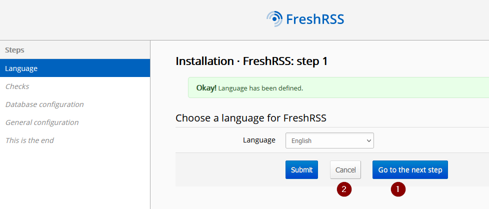
When already a language is chosen (f.e. when you skip back from step 3 to step 1) than a third button appears (marked with (1)).
This Button (1) is not intuitive and imho useless. It is not a real form button. It is (technically) just a link to the next step without (!) saving the form above. But it looks like a "save and go forward" button. I would suggest to remove this button. I prefer to use the "submit" button to confirm the selected language.
Also the "cancel" button is imho useless. It is just a reset button and resets the select to the previous language. If the user did not changed the language than nothing will be changed. It does not cancel the installation routine.
I would prefer the smart one-button start of the install routine.
That sounds fine. We also need to check in the case when a FreshRSS configuration already exists (for which the "Go to the next step" makes more sense)
@Alkarex What would you expect from the "Go to the next step" button? Right now it is a link to the "checks" step (it is the next step, the same target like the "Submit" button)
That sounds fine. We also need to check in the case when a FreshRSS configuration already exists (for which the "Go to the next step" makes more sense)
In case that a previous installation has already selected a language, the sensible thing to do, is to select that langauge and still just show that single 'submit' or 'next' button (or however it ahould be named).
Agreed, this is a small papercut issue, but it would make for a smoother installation 'experience'.