[Suggestion] Improve User Queries Interface
- Add a Menu Item for "Edit User Queries" in the Main Menu (#dropdown-query) next to "Bookmark current query" OR put an edit icon next to every user query in this dropdown menu
- in the user queries editor: the hyperlink "filter" on the top right below the headline should be a more prominent real button, maybe with a text like "run", "show" or "go", or maybe it can stay "filter" if it becomes a real button. It should be placed at the bottom, next to save/cancel.
- in the user queries editor: the "type" box should be a multi-select box. A user might want to search for "iphone" on 2 or 3 feeds at the same time.
- the word "state" and "type" are not fitting, but I lack better words. Maybe leave "state" as it is. But "type" feels plain wrong. Even "nothing" (empty) would be better than "type", as the content of the box is quite self explaining.
- it would be great to have some kind of syntax help link next to every input box, in which the user can input complex user queries. This means on the main page next to the search box, and in the user query editor next to the "expression" input box. Maybe put a small question mark icon there, with a link to: https://freshrss.github.io/FreshRSS/en/users/03_Main_view.html --> "with the search field" (actually, there should be an extra page "query syntax" in documentation).
Originally posted by @rom-1 in https://github.com/FreshRSS/FreshRSS/pull/3379#discussion_r559207171
@rom-1 Could you tell me what theme you are using? I suspect that you are using one of the following:
- Blue Lagoon
- Screwdriver Those themes remove the header of the drop-down menus. I guess that's the reason you've added the first item in your list. Could switch themes to test the menu entry and tell us if that's what you had in mind?
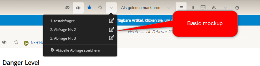
@aledeg you are correct, I am using Blue Lagoon as a theme as I like it's minimal button style. This is why I did not have a headline, and could not see the settings button.
I switched themes, and the button in the headline is a good alternative to the idea I had in mind. Just for clarification, this is a basic mockup of what I had in mind:
Perfect. We know now why you mentioned the first item in the list. I was confused why you'd wanted something more :)
I think that your mockup give us a good overview. Thank you!
@rom-1 Could you please check if you like the current solution in 1.20.0-dev?
@rom-1 Could you please check if you like the current solution in 1.20.0-dev?
Well, only the first issue out of 5 have been fixed by adding a menu icon. The User queries slider (/i/?c=configure&a=queries#slider) could see some improvments (see original post 2-5) but maybe thats not a priority.