Logotype
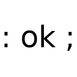
The current ForthHub logotype is a simple combination of a colon definition and the friendly Forth prompt:
I'm happy to take suggestions for a fancier logo.

@jkotlinski I turned that into a header image for: /r/Forth
But I do also like @larsbrinkhoff's image (it's a bit more serious haha...)
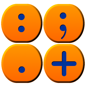
These Android app icons are also cool:

to pick up an cute animal (maybe an imaginary one) to serve as the mascot and logo will make the tech less cold

The SWAP dragon seems just perfect to me! If everyone likes it, maybe we can commission someone who is actually great at drawing? I would be happy to donate for that cause.
I wanted Swap too, but I couldn't borrow it due to this copyright thing. And I'm not the best artist around.

Image courtesy of Forth, Inc.

Good news, I found an illustrator that volunteered to do the swap dragon pro bono :) So let's wait and see the results!
Ha! swap dragon long time no see, : ok ; is great too, change it only with a much much better one.

Zeila Dell Arte, an artist at the company I work at, volunteered and made this drawing for the group :) What do you think? I love it!
As you can see (when the caches are updated), the wings got cropped. Could you ask for the design to be adapted to a square format?
Also, it's a little bit hard to see the details in the size used in user profiles:

Another thing I wondered is how to properly give credit for the logo? It would be nice if it somehow was reachable, some info text about who made it. But I am still very new to Github so I am not sure what is the appropriate way to do things like that...
I'll put the file in a repo, and then we can add credits in a README.
Also, a LICENSE would be nice.