Review/Improve progressive font fallback
Today me and @i-like-robots discussed o-typography progressive font loading. We don't like that whether the font has loaded is stored in a cookie, which doesn't mean the font hasn't been cleared from browser cache; we're not a fan of the extra css weight although it's not terrible; and we don't love copying js in the head to remove the fallback classes snappily, or the related maintenance cost (PageKit will try inlining all of o-typograpy with polyfill). We'd much rather just rely on font-display.
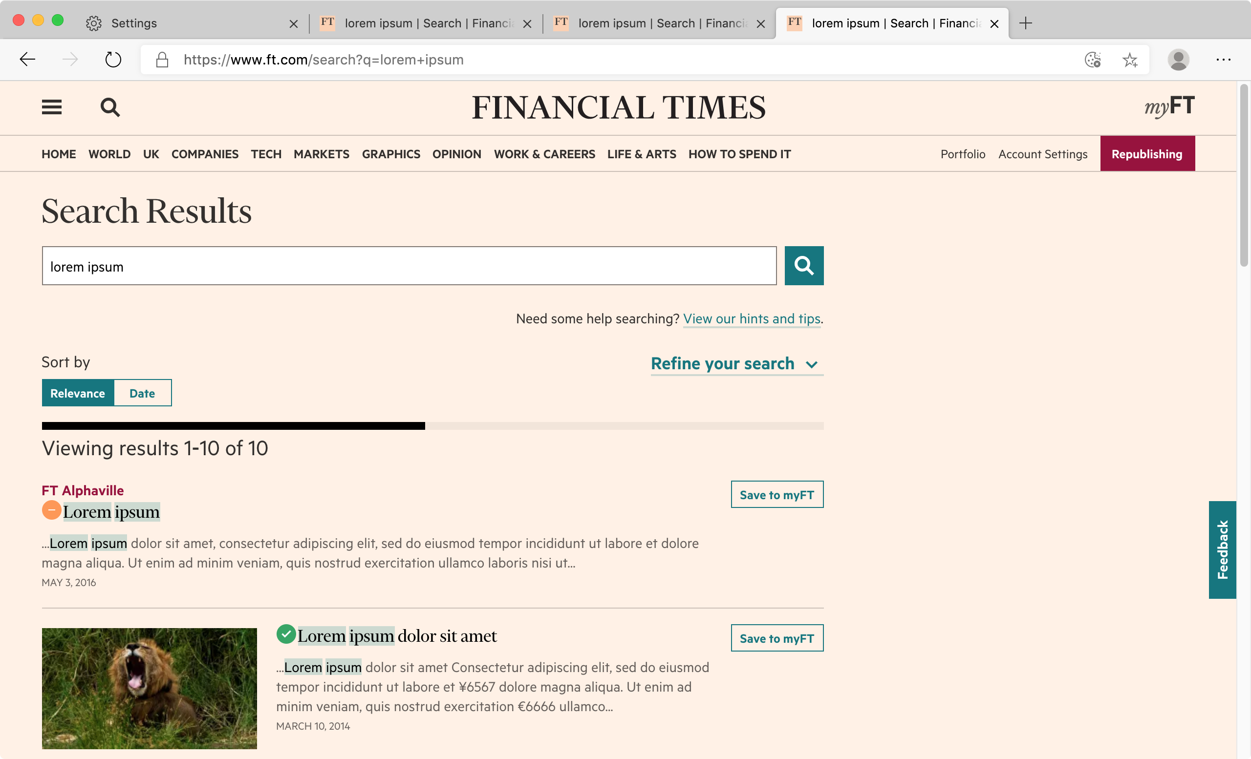
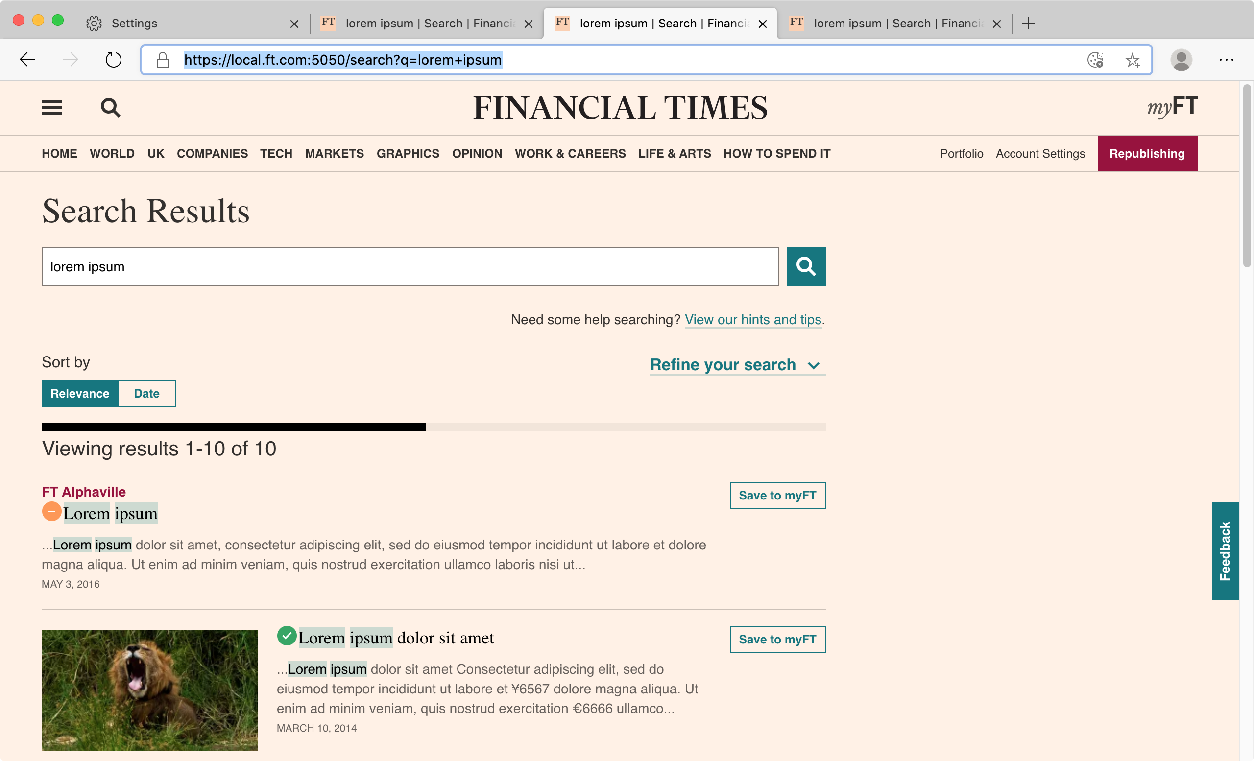
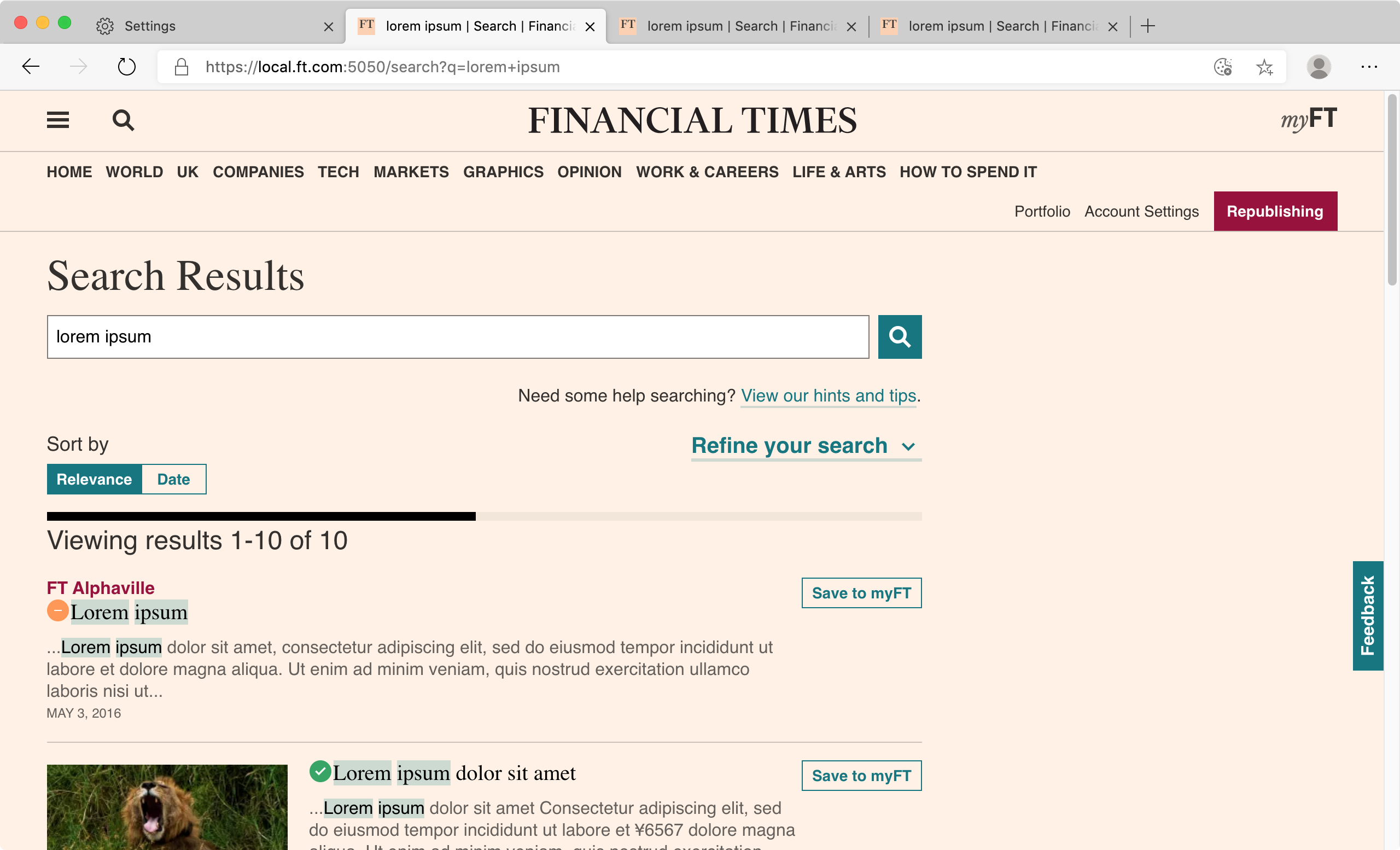
However the fallback font resizing does make a decent visual difference. So we're keeping it. Note in particular the header of this page, and the Financier "Search Results" title (it's better to view full screen and switch quickly). We'd probably want to review the design of key pages to adapt better to custom or fallback fonts to remove our custom progressive font loading completely.
We did however notice some areas where the fallback font size seemed a little off and could be improved, particularly for Metric. We should review key ft.com pages with the font fallback classes o-typography--loading-sans o-typography--loading-sans-bold o-typography--loading-display o-typography--loading-display-bold and not to see if we can refine the fallback font scale. And or hunt back in previous issues to find out how the scale was determined and comment in the Sass
font loaded correctly
no font, with fallback sizing
no font and no fallback sizing
This is causing problems again, this time on the homepage, where the typography classes are not removed for some reason.
We have commissioned a resized Metric2 variable font from Klim, which we can use instead of this resize/loading behaviour. It may be a major release as anyone who has set font-size explicitly, instead of using Origami's mixins, will need to update their font size accordingly.