 Esri
Esri
[Combobox] Improve placeholder display / add support for placeholder icon
Description
The current implementation of the placeholder text leads to a weird space when there are icons present in the combobox items.
Current functionality:


Acceptance Criteria
We should:
- Accept a new
placeholder-iconproperty to set a default icon. - If
placeholder-iconis not provided, left-align the placeholder text to remove the awkward space.
Relevant Info
Breakout from https://github.com/Esri/calcite-components/issues/3074.
Which Component
Combobox
Example Use Case
There are often times when having a prompt icon adjacent to the placeholder text could be useful. If a placeholder icon is not desired, the current empty space between the edge of the input and the placeholder text is not desirable.
I would need the icon placeholder for the VTSE product. I'm using Combobox for folders and tags search (this is part of a new screen in VTSE). Could you please prioritize this issue?

@benelan could we bump priority of this? Should be a reasonably easy add.
Also, It's very confusing to clear the input, it's not a straightforward way. Can we add a "clear button" on input for single-mode?

Also, It's very confusing to clear the input, it's not a straightforward way. Can we add a "clear button" on input for single-mode?

Yep, that is proposed as default here: https://github.com/Esri/calcite-components/issues/4738#issuecomment-1159177061
![github-actions[bot] avatar](https://avatars.githubusercontent.com/in/15368?v=4 "Published by a pub.dev verified publisher")
@macandcheese can you help verify that this is the intended spacing when there is no placeholder-icon?
 https://codepen.io/benesri/pen/VwXrMwR
Two pieces of feedback on that: It seems the example shown should use the same spacing as input :

It seems like there is extra padding on the left - and you can see there is a cursor change at the left side that coincides with that extra space.
I would also imagine the alignment between the value / placeholder with icon, and the spacing of the combobox items (when not nested), would align:

cc @ashetland for visibility.
Yeah I agree with that feedback. Assigning back to dev for some adjustments. Thanks Adam!
@anveshmekala - let me know if you don't have cycles to work on this, I can put it up for grabs in the current milestone. I also updated the codepen with the examples from Adam's feedback - https://codepen.io/benesri/pen/VwXrMwR
@macandcheese one more question - when a combobox has a placeholder-icon and the selected combobox-item has an icon, which icon should be displayed next to the placeholder text?
It is currently the item's icon, which is how it behaves when the combobox does not have a placeholder-icon. However, should the placeholder and placeholder-icon props to be "in sync"?
@anveshmekala - let me know if you don't have cycles to work on this, I can put it up for grabs in the current milestone. I also updated the codepen with the examples from Adam's feedback - https://codepen.io/benesri/pen/VwXrMwR
I have some bandwidth to fix this.
I agree with @benelan - persisting the icon when the entered characters (or placeholder text) is there may be confusing - using the placeholder icon (or no icon if there is no placeholder icon), would I think avoid that. cc @ashetland
<input/> inside combobox is a native one which is why there is a difference in spacing with calcite-input even after the fix 5073 .
We can replace input in combobox with calcite-input unless there is a known limitation that prefers the native one. OR we can add the missing border to input in Combobox but there could be a chance of misalignment if calcite-input changes.
Thoughts ? @macandcheese
cc: @benelan
This issue has been automatically marked as stale because it has not had recent activity. It will be closed if no further activity occurs. Thank you for your contributions.
@macandcheese / @ashetland - Would we need to account for both icons and non-icons in the same combobox?
It looks like the spacing differs, but wondering if that's a pattern we'd recommend/support and if we'd need to account for both with the fix. A Codepen sample for context.
Ideally the spacing is the same, in that example the bullet dot is visually misaligned. IMO it would make sense to push it out to match the item with icon. When there is an icon and item is selected, I do find it weird the dot isn’t present, even if it pushes the icon over, it could still be aligned to the gutter of icon / bullet. We could also the icon the color of the dot to make it easier to tell when it’s selected.
Given the context of alignment to accommodate combobox with and without icons (info below)...
@jcfranco Should we proceed with closing and creating a new issue with this context or re-assigning this issue to the current or next sprint to tackle? Fairly low in prioritization, but seems pertinent for the 1.0.0 release.
Ideally the spacing is the same, in that example the bullet dot is visually misaligned. IMO it would make sense to push it out to match the item with icon. When there is an icon and item is selected, I do find it weird the dot isn’t present, even if it pushes the icon over, it could still be aligned to the gutter of icon / bullet. We could also the icon the color of the dot to make it easier to tell when it’s selected.
The recommended fix would include:
- [ ] Spacing the selection indicator in alignment with the icon (when present)
- [ ] Spacing the text in alignment regardless of icon presenc
Recirculating to a future sprint to meet the additional items in the comment above.
cc @jcfranco
The recommended fix would include:
- [x] Spacing the selection indicator in alignment with the icon (when present)
- [x] Spacing the text in alignment regardless of icon present
Added fix for aligning selector indicator with the icon when present and text aligns regardless of icon. Do we need to add selector indicator for items with icons or would that be a separate discussion ?
cc @macandcheese
I think I'd expect it to also have in indicator, like dropdown, but cc @ashetland @SkyeSeitz for final design.

I think I'd expect it to also have in indicator, like dropdown, but cc @ashetland @SkyeSeitz for final design.
Yup. 100% agree here.
I think I'd expect it to also have in indicator, like dropdown, but cc @ashetland @SkyeSeitz for final design.
Yup. 100% agree here.
Can i get a Figma design for this one as matching with dropdown is bit of an issue with difference in padding for dropdown-item compared to combobox-item .
The original issue has been addressed above in the following Codepen. A new issue, 6287 was created to address the component's indicator icon when children have accompanying icons.
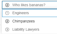
placeholder image:

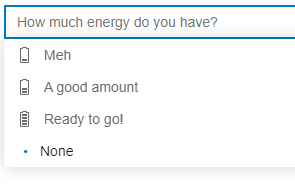
no placeholder image (left-align):
