 EdgeTX
For consideration - revised input edit page for color LCD radios.
I've reworked the layout for the input edit page for color LCD radios. Comments, criticisms and issues welcome.
Summary of changes:
- Move everything out of the 'advanced' pop up to the main input edit page
- Move Source to the title bar to free up space
- Input name and Line name on the same line
- Switch and Trim on the same line
- 'Side' drop down replaced by 'x < 0' and 'x > 0' buttons under the preview (these are the only two options in the code). At least one or both must be active (handled automatically).
- GV buttons highlighted if the corresponding input is a GV variable.
- Portrait layout fits on one screen, Landscape has a small amount of scrolling still
Screenshots:


Coool! Thx!
I would like to see in close future this implemented: https://github.com/EdgeTX/edgetx/issues/2466 (not related to this PR). This could save me a lot of headaches :)
Maybe make white text in "modes" and in the graph black for better visibility?
@Eldenroot the flight mode button color is set in the libopenui project. It’s easy to change but I’m not sure what else this might affect. Changing it might also adversely affect other themes. I agree it looks odd at the moment on the default theme.
Maybe FMMatrix is missing the active/inactive colours being set? It really should behave like a button - so perhaps needs some tweaking in either radio/src/gui/colorlcd/fm_matrix.cpp or radio/src/gui/colorlcd/themes/etx_lv_theme.cpp?
I may be missing something; but to me it looks like the colors are hard coded into libopenui/src/button_matrix.cpp, btn_matrix_event function. When I change line 50 to use COLOR_THEME_PRIMARY1 the flight modes display with black text when active. I could not see any way to override this in fm_matrix.cpp or etx_lv_theme.cpp.
I found a way to make the flight mode button text color behave like other text buttons. I also updated the landscape layout to fit without scrolling.

Cool, good job. Now it should be consistent over all screens etc. So maybe future pr. I really like this change, thank you

Although I understand advantages of no-scroll this implementation has 3 problems
- Brakes UI consistency - top bar is for navigation and info
- Flight mode buttons are too small though prone to touch error
- Flight mode buttons are in 'difficult touch" area 20-30 px from the bottom (recessed screen)
Scolling with touch is quite fast so I'd leave it here to keep usability Had a lot of work (closing year) but it's finished so if you wait @philmoz just a little I'd prototype it in Figma on Friday. There are few other thing like preview on left side and values on right (most of people are right handed).
- Brakes UI consistency - top bar is for navigation and info
It seems a waste to not utilise this available space. Also the 'Select Model' page has the 'New Model' button in this space so it is not entirely inconsistent :)
I like this change a lot, no wasted space and easier editing/adjusting of points. All UI should be unified across all menus etc., so it could change depending on users feedback.
After using it on my TX16S for a while I found the flight mode buttons awkward as @JimB40 suggested. I've reverted them back to two rows with larger buttons and scrolling in landscape layout.
After using it on my TX16S for a while I found the flight mode buttons awkward as @JimB40 suggested. I've reverted them back to two rows with larger buttons and scrolling in landscape layout.
@philmoz I'm brief sometimes, but spent more than 10 years with UI/UX. Handheld touch devices are for decade so there are already best UX/UI best practices for them. UX is not my job ATM but still have some friends :) so I can read reports (like Nielsen) that costs 5k usd.
They may seem not to be important but using them "magically" makes UI user-friendly. Like 85-90% people are right handed, so placing editable content on the right part and preview on the left instantly brings better UX. (Like with a curve edit screen)
I've made part of mockup yesterday based on changes we discuss. Do you use Figma?
@philmoz as you do a lot of nice UI changes one more tip.
Whenever you need to split screen (columns layout) start design on horizontal with 3 modules So split can be
- 160/160/160 px
- 320/160 px
- 160/320 px
Then porting to vertical NV14 that is 320px wide is easier.
Sometimes split has to be different but it's a good starting point.
@JimB40 Thanks for the tips, will try and keep all that in mind. I have not used Figma, can you post images here to discuss.

@philmoz I'd strongly advocate not to use TopBar for editable UI elements.
There is ongoing UI 3.0 sub project. Once we cover all TABs conversion to LVGL it will provide solution to user-case based UI. Simply saying available features will be based on type of model (Plane, Glider, Quad, Heli etc) TopBar area is intended to serve as information, general navigation & general tab specyfic functions.
If we stay within 'content' area, UI (code) will fit seamlessly. Otherwise fixes will be needed.
Some previews of UI.3.0


@JimB40 Looks interesting although I'm not sure how the top bar will fit on the NV14 - the middle section with the date etc is the full width of the portrait LCD screen.
Reviewin & Mockin up Input editing screen. Can someone check in code what does Trim 'ON" parameter?
So Trim dropdown list has below stated entries OFF - is to disable trimming feature ON - ??? T1..T6 (or assigned trim buttton name) - sets desired trim button as the source of trimming (and of course enables trimming)
So what ON is doing? @pfeerick you're plane pilot :)
IIRC OFF - no trim ON - trim active (default - i.e. throttle is throttle trim, ail is ail trim, etc) T# - trim active, some other trim control
Can we re-code so:
- Trim ON/OFF is check box
- if checkbox is ON default trim button is selected on trim source list - unless user changes to different trim button?
Finish that thought... and do what then?
At the moment, the one UI element allows for trim enable/disable/reassign. So now it will be a checkbox, and a choice that is shown when it's ticked (which we now have to reserve space for since there are now two controls)? Don't make me guess what you're thinking ;)
Okay okay I know 'drawing is a language of engeneers', Just throwed idea in the middle of designing when figma was not ready yet. After year and half I hoped you already read my mind ;)
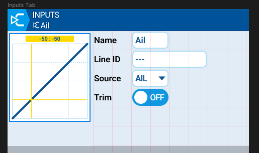
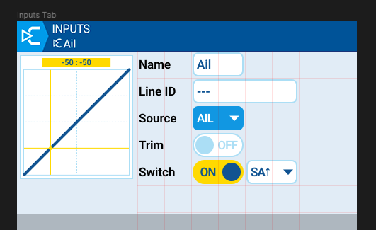
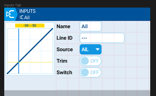
Triming is OFF - trim source selection is not visible
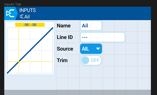
Selected
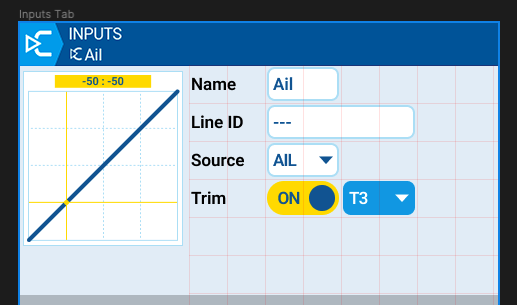
Activated - trim source selection shows up
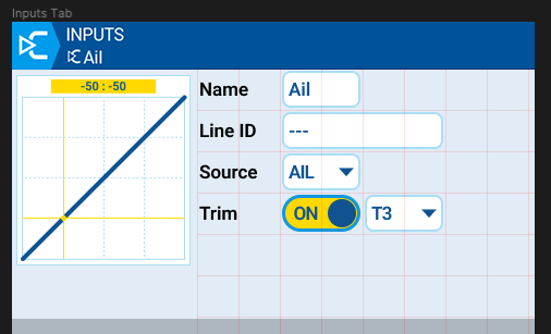
List selectable to change if needed
Regarding the trim suggestion - for non stick inputs (sliders, pots, etc), there is no 'default' trim switch. In this case the 'On' option does not appear in the popup menu and the user can only select 'Off' or choose one of the available trims.
With your checkbox idea what happens in this case when you turn trim on?
Next example is more convincing as checkbox allows to reset list value. Can't remember how many times I cursed because I had to scroll to '---' to disable switch.
Switch ON - now you can seclect switch source
Switch OFF - value is reset to default.
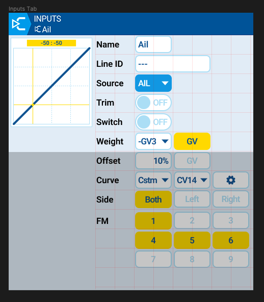
BTW - All input controls with visible area marked
-
If Custom curve is selected - CONFIG button is visible to let user inform he can go to curve editing
-
Need some comments how FM (Flight modes) works
- what is default? all OFF, all ON, just FM0 is ON
- if all FM are OFF is Input enabled or disabled?
- is FM0 kind of special Flight mode?
PS. FMs buttons on mockup are labeled 1-9. My mistake shoud be 0-8
Is possible to make graph (curve) sticky, so always visible even during scrolling?
Regarding the trim suggestion - for non stick inputs (sliders, pots, etc), there is no 'default' trim switch. In this case the 'On' option does not appear in the popup menu and the user can only select 'Off' or choose one of the available trims.
We may render Trim checkbox not focusable, but I prefer to hide control (only needed information is visible)
Is possible to make graph (curve) sticky, so always visible even during scrolling?
Left panel 160px is sticky. Right panel 320px scrolls