BioDrop
 BioDrop copied to clipboard
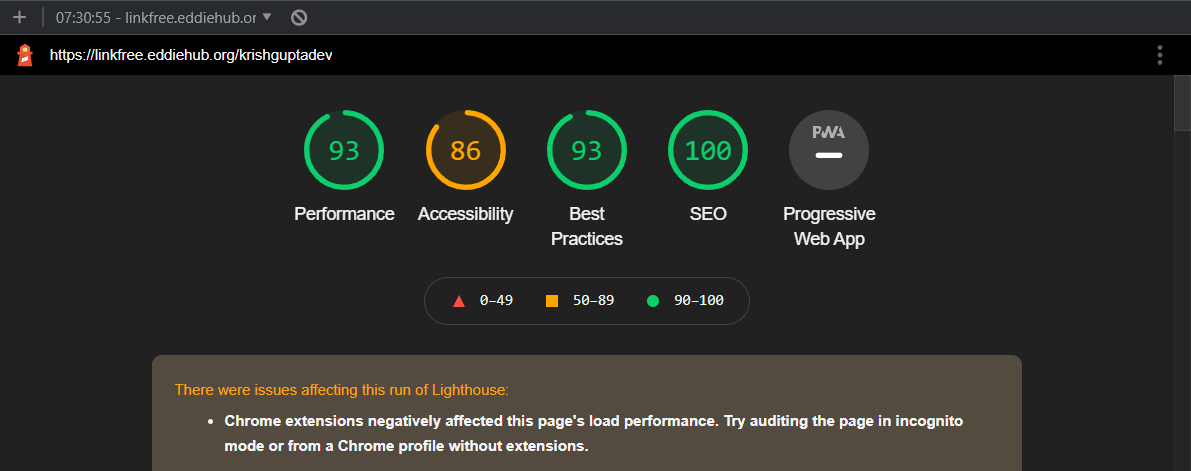
[OTHER] Color contrast is problematic - discussion
What would you like to share?
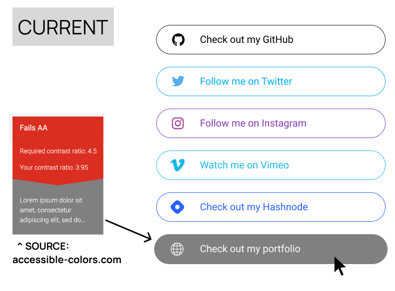
The color contrast for youtube red, twitter blue and linkedIn blue is not sufficient to meet accessibility requirements. Suggestion that the text is black and the logos/borders are the correct social color but thought it would be good to open a discussion about this and see what others think.
Additional information
No response
It's great having you contribute to this project
Welcome to the community :nerd_face:If you would like to continue contributing to open source and would like to do it with an awesome inclusive community, you should join our Discord chat and our GitHub Organisation - we help and encourage each other to contribute to open source little and often 🤓 . Any questions let us know.
There's a lot that can be improved.
🟢 for someone willing to make these issues 👆
I am a beginner if anyone could explain what is this issue about, I would love to contribute in any way if I can.
What would you like to share?
The color contrast for youtube red, twitter blue and linkedIn blue is not sufficient to meet accessibility requirements. Suggestion that the text is black and the logos/borders are the correct social color but thought it would be good to open a discussion about this and see what others think.
Additional information
No response
Hello there! I was thinking I could make up a couple of quick mockups for this issue... I'd post them here, and we could discuss which (if any) we'd like to try out!! (Then I'd code it up and open a PR 🤓)
@alex-anson some mock ups would be great! There might be a few more colours that need adding to the list since we added more icons (or maybe the design can cover all buttons so there is never a problem when new icons are added)
@eddiejaoude I think the colors of the marked ones can be changed to different colors to make it look prettier. Otherwise this could be made a little lighter green color.
@emmalearnscode @eddiejaoude Sorry for the delay 😳 What does everyone think of these ideas?
For hover idea number two, I would propose adding a dark variant for each of the properties in src/config/links.json, for example: "globe-dark": "#595959",
Also, I have a question -- is the goal to meet AA or AAA standards?
Let me know your thoughts! All feedback is welcome.
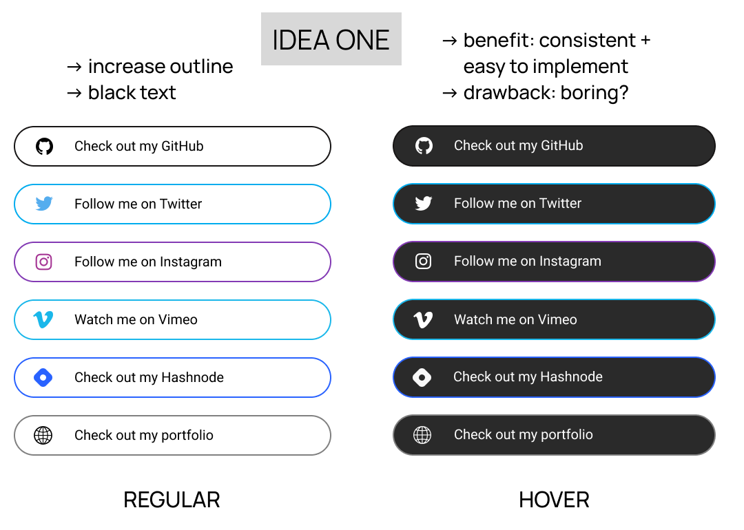
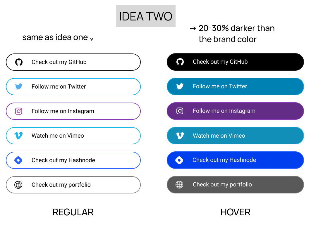
(PS - I couldn't (quickly) find a png in the correct color for instagram or for the globe icon)
@alex-anson I do like that second idea a lot! Does the contrast ratio for each of these hover links meet AA or AAA standards? (Just curious 😃 )
@Umayarz18 Cool!! Most of them meet AAA. (There's one that doesn't even meet AA. 😳 ) The mockup is more about the concept, I suppose -- I hadn't even checked the ratios until just now. And I wasn't sure which we were aiming for -- I'd asked "...is the goal to meet AA or AAA standards?" in my last post. 😁
Do you know which we're trying to adhere to? I appreciate your feedback!! 🙏
@alex-anson not sure which we are going for either. I personally think AAA if possible is best since accessibility is something I feel is neglected a lot for beginners. Showing an AAA (except the one 😳) compliant design would be a good example for the developers contributing here.
Hoping @emmalearnscode might have an answer 😄
AAA is the highest accessibility level but it's difficult to achieve in all areas. Most websites are expected to reach AA, government and other critical organizations are expected to be AAA. Of course we can try to reach AAA as much as possible if we choose to.
Great discussion everyone 🔥
I think if we can continue to make little improvements, not everything has to be done perfect in one go - any little improvements will definitely help
Wow lots of great collaboration ❤️ love it! I am going to close this as we have a new release, maybe a new issue can be created for the new version