BioDrop
 BioDrop copied to clipboard
[FEATURE] Change text color of the profile views bubble to white
Description
I think the text color of the bubbles would be seen more clearly if it was white. I have attached a screenshot of both side by side for comparison
Screenshots

Additional information
No response
It's great having you contribute to this project
Welcome to the community :nerd_face:If you would like to continue contributing to open source and would like to do it with an awesome inclusive community, you should join our Discord chat and our GitHub Organisation - we help and encourage each other to contribute to open source little and often 🤓 . Any questions let us know.
I would like to work on this one.
@JunDevHarsh Great but you should've discussed it first before opening a PR. no worries, just a suggestion from me.
Hello @HarshDeep61034,
I noticed that you had requested to work on Issue #3423 and I apologize for not reaching out to you before creating the pull request. I had taken the initiative to work on the issue as I saw that it was unassigned and I wanted to help move the project forward.
However, I understand that this might have caused confusion and I apologize for any inconvenience caused. I would like to request you to review the pull request and let me know if there's anything that needs to be fixed or if you have any concerns.
@JunDevHarsh No problem 😊 👍 I also make a lot of mistakes daily.
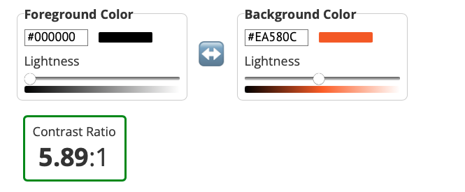
Please check that the color contrast is more than 4.5:1 with white text on the orange background before making this change.
@EmmaDawsonDev Please take a look at this. Is this what you were referring to? I agree with you that the white text does not contrast well enough with the orange background.

Please check that the color contrast is more than 4.5:1 with white text on the orange background before making this change.
The contrast for white text is 3.53:1 . Will keep this in mind next time !
@EmmaDawsonDev Please take a look at this. Is this what you were referring to? I agree with you that the white text does not contrast well enough with the orange background.
Yes, that’s what I was referring to.
@EmmaDawsonDev Please take a look at this. Is this what you were referring to? I agree with you that the white text does not contrast well enough with the orange background.
Yes, that’s what I was referring to.
I think this issue can be closed since the black text has a good contract ratio
