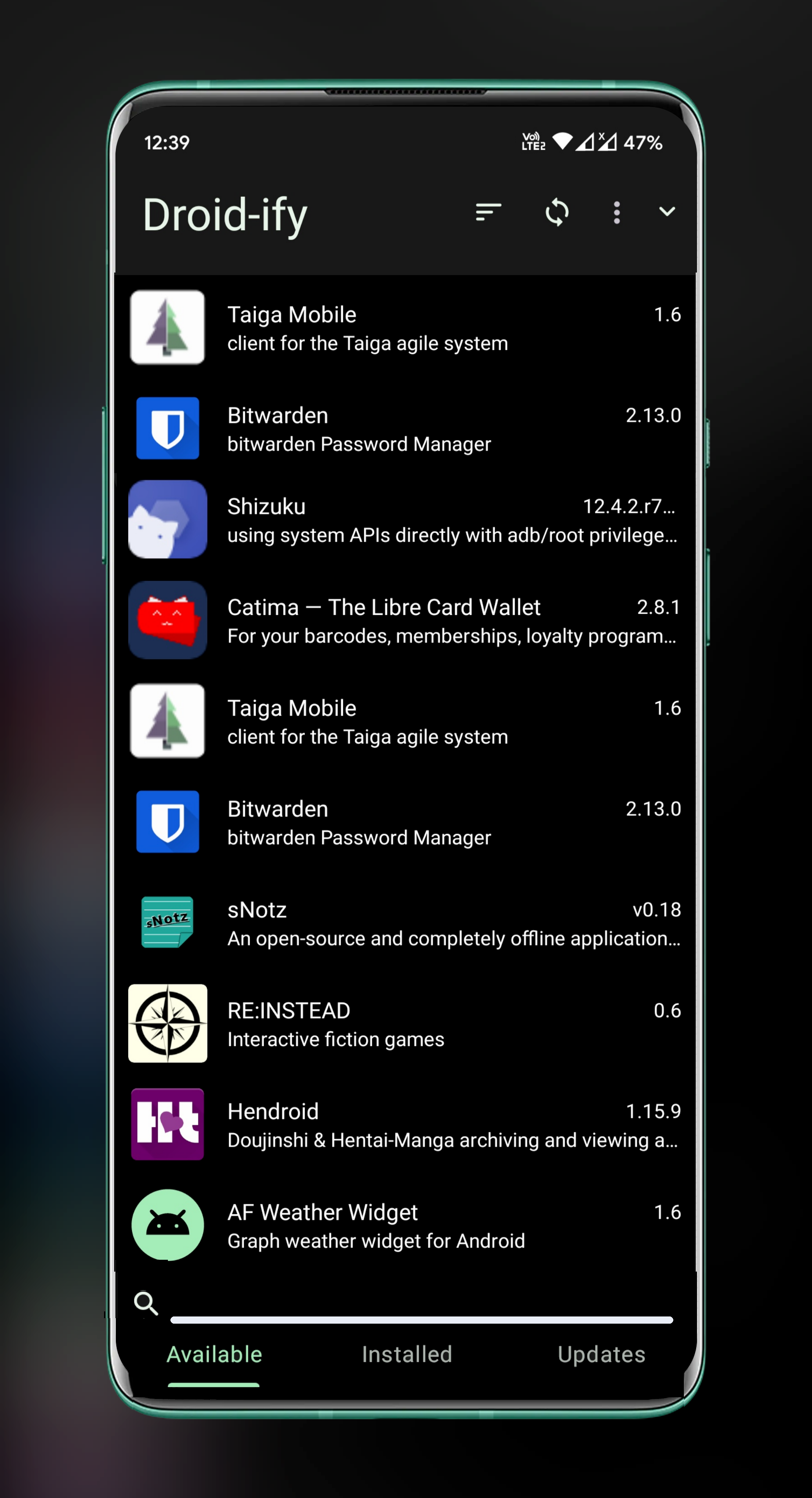
[Feature Request] Change the tab switching animation?
I don't like the way it switches between "Available" and "Installed". Maybe just the usual horizontal animation instead of the diagonal way in the current one.
Then how should I proceed to hide the Categories section?
Maybe putting it beside the search button.
I think putting the category selector at the bottom is the best option. Then #106 is possible. The categories could also be in the 3 vertical dots menu.
Heh, I actually think the animation is kinda fun, and when I first started using Droid-ify I had to swipe back and forth a couple times to see what was going on. Issue #189 requests this to be added to the Installed tab as well, which would eliminate the problem between those two and only cause it when switching to/from the Updates tab. It could simply be added to all tabs, even though the usefulness becomes exponentially less as you move to the right, but at least then it would be consistent. Another option is putting it in a sidebar that's swiped out, which would also allow a search icon to be at the bottom of that, making it easier to initiate a search without reaching to the top of the screen.
I don't see how putting it at the bottom would help with the other issue, but another possibility would be to place this, the sort button, and the search button at the bottom, so the top would be "Droid-ify" and the refresh and 3-dots, which are rarely needed, and the more often-used items at the bottom, so they would be easier to reach and the diagonal animation would be "fixed."
Yet another option I've seen used elsewhere, and which I personally like, is to have a button at the bottom-right, around where the new green up arrow button is, that when tapped expands to show other buttons. So it allows more use of the screen to show the app list since you don't need a toolbar, yet is unobtrusive since it's just one (possibly translucent) button, and you can tap it to access search, filter, sort, etc). I think this approach is probably the best overall, and certainly better than a toolbar at the bottom, which I don't like, especially since that's right next to the Android nav bar.
@Iamlooker Does this solve the issue?

@Iamlooker Does this solve the issue?
This is a nice concept, hmmmmmmm. I would like to use bottom bar for many stuff and it is planned
There are two things about that I don't really like, though both minor, and it does look nice. As I mentioned, I prefer tabs at top, especially since at the bottom they're immediately next to the Android nav bar, though at least they can be swiped between, so not too much concern of accidentally tapping one of the nav buttons. The other issue is that it takes the search icon/field and moves it from sharing a horizontal space with other icons, therefore not wasting any screen real estate, to being on its own, leaving less space for actual content. I think a floating icon would be better, which would also allow putting the sort, filter, and categories functions within easier reach, or else possibly putting it inline with the tabs (though this would risk accidentally tapping back or recent apps instead, but that's unlikely to happen much).
@vertigo220 If I am about to implement this as proposed by kingu, I will be making some UI changes like I will use Bottom navigation bar or maybe use a bottom app bar like Google Tasks uses. Either way your concerns are actually pretty significant in terms of UX.
I like the idea from kingu as well.
@or maybe use a bottom app bar like Google Tasks uses.
I mentioned this elsewhere, but I think the use of icons is definitely bad due to the wasted space. The nav bar on the bottom, while I don't care for it, ultimately doesn't affect things too much, but including icons and making the bar 3-4x as high as a result really wastes a lot of space and adds nothing. Icons are good when there are a lot of items to help find one quickly, but with just three they're unnecessary and the labels are more than sufficient. Conversely, apps that use icons without labels result in more space usage while being less helpful to the user. If you do decide to go that route, perhaps it could be swipeable up and down to expand and collapse it, though this could be accidentally done while scrolling.
Currently swiping down to browse the application list will pretty easily cause accidentally switching to the next tab. I'd like to +1 for using bottom navigation instead of tabs (https://github.com/Iamlooker/Droid-ify/issues/10). While "Available" and "Installed" are both pages that contain a list, I think it's still reasonable to treat them as two different pages and not really need to share the same animation for the list component. Thus, the animation issue will be gone.
but I think the use of icons is definitely bad due to the wasted space.
Personally, I don't think the icon is a waste of space. The icon could help people know the purpose of an action without actually reading the text. But anyway, there could be an appearance option to disable the icon on the navigation bar.