yellowbrick
 yellowbrick copied to clipboard
Probability Calibration Curve
When performing classification one often wants to predict not only the class label but also the associated probability to give a level of confidence in the prediction. The sklearn.metrics.calibration_curve method returns true and predicted probabilities that can be visualized across multiple models to make the best model selection based on reliability.
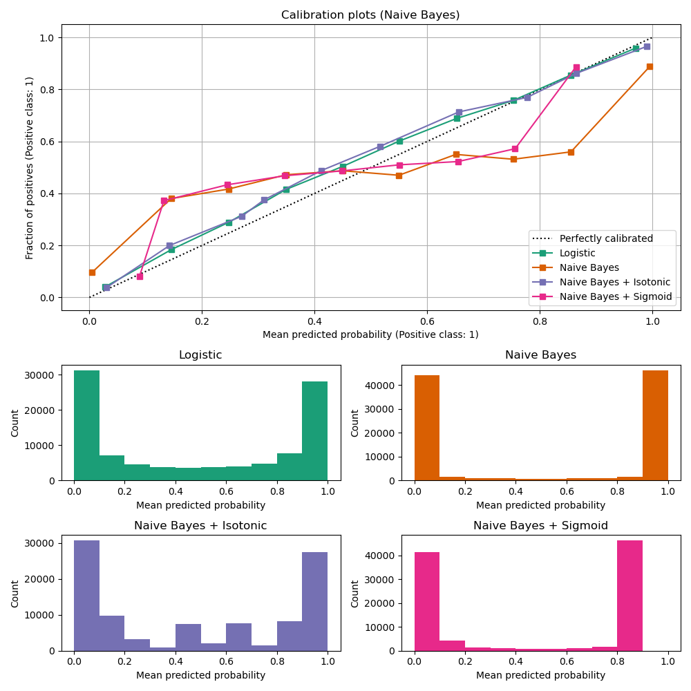
Alexandru Niculescu-Mizil and Rich Caruana (2005) Predicting Good Probabilities With Supervised Learning, in Proceedings of the 22nd International Conference on Machine Learning (ICML). See section 4 (Qualitative Analysis of Predictions).
@bbengfort , Hi, I am interested in contributing to this feature.
https://nbviewer.jupyter.org/github/saurabhdaalia/ProbablityCurve/blob/master/Curve.ipynb I have put together this very naive sort of example to get an idea that what are we trying to implement exactly. Would love to get some feedback over it to put down some initial steps to implement the feature.
Hi @saurabhdaalia Thanks for taking interest in Yellowbrick. However @bbengfort is going to be away for the next couple of weeks. You are welcome to open a pull request to address the issue. I encourage you to check out the contributor’s guide for our conventions around branching, API, testing, etc https://www.scikit-yb.org/en/develop/contributing/index.html If you don't hear back from us in a couple of weeks just give us another ping. We look forward to your contribution.
Hi @bbengfort,
I was hoping to get some clarification regarding the implementation of the visualizer. When we are showing the calibration curve using the reliability diagram, should only the true calibrated probabilities be plotted as a base or do we need to plot another model as base as well? As shown in the figure Logistic Regression is also used for comparability.
Does it make sense, if we add something like this?
proba_curve = ProbabilityCalibrationCurve(GaussianNB(),base=LogisticRegression())
proba_curve.fit(X_train, y_train)
proba_curve.score(X_test, y_test)
proba_curve.poof()
user can pass a base parameter which will be a secondray model for better comparability
Hi @saurabhdaalia Thanks for the questions and comments. we are currently working through our backlog of PRs and Issues. We will address this asap.
Some neat examples from R: https://rdrr.io/cran/rms/man/val.prob.html https://rdrr.io/github/BavoDC/CalibrationCurves/man/val.prob.ci.2.html
Hi all, I am looking for a way to plot a reliability diagram (accuracy vs confidence) for a multi-class task. Do you have any resources in your mind to plot reliability diagrams for such tasks? Thank you.
@Mahhos this does sound like an interesting visualizer; do you have some examples you could point us to?