yellowbrick
 yellowbrick copied to clipboard
Add FeatureImportanceVisualizer for Treebased-Models
When you use tree-based models, a common approach is to investigate the feature importance induced by the splits of the trees.
- Example: http://scikit-learn.org/stable/auto_examples/ensemble/plot_forest_importances.html
- Make a barplot to show the feature importance provided by sklearn.
- Option for normalization of values
- Featurename parameter
I will start implementing this today and PR. Any opinions about this?
@tsterbak we have some folks working on feature importance with linear models using coefficients right now, but I'm not sure how far along they are, so my opinion is that you should go for it, and we'd be happy to have a PR. Looking forward to seeing what you put together.
Let me know if you have any questions. We're in the process of writing a better contributor guide, check out what we have so far in the develop branch.
@tsterbak - sounds great! Here's some info we put together on rolling your own yb visualizer, in case it's helpful!
I opened a pull request and added a basic implementation of what I was thinking of. Maybe we should abstract this more and build a baseImportanceVisualizer and subVisualizers for different types of models, or make visualization for a bigger class of models possible with the ImportanceVisualizer.
Looks good so far.
In terms of the hierarchy, I'd say that this was a ModelVisualizer potentially we could create an extension of that called ImportanceVisualizer, and then have your model subclass that.
In terms of checking if the model is a forest model, we've certainly been using is_classifier() and the like in the utils.py module, since Scikit-Learn also does stuff like that. See how we use that in the ClassifierScoreVisualizer base class: classifier.py#L49. Not sure how you would come up with an is_forest method though.
Copied from @ianozsvald on #195 for reference as we develop this further.
At the risk of adding noise - I'll note that commonly I create the following code to look for the most important features in a RandomForest:
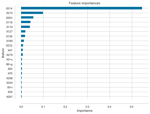
df_feature_importances = pd.DataFrame(list(zip(clf.feature_importances_, X.columns)), columns=['importance', 'feature'])
df_feature_importances = df_feature_importances.sort_values('importance', ascending=False).set_index('feature')
nbr_features = 20

fig, ax = plt.subplots(figsize=(8,6));
df_feature_importances[:nbr_features].plot(kind="barh", title="Feature importances", legend=None, ax=ax)
plt.gca().invert_yaxis()
plt.xlabel("Importance")

# remove right/top border to make things slightly neater
ax.spines['right'].set_color('none')
ax.spines['top'].set_color('none')

# visual tidy-up to make left axis small values slightly easier to read
# offset left and bottom axis
ax.spines['bottom'].set_position(('axes', -0.05))
ax.yaxis.set_ticks_position('left')
ax.spines['left'].set_position(('axes', -0.05))
In #194 the sklearn visualisation was noted http://scikit-learn.org/stable/auto_examples/ensemble/plot_forest_importances.html and this adds a standard deviation to each bar. A measure of spread sounds very useful - I'm not sure if assuming a Gaussian is right (I only have a weak opinion on this). Can we guarantee a Gaussian distribution for feature importances? Might it be skewed? Maybe a boxplot per feature is actually a better thing (as it is non-parametric and really quick)? I'm wondering if occasional outliers might skew the distribution and make it non-Normal?
Looking at a problem I'm working on right now, with a RandomForest with 58 estimators, extracting the most important feature (X314 in the picture above) and plotting each tree's feature importance for this feature I get:
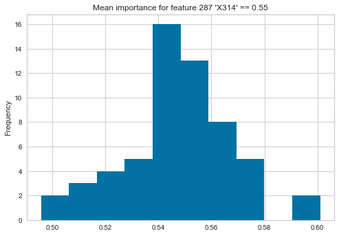
but if I take the second most important feature then the mean and standard distribution would paint the wrong summarised picture (as a set of my estimators think this feature has very low value indeed):

vals = pd.Series([tree.feature_importances_[288] for tree in clf.estimators_])
vals.plot(kind="hist", title="Mean importance for feature 288 'X315' == {:0.2f}".format(vals.mean()))
Edit - Olivier Grisel of sklearn agrees that using percentiles, if we want to show a measure of spread, makes more sense: https://mail.python.org/pipermail/scikit-learn/2017-June/001615.html
I also wonder if some additional tree information (e.g. n_estimators, max_depth) might be a useful addition to the plot, perhaps in the title?
Note that as of #317 we now have a generic feature importances visualizer that looks for coef_ or feature_importances_ on the wrapped class. This can be extended to EnsembleImportances or something like that to add standard deviation, percentiles, etc. as mentioned by @ianozsvald above and to include additional information such as tree depth, number of estimators, etc.
I think there's a nice opportunity here for a complementary analysis alongside ELI5's show_weights and explain_weights: http://eli5.readthedocs.io/en/latest/tutorials/xgboost-titanic.html
ELI5 is exposing high-level explanations from models (including per-prediction explanations). https://github.com/slundberg/shap is also doing something similar, both build on LIME.
I'd love to have high level summaries of things like percentiles of guesses in trees, tree depths etc. I already use both YB and ELI5 on my current client projects.
If there's progress on this topic in the next 6 weeks then I'm likely to be able to fold the updates into my slides for my proposed PyDataLondon conference talk (assuming the talk gets accepted).
@ianozsvald well that's a pretty good motivation to get moving on it! The simple feature importances visualizer will be up soon then we can look at something tree-specific.