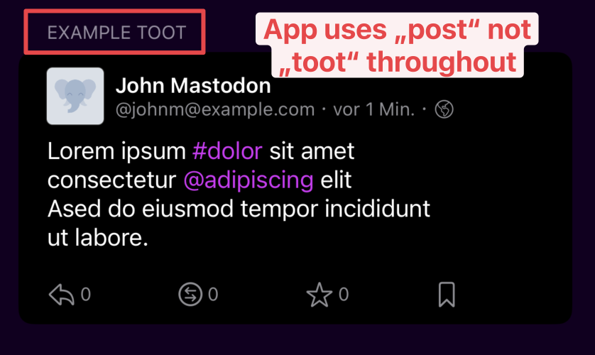
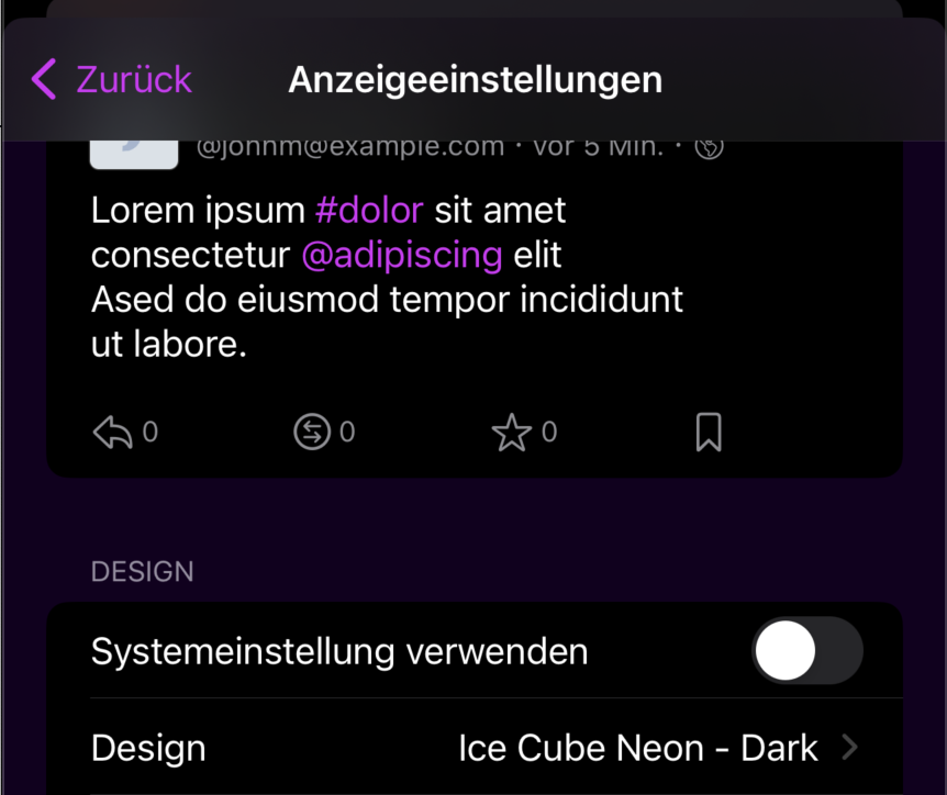
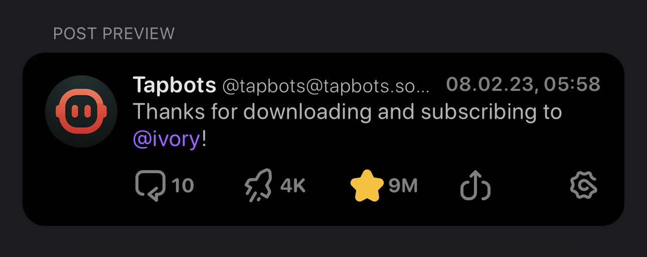
Add a preview toot to the top of the display settings page.
It also makes a few changes to the preview toot to accommodate them.
The (optional, default false) parse markdown flag stops the preview toot having weird highlighted regions when used as a placeholder, but allows links to look correct in settings.
Nice! I was going to work on this next—a few comments about the UI. I will put them in individual comments to more easily "talk" about them if necessary.
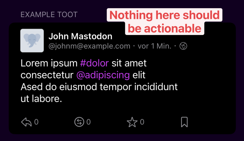
One thing I notice is that because it is actionable, the state gets lost depending on what is tapped. No point adding any state to this, no matter how quick and easy it may be!
The preview should stay in place. This will allow smaller phones to make changes further down the screen and still see what those changes would do.
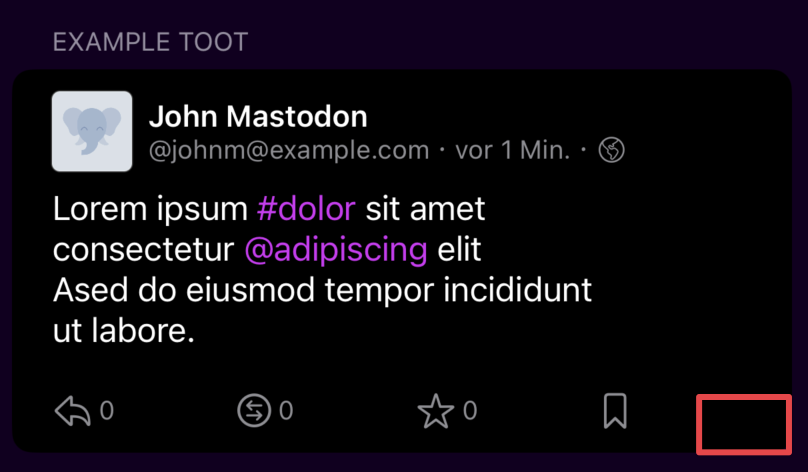
Highly recommend showing the share icon here to get rid of the "whitespace" and make it look more uniform.
Again, I like what I see. I'm sorry if my suggestions don't come off as suggestions. I do mean them as such.
How about a more personalised post example? I don't know what to put, but I like what Ivory did.
Thanks for the review @EvilOne I agree with all of those. @xurble I'm fixing some issue in order to merge it for next release, because this is a very good start! We can iterate on this.
No problem, I've just changed the wording and disabled the interactions which was necessary. More polish can come later :)