draggable_home
 draggable_home copied to clipboard
 DevsOnFlutter
A draggable Flutter widget that makes implementing a sliding up and fully-stretchable much easier.
Draggable Home
A draggable Flutter widget that makes implementing a Sliding up and fully-stretchable much easier! Based on the Scaffold and Sliver.
Usage
Make sure to check out examples for more details.
Installation
Add the following line to pubspec.yaml:
dependencies:
  draggable_home: ^1.0.2
Basic setup
The complete example is available here.
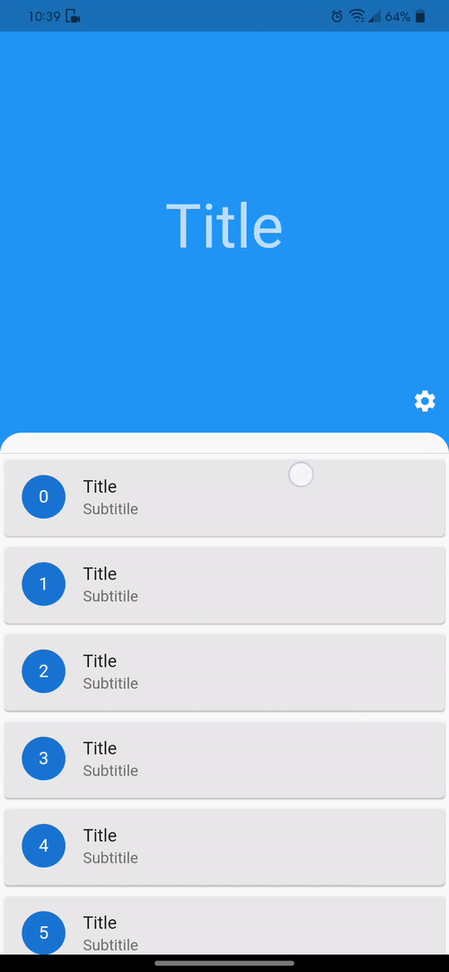
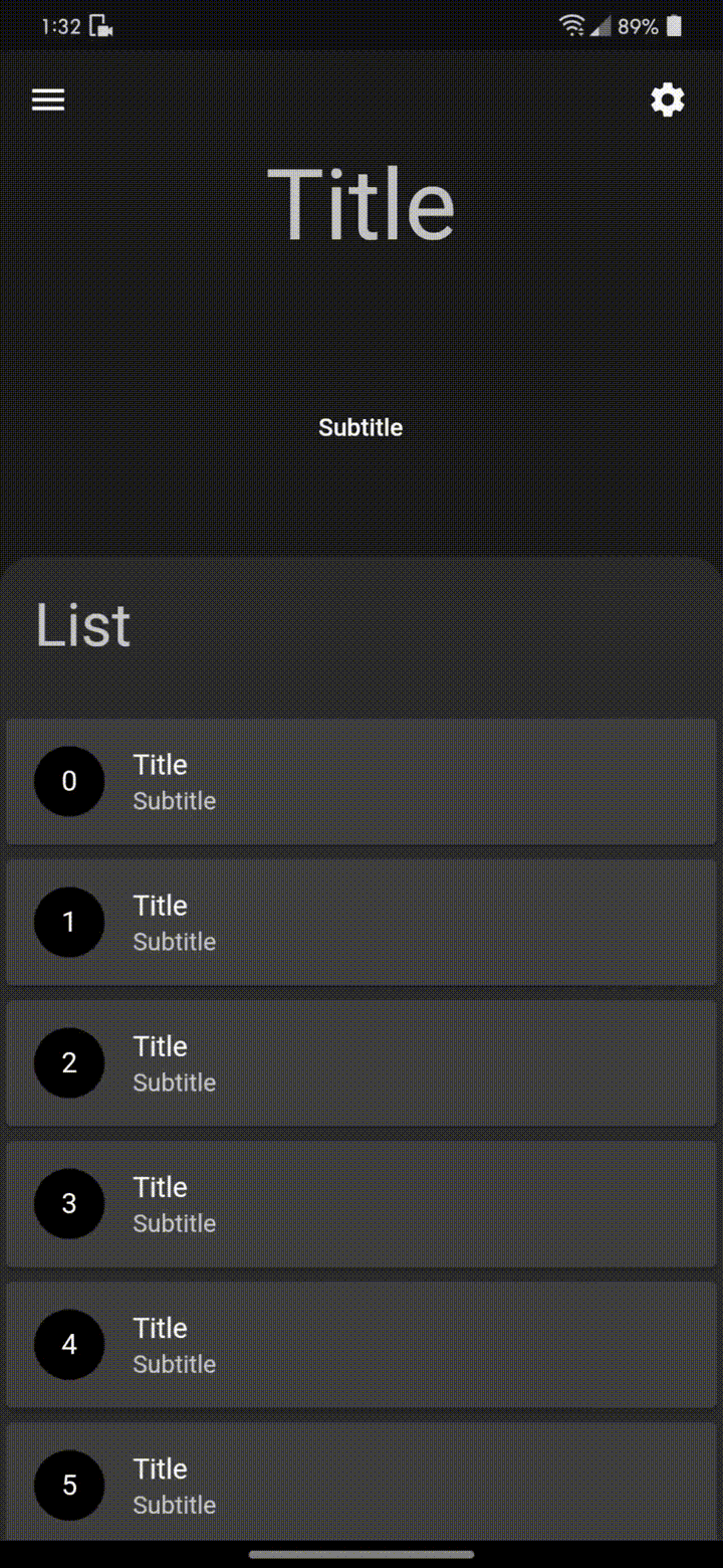
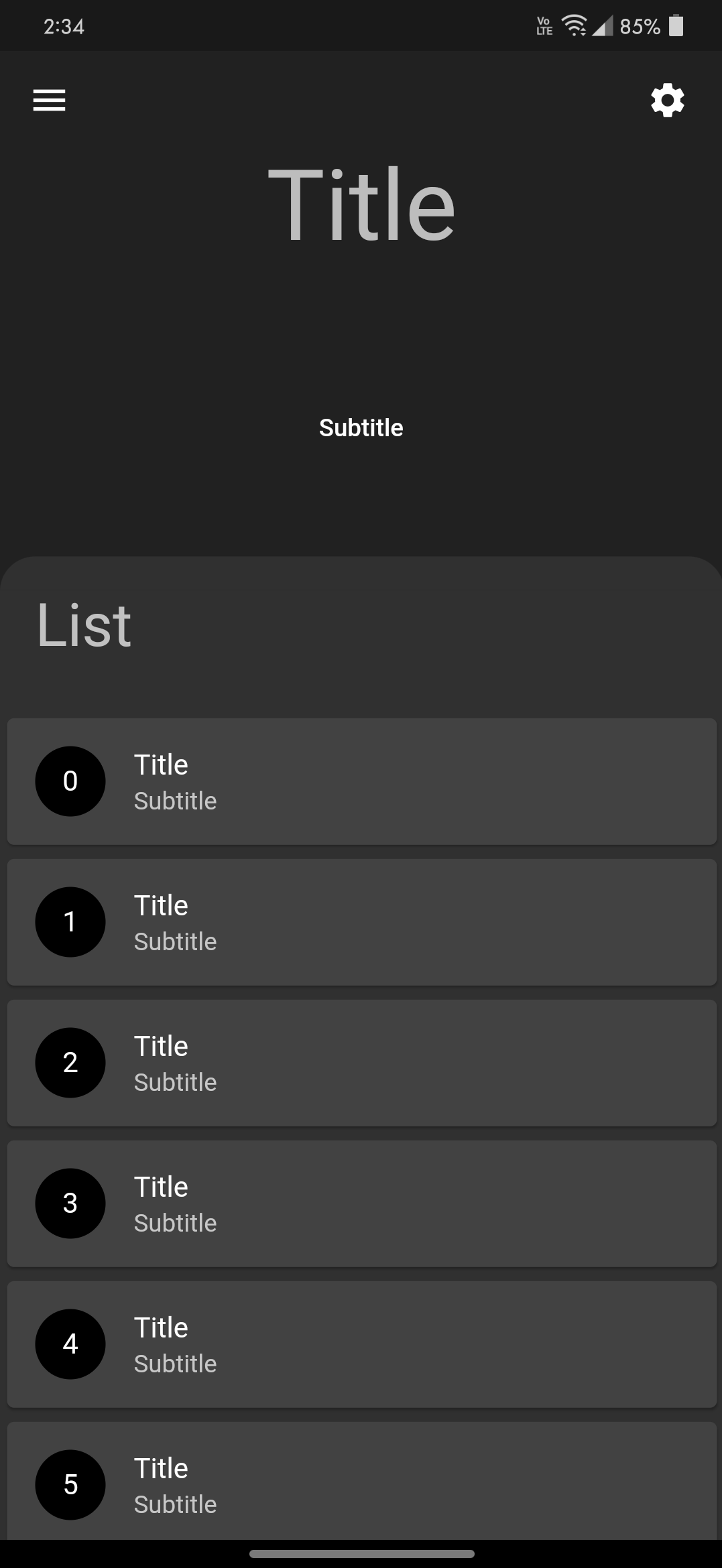
DraggableHome requires you to provide title, headerWidget and body:
titlewidget is basically for a title in the AppBar. For no title in AppBar, simply pass an empty Container.headerWidgetis the expanded widget just above the body when not fully expanded.bodyis in the form of Column which requires a list of widget or a widget. Do not add any vertically scrollable widget or you may just disable the scroll.
physics: const NeverScrollableScrollPhysics()
Sample code
DraggableHome(
  title: Text("Title"),
  headerWidget: headerWidget(),
  body: [
    Container(...),
    (...),
  ]
);
Arguments
There are several options that allow for more control:
| Properties | Description |
|---|---|
leading |
A widget to display before the toolbar's title. |
action |
A list of Widgets to display in a row after the title widget. |
drawer |
Drawers are typically used with the Scaffold.drawer property. |
centerTitle |
Allows toggling of title from the center. By default, title is in the center. |
headerExpandedHeight |
Height of the header widget. The height is a double between 0.0 and 1.0. The default value of height is 0.35 and should be less than stretchMaxHeight |
headerWidget |
A widget to display Header above the body. |
alwaysShowLeadingAndAction |
This makes Leading and Action always visible. Default value is false. |
headerBottomBar |
AppBar or toolBar like widget just above the body. |
backgroundColor |
The color of the Material widget that underlies the entire DraggableHome body. |
curvedBodyRadius |
Creates a border top-left and top-right radius of body, Default radius of the body is 20.0. For no radius simply set the value to 0. |
fullyStretchable |
Allows toggling of fully expand draggability of the DraggableHome. Set this to true to allow the user to fully expand the header. |
stretchTriggerOffset |
The offset of overscroll required to fully expand the header. |
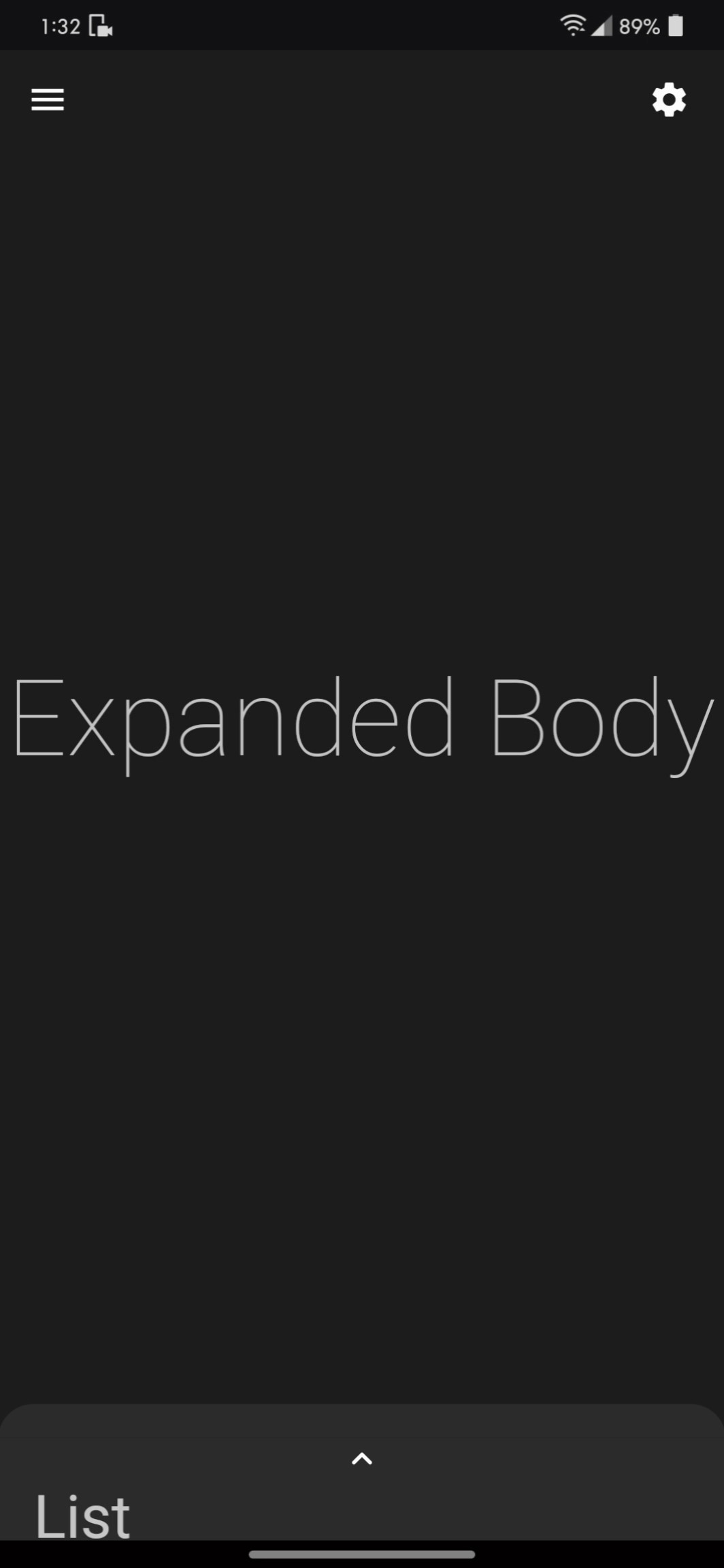
expandedBody |
A widget to display when fully expanded as header or expandedBody above the body. |
stretchMaxHeight |
Height of the expandedBody widget. The height is a double between 0.0 and 0.95. The default value of height is 0.9 and should be greater than headerExpandedHeight |
bottomSheet |
A persistent bottom sheet shows information that supplements the primary content of the app. A persistent bottom sheet remains visible even when the user interacts with other parts of the app. |
bottomNavigationBarHeight |
This is required when using custom height to adjust body height. This makes no effect on bottomNavigationBar. |
bottomNavigationBar |
Snack bars slide from underneath the bottom navigation bar while bottom sheets are stacked on top. |
floatingActionButton |
A floating action button is a circular icon button that hovers over content to promote a primary action in the application. |
floatingActionButtonLocation |
An object that defines a position for the FloatingActionButton based on the Scaffold's ScaffoldPrelayoutGeometry. |
floatingActionButtonAnimator |
Provider of animations to move the FloatingActionButton between FloatingActionButtonLocations. |
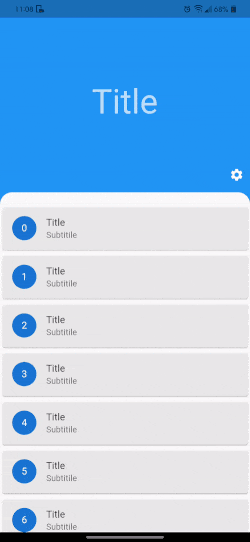
Sample code for ListView.builder
DraggableHome(
  title: Text("Title"),
  headerWidget: headerWidget(),
  body: [
    Container(...),

    // shrinkWrap true required for ListView.builder()
    // disable the scroll for any vertically scrollable widget
    // provide top padding 0 to fix extra space in listView
    ListView.builder(
      padding: EdgeInsets.only(top: 0),
      physics: NeverScrollableScrollPhysics(),
      shrinkWrap: true,
      itemCount: list.length,
      itemBuilder: (context, index) => Card(
        child: ListTile(
          title: Text("$index"),
        ),
      ),
    ),

    (...),
  ]
);
Show some :heart: and :star: the repo


Contributions
Contributions are welcome!
If you feel that a hook is missing, feel free to open a Pull Request.
For a custom hook to be merged, you will need to do the following:
-
Describe the use case.
-
Open an issue explaining why we need this hook, how to use it, ... This is important as a hook will not get merged if the hook doesn't appeal to a large number of people.
-
If your hook is rejected, don't worry! A rejection doesn't mean that it won't be merged later in the future if more people show an interest in it. In the meantime, feel free to publish your hook as a package on https://pub.dev.
-
A hook will not be merged unless fully tested, to avoid breaking it inadvertently in the future.
Metadata
Owner
 DevsOnFlutter
Metadata
A draggable Flutter widget that makes implementing a sliding up and fully-stretchable much easier.