wallet
 wallet copied to clipboard
Various proposals to UI and functionality.
Hey guys, I've been following for a little while and it's great that you've got the platform out.
I've got a few fixes & proposals based on UX/UI that I'd normally discuss before putting up in an issue on Github if it was my own work, but I haven't seen anywhere that you've got a forum for discussing these things so I'll go ahead and dump them in a list, and they can be broken into separate issues if they're taken as a good proposal. Apologies if there are any duplicates with other issues - I haven't seen duplicates from a quick look in the list.
All issues are based on the app as viewed in Chrome on MacOS.
-
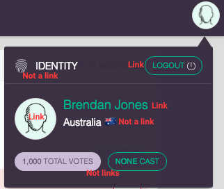
UI inconsistencies: some things that look like buttons aren’t links, and some things that just look like text are links. Please make the UI consistent. Example screenshot:
-
No feedback on some clicks. The site isn’t super fast, so feedback on links is really needed. There’s an invert of colour when you click the sign-in button, but, for example, the avatar doesn’t change when you click on it, which can be annoying when the site is responding slowly because you’re not sure if it’s worked or not.
-
When the menubar user profile dropdown is open, it should be closable by clicking anywhere off it, rather than just on the avatar.
-
Add a back button when viewing another person's user profile. The name of the app shouldn't be the only way to get back to the voting page when you're on a user profile, and also showing the user's path makes it clearer where they are in the site. This could be solved by simply adding a < before the user's name on the menu bar.
-
The shadow on the sidebar is going wrong way…or something. I dunno, it looks wrong, anyway. I’d say either remove the shadow, or reverse the direction so that the sidebar is ‘on top’.
-
It’s not intuitive that the delegation pop-up only appears when mousing over the tiny avatars. Maybe it should pop-up over the entire name and avatar, and add a button to the pop-up to ‘View Profile’?
-
I love Material Design, but the FAB (floating action button) is the worst. Put the FAB up on the left hand side of the menu bar (no longer floating). Or maybe top right, to the left of the avatar. Where people will actually see it, anyway.
-
Where is my voting history? I want to see every issue I've voted on, not just the proposals I've made. Add voting history to user profiles (viewable only to that person, not to others)
-
The infinite-scrolling feed needs a summary up the top. You could put this in the menu bar, or float it at the top of the page once a user starts scrolling down. Anyway, I need to know how many active proposals there are, or how do I know to keep scrolling down?
Voting is currently a 3 step process, and the UI is more cluttered than needed. So:
- Remove the votes slider. It’s stealing screen real estate and it’s unnecessary to display it on every vote until the user takes action to vote.
- Permanently display the remaining available votes in the menubar, to the left of the user’s avatar
- Voting ‘yes’ or ‘no’ should now open the popup window. Incorporate the vote slider into that pop-up.
I’m a bit confused about how the current UI achieves the specific aims of Sovereign, “Sovereign, a blockchain liquid democracy that enables direct voting on issues as well as the ability to delegate voting power on specific topics to peers over a secure network without central authority.” Key words: direct voting, and delegated voting. Not discussing votes. If you're going to allow comments, as you currently are, then it needs to work better so as not clutter the voting UX.
- When I delegate votes, I’d like to delegate for a person to vote on a specific issue on my behalf, not give them free reign over my votes to use them where they will. The whole point of delegation is that I trust someone knows better than me on one specific issue at hand (or on one topic, at least. See my comment below RE tagging proposals with 'topics'), not that I trust them to make all my decisions for me. That's just representative democracy, and allowing it just encourages lazy voters. At the moment it looks like delegated votes can be used anywhere. To fix this, you’d need to add to each vote a button to ‘delegate vote’. Selecting this would bring up a popup: [Header] Delegate Vote [Body] Do you confirm delegating your vote on this issue? You will no longer be able to vote on the issue yourself, though you may revoke your delegation at any time. [line break] Select how many votes to delegate [vote slider bar] [and then two buttons, “Not Now” and “Delegate”].
- If this is a voting app, why are comments allowed? But since they are, they need to work with the voting, so; 1. They’re not attached to any vote, so how do you have a coherent conversation about any particular proposal? Why are comments not threaded below a proposal? 2. In the same vein, comments can’t be replied to, so they’re simply stand-alone statements, not a conversation. This is pointless. 3. As soon as you have any decent kind of traffic, the number of comments will completely clutter the feed. Finding things to vote on in between the comments will become very messy. See my comment below about separation of the workflows.
- Where is multiple choice voting? There needs to be nuance, not just yes or no. Where’s the ‘yes, but…’ vote? What about the ability to suggest an answer to the person who posed the vote (this could be an optional preference)? There could be 3 tiers of this, set by the person who made the proposal: 1. Set answers (no changing them) 2. Accept suggestions (people suggest alternative answers, but they don't appear until you approve them), and 3. Accept new answers (anybody can add an answer option, without approval needed).
- A 140 character limit on proposal descriptions? That seems a bit Twitter-esque. How does one fit any information in, like links to resources for educating oneself on the issue at hand?
- I’m of the opinion that voting outcomes should be hidden while voting is in progress, to prevent herd mentality, laziness, following of the norm, etc, but if you’re going to keep it visible then I think the ‘X Voters’ statistic should be broken down on the Yes/No vote bars. To do that, add the text ‘from X voters’ on the end. As in, “X Votes (XX%) from X Voters.” I think it’s important to see the engagement, e.g. Yes has 300 votes from 4 people, and No has 200 votes from 100 people.
- I wonder if, what actually needs adding is better workflow separation? To that end, you'd make it so that there's 1. a 'current votes' (or 'in progress' or something like that) page, where the current proposals are displayed, and nothing else. You could have threaded comments below a proposal still, I guess, but those would be hidden until you opened them (just display a "[number of active comments] comments" button to open them) 2. a 'proposals' page, where people can discuss proposals before putting them live. This allows feedback and refinement, and maybe moderation (depending on the settings of whoever owns the app) 3. a 'closed proposals' for people to view all the votes that have finished. Currently, these closed votes are cluttering up the feed.
- I'm curious why delegation is shown? 1. Why is my delegation of votes anybody else's business? 2. Showing delegations clutters up the feed. If you want to show them, you could add another section to the workflow, just for delegations.
- The app appears like it'll only work for single-issue groups. What happens if it's being used for a community, with wide-ranging issues at hand? I feel like the app becomes very unwieldy, very fast, as soon as you have any number of proposals in there. It seems like votes need a tagging system, so that while you can still display all current proposals, a user could also select the 'health' tag, for example, and see just proposals tagged with 'health'. Users could follow specific tags, and be notified when a new proposal in their interest/expertise area comes up.
I think you have some very good points there, and probably a lot of us have thought some of them as well, it seems that they just need to be transformed into real working items or issues to be worked on.
Amazing feedback. Some of the 'non-links' you point out are meant to be links very soon as we work on the queries for those. Excellent feedback, will review in more detail when I get more time.
No worries guys. I figured there's reasons for a lot of what I addressed, so thought I'd just dump everything I saw in a list and let you implement the feedback as you see fit. Just happy to help.